“-4.5° rather than -45°?”
Two nice follow-ups to topics we covered before.
In February, Nobert Heger did some analysis of precisely which pixels in Tahoe are intercepted by mouse when trying to resize a window. In April, Steve Ruiz, author of tldraw, did this more extensively for all the drawing apps like Canva, Figma, Illustrator, and so on:
When a user has one or more shapes selected, we display an interactive overlay that allows the user to transform their selection: a drag inside the box will translate the selection; a drag on the edges will resize along that axis; a drag from the corner will resize along both axes; and a drag from further out on the corners will rotate the selection.
Like many features in tldraw, my design here was meant to follow the conventions of design tools. This meant a broad survey of other applications, both new and old, reconciling differences between them, and picking a design that I felt best served the user while remaining conventional.
Remember the “if you put the Apple icon in reverse” joke from January? Last month, Jim Nielsen on his blog pulled on that thread and showed a few more examples:
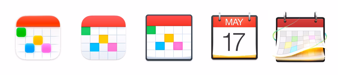
Some 3rd-party apps continue to fight a good fight, even as Apple’s definition of what an icon should be — or what’s even possible — shrinks all around them.
One finding from this blog post for me was that things changed. In Big Sur, the squircle form factor was encouraged, but not enforced. Well, it is enforced now, when even shapes very similar to the squircle are now inside “the gray box of hell”:
These gray boxes are not some pedestal for icons. They’re the actual icons.
Anyway, I always appreciate efforts of people methodically documenting things so we can all learn and notice patterns and/or continue the work from the best possible starting point.