Immich is a self-hosted photo/video app, and one of their side pages is Cursed Knowledge:
Cursed knowledge we have learned as a result of building Immich that we wish we never knew.
There is something about this format that I really enjoyed as a reflection but also as a way to share with others – simple one sentence/paragraph updates with links, so you can inhale quickly but also go deep if needed. There’s some overlap with bugs here, but it’s not necessarily only buggy stuff – also quirks of formats, observations, etc.
Favorite and least favorite file formats? I’ll start.
Favorite: TXT
Least favorite: HEIC
The answers – both replies and quote posts – are really interesting because most of the time they’re not about inherent capabilities of each format, but:
how well supported it is in the general ecosystem?
how painful it was last time I used it?
who’s using it and for what?
if there is one app I use it with, do I like this app? (interesting in the context of PDFs which some people love, and others hate)
Of course, Walsh put a finger on the scale with her initial example, but HEIC stands out as a favorite least favorite. I understand this is mostly out of its limited support, raising a question whether Apple spent the right amount of time socializing and incentivizing its adoption – even on a Mac, you can’t escape blank stares the moment you drag it into many websites/web apps:
HEIC on the other hand, Apple’s way of making photos smaller and everything else more complicated than it needs to be.
By the way HEIC is when you drag a picture from your Notes app into your email, and then it laughs in your face and is like sorry, girl, I’m HEIC!! I don’t do things like that!!
I didn’t know I had a least favorite file format but yeah HEIC can fuck right off
Sweet fucking hell fuck heic into the sun
Reading the replies here makes me feel like I live in an oddly privileged bubble in an inverse of the usual meaning of privilege for being a poor Android-using mfer who has never seen a HEIC in their life and had to actually look that sh*t up.
Least favorite is a toss up between HEIC (WHICH NOBODY ASKED FOR, APPLE) and WEBP
Controversial but I hope everyone involved with HEIC only tastes soap instead of cilantro forever
I agree with this person that WebP is much better supported than it used to, but it sometimes takes one link in the chain – cough Google Docs cough – for you to avoid a format forever. And, those are always lagging indicators. If a format didn’t work once in an important flow, it might take many years before you come back:
all the people saying “webp” in the quotes might as well be fighting WW2 still. look for another grievance. please
Some other fun answers:
IF IT’S CALLED [C]OMMA [S]EPARATED [V]ALUES WHY DO I HAVE TO OPEN A WINDOW AND CHANGE THE DEFAULT DELIMITER OPTION FROM TAB TO COMMA ??!?!?!
Favorite: MP3 (invented piracy, patents all expired, doesn’t need an FPU)
Least favorite: DICOM (nightmarish metadata, too many possible image encodings, when it wants a 3D volume the solution is just “a bunch of files in a folder”, also IT IS A NETWORK PROTOCOL >:( )
Least fave: .R01, .R02, etc... – nothing needs to be split into multiple rar files! Please stop! The world has moved beyond this.
Least favorite: can I count those awful pointer doc types Google uses, like .gdoc and .gsheet
favorite: transparent PNG
least favorite: transparent PNG that is not really transparent but just a fuckin checkered background
I forgot about this meme:
For least fav I voted for GIF, having not only spent countless hours trying to make good-looking animated gifs that do not weigh tens of megabytes, look horrible, and cause performance issues… but also having worked on two different products (Medium and Figma) that had to swallow gifs made by others, and seeing engineers lose their minds peeking into their insides and how messy they were.
To be fair, GIF comes from the late 1980s, and simply outlived its purpose. It’s a fascinating format that literally deserves a book written about it: the messy patent wars, the pronunciation, the technical format and many surprises hiding inside, even the word “gifs” transcending the format itself to mean “short animated memes.”
To go back to the thread, a small pattern that I also encountered from time to time:
Least favorite: .md, specifically when it’s used for Sega Genesis game roms. There’s already a type of text file type called .md, so Windows tries to open them in notepad. Just call it .gen instead, nerd.
Favorite: TS, the one that opens in my IDE
Least Favorite: TS, the one that opens in Quicktime
I’m endlessly confounded (as a user) and fascinated (as a designer) when it comes the shortcut conventions in Google’s professional web apps.
They seem… bad, but bad in a strange, inexplicable, enthralling way. Previously, we encountered this:
The lessons there were, primarily: don’t… do this, and also maybe don’t show it like this.
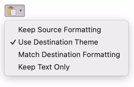
Today’s entrant, from Google Drive, offers a different lesson:
Immediately, I have so many questions. Why a sequenced shortcut instead of something simpler, in a space where there aren’t that many shortcuts? Why Control of all things? On a Mac? Why is it so different than Google Docs in every way – don’t you all talk to each other? And why not a proper typographical symbol for Control (^ is not ⌃)?
But there is also a mechanical lesson here. I’d encourage you to actually press any of these three shortcuts, and watch your fingers doing that. I bet you will observe one of two ways:
⌃ down, C down, C up, ⌃ up, F down, F up
⌃ down, C down, C up, F down, F up, ⌃ up
Turns out, people are messy when it comes to modifier keys. That messiness was even encouraged from the very first day we breathed life into the very first modifier key. Most of 20th century typewriters had a full stop and a comma on both shifted and unshifted positions – pressing Shift was heavy early on, and this helped when punctuating all-caps sentences or preparing for a capital letter starting the next sentence. (Also, Shift Lock wasn’t as smart as Caps Lock is.)
But even without that encouragement there are still two legitimately valid ways to understand “^C then F” – you release ⌃ before the second key, or after – but Google Drive only listens to the first one. Couple this with giving you zero feedback after ⌃C, and I won’t be surprised if many people try this sequence once, and give up assuming it’s just not working. So, it feels it’d be good to think about being extra forgiving here, the same way it’s good to think about “coyote time.”
As always, please let me know if you see the method in this alleged madness. After all, the goal for this blog is not to blindly ridicule things, but to learn together through thick and thin.
Somewhere next to optimistic loading and optimistic saving exists another technique to make apps feel faster: optimistic committing.
Flickr is a great example. After navigating to photo upload, you enter a sort of a foyer where you can drag in the photos, reorder them, name and tag them, and otherwise prepare them before pressing the big Upload button.
But Flickr also optimistically assumes you will press that button, and slowly starts uploading the heavy photos in the background the moment you drag them in.
Like all optimistic schemes, being friendlier toward the user complicates things for Flickr’s designers and engineers. After all, there is still a regular upload modal after you do commit to the upload…
…so the two states – quiet staging area upload, and the official visible upload – have to be reconciled and kept in sync.
Also, optimistic but eventually cancelled uploads have to be cleaned up from the servers.
Lastly, there’s signposting. Contrary to lighter optimistic loading schemes, which typically simplify reality by pretending no data transfer is actually happening, the optimistic committing here is actually visible through small indicators:
I think this transparency is welcome. In the past, Meta (who else!) got into hot water for abusing optimistic committing:
Did you ever record a video on Facebook to post directly to your friend’s wall, only to discard the take and film a new version? You may have thought those embarrassing draft versions were deleted, but Facebook kept a copy. The company is blaming it on a “bug” and swears that it’s going to delete those discarded videos now. They pinkie promise this time.
In this context, it’s good that Flickr conveys data is being sent to the servers; I believe this helps with building trust.
On top of transparency, I think it’s also good that this process shows the progress of uploading with a lot of precision – not just between files, but also within each file. Internet connection speeds vary so much, not just geographically, but also even situationally, that this is really helpful in practice. There are many moments where auto saving to the cloud needn’t bother the user unless the connection goes offline for a longer while, but this feels like a situation where clarity is better than magic.
When I was at Medium, over a decade ago, I really enjoyed going deep on typography.
People seemed to generally enjoy what we did. Writers really loved automatic em dashes and range dashes, discovered the beauty of hanging punctuation, and as funny as it might sound today, the smart quotes were a huge hit, too. I was proud of the tight drop caps, the underlines brought me some notoriety, and we even supported ligatures at a time when not only this wasn’t the default, but it also had some mildly scary performance consequences.
But for every two things that worked well, there was also something that in retrospect proved to be me trying too hard, and had to be quickly undone.
I was really excited about resurrecting pilcrows, but many users saw them as rendering or escaping errors.
I briefly added vulgar fractions to all the places where Medium rounded numbers, but that made those numbers confusing and weird in practice.
It was an interesting calibration process. And somewhere in between successes and failures was one thing that I have never mentioned before, and one nobody ever brought up.
I recently shared the story of 2015’s typographical redesign of Medium. As we were exploring the candidate typefaces, we fell in love with one in particular: Charter, a font designed by the industry legend Matthew Carter – and no, this is not a bug, Google Search switches to using Carter’s own Verdana to honor him.
Charter had this perfect balance of “casual” and “refined” we wanted for Medium at the time. Unsurprisingly, it also came with a bunch of typographical niceties – among them lowercase (old-style) digits, which I really wanted:
But there was a problem. Those lowercase numerals came with a “medieval 1,” a particular style of a lowercase digit 1 that resembled an uppercase I. People hated it and were confused by it, thinking indeed that a bug caused a letter I to make its way to the numbers.
No amount of pleading would get us to push that digit through. The backup plan was going with uppercase numerals, but I hated the idea; those digits felt so ugly and pedestrian to me – they were not just uppercase, but also monospace! It was a frustrating situation, being so close and yet separated from a warm Charter embrace by one glyph that it didn’t happen to have.
And so… I drew one.
I, someone who has never ever designed a typeface, decided to vandalize Matthew “The Most Widely Read Man In The World” Carter’s typeface and plop in a new digit 1 of my own creation.
The internal complaints stopped. Weeks later, we launched the new fonts, Charter front and center, my fresh non-medieval 1 attached. I don’t remember the exact details, but we found a way to do this that was compatible with the font’s licensing – and yet I never talked about it because… well, I think you can understand why.
I believe my rogue 1 lasted until a subsequent redesign in 2022, long after I left the company. A decade in, I still don’t know how to feel about it. Did I save Charter as a candidate for Medium by mutilating it a bit, am I writing this post just to launder my own ego, or is this the equivalent of a perp coming back to the scene of the crime? Was I ambitious (laudatory) or ambitious (derogatory)? Maybe you can tell me. But I hope either way it makes for a fun story.
From Jakub Krehel, a new blog post about self constraint in the era when AI makes it easy to ignore constraints altogether.
My caveat is that the post doesn’t fully come together for me – jumping from AI to animations and then back to AI the way the author did does not feel cohesive.
At the same time, in the middle of the post, there are some nice examples of animating juxtaposed with overanimating that caught my attention. We talked about sugar and juice before, and this adds to that conversation. Here’s one example:
Not all animations need to be wholly meaningful and functional – just like not all graphic design, iconography, and typography have to be – but part of growth as a designer is knowing how to limit your budget of “superfluous” stuff even if no one else tells you to, and then how to spend that budget really, really well.
Perhaps ironically given the subject matter, I found this 34-minute video by Razbuten a bit intense, but I would still recommend it to people who work on onboarding, settings, etc.:
In the video, the author tries to answer the question: how to make any given game a challenge, given there is no universal standard of difficulty and every player arrives at a game not just with different skillset, but also likely different goals.
There are many techniques a game can use to adapt to the player – a simple upfront difficulty selector, complex difficulty settings, a training level, adaptive difficulty, accessibility/assist modes – but there are no easy answers. Each method comes with pros and cons, and perhaps the very notion that a game should adapt to the user is flawed; some players might find it more rewarding to have to step up to the game instead.
In the video, Razbuten covers a lot of examples really well. I’m not going to say any of this maps 1:1 to productivity software as goals of games are very different than goals of apps… but even though I have never played any of the games mentioned, the examples made me think. After all, some of the psychology of mastery will be the same between these two realms. (I bet there were at least some of you who saw the previous post about LaTeX and thought “this looks hard and fascinating – I’m going in,” and others took a note to never approach it.)
Collier talks about why physicists prefer LaTeX to Word. LaTeX is sort of a nerdy HTML that predates HTML. It looks like this…
…and given how nerdy HTML already is, you might imagine this is a power-user tool that’s chiefly about power and control. But Collier makes the argument that there are some things that LaTeX makes much easier:
there is absolutely no need (or peer pressure) to spend time styling the document by choosing fonts, colors, etc.,
there is no “live preview,” and making a PDF is a separate step similar to compilation in coding – which means it doesn’t constantly occupy your mind,
GUIs can slow you down because the keyboard is faster than the mouse,
(Of course, there is also the issue of typographical craft of LaTeX documents set in Computer Modern, but let’s save this for another time.)
Also, the video starts with Collier apologizing for potentially making the audience feel dumb in a prior video. I don’t think it’s a joke, and I found it thoughtful and refreshing.
My arch nemesis lives only about 1.5 blocks away from me. It’s a coffee shop door. More specifically, it’s a sign on that door:
This is what happens with embarrassing regularity: I am inside, about to step out, my brain reads PUSH from the other side – and so of course, like an idiot, I push the door instead of pulling it.
Sure, bad design. But don’t worry, I am not going full Don Norman on you. I wanted to show you this other thing, in Pixelmator Pro:
A pretty non-threatening menu, it seems, but sometimes when I see a treatment like this, my brain actually sees this…
…and it takes just a bit of extra thinking to figure out where I am and where I’m going.
This is one of the recurring boolean problems in UX design. Given a choice, do we show the noun/adjective of the present, or the verb of the future? Because another way would be to show the current state:
To me, this is unambiguous; the state is easy to understand visually without thinking, and the implied flip action also feels pretty natural. You could go even further:
Without knowing much of the context here, this would be my recommendation. Of course, this last configuration not only implies toggling but also implies showing, but that’s probably okay given all the context surrounding it?
Now, like with many things I talk about here, I don’t have the benefit of user testing or research. (In practice, though, they aren’t often available for small things like this, anyway.)
Also, this isn’t a universal recommendation. This is an evergreen UX problem for a reason. If there were other commands around it, the showing/hiding verbs might have to appear. Same if no option had a checkmark by default. (One or two checkmarks establish an implied “show/hide” verb for the whole section, but without any, it might feel like an unusual menu filled with only nouns.)
There are more conventions – “Turn X On,” showing both options, submenus – each one with pros and cons. It’s good to be aware of all, because even if your tool uses one consistently, users might bring a different one as a default way of processing things. But the worst part about the Pixelmator menu is that it’s mixing conventions:
This screenshot, like the first one at the top, is real. It’s hard for me to understand the rationale here, and it makes processing this menu even harder. Maybe I need to go to a certain neighbourhood coffee shop to get more coffee…
I know software updates can be exhausting these days; on top of regular weariness of things changing, there’s contentious stuff like Liquid Glass, or thoughtless AI integrations.
So, I’m curious: What is a recent software update, anywhere, that made you happy? Something that made an app genuinely better for you, or showed a developer listening to users, or was just plain old delightful?
I’d love to learn, and I will summarize the responses next week.
If you want to, you can respond on Mastodon and Bluesky – and see other a few people’s nominations as inspiration – or send me an email. Thank you in advance!
As of today Maestral continues to work just fine. I don’t know when these certificates are expiring. And I don’t know what I’m going to do when they do.
Dropbox enshittified its app – my friend joked once that Dropbox is a rare example of a company that pivoted away from a product-market fit – and it seems Apple’s API changes didn’t really help, either.
Maestral stepped in to help restore the minimalistic, functional core of Dropbox – I believe Doctorow terms this “disenshittification” – but it was helmed by one person, Sam Schott, who has every right to move on to other things.
I have never been particularly fond of “shake to undo” on the iPhone. It’s not a pleasant gesture to perform, I feel like typically I don’t have strong enough of a grip on my iPhone to invoke it without fear, and the gesture often undertriggers, requiring an even harder and more cumbersome shake, etc. etc. (One thing I never want to undo is my screen’s pristine surface by having it meet the sidewalk.)
I am aware that many years ago, iOS introduced an alternative: a three-finger swipe. But I feel like Apple flubbed that, also – three fingers are hard to plop onto a small screen, and while regular going back navigation means swiping from left to right, undo is inexplicably a three-finger right-to-left swipe. I mean, okay, it’s explicable – it’s the movement of the cursor before and after the typing is undone. But to my brain that feels less strong than the other association, and undo is not always about typing.
I also see many people not knowing about this alternative and I must not be the only person struggling, since I see more and more apps throw in the towel and put undo and redo as on-screen actions:
Curiously, I even spotted Gmail on desktop doing that recently:
It’s all a welcome improvement under the circumstances, but those are literally all over the place – imagine if on a laptop, each app had a different key shortcut for undo. (We’ve had that, in the 1980s. The 1980s Nostalgia Industrial Complex doesn’t want you to know about stuff like that.)
Anyway, some time ago I promised more onboarding content, and here’s a little thing that happened to me recently. The inciting incident is that I accidentally shook my iPad, and then I saw this:
Wait, does it mean there is yet another, third undo shortcut?
I swiped through the carousel to see these:
None of these feel particularly pleasant to use – although they are nicer on the iPad than on the iPhone – but I started playing with them, and I discovered a fourth entry point. Just a single three-finger tap shows a new-to-me onscreen editing menu, sort of the equivalent of the Edit menu on the desktop:
This works on the iPhone and the iPad, and since then that’s the one thing I did remember and I find using. So, to summarize:
shake to undo – unpleasant
double tap with three fingers to undo – unpleasant
a three-finger swipe to undo – unpleasant, confusing direction
single tap with three fingers to show a menu, then tap to undo – less unpleasant, but stuck with me
Yeah, even this still doesn’t feel great. But it’s there in a (no pun intended) pinch.
So, is this a success story for onboarding? I think not quite. It all started with an accidental iPad shake, after all, and the gesture I ended up using I also discovered accidentally. But to be fair, I also did learn something, and I think there are some bones of the right solution in here somewhere. Onboarding and in-product education generally feel so bad that even this rickety encounter can be counted as a small victory.
It’s Button Week here on Unsung, and here’s a 10-minute video by Jago Hazzard about the door opening/closing buttons on London’s tube:
We previously covered elevator buttons and the enduring myth that – at least in America – they are just “pacifiers,” disconnected from the elevator’s systems.
The door opening and closing buttons in London went a different, but no less complex route, having to do with changing expectations, dwell time, and air conditioning. The video also briefly covers how the subway trains changed, which is fun to see.
I have to admit that when a reader wrote to me and said…
Every point release of BBEdit delights me. I live in BBEdit. It’s one of the few packages for which I read through the release notes every time (they often have spots of hilarity).
…I got a bit concerned. One thing that I hate more than wasted release notes (“Bug fixes and performance improvements” is the boilerplate’s boilerplate) is funny release notes – the ones where instead of actually conveying what changed, the text field is used for something, erm, “creative.” (Perhaps most infamously, Medium had had a spell of “fun” release notes about 10 years ago, to a mix of amusement and blowback).
But I needn’t have worried. The release notes of BBEdit are just plain old solid good work, with only a sprinkle of humor:
The “Zoom” command makes a triumphant return to the Window menu.
Fixed crash which would occur when displaying completions from language servers which violate the published specification and provide something other than a string for the details field of a returned completion item. (glares at Solargraph)
SNUCK IN A SPECIAL FEATURE FOR CRAIG NO NOT HIM THE OTHER ONE I HOPE HE LIKES IT
It’s been a while since we looked at release notes, and these are a great example of something that can help you understand not just what an application is, but what it will become. For example, I saw this fly by…
Made a change in the minimap so that punctuation isn’t greeked, which helps improve visualization.
…and even though I have never used BBEdit, I immediately started nodding. It made sense; greeking is helpful for letters, but I can see how it can do more damage than good for punctuation that has a pretty specific visual signature. BBEdit’s author knows what they’re doing.
Nothing in BBEdit is “abandoned.” Everything is on the table for possible improvements. Also remember that this is an app that was originally written for classic Mac OS!
This made me think about what separates apps that you’re excited to keep growing from the apps you’d rather see frozen in time.
The release notes of BBEdit made me trust it so, so quickly. Not just the pace of change and clarity of communication, but also indeed this certain feeling that the product is “alive” in all the right ways. Even if I don’t know or use the features, I quickly get a sense that the changes are for me, or at least other people like me, rather than serving unspecified corporate needs, chasing fashionable trends, or pursuing unnecessary pivots. Hell, even the ratio of changes – new features vs. quality-of-life fixes vs. performance improvements – seems good.
On top of all that, it’s fun to read good release notes, because you can learn something new. These, to me, were fascinating:
“Entab” and “Detab” have had their names changed to “Convert Spaces to Tabs” and “Convert Tabs to Spaces”, respectively. This is more verbose but less abstruse.
Jargon!
There is a new setting in the Keyboard preferences: “Enable macOS “Help” key”. This is off by default, so that pressing the “Insert” key which is present on some PC-style keyboards doesn’t open the in-application help. (This frequently happens accidentally.)
Keyboards!
If an FTP browser window is active and disconnected, “Open from FTP/SFTP Server” will start its connection sheet, rather than doing nothing.
A truly fascinating 17-minute video where Chris Siebert at 100th Coin ventures out to play Super Mario in a way where every single byte of code and every single byte of graphics are used, and then shows his work:
There was something about seeing the visualization of the entirety of the code being “used” that made me sit up:
It reminded me of IBM 1401, the 1959 business computer I saw a lot at the Computer History Museum. It takes up a big chunk of the room…
…but is still so simple that you can watch its console and understand exactly what is going on in its little huge electronic brain:
There’s something very powerful about this and made me imagine a version of it for my code, my CSS, my blog. Even the web lost a lot of its visited link vs. unvisited link fog of war kind of feeling of exploring the space and understanding how it is shaped.
The video gets into the coding weeds in between 2:25 and 13:35 – by the way, isn’t it scary to imagine your code pored over decades later, bugs and hacks and all? – but if you skip this part, make sure to come back at 13:35 for the verdict, and then for the graphics.
Spoiler alert: Some bits of code are never used, but the reasons are fascinating. All the untouched bytes are remnants of shameful mistakes, abandoned decisions, head fakes, and twin protections so strong that their first layer never gets penetrated – each one of them a tiny afterimage of other possible versions of Mario we’ve never gotten.
This is one of the meta posts about this very blog. If that’s not interesting to you, skip to the next one!
Here are some improvements I’ve made to Unsung in recent months. Always curious of your feedback or pointers to places that do these things better!
Weekly emails. I made it so clicking on every (non-YouTube) video or image takes you to the equivalent of the weekly email you’re looking at, but on the web, where you can watch the videos in their natural habitat. It’s scrolled to the right position, so you can just continue reading there.
I’m sorry, I know it isn’t great to shove people outside of their mailbox, but I don’t think there is any way for videos to work well inside emails, and a lot of Unsung is about precise videos. (The only thing allowed is GIFs, and they are really not up to the task.)
Video playback. On that note, I improved the handling and controls of video playback. On mobile, you can tap to play/pause and swipe left and right to move. On desktop, you can drag the handle, or also swipe left/right. You can also use ← → keys to advance frame by frame.
My goals are to have video controls that are both minimalistic (for example, never covering the contents) and precise, to match how videos are used here. (But if you tab to the video, it still shows “classic” controls for accessibility.)
Blink comparators. You might have noticed that I added some blink comparators in a few posts where they seemed to be useful (one, two, three, four). Is that fun? Does it work for you? Because I have more ideas for light interactivity on Unsung.
Technical details. Some people asked technical details about specific things on this blog, so I added a technical details page with answers.
Dashboard. If you are interested in that kind of stuff, I added some more charts and stats to Unsung’s internal dashboard (and deprecated sentiment, which wasn’t really working).
Here’s the best printer in 2023: the Brother laser printer that everyone has. Stop thinking about it and just buy one. It will be fine!
The Brother whatever-it-is will print return labels for online shopping, never run out of toner, and generally be a printer instead of the physical instantiation of a business model. […]
I am telling you to just buy whatever Brother laser printer is on sale and never think about printers again.
Patel did the same in 2024 and 2025 – you should check them all out if you want to smile, because they’re genuinely funny, as are some of the comments:
I’ve been using one of these for 6 years. The low toner indicator came on about 7 months ago. I bought new toner.
Reader, I haven’t replaced anything. It still prints fine, the new toner is still sitting on a shelf somewhere.
Least frustrating printer I’ve ever owned. Would buy again.
I’m sharing these on this ostensibly software-related blog not only because printer enshittification happens primarily via software. I wanted to share it also because this feels very similar to me to the post about TextEdit – a simple and deserved desire to own technology that works without any strange machinations, forced updates, and stress.
Past decades get compressed into a singular point in time, so we might all think of Selectric as “yet another old typewriter,” and I definitely did before learning about it. But the Selectric came 80 years after the first typewriters, and it packed so much user-benefitting innovation it really was an iPhone of its time. (Alas, I don’t believe there was a matching “are you getting it?!” keynote.)
Selectric was, honestly, a triumph of engineering. It popularized swappable typewriter fonts, showcased good industrial design, enabled jam-free typing, and even invented – although that came a decade after its introduction – an actual destructive Backspace. Crucially, on day one, its typing experience was so fantastic that many of the keys on keyboards we’re using 60 years later are still in the same place Selectric put them.
What’s even more impressive? Selectric was purely electromechanical. It had no software, no chips, and no electronics. Everything it has accomplished was expressed in the mechanical language of steel, grease, links, and levers.
Here’s one problem that’s trivial in software, but hard in hardware: How do you prevent people from pressing two keys at the same time?
This is a thing that plagued typewriters since day one, and IBM’s engineers came up with a smart solution: each key was connected to a bar (interposer), each bar had a little protruding notch (lug), and that notch would smoothly dip into a little horizontal row of steel balls (selector compensator tube).
The balls had just enough wiggle room for one notch, so if you tried to press a second key at the same time, the balls would now be packed tight, there would be no room to accommodate the second notch, and the key press would be blocked.
I thought that was really clever, but it was even more clever than that. If you read my essay, you know it starts with the very notion that fingers overlap: as one is going up, often another one is already pressing down. If you were to block any second press before the first press was completely done, you wouldn’t be able to type very fast – and Selectric was meant to be a professional typing tool.
Here’s where the choice of the carefully sized and arranged steel balls came into play. In practice, the second press was not completely blocked. The lug was able to slide just a little bit in between the adjacent steel balls. It was a half press – or, effectively, a half-character buffer. It was all fine-tuned just enough to not impede overlapping typing, while still offering protection from two keys at the same time.
Now, if Selectric did this, in a universe where creating even a half-character buffer meant a little row of carefully machined steel balls, and added weight, and anticipating future wear and tear, and multiple pages in the maintenance manuals… what’s your excuse?
One thing I was (and still am) worried about when it comes to my recent big interactive essay is that by showing all these classic desktop examples, the whole thing might appear old-fashioned, relevant only to a bygone era.
Yet, the challenges it shows are universal. Here’s something I just spotted. This is how you rotate an image on an iPhone and on a Nothing Phone:
It’s a pretty standard control – tap once to rotate counterclockwise, tap a second time to do it again, etc. – with a helpful transition of the photo’s orientation so that you don’t lose yours.
Now, I’m going to exaggerate the problem a bit and tap 90-degree rotation quickly eight times. Eight times should result in what engineers call a “no op” – the image rotating twice in full, and ending up where it started. That indeed happens on the iPhone:
But it’s a different story on the Nothing Phone/Android:
iPhone will remember and buffer the taps, so that the second, pending rotation will happen as soon as the first is done. The Nothing Phone button gives you a tap confirmation via both haptics and sound, and then ignores the tap if a previous rotation is still animating.
Why does it matter?
I often keep thinking about the framework of situational disability, stating that disability is not just something that happens to a few people and no one else. No, pretty much everyone will occasionally encounter a situation that will make them effectively disabled, and this is why accessibility matters much more than many of us assume:
I think similarly about casual and non-casual use. Photo-taking on phones is typically casual. Phone cameras are typically very good at detecting the photo orientation – but get confused when you’re pointing down. Now, as an example, if you had to take photos of a bunch of landscape documents, you might end up having to rotate dozens of photos, one by one. And it would be so much more predictable and pleasant if you could just tap the button three times at any pace you wanted without thinking, without paying attention, without getting your UI blocked by an animation that no longer helps you.
This is, I suppose, “situational power user-ness.” Given a long enough timeframe – or, in this case, a large enough population – even a casual interface like phone photo editing (or, GarageBand) will meet someone who will have no choice but to treat it more seriously and expect more from it.
By the way, buffering the taps is not the only answer. You can also stop/accelerate the animation after an interrupting tap, and it seems the iPhone does that as well. But the rule is: never force the user to wait for the animation to finish.
I liked this page I just learned of called Incomplete List of Mistakes in the Design of CSS. It might not mean much to you if you don’t write CSS, but could be fun to check out if you do. Here are some choice quotes:
border-radius should have been corner-radius.
It shouldn’t be !important — that reads to engineers as “not important”. We should have picked another way to write this.
white-space: nowrap should be white-space: no-wrap.
The “caron” should have been called hacek and combining hacek. The term “caron” is suspected by some to be an invention of some early standards body, but it has also been claimed by others to have been in use at Linotype before the days of digital typography. Its true origin may be lost in the mists of time.
These are great because they simply say “this is how we messed up.” They are succinct and candid about problems. More work needs to be done at this point, of course – the CSS list only really contains the “simple,” low-level observations, and I think for both CSS and Unicode fixes cannot simply be made because people and systems rely on the existing behaviour – but the first step is admitting you have a problem, right?
If you’re on the outside, it can be comforting to realize “oh, it wasn’t just me, other people don’t like this, too.” (Scanning bug reports from other users can help in a similar way.) If you’re on the inside, consider making a list like this for a long-standing project. It might do you or your team good!
If you are aware of more documents like these, I’d love if you could send them over.
Love seeing real work in progress like that, plus it ends up in a place I didn’t expect.
It was also great to see “delay and snap” action elucidated so clearly. It feels like a variant of rubberbanding (or, elastic scrolling) where you intentionally disconnect an object from the cursor or finger dragging it.
A nice and I think effective notification preview in Retro, with a verbatim sample text of a notification right below its name:
Not only you can see exactly what you’re going to get and make a much better-informed decision, but the app even uses actual names of your in-app contacts, so you can relate to the notifications more.
I know I’m usually driving the Finder pretty hard, but I think that’s a necessity, given its position as the center of macOS for power users, and its situation where it feels like Apple pretty much gave up on it.
But I also want to show things that Finder does well, and this might be something no one does nearly as thoughtfully: text truncation.
This is what happens when you have a filename that’s too long:
This is really nicely done, for many reasons that work in lockstep:
Finder cleverly elides text from the middle, knowing that both the ending of the last words (or digits!) of the file name, and its extension are important.
Finder shows the full name in a tooltip. I’m surprised how many tools forget to do that, offering no easy explanation for the missing letters. Here are some examples from Notion and Bear, neither of which offers help on hover:
Finder position the tooltip exactly atop the existing text. I think this is really clever: it avoids overlapping other useful information, and makes it faster to reorient yourself. Compare with, for example, AirTable:
Lastly, Finder only shows the tooltip when it’s needed. This is something where so many places lose their way. For example, here’s Paper and Google Drive, throwing up a tooltip indiscriminately, even if it has absolutely nothing to add to the conversation:
Why does this last thing matter? Because unnecessary tooltips are distracting, cover information, and also – maybe most importantly – turn the interface into a minefield where no safe places remain to just mindlessly rest your cursor without worry.
This last thing is very fuzzy, but so important. You know how unpleasant a lot of articles are on the web these days, solely because you’re always on the edge about what’s going to happen while you read? Am I going to be moved up and down? When and where is the ad going to appear? When will I encounter a new subscription pop-up, and what will be the weird way to close it this time around?
I know you don’t literally tense your muscles while reading those, but I feel like in some sense, in the back of your head, there is always this unpleasant worry that you’re dealing with an unstable interface.
This is not as strong, but I feel a similar way about unnecessary tooltips; they make interfaces feel less stable. You rest your cursor, something jumps up at you, you get distracted and move your cursor instinctively to avoid it, and with any luck, you trigger yet another tooltip, and so on.
I will write more about this in the future. If you asked my former coworkers, I bet a significant portion would say “this guy gets angry at tooltips, like, all the time.” I promise I will get angry at tooltips more here. But today? Today, kudos to the Finder. It shows us that if you care, you can make this small moment feel really great and thoughtful – knowing that small moments multiplied in the thousands are no longer small.
Speaking of breaking search, an absolutely horrendous design decision I just spotted when using Bing Search:
Yep, you saw this correctly: as you scroll, the ads (already pretty much masquerading as regular search results) actually get bigger to grab your attention.
Jesus.
I don’t know why I was reminded of this fav Twitter joke:
Google’s feed-reading tool offered a powerful way to curate and read the internet and was beloved by its users. Reader launched in 2005, right as the blogging era went mainstream; it made a suddenly huge and sprawling web feel small and accessible and helped a generation of news obsessives and super-commenters feel like they weren’t missing anything. It wasn’t Google’s most popular app, not by a long shot, but it was one of its most beloved.
In the essay, Google Reader is presented as a victim of Google+. I was at Google when Google+ was announced and can corroborate the feeling of an end of an era at the company. The first large internal presentation was a shell shock: the arrival of secrecy, bureaucracy, corporate delusion, inevitable sycophants following not-so-inevitable bozos. But perhaps it was the opposite – Google as a company would have changed anyway, and Reader just randomly ended up being among the early beloved things that stood in the way. (I mean, arguably, Google changing for the worse destroyed even Google Search since.)
I am worried about the open web, but excited seeing some resurgence in RSS usage, and more and more people wanting to come back to the feeling of control, care, and intentionality that using Reader represented. Just a few months ago, Roger Wong found himself reflecting on Reader, too:
What gets me is that the vision Wetherell drew on that whiteboard—a single place to follow everything you care about, organized by your taste, shared with people you trust, and non-algorithmic—still doesn’t fully exist. RSS readers are the closest thing we have, and they’re good enough that I’ve built my entire reading and writing practice around one. But the curation layer Wetherell imagined is still unfinished.
I’m introducing a new tag to Unsung, software eulogies, which right now encompasses Aperture and Reader.
One has to be careful about nostalgia since it has its own gravity and can corrupt as much as a runaway World of WarCraft virus. “They don’t make them like they used to” is a potent drug that can make us disinvested in shaping the future, but it is also true that, well, we don’t make software like we used to. Part of Unsung is about finding inspiration in history, and while each one of us can miss a certain era of computing, certain machines, and certain software for whatever reasons we choose to – healthy or not – I do believe we collectively miss Aperture and Reader for the right reasons that are worth listening to.
If you stepped into the dwarven capital of Ironforge on September 13, 2005, you would find only bones. Lots of bones. The city, along with every other major population center in World of Warcraft, had been ravaged by a plague that slaughtered players by the thousands, their bleached bones covering every street.
This is the beginning of the retelling of one of the most infamous bugs in videogame history, written by Steven Messner in 2019. It’s a surprisingly thrilling read.
The TL; DR of the whole issue is that during a specific special event in World of Warcraft featured a big bad boss who actually stole blood off of players to replenish his own health. The fun narrative idea was that players were meant to infect themselves with a virus called Corrupted Blood, to trick the supervillain into getting infected, too.
Things worked well except… the virus escaped containment.
“The corrupted blood was an effect and the designers forgot to clear it off your pet, so if your pet got despawned while it was in the encounter, it would save your pet with corrupted blood on it. The next time you summoned your pet there was no code to go «Oh you’re not in the raid, we should get rid of the corrupted blood.»”
“Our choices were either to go through every pet in every server in every country in the entire world and check if it had corrupted blood and get rid of it, or get really hacky code in where every time you summoned a pet it would check and see if it had corrupted blood on it and get rid of it.” […] Despite numerous hotfixes, it was nearly a month until Blizzard fixed the problem completely by making it impossible for pets to contract the disease.
The disaster had a few interesting codas. The first one was that World of WarCraft and other games eventually started occasionally introducing an epidemic – now 100% intentional – as special events in their games.
The second one? The accidental in-game event helped researchers understand actual real-life epidemics. As summarized on Wikipedia:
Of particular interest to researchers in the use of MMORPGs for epidemiology is that character responses to a virtual pandemic are the result of individual player reactions, adding “a level of authenticity that doesn’t exist in other simulations”. Disease researchers typically study disease spread and control through the use of three general models, all of which make significant assumptions about human behavior. As behavior is difficult to predict, the effectiveness of these models is limited.
In 2023, Neal Agarwal created The Password Game, a viral browser-based game. Wikipedia has a nice summary:
Although the initial requirements include setting a minimum of characters or including numbers, uppercase letters, or special characters, the rules gradually become more unusual and complex. These can involve managing having Roman numerals in the string to multiply, adding the name of a country that players have to guess from random Google Street View imagery (as a reference to GeoGuessr), inserting the day’s Wordle answer, typing the best move in a generated chess position using algebraic notation, inserting the URL of a YouTube video of a randomly generated length, and adjusting boldface, italics, font types, and text sizes.
The explanation goes on for another paragraph, but I don’t want to spoil too many surprises. However, if you’re not a puzzle kind of person, you can just watch a 40-minute video of Bog trying to beat it:
Last year, Agarwal followed The Password Game with I’m Not A Robot game, making fun of similarly onerous CAPTCHA requirements. Here’s Bog completing it once again – and you can also find other YouTube creators doing the same for both games:
In the same category, a game designer Linternet User just launched a teaser for their game CAPTCHA Hell, which has a different take and looks fun:
I need to add that underlying all of this “fun” is not just tons of frustration with passwords and CAPTCHAs, but also a genuine accessibility problem, as described by Robin Christopherson in 2019 in an article titled AI is making CAPTCHA increasingly cruel for disabled users, or by A11y Collective a few years later. I don’t know what is the absolute latest in the battle with AI bots; anecdotally, I have been seeing almost zero text CAPTCHAs and less visual CAPTCHAs, at the expense of more and more CloudFlare turnstiles (and Google’s equivalent), which make you only click the button, and do a lot of work under the hood to determine if that button press felt human-y or robot-y:
These challenges include proof-of-work (computational puzzles), proof-of-space, probing for web APIs, and various other challenges for detecting browser-quirks and human behavior. As a result, we can fine-tune the difficulty of the challenge to the specific request and avoid showing a visual or interactive puzzle to a user.
There is no more explanation. I think the nature of the beast is that the actual details of how to tell one group from another cannot be shared, which is a shame – I’m very curious.
In my three decades online, it has never occurred for me to try this, and I found it so delightful once I did – both Chrome and Firefox will quietly rewrite backslashes in URLs into slashes:
I am very curious if the presence of backslashes in URLs is owing to Windows still showing backslashes in file paths, or just because people casually don’t see any difference between / and \, which are arguably both similar, and relatively alien in everyday typography. (“Solidus” is the proper typograpical name for this kind of a slash, partly to disambiguate it from all the other slashes with their equally fascinating names.)
Even before the “remaster,” my essay about the Polish S bug was routinely discovered by Hacker News and other places, so I thought I would take a look at all the commentary over the years and summarize.
First, pragmatically, these are the lessons for any keyboard shortcut designer:
On Windows, AltGr (Right Alt) and Ctrl+Alt shortcuts are one and the same, and Right Alt and alphabetic keys are used for some languages to output regular accented letters. You should not prioritize Ctrl+Alt shortcuts anywhere your users write text.
On a Mac, ⌥ and most keys generate characters. They do so even on English layout for extra typographical flair, but particularly in other languages, regular accented letters might hide there. Note that these are not just letter keys, but also digits and other keys. You should not prioritize ⌥ shortcuts anywhere your users write text.
I couldn’t find a good image, so I made these two as an example. First is Mac’s American keyboard with ⌥ held. Second is Polish keyboard with ⌥ held, with Polish letters highlighted:
Jumping to the promised comments, I liked this story:
Outlook has a shortcut Alt+S to send the current e-mail. In Polish “Hello” is “Cześć”. When you acidentally have non-Polish locale enabled and write “Cześć” in Outlook - you send “Cze” as your whole e-mail.
“Cze” is a very informal greeting, sth like “Yo”. There has been thousands of such e-mails in Polish companies sent to people who really shouldn’t be greeted with “Yo.” :)
Here’s a little summary of other similar bugs. I verified some of them:
“Oh, that explains why I accidentally triggered Claude with Alt+Space, despite it being configured as Ctrl+Alt+Space.” Link
“Noticed similar issues with official Australian VISA / immigration pages. You can’t simply fill some forms with your email address using Finnish keyboard. Why? Because they block usage of AltGr button on their page. They also prevent using clipboard blocking copy paste option for that sign. User has to be smart enough to switch to US keyboard and then enter @ sign and then switch back. So this is nothing new, but it’s absolutely rude from part of the site designers to vandalize basic functionality like that. Normally @ is produced by AltGr+2.” Link
“In a similar fashion, you cannot type the capital letter Ł in Notion. You type the letter with ⇧⌥L on the Polish keyboard on a Mac. Notion uses the ⇧⌥L keyboard combo for its own purposes.” Link
“Medium learnt its lesson in 2015. Google still hasn’t and you cannot type Ś in Sheets, at least not on MacOS.” Link
“Meanwhile, in 2026 I suddenly cannot type capital Ś in Edge on Mac. I feel like I moved back in time 25 years or so.” Link
“I wonder if it is a similar reason why currently on MS Teams I can’t type the letter ń.” Link
“It’s just like the new Copilot 365. Every time I try to type Ć, Copilot pops up. I have to close the app constantly.” Link
“I had a similar issue when ASUS’s bloatware background service decided to bind something to both Alt+S and Alt+A globally. I have to keep it disabled or else I won’t be able to type ą, Ą, ś and Ś without using Caps Lock to work around the issue.” Link
“In an Nvidia overlay there is a shortcut Alt+Z. It’s pretty annoying because it triggers on both left and right Alt, so polish users cannot type letter ż without opening the overlay or rebinding it. Nvidia pls fix.” Link
“The very same bug used to be present in early Windows mobile GPU drivers - with global hotkeys making it impossible to enter Ł (with Intel GMA 950) and Ć (with ATI Catalyst). Being a Polish geek, I used to earn lots of free dinners from frustrated friends who were forced to copy-paste those letters on their brand new laptops. Funny how the same bug recurs in different types of software due to an obscure locale-dependent edge case - and it’s much less known than, for example, the Turkish dotted/dotless I.” Link
“Installing KeePass used to silently disable ”ą” key (AltGr+A hotkey). KeePass broke system of every Polish user immediately after being installed.” Link
I’m sharing this for awareness. I believe many other languages/writing systems also have this problem; the examples are lopsided toward Polish only because my original example was about Polish.
In Portugal we had a similar workaround in the early days of computers not supporting our alphabet properly. Like in Polish there are plenty of words that without diacritics get another completely unrelated meaning, e.g. caça vs caca, which you didn’t want the interpretation to be left to the receiver.
So tricks got invented, like adding additional letters for the missing diacritics, é becomes eh, è becomes he or eh as in the former case, the example above would be cac,a and so on. However it was still quite flexible, not everyone uses the same extension set.
I wouldn’t be surprised if every single language outside of English developed some sort of a way to cope and adjust to limitations of originally American-oriented computers. In my book, I wrote about Japanese and Turkish, and there is another book – The Chinese Typewriter – that spends a lot of time talking about this very issue for China.
If this subject is particularly interesting to you, venture out into the Hacker News waters to see more commentary: 2015, 2021, 2024, 2026.
Here’s another nice detail. If you press and hold ⌘⇥, you will eventually stop at the end. (You can then press ⌘⇧⇥ or ⌘` to go in the other direction.)
However, if you are already at the end, pressing ⌘⇥ again wraps around to the beginning:
The issue of whether to wrap around or not is more universal; you can see it in many lists, ⌘F, and so on. On one hand, it’s nice to have a solid deterministic stopping end that you can rely on, especially since sometimes the last item on the list is special (“See more items…”). On the other hand, going all the way back from the end can be frustrating, too, especially on a Mac that does really strange things with Home/End/PgUp/PgDn keys.
I thought the hybrid approach that ⌘⇥ is doing here was clever, and might be applicable elsewhere.
For decades now, Raymond Chen has been posting to his blog The Old New Thing about various technical Microsoft quirks, occasionally venturing into Unsung territory. Last week, Chen shared a nice remembrance of Tony Krueger, a person responsible for implementing the red squiggly underlines in Word:
Tony worked on Word 1.0, 1.1, 2.0, then on Word for OS/2 and Word for Mac, then returned to Word 6.0 and several versions beyond that. He probably holds the record for “most versions of Word shipped.” […]
Tony made the spell checker much more unobtrusive so that it didn’t interfere with your foreground work. And when it found a problem, instead of waiting for you to trigger a spell check, it immediately drew red squiggles under potentially-misspelled words (and later green squiggles under potential grammatical errors). […]
Today, there are red (and even green and blue) squiggles in nearly every word processor, and often outside word processors. Tony did it first. The next time a red squiggle catches one of your mistakes, say thanks to Tony. I think he’d appreciate it.
Read on for some fun celebrity encounters, and even a touching comment from Krueger’s father. Another person adds that a “PM named Diana” and another Microsoft employee, Jim Walsh, might have been the people who designed the feature.
Chen doesn’t name it specifically, but it’s my understanding that the red underlines were named Spell It (meh), and appeared in Office 95 in 1995. Steven Sinofsky confirms it on his blog, adding “The red squiggles were simply reflective of a proofreader’s style of mark (also one of the early uses of color in the interface).”
As far as I can tell by looking at various screenshots and photos of boxes, the feature wasn’t advertised at all. It was only mentioned more explicitly a few years later in Office 97:
On his blog, Jim Nielsen writes how Apple filed away so much expression by forcing rigid icon bureaucracy in macOS. Nielsen focuses mostly on distinctiveness; previously, you could make the icon unique by its general shape or the shape of its contents, but one of these two levers has now been taken away:
This over-emphasis on “systems” design seems endemic to modern software. Systems prescribe rules because they are the easiest attributes to document, enforce, and automate — “All icons must use this shape, this lighting, this stroke.” Excellence, by contrast, is harder to systematize. It requires judgment, taste, care, experience, and a sensitivity to context — all in service of meaning and purpose, not superficial similarity.
However, one also can’t help but notice how ugly and amateurish the Creator Studio icons are, so it all feels absolutely like a net negative – the new system took something away and the proposed replacement feels low quality:
Elsewhere, on Rogue Amoeba’s blog, Paul Kafasis straight up asks Apple to undo the 2025 decision to contain macOS icons inside squircles:
Apple’s prohibition on shapes is a step backward for both usability and creativity in app icons. Icons are now harder to distinguish because they’re no longer allowed to be distinctive. But there’s no technical reason for it. Apple could, and should, once again allow icons to take on a wide variety of shapes.
Both these prompted me to think a bit of Apple’s app iconography as a system.
Let’s start with iOS:
I believe the rigid squircle shape of app icons starting with the first iPhone was to make them look like a grid of buttons, and also to establish apps as a new primitive, particularly with the subsequent arrival of the App Store. (Similarly how over time “a face in a circle” became recognizable as a “personal avatar,” a user proxy primitive.)
Soon, the rigid shape also helped when custom Springboard wallpapers arrived in 2010 – it reduced the likelihood of apps blending with the background.
Recently, a new option has been added to remove names of apps, which is another way to disambiguate them.
Also recently, Apple’s generally unpleasant-looking theming options (color tinting and glassification) reduced color coding as a way to recognize a particular icon.
At the same time, iOS is still highly spatial. Most apps have a specific physical place on a specific page of the Springboard, or inside a specific folder. I believe that this helps a lot even if shape coding, color coding, and name disambiguation are failing or turned off to begin with.
Now, for MacOS:
The original Mac OS X followed in the footsteps of the classic Mac OS and allowed arbitrary shapes, allowing for more flexible shape coding, although with some guidance on angles and styling:
However, more recently, the iOS squircle shape has been first strongly suggested (in 2020) and then rigidly enforced (in 2025) for macOS as well.
But then, the usage of app icons in macOS is different than in iOS.
First of all, macOS isn’t nearly as spatial as it used to be, and I would say not as spatial as iOS. Even Dock is more malleable compared to the memory palace rigidity of the Springboard, and its overflow section with suggestions and hand-off is very fluid. ⌘Tab is completely non-spatial and just like the Dock doesn’t upfront identify apps by their names. App icons also appear in more fluid contexts like Spotlight, Finder, and the right side of the menubar (I know iOS has some of those as well, but I would imagine they’re getting much less use overall). This all increases the pressure on icons to be easily distinguishable.
At the same time, there are fewer issues with custom backgrounds on macOS. Most icon surfaces have opaque backgrounds and while you can keep your apps on the desktop or put backgrounds in Finder windows, I don’t think that’s very common.
I’m probably missing some other aspects, but this would be my summary of where we’re at:
Apple has not done a good job shepherding their app iconography system. The system feels too rigid, and some of its ostensible benefits (dark mode, color tinting, glassification) have been executed poorly. You could imagine a better tinting system that doesn’t feel like a cheap CSS filter applied to the icon, or (my dream!) a way to tint individual app icons. I personally love when apps – here Raindrop, Bear, and Retro – give you a lot of icon options in various colors, so I can invest in color coding:
People’s trust in Apple’s skillset has deteriorated after the unveiling of horrendous icon redesigns in 2025’s Tahoe, and more recently in the abovementioned Creator Studio (the 2026 updates are nice, but very minor). This is in some contrast with other controversial visually-motivated changes appearing at the same time. Say what you want about Liquid Glass, but there are moments it looks absolutely gorgeous (see the video below for perhaps my favourite Liquid Glass surface). Forced menu icons felt similar: embarrassingly naïve as a system, but with icons themselves executed well (which you can still appreciate when perusing SF Symbols). But the app icon changes seem to have been assigned to the team that delivered on neither good visual craft, nor good systems thinking.
I think it’s fair to look at Creator Studio specifically, and fear Apple is following in Microsoft’s and especially Adobe’s unforgivable footsteps in prioritizing abstract corporate identity goals over both functional and visual aspects of app iconography. Adobe’s product icons used to be beautiful and distinct before they got all shoved into the same “uppercase + lowercase letter” framework that became a canonical example of a system that took something away from the user but didn’t really give anything in return:
I also feel this feeds right into another fear of Apple’s actions steamrolling over particularly indie app developers where being able to express one’s identity via the app icon feels much more important than it would be for a huge company.
I don’t see Apple abandoning their stance on the rigid, distinctive app icon squircle shape. It’s possible that iOS apps will start appearing on touchscreen Macs outside of screen mirroring. Even without that, it just simplifies things for them, even if the jobs for macOS app icons are not the same as those for iOS app icons.
At the same time, I could see Apple allowing the app icons to stick out of the basic squircle shape, like some macOS apps did in between 2020 and 2025; I believe it would even be possible to detect programmatically if the basic squircle shape is still there in the background. This would improve shape coding, and give icon designers some clearly much-desired flexibility. The icons below still register as squircles to me – why not allow this as an option? (For both macOS and iOS.)
I wish Apple standardized app icon changing UI on iOS. Right now, each app offers their own interface in a different place – you could see that above – and rarely links to that place from the Springboard’s long-press menu. But imagine if you could nicely change app icons in situ in the same flow when you’re customizing the Springboard itself! (And then, the same for Dock and macOS.)
I think it would also be a nice gesture to allow to rename iOS Springboard apps to whatever you want the same way you can rename folders, to give some users an opportunity to disambiguate by that if everything else fails.
In 1982, the videogame Yars’ Revenge for the Atari 2600 needed to show a “neutral zone” in the middle of the screen. The console was so primitive – an entire great book was written about this – that it didn’t have any video memory. Any cheap effect would do, even random noise… but something as simple as generating noise was also too much for the underpowered system. So the creator of the game decided to do something that in any other situation would mean at the very least trouble, if not a downright security disaster. He crossed the wires and output on screen… the game’s own source code:
The source code looked noisy enough, and the problem was solved. (Somewhat recently, Retro Game Mechanics Explained analyzed it carefully in this YouTube video, to make sure it’s not just a myth.)
A similar approach was used in a Nintendo GameCube game Metroid Prime, at a moment when the protagonist’s visor needed to appear disrupted. It was two decades later, but the team still bounced off of hardware limitations, this time around memory:
The GameCube only has 24MB of RAM, so every texture has to be carefully considered. If we used a low resolution texture (64x64) to save memory the “static” would be blurry and not crisp. One engineer on the team came up with a great idea: what if we just use the memory holding the Metroid Prime code itself! We quickly tried it out and it looked amazing. When you see Samus’s visor affected by electrical “noise” in game, you’re actually seeing the bits and bytes of the Metroid Prime software code itself being rendered on the screen. Turns out machine code is sufficiently random to work great as a static noise texture!
This is how it looked:
A few years later, in 2008, people working on Xbox 360 were testing a new interface for their entire console. It was called NXE – New Xbox Experience – and in the bottom-right corner it showed delightful ripples:
…or, not just delightful. While NXE was tested internally, the ripples actually encoded the serial number of the console, to prevent leaks. Apparently, it was built specifically so that Microsoft only needed just two images to find out the entire serial number.
A less surreptitious version of this idea exists today – for example, setting up a new Apple Watch shows a pretty pattern…
…that also happens to encode enough information to identify the specific one watch. It really appears to be nothing more than an obfuscated QR Code, and “boy, have they patented it.”
I know concealing a message inside another message is called steganography. I don’t think all of these fall under that umbrella, and I don’t even know all the above can be called “hacks.” I just thought they were interesting examples of information masquerading as noise, and noise pretending to be information.
A few readers wrote in response to me sharing Panic’s blog to say that they witnessed online publications doing the same.
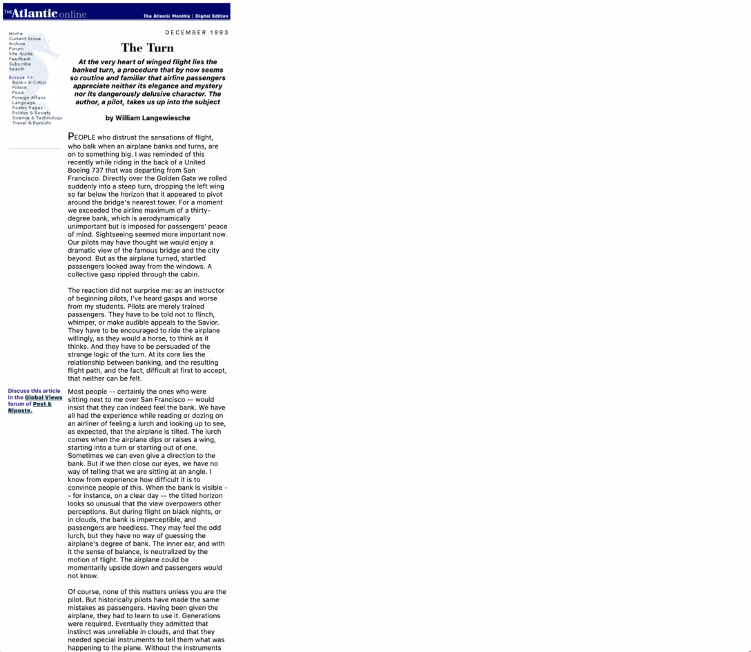
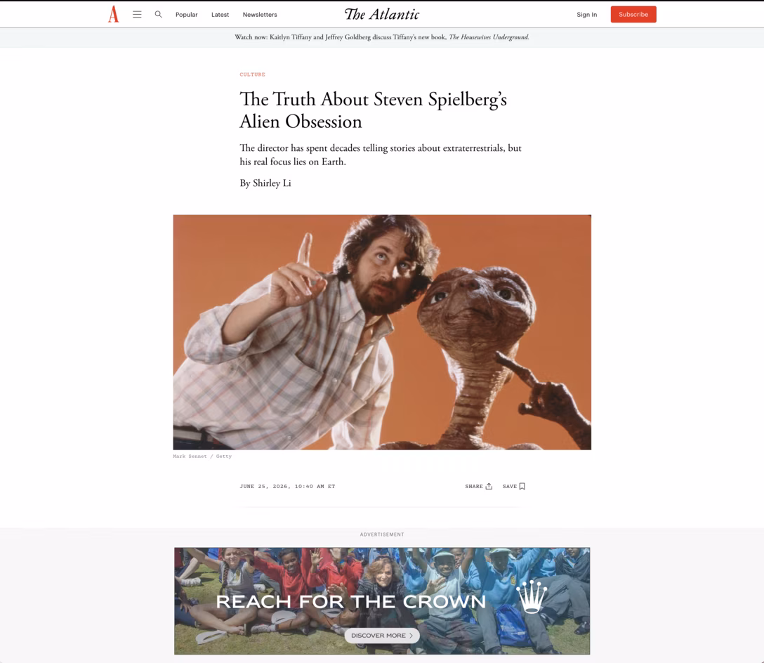
Here’s a 1993 essay by William Langewiesche from The Atlantic Online (sic!) that’s still on the web – which, by the way, you should read because it’s really great writing – juxtaposed with a screenshot of a 2026 Atlantic essay on the same machine:
I do see those as something different, though. The old articles here are basically preserved as they were, which you can tell by the tiny images, pixel fonts, narrow widths, and so on. They’re likely the output of contemporaneous CMS frozen in time, functionally equivalent to a “Save As…” command.
This is better than those articles disappearing altogether, and better still than them being carelessly converted in bulk to a more modern CMS, resulting in formatting mistakes, broken images, and missing context. But what I appreciated about Panic’s approach is that it felt unified with the rest of the blog. In a way, it was less like preservation “as is” and more like “remastering” – ask any Star Wars fan about the difference – with slight updates to fonts, more thorough integration, and thinking about readability on smartphones that didn’t exist in the 1990s.
Of course, compounding the difficulty of online preservation, “as is” in the computer realm doesn’t really exist; even The Atlantic Online’s 33-year-old HTML is served using modern fonts via crisp and tiny pixels 1993 would die for – but even if it’s increasingly more and more possible, you also probably wouldn’t want to emulate an old, flickering CRT and Internet Explorer 3 to read it. On the web, just like elsewhere in computing, you truly can’t go home again.
Duff’s device is a C language technique that looks like this:
send(to, from, count) {

    register n = (count + 7) / 8;

    switch (count % 8) {

    case 0: do { *to = *from++;

    case 7:      *to = *from++;

    case 6:      *to = *from++;

    case 5:      *to = *from++;

    case 4:      *to = *from++;

    case 3:      *to = *from++;

    case 2:      *to = *from++;

    case 1:      *to = *from++;

            } while (--n > 0);

    }

}
It achieves two things:
It unrolls the loop in chunks of eight. Unrolling the loop is when instead of telling the computer “do X 5 times,” you say “do X do X do X do X do X,” trading some code readability and memory usage for higher speed.
It cleverly (ab)uses a property of the C language to unroll the remainder of the loop, which normally would be impossible to do as the remainder is less than 8 and different every time. It does so by basically overlapping a do/while loop atop a switch/case structure in a way that should come with a coding equivalent of a parental warning.
I always assumed the technique is from the 1970s and was just a show-offy thing that didn’t serve any function, a “look how clever I am” from a programmer who was perhaps just a touch too nerdy. But yesterday, I found a 1988 message from the said programmer, Tom Duff, and it turns out I got almost everything wrong.
First of all, the technique was from 1983, when Duff was at Lucasfilm – much later than I expected.
Second of all, it actually solved a problem. Duff’s device wasn’t just making things faster abstractly, but actually fixed a user-visible performance issue. “[The loop before applying the device] was the bottleneck in a real-time animation playback program which ran too slowly by about 50%,” writes Duff.
Most importantly, however, Duff himself had mixed feelings about it:
Disgusting, no? But it compiles and runs just fine. I feel a combination of pride and revulsion at this discovery.
I recognize this set of feelings from many different software hacks I invented in my life. I think it’s important to carry them all with you – not fall in love with the hack and continue seeing it for what it is (and what it will be in the future as code ages), but at the same time not be above using it if it’s solving a real issue.
Also, Duff adds:
Many people […] have said that the worst feature of C is that switches don’t break automatically before each case label. This code forms some sort of argument in that debate, but I’m not sure whether it’s for or against.
I can’t speak for C, but I have always felt frustrated about JavaScript stealing that convention – it’s so error-prone, and in my many years programming in it, I have never had to use a Duff’s device or anything else that benefitted from it.
[… Apple] decides to do a big feature. The circus comes to town, they build the feature, they launch it, they leave town, and that feature sits there.
And the problem is, there’s bugs, things are broken, and in Year Two, you’re like, “You’re going to fix all the things that were broken in the thing you shipped last year, right?” And in the last decade, I would say, a lot of times what happens is they just don’t. And if you’re lucky, they’ll fix it Year Three or Year Four, […] give it a polish.
The thing that troubles me most about Apple software quality in general is the feeling like they don’t have the people to own the thing that they launch. They build the thing that they launch, and then those people go off and do something else, and nobody is maintaining and improving the thing that’s there.
And whether it’s Time Machine, things that are often really system critical but that are super quirky, then they will do a brush up and you’ll be like “yay,” but… there’s still this bug, and then it’s “good luck, wait three more years.”
Or I think the one that we’re all thinking of this year is Screen Time, which they have a big revamp of. […] On one level, it’s great, but on another level, if you’ve talked to anybody who’s tried to use Screen Time, it’s broken. And so what they’re really doing here is trying to fix it, and we’ll see how they do. […]
The new features with problems is not a crime. It happens. The crime is: they never fix the problems.
And that’s the part that I would like to see Apple get better at: if you’re going to launch something, you got to maintain it. Sometimes I feel like Apple is willing to spend the money and time and effort to launch something, but then they’re not really willing to do anything other than walk away.
And I think that’s irresponsible. If you can’t stand by that feature, you shouldn’t launch it.
I think this is spot on, and said really well. Are you honest with yourself about resourcing and focus for right after the launch and then later on? Have you really thought about worst case and best case scenarios vis-à-vis bug reports, latency, user feedback, and craft/quality however you define it? Have you actually started to make room for those outcomes ahead of time?
For me, an ongoing tension with Apple is Finder, so central to my (and I imagine many people’s?) use of a Mac, but rewritten at some point eons ago in a new framework that caused all sorts of problems, and then pretty much abandoned like a proverbial American city’s downtown. (I gave up listing stuff on this blog because it didn’t feel like fun, but I also see 100% of what Ilya Birman sees in his “Finder” section, many times every day.)
It’s not a story unique to Apple – I’ve seen many a designer and engineer quitting their jobs when an empty promise of a “fast follow” never materialized – but you’d expect them to do better here.
For a while, the digital artist James Dalzell Hodge kept a video diary of various design decisions while making his next game. This 13-minute video is interesting because it harks back to my mention of diegetic interfaces just a few days ago:
It’s a nice quick dive into the subject – a rare coverage of what “diegetic” means outside of the realm of movies.
I like these videos because Hodge focuses on details and shows working through things, including approaches rejected along the way. Inside, there are even occasional peeks at interfaces from Unreal Engine tools and Blender, not to mention examples from other games.
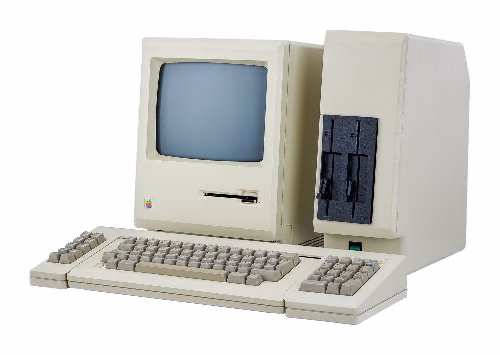
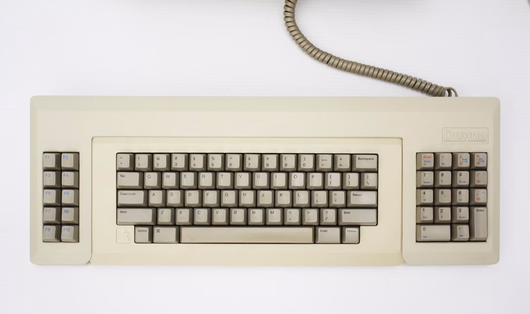
I keep thinking about MacCharlie, this strange product from 1985 that turned the original Macintosh into a dual-purpose machine that could also run software by its chief competitor, early PCs:
I’m fascinated by it because it almost feels like cargo culting: “hey, PCs are big and ugly, so if we make a Mac big and ugly, it must turn into a PC.”
Of course, there was more method to this madness, and two alien cocoons wrapped around the Mac and its keyboard actually have the correct technology, but still – what an absolutely soul-sucking experience: an ugly on/off switch, ugly disk drives, ugly, slightly misaligned elements, ugly, ill-fitting, slightly off-color plastics, even ugly colors for key legends.
(Okay, I liked one thing – the embossed Dayna logo matching the Apple’s.)
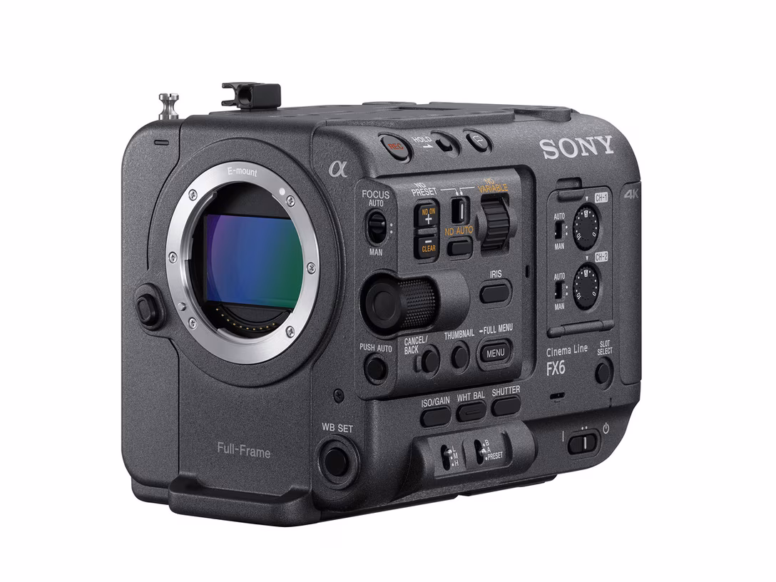
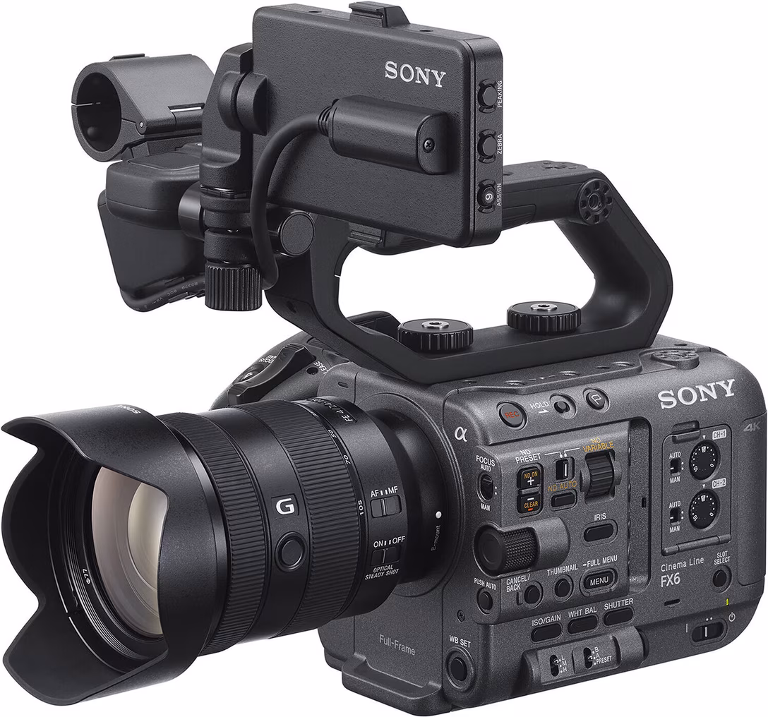
This was not a novel idea. Those kinds of matryoshkas happened to computers before, and are still happening to computers today:
There even exists a concept of a “naked robotic core” – devices designed specifically to welcome more infrastructure around them. Here’s an example from the professional cine camera world…
…but your smartphone with MagSafe is gesturing toward this idea, too.
This is not limited to hardware, and it is in software where things get really interesting to me. Here’s a thing I saw the other day when installing some keyboard modification software:
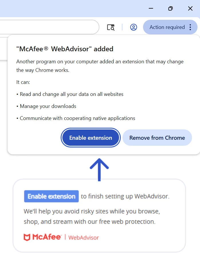
The top is the native macOS interface. The bottom, including those arrow tendrils, comes from the interested app, trying to walk me through the process using some overlaid coach marks.
Or, this is something I saw on my Windows laptop. Putting aside none of this was what I gave consent for – again, top is native, bottom comes from McAfee:
Those adornments, whether “white hat” (like the keyboard tool), or “gray hat” (like the McAfee), all feel equally desperate and hopeful.
Desperate, because if this is the best idea, there are no good ideas. You can almost feel developers gritting their teeth, saying “I can’t believe we have to do this.”
Hopeful, because – well, you’re skating where you hope the puck will remain. At least the hardware, once mounted, cannot morph into something else. But the software appendage you create doesn’t really know how the host organism will evolve. Even a singular word change in the original UI can throw everything out of balance. This is no software proprioception where you control both sides of the equation and can re-synch them when either needs to evolve.
Okay, I imagine if you think ahead enough, and have an appropriately vivid imagination, and a robust QA process set up so you can react immediately when the host changes its UI from under you, you might get something passable.
But I think it will be hard. Sure, McAfee’s pop-up didn’t even try so its approximation of the “Enable extension” button is basically laughable – but CustomShortcuts did, and even then, the rounded corners and the shadows don’t quite match.
I think this is the foundational disadvantage of this kind of an approach. I imagine there are much worse and more nefarious “black hat” examples than the McAfee callout I showed above, but even without that, shoddy facsimiles of things are all around us – fake text messages from fake support centers, fake smartphone pop-ups telling you to update your OS – and we learn not to trust them. And this kind of UI inevitably starts as a shoddy facsimile. You can pull it, with effort, to be something better, but it will never forget its roots.
Here’s another “white hat” example:
This is from Raindrop. Again, you can sense some pretty understandable desperation as presumably iOS doesn’t allow you to add the highlighting and annotating commands to its top toolbar – hence additional, bottom toolbar.
I consider Raindrop a generally well-made app, but you can immediately feel a certain maccharlieness of it all here – what was mismatched plastics in the 1985 is mismatched liquid glass effects in 2026.
And, on top of all that, once in a while, disaster strikes:
This is what happens when you go to the homepage of Gemini and start typing quickly:
Mechanically, I think this is React or some other framework setting focus again with some delay, but the end result is… rather disturbing.
While the technical solution would be to fix the problem or at least do not set focus again if already set, I wonder what’s the real challenge here. I imagine it might be that the testing process (if any) assumes using the mouse or trackpad first. In this case, moving the hand to the keyboard to start typing gives the interaction just enough delay to miss the second, unnecessary focus.
I think a good assumption to have for all common interactions is that for some users, fingers are already on the keyboard and things can happen so much faster than you expect.
Not accounting for that, the creators of this flow inadvertently broke one of the cardinal rules. We talked about it in the context of mouse pointers before, but it applies as well to text: don’t move my cursor for me.
Since we’re talking about pixel art, in this 30-minute video, Stuart Brown known as Ahoy embarks on recreating an illustration called Four-Byte Burger:
The original picture was created by artist Jack Haeger on an influential computer Commodore Amiga in 1985, on prototype software that “was in such an early stage of development that it lacked a save feature, entirely.” Proper to-disk screenshotting didn’t come to computers until the 1990s, so the only reproduction of the picture was a photograph taken off of the display and reproduced in print in a manual for the graphics software; the original image pixels evaporated when the computer was eventually turned off.
Brown recreates the image using more modern means (Photoshop), but eventually goes back to an Amiga to try to display it as close to the original as possible. It’s a soothing watch, and there are some fun moments in the video, like rotating the CRT to “portrait mode” – in a world populated by smartphones, in some sense the image aspect ratio seems oddly prescient.
(Also, if you ever find yourself having to rotate a CRT, you can just degauss it instead of waiting all night. Degaussing a monitor is one of the forgotten weird tactile pleasures bordering on dark magic, and if you’re ever near an old CRT, ask someone to show you.)
The videogame MainFrames was released on Steam and Nintendo Switch in 2025 to positive reviews:
MainFrames invites you to meet Floppy and to browse a clever and charming platformer that plays out entirely within the windows and desktop of a PC monitor. You won’t want to press the escape key on this cozy outing!
Recently, I stumbled upon the artist Alexis Morille who worked on a game sharing a few visuals and animations on Bluesky.
Here’s what really happens under the hood when you resize the window:
I believe the word “gremlins,”x before being usurped by the 1984 horror comedy, was generally used to denote little mischevious creatures that live inside machinery and cause trouble. I wonder what the word would be for the little creatures that do all the hard work.
I haven’t tried the game yet, but I found these to be delightful.
Before I say anything, I’d recommend you just visit the site of a new little app called Liquid Radius, click around, and see how you feel (don’t install it, though!):
So. One of the design memes surrounding macOS 26 Tahoe from last year – the one with Liquid Glass – was this screenshotted quagmire of mismatched rounded corners:
The tool, Liquid Radius, promises a solution, and then goes to strange lengths to accomplish it.
Fixing the mismatched radii is, apparently, much harder than for example something like Lickable Menu Bar, which many of you have spotted me using via various Unsung screenshots. To get Liquid Radius to work, you have to take a pickaxe to deep recesses of your operating system in order to disable some of Apple’s protective measures – stuff like FileVault (which you have to turn off momentarily) and System Integrity Protection (which you are never allowed to turn back on). The installation requires friendliness with command line and a stomach for multiple reboots, including some of a kind you might have never actually done before.
Then, there’s the website you’ve just seen: elaborate, with nice “before and after” animations, and a fun landing page. I thought the installation steps, given the complexity of the effort, were exemplary and even educational. There’s also a page listing all the apps confirmed to work, and a “How Liquid Radius limits its blast radius” (ha) section, revealing the author is clear-eyed about their work being a hack, and even the dimensionality of its hackiness. Even within the tool there are nice design details.
But, as I was exploring the site, I kept switching between “this is ridiculous!” (laudatory) and “this is ridiculous!” (derogatory) in my head.
At some point it all started feeling like… overkill. Is this really worth all this effort? Are there people who pay for and install this, lowering their system’s overall security and installing unknown code by unnamed developers? Do the ends justify the means? How much do rounded corners matter?
I’ve also seen many products that were a lot more complex, but came with smaller landing pages and fewer snappy taglines. At some point I even had this thought that if you wanted to make The Onion-style joke describing how designers can get incredibly self-serious and obsessed about some teensy detail, the site is exactly what you would do. You’d just never build the actual app.
(Caveat: I didn’t buy or install Liquid Radius for reasons that are probably obvious – nor would I recommend you do so – so I cannot fully discount this actually being an incredibly sophisticated practical joke.)
Maybe it’s my reaction to rounded corners in particular being its own exhausting thing in the design world – a shiny, shallow distraction of product designers in lieu of focusing on more important issues of utility, ethics, privacy, and so on. Maybe it’s the fact I’ve always been suspicious of the oft-told Steve Jobs round rect story: sure, round rects are everywhere in the world, but then so are regular straight corners. Or maybe it’s my own frustration that conversations about macOS and Liquid Glass still feel largely surface-level, on terms established by Apple at WWDC last year.
Speaking of this: timing-wise, Liquid Radius is peculiar, too. This effort was only launched in May, and graduated to 1.0 on the first day of WWDC, the same moment Apple announced they will fix this problem in the upcoming macOS Golden Gate – to audience’s applause – which renders Liquid Radius obsolete, and was an absolutely predictable outcome.
The Liquid Radius creator seemed perhaps surprised by it, and promised to keep the tool running, allowing people to continue customizing their border radii even after Golden Gate makes them all match – but that makes the product an even trickier proposition given the frightening installation steps and the very notion of anonymous, closed-source code being allowed straight into your system’s bloodstream. Besides, if you judge the tool on its own, visual-design terms…
…I don’t think you can simply straighten the corners like they’re showing in the bottom row without rebalancing it with other design changes I’m not sure the tool can make en masse for all the apps.
I know this is navel-gazing, so I will stop. I linked to some third-party fixes before, but this one is newly fascinating. I’m sharing this in part because I don’t know how to feel about it. It reminded me of the mixed feelings I had after watching Jiro Dreams Of Sushi: is Jiro a hero or a villain of this story? I couldn’t say then, and I still don’t know today.
It has been an interesting few weeks to ponder the relationship of style and substance. macOS Golden Gate announcements made me wonder: if you strip Liquid Glass of a lot of its original style via all the reactionary fixes, is what remains even worth the name? The controversial Ferrari Luce reveal not long ago was another rich entry point, especially as for Ferrari the style is a large part of substance.
When taking screenshots, macOS at some point followed iOS and introduced a “floating thumbnail,” which serves as a proxy of the screenshot you just took – you can drag it somewhere, open it to annotate, etc.
The thumbnail is a nice gesture. The problem is that I rarely do the things it enables, so the thumbnail is now an extra thing to deal with and dismiss. And you have to dismiss it, because inexplicably on macOS the floating thumbnail is diegetic, meaning it itself can be screenshotted. And this happens, routinely, if you do a few screenshots quickly in a row – the screenshotting tool literally ruining your screenshots. “You had one job,” &c.
(“Diegetic” is perhaps my favourite pretentious word. It generally stands for “in-universe.” If characters in a movie are listening to the song, that song is diegetic. If the song is just for the viewer as part of the soundtrack, that song is non-diegetic.)
You can turn off the thumbnail, but then outside of the sound – which is unreliable for other reasons – there is nothing else to tell you the screenshot was taken. And I think it’s good to have some sort of a confirmation, especially since the screenshot shortcuts are so harrowing.
Now, on Windows, when you press the equivalent (Windows key + PrtSc key), this happens:
I think this is better. It’s elegant, unmistakably recognizable as a screenshot, gone immediately, and a cute skeuomorphic nod towards old cameras.
There is nothing quite so frustrating as a persistent user interface papercut. You know it’s there, but you keep running into it because the moment you start thinking about what you’re doing instead of how you’re doing it, that knowledge slides away until BAM you run into it again.
I think this is really nicely put and highlights about why it’s very important to care about this kind of stuff.
If you forgo a standard interaction out of carelessness, a bug, bad systems thinking, or for other reasons, you’re not just making your users frustrated by something not working. You’re also at risk of making them frustrated atthemselves, assuming they can change what their fingers do easily, not fully knowing that a) this is motor memory, not just regular conscious actions (and any memory is hard to “update” intentionally), and b) motor memory is separated from regular, declarative memory, and not possible to reason with using the same techniques.
(As an example, it’s very hard when keyboard shortcuts or mouse gestures disagree between apps, because while you consciously might know which app you’re in, that’s not necessarily true of your fingers.)
Waider continues with an example:
The canonical example of this, for me, is Microsoft apps on macOS: even now, decades after Microsoft started producing macOS versions of their apps, they insist on largely disregarding the native UI idioms in favour of their own. Current pet hate is that if I’m commenting on a document, the Ctrl-A/Ctrl-E actions do not work, and boy howdy do I use those constantly.
My recent example is that even though I wrote about Safari overriding the natural “scroll to top/bottom” tap gesture on their tabs – so I am aware of it in my declarative memory, I know Safari designers messed it up, and I know exactly what to do and not do – my fingers still occasionally tap to scroll in Safari anyway.
Our wet little term for constant and bountiful user feedback. A juicy game element will bounce and wiggle and squirt and make a little noise when you touch it. A juicy game feels alive and responds to everything you do - tons of cascading action and response for minimal user input. It makes the player feel powerful and in control of the world, and it coaches them through the rules of the game by constantly letting them know on a per-interaction basis how they are doing.”
It’s mostly, but not exclusively videogame related, but it has some obvious tentacles reaching into the consumer and even professional UX world – at this point in Unsung’s history you all probably know I see these worlds as overlapping, hence linking to a lot of videogame interaction stuff.
Won’t be a surprise that I particularly liked the “level of juice” slider:
The whole page is messy, but that’s actually kind of great. It generously links to other things, too. I don’t agree with all the examples, but I the entire effort feels like it came from a person, and I really treasure that.
I also thought this notion was very clever:
There is a trend to juice rare events in non-game software. For example, an explosion of confetti to celebrate completing onboarding or a funny animated 404 page. Game developers do the opposite. They focus on the mundane, routine tasks. Because these are the foundation the rest of the software sits on.
(Brad Woods’s “Digital Garden” is generally worth checking out as a whole.)
A funny and occasionally spicy 15-minute video by Nerrel from October 2024 about some of the nuances and legal fights surrounding Nintendo’s fight with community-made emulators:
The video paints Nintendo in the harsh light, highlighting their double standards and willingness to throw their corporate legal weight around just to squash the challenges before they go to court, despite court precedents ruling against them.
The video also talks about software preservation – this is the part that feels very important to me – and I also learned things about piracy, DCMA, and modern video game encryption.
Just to highlight the versatile value of emulation, in another corner of the emulation universe, I found this fascinating project: a web page called Yes we scan, made by George MacKerron, that promises scanning directly from the browser – for example if you have an old scanner unsupported by your modern OS.
And… it actually works! It combines WebUSB with an interesting technique:
Your web browser emulates a whole PC running Linux with open-source scanning software (SANE). It connects that to your scanner via WebUSB.
If you are interested, the details page has more… well, details. MacKerron also wrote Printervertion that allows you to print directly from web, too, even if your operating system abandoned your vintage printer. The way I understand this, both efforts basically invite an alternative operating system that might be more supportive to take a stab at scanning or printing, and do it in a friendly and sleek way through emulation. It’s kind of incredible this is even possible.
Aanand Prasad, Ben Firshman, Carl Tashian, and Eva Parish put together Command Line Interface Guidelines for people who write command-line tools.
I like that it harkens and links back to other writing, and is also pragmatic: shares good parameter-parsing libraries, commonly used options, and so on.
Here are some good principles that caught my attention:
Display output on success, but keep it brief. Traditionally, when nothing is wrong, UNIX commands display no output to the user. This makes sense when they’re being used in scripts, but can make commands appear to be hanging or broken when used by humans. For example, cp will not print anything, even if it takes a long time.
It’s rare that printing nothing at all is the best default behavior, but it’s usually best to err on the side of less.
By default, don’t output information that’s only understandable by the creators of the software. If a piece of output serves only to help you (the developer) understand what your software is doing, it almost certainly shouldn’t be displayed to normal users by default—only in verbose mode.
Catch errors and rewrite them for humans. If you’re expecting an error to happen, catch it and rewrite the error message to be useful. Think of it like a conversation, where the user has done something wrong and the program is guiding them in the right direction. Example: “Can’t write to file.txt. You might need to make it writable by running ‘chmod +w file.txt’.”
Signal-to-noise ratio is crucial. The more irrelevant output you produce, the longer it’s going to take the user to figure out what they did wrong. If your program produces multiple errors of the same type, consider grouping them under a single explanatory header instead of printing many similar-looking lines.
Consider where the user will look first. Put the most important information at the end of the output. The eye will be drawn to red text, so use it intentionally and sparingly.
Make it recoverable. If the program fails for some transient reason (e.g. the internet connection went down), you should be able to hit <up> and <enter> and it should pick up from where it left off.
(The document is undated, but I believe the effort started in 2020. It seems to still be updated via GitHub, where you can also send in your suggestions.)
Every once in a while, I stumble upon a long thread in a random corner of the internet where someone discovers Paste And Match Style, and everyone erupts in applause. “Yeah, it’s a life saver.” “I use it all the time.”“I can’t believe this isn’t the default!”
Then, inevitably someone chimes in: “Oh yeah? I can show you how to make it the default.” And they explain how to wire ⌘V to use Paste And Match Style.
And I always get worried seeing that.
I believe this is the core problem people are bothered by before discovering PAMS – when you copy and paste from another doc, you inherit its style/visual appearance:
And Paste And Match Style, well, does what it promises:
This feels nice. So, what’s the problem? The problem is that PAMS is drunk with power and flattens everything on its way:
That includes:
emphasis by italics or bolding
links
bulleted and numbered lists
strike-through text
headlines
None of these are “style.” This is actual information that should not be removed. If you wire PAMS as your main ⌘V shortcut, or even if you use it occasionally, you might remove valuable data from text you’re moving around, without even noticing.
(And if you do notice, the frustrating irony is that recreating the information lost in transit – for example, re-linking things one by one – is often more work than fixing the style would be.)
If you are designing an app that handles rich text, here’s what I have seen others do:
Do not have styles to begin with. If you use Notion, Dropbox Paper, Medium, or anything that relies on Markdown, they give you no way to customize fonts, colors, letter spacing, and so on, so regular superliteral Paste has a limited blast radius and works well:
Have a very strong center of gravity toward the default style. Apple Notes does this well. Use Notes for years, paste into it from all over the world, and you might never realize it allows you to change fonts and colors. Its default Paste removes style, but it doesn’t remove any valuable information like links or bullet points.
Notes also introduces a shortcutless Paste And Retain Style as a third option after a “semantic” paste (which keeps data and removes style) and PAMS (which removes everything), for those who really want to paste extremely literally:
Word has Paste And Match Formatting that seems to be what Notes does by default, but it’s not the default:
Help users understand the options they have more. For example, Word offers a little post-paste menu. I don’t personally love (it doesn’t have a preview + it doesn’t remember my preference + the options are scary), but it uses better-than-default language like Keep Text Only, and it protects people from the harrowing backrooms of its own Paste Special:
Have some contextual rules – for example Figma does things differently depending on whether you paste into a new text box (preserve style), or a text box that’s already filled (match formatting).
(If you’re seeing some other apps doing something interesting, please let me know!)
Doing the right thing won’t be easy. Books have been written about the illusion of the difference between “stylistic” and “semantic.” People use bolding for either. Others treat headlines as visual style, right aligning means something different in English than it does in Arabic, you might still have to normalize indentations, and so on.
But I believe it’s necessary to put in the effort to make regular Paste work as well as humanly possible, rather than relying on people to know about the far-from-perfect ticking time bomb that is PAMS.
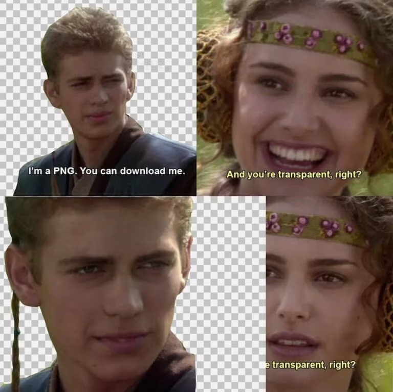
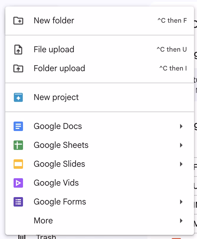
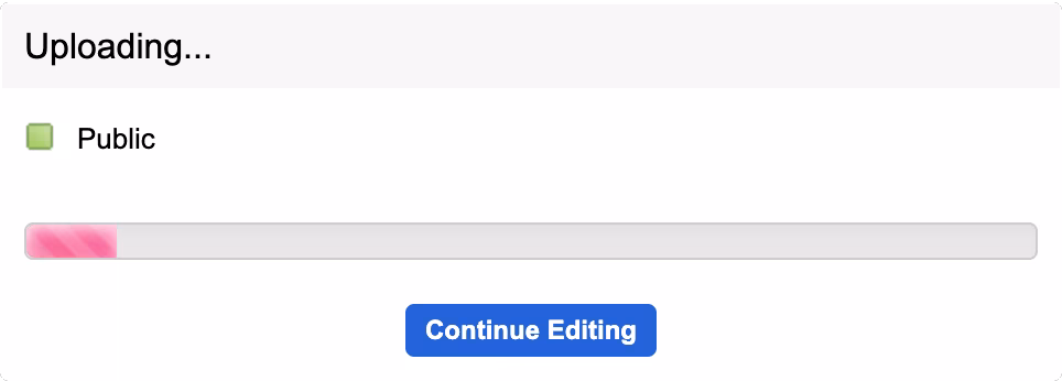


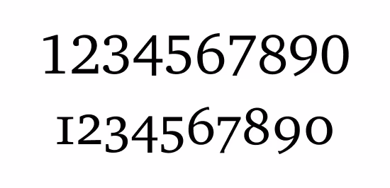
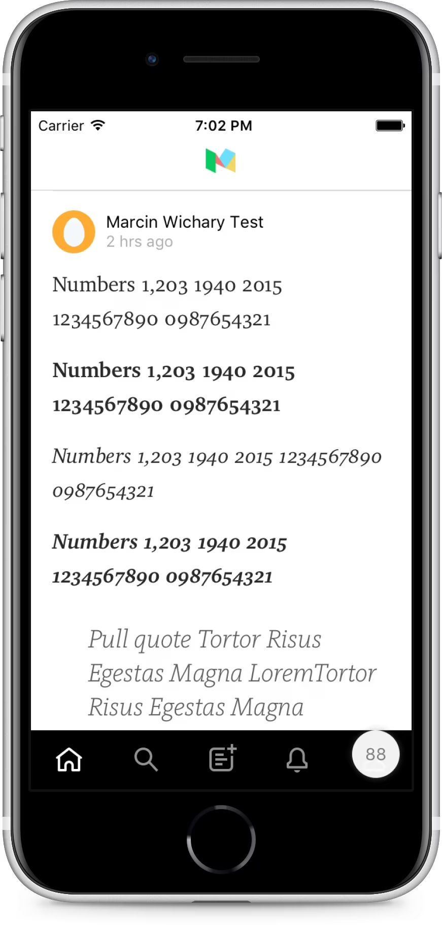
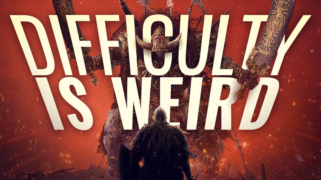
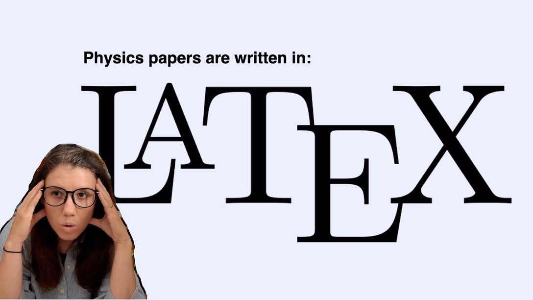
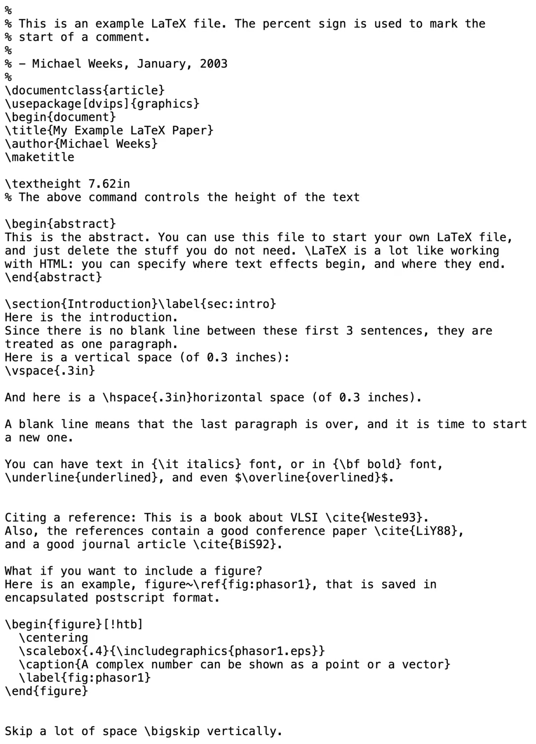
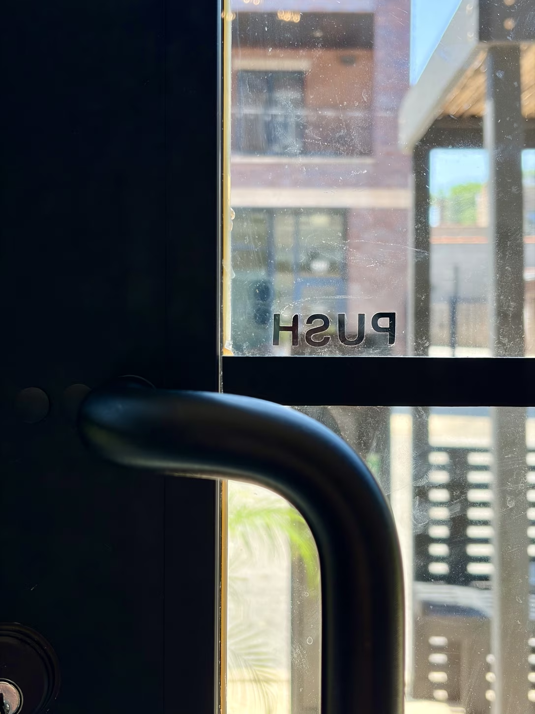
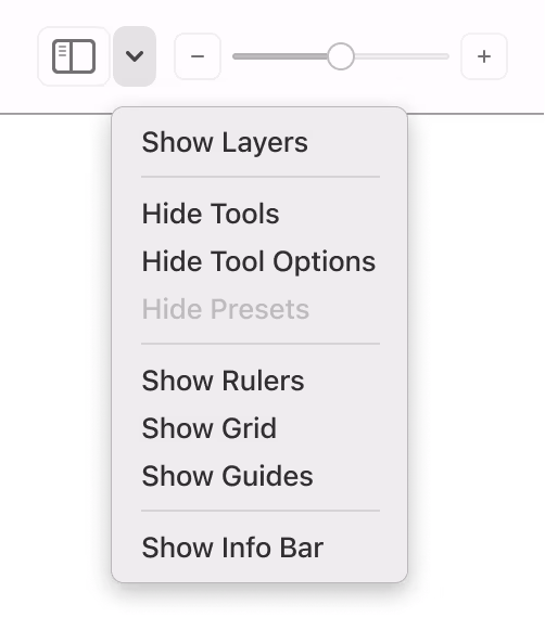
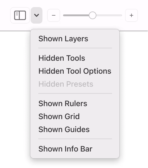
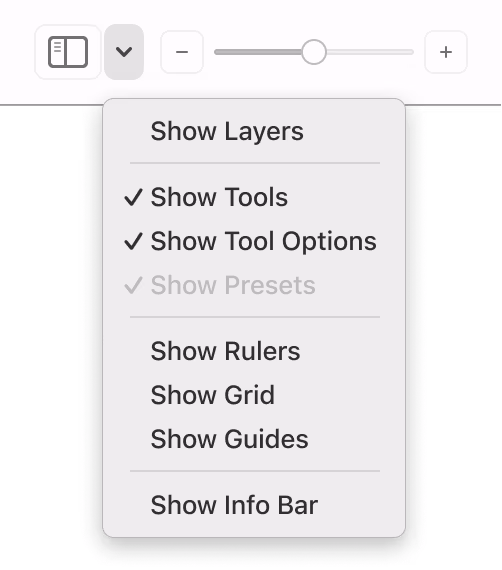
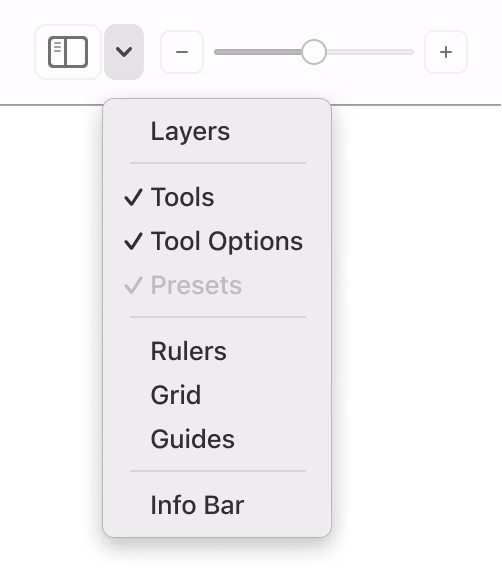
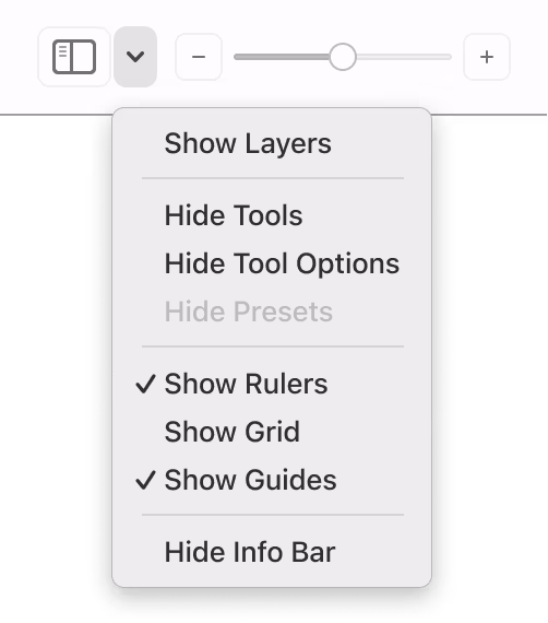
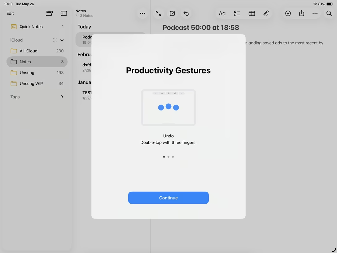
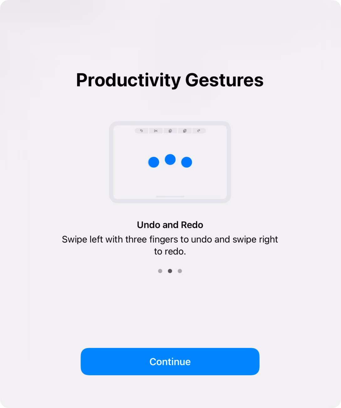
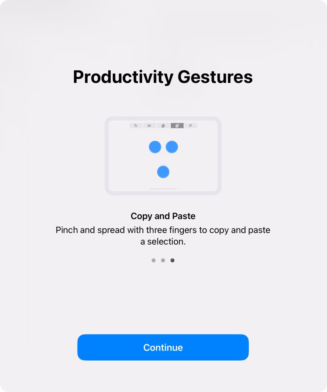
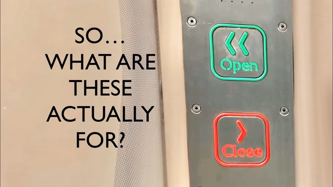
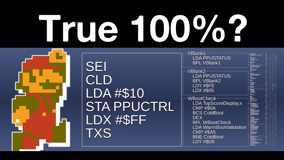
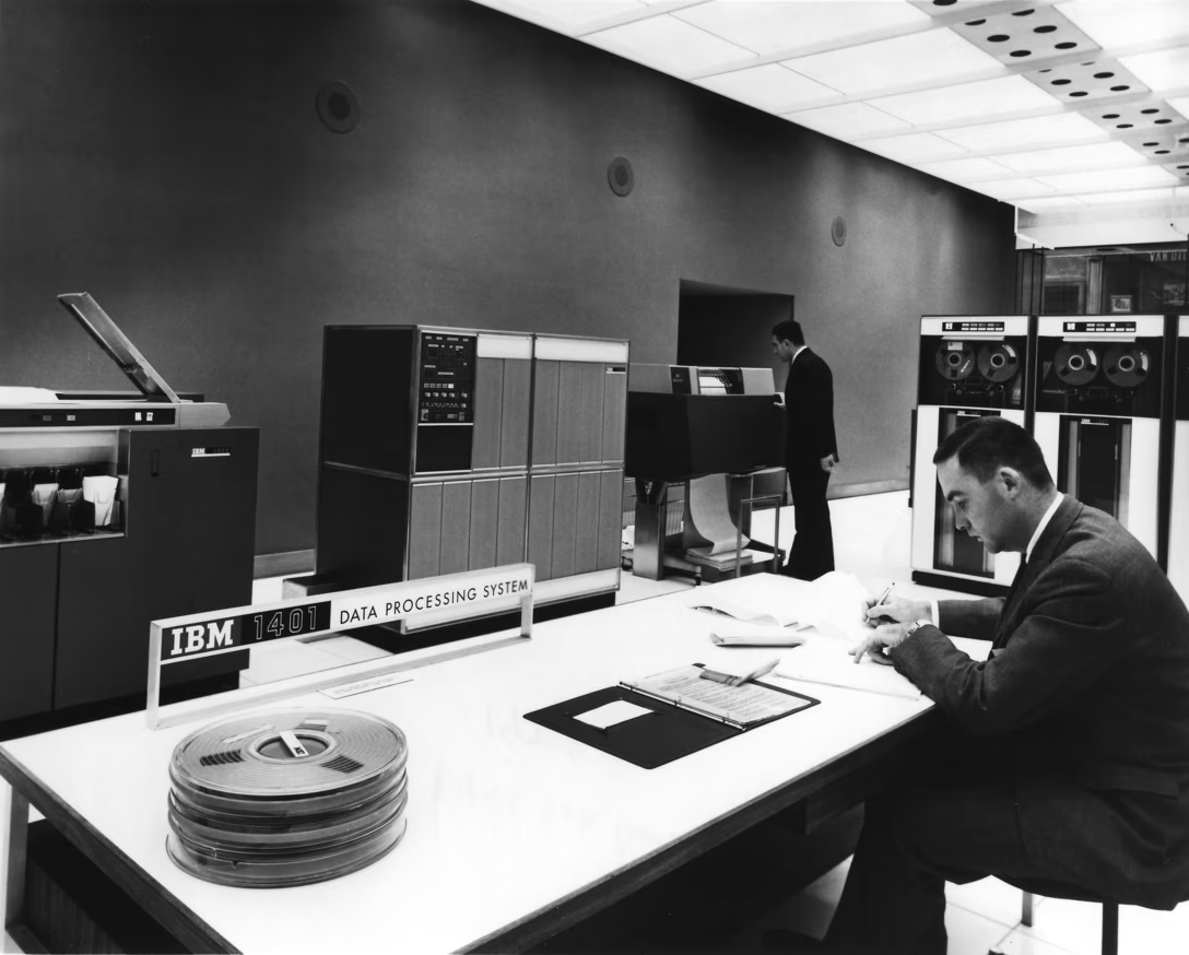


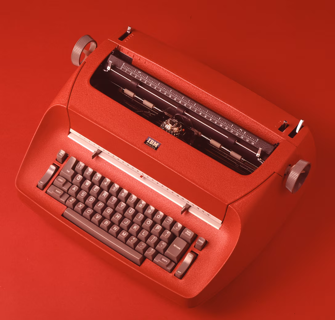
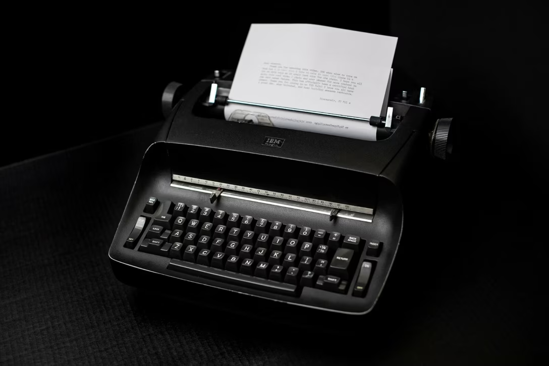
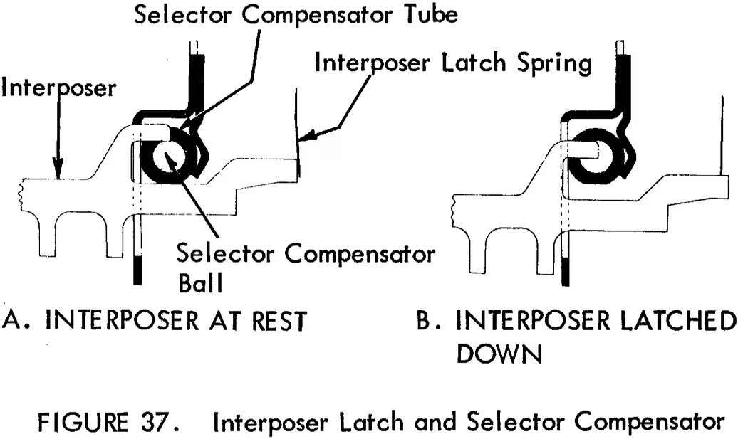
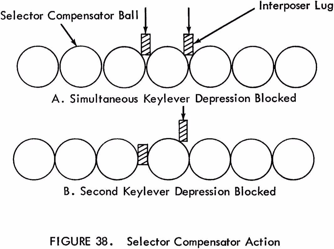
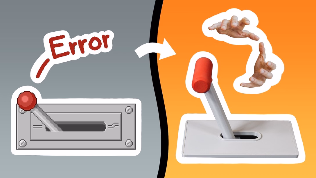
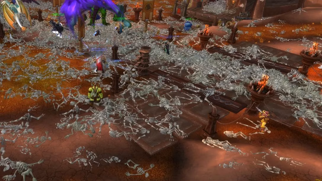
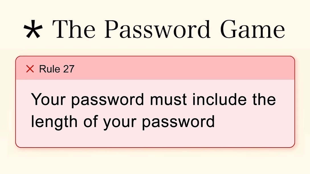

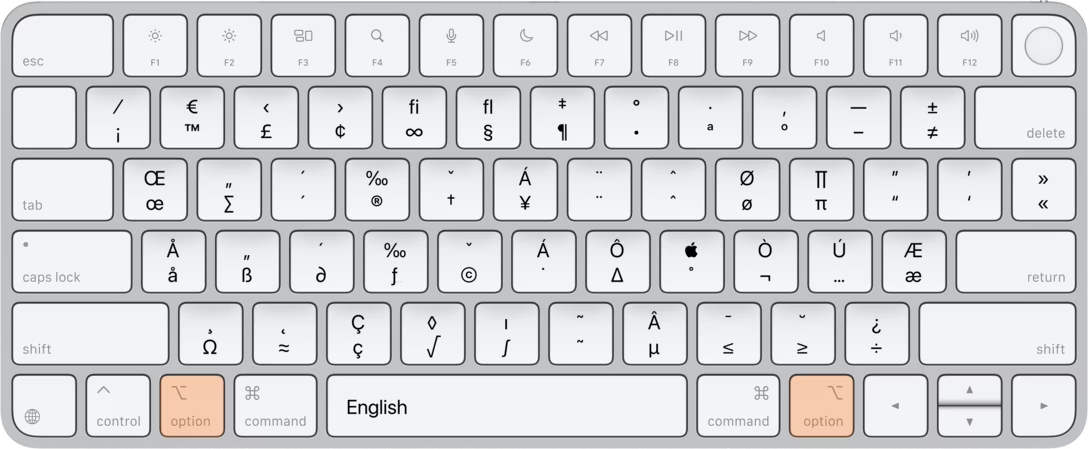
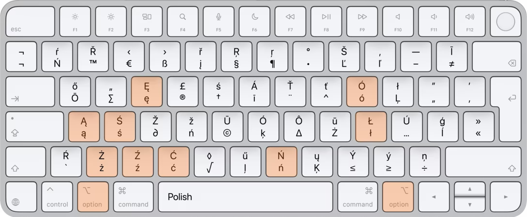
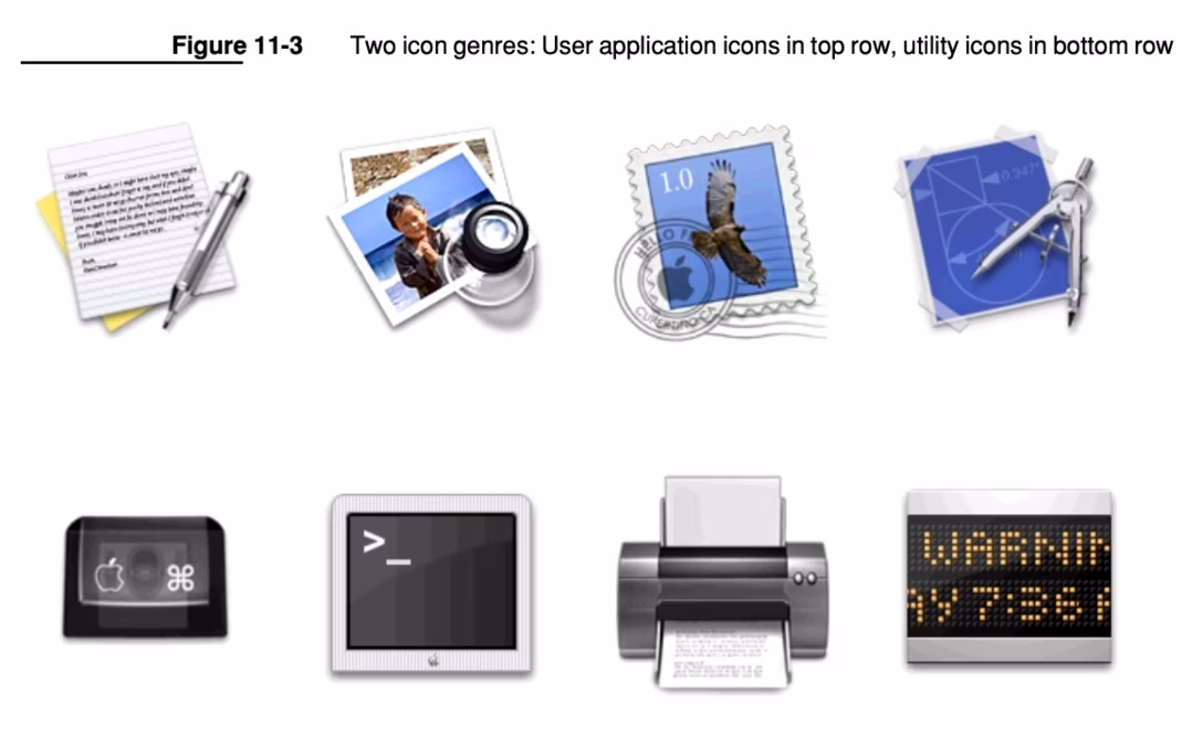
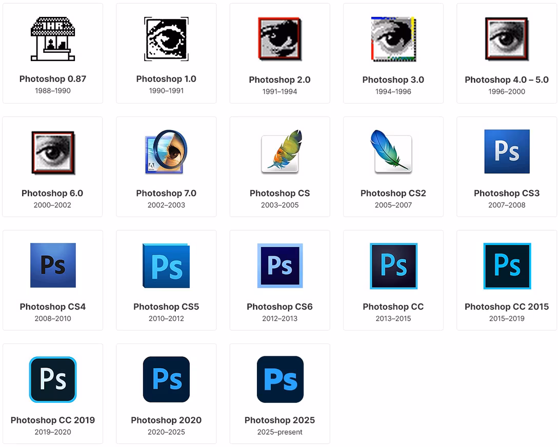