“A lot of nice little touches in UI design go unnoticed”
John Gruber (twice) on macOS Tahoe rounded corners (previously), with a nice bit of archeology:
It was, I’d argue, a small mistake for Apple to stop putting a visual affordance in the lower right corner of windows to show where to click to resize the window. It was a bigger mistake to change the scrollbars on MacOS to look and work like those on iOS — invisible, except while you’re actually scrolling (by default, that is — savvy Mac users keep them always visible). The removal of the resize indicator happened long ago, in Mac OS X 10.7 Lion, released in July 2011.
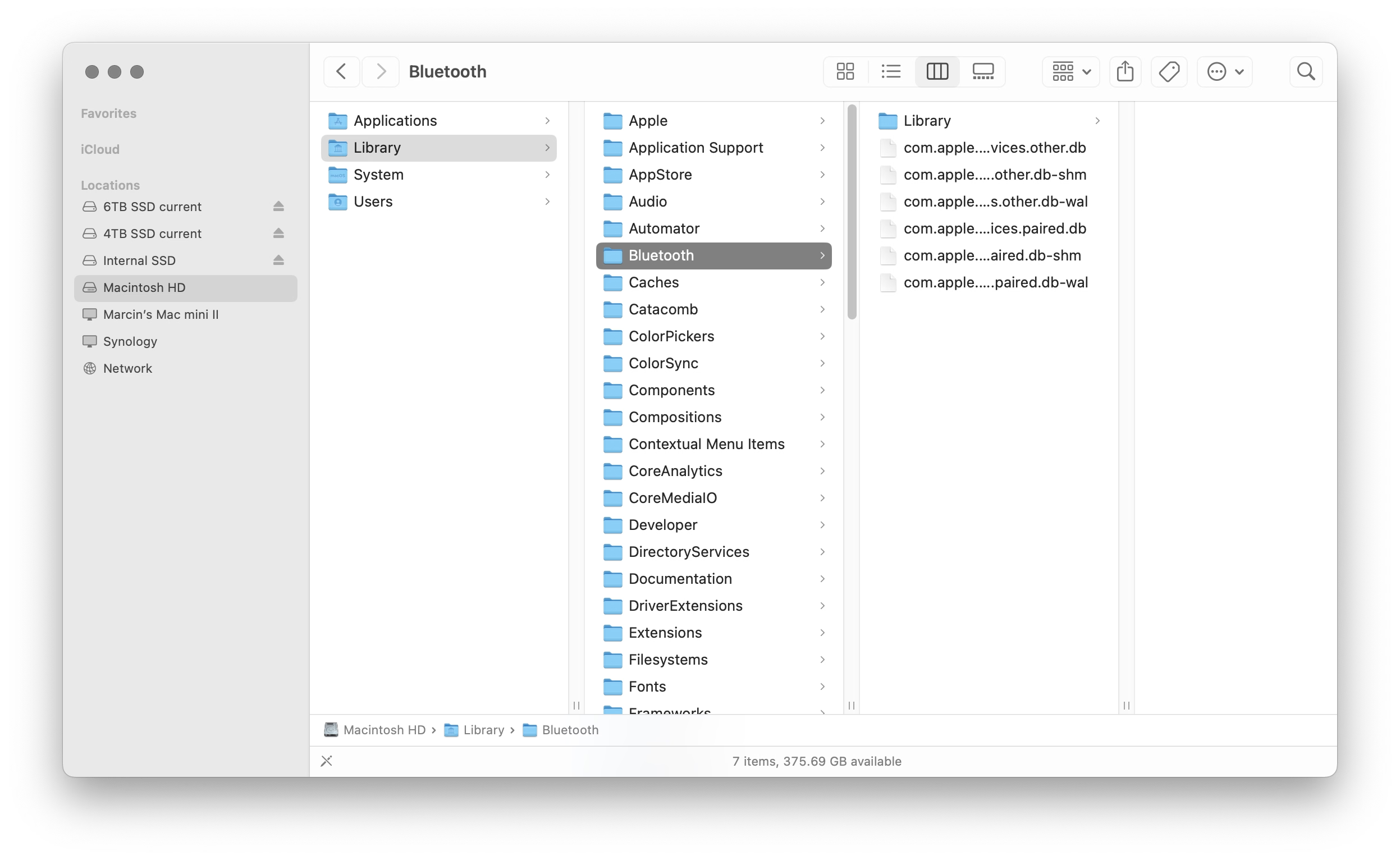
I can recall at least one place in macOS where you can still see the resize grabbers – it’s in column view in the Finder.
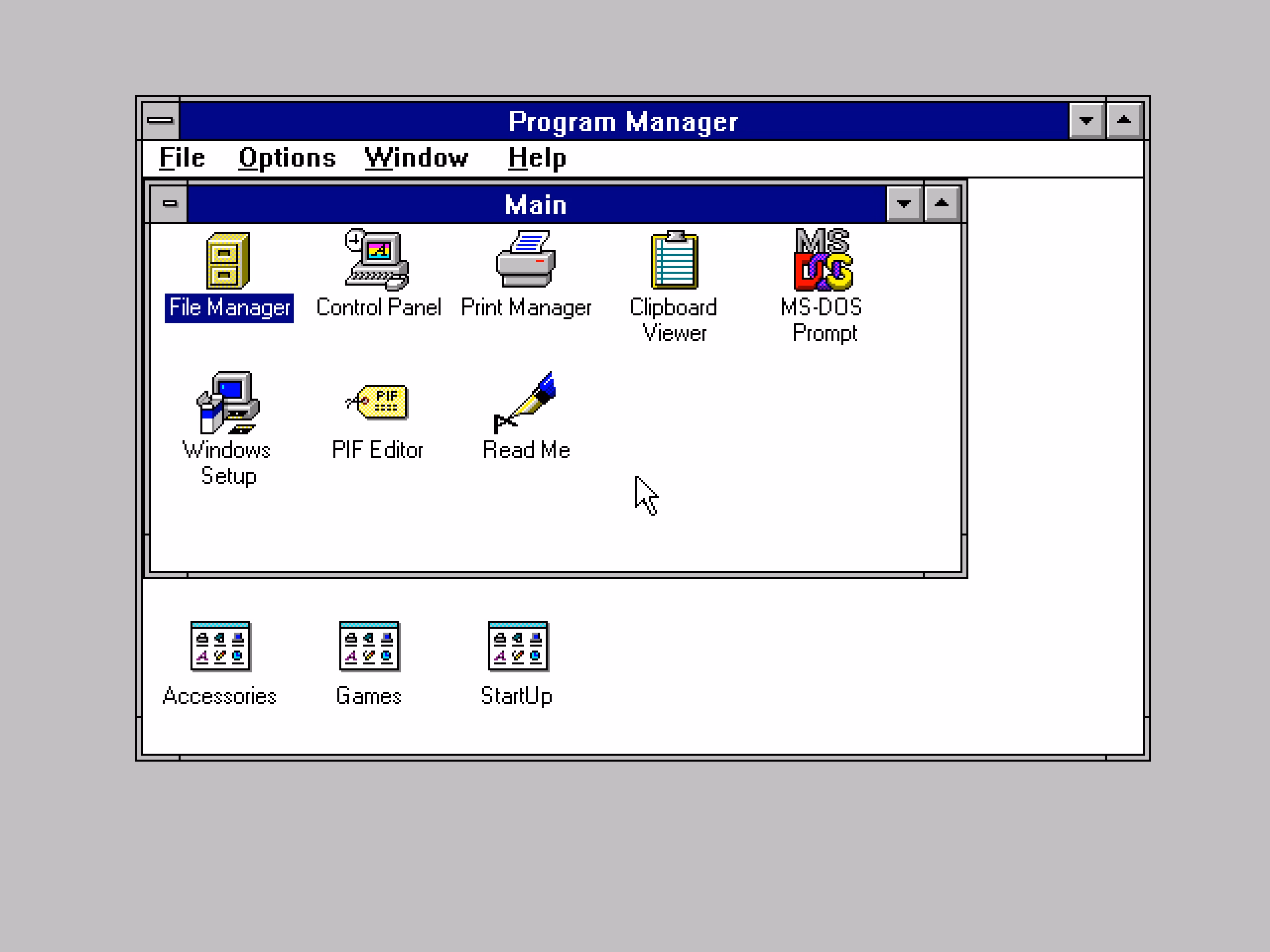
I still think sometimes of old Windows where all the 8 affordances for resizing were clearly visible. I know Windows 3.1 was generally kind of ugly, but I liked how they aligned with the title bar and the buttons:
By the way, don’t love Gruber’s “Dyehoe” thing in the title. Feels Trumpian.