Abort, Retry, No, Thanks
If there was one go-to example of an impenetrable error message in the 1980s, it must have been this – popping up, for example, if your disk drive was dirty:
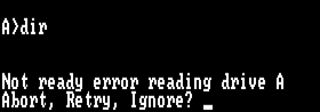
On some technical level, the options made sense: “Abort” would stop whatever you were doing, “Retry” would try to repeat the action, and “Ignore” would proceed as if there was no error. But in the heat of a moment, or seeing it for the first time, this was a puzzling choice to be asked to make. Not only were the words weighted improperly (the seemingly most innocuous action here, “Ignore,” was actually the only one that could do actual lasting damage); it also wasn’t entirely clear what’s the safe thing to do to get out of the situation.
(The redesign of “Abort, Retry, Ignore” was “Abort, Retry, Fail,” and it wasn’t really a huge improvement.)
Last night, I installed Google Photos on my iPhone, and the first message that greeted me was this:
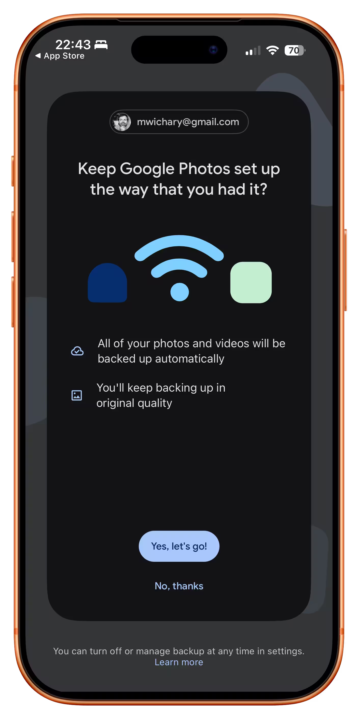
This is really a matryoshka doll of bad dialog presentation.
First: any buttons in a dialog should be labeled with enough information to keep me going. Here, both have generic labels, so now I need to pay attention.
Second: Even after reading, I have no idea what is the choice I’m making. I see the pathway marked “yes, keep it the way I had it” and, sure – this would be generally what I want from any given computer on any given Sunday. But what’s the actual alternative?
But the third, and most important one, is this: this dialog has no safe escape hatch. By now, in UX design, we established quite a few canonical escape hatches:
- a Cancel button,
- a × close box,
- a “No, thanks” link,
- a press of an Escape key.
But you can’t × this dialog out. The main button seems positive, but it also feels like I’m taking an action with consequences, and I don’t want to deal with that. There is a “No, thanks,” but it doesn’t feel like the other “No, thankses” I have seen – it’s juxtaposed with copy that makes it seem… a dangerous thing to choose.
And this last bit makes it a pretty serious design offense, because you are now messing with foundational stuff. You need to protect those escape hatches for the future; the moment you introduce hesitation into the mix and taint “No, thanks” as a concept, really bad things will start happening all across your product.
In real life, fire doors have to open outwards when pushed with body weight, aircraft stick shakers are impossible to ignore, and anti-lock braking systems do smart things even after your brain turns off its smart parts.
I know seeing a dialog like this would never happen in a moment of true panic, but sometimes I think of the user in their most absent-minded moment: trying to get their kids to hurry up for school, on hold with an annoying cable provider, with a cat looking like it’s about to jump up directly into a running toaster. A dialog on their phone pops up. If that dialog absolutely has to happen, what is the escape hatch it can offer so they can dismiss it safely if they cannot think about it at all?
This Google Photos screen needs a lot more rethinking and rewriting, but in its current incarnation, it desparately needs a clear and trustworthy escape hatch I can tap absentmindedly, just so I can get to my photos.