Accidental UI calming
I keep thinking about this very good 11-minute Not Just Bikes video about traffic calming. In it, a simple argument is made: the posted speed limit of any given street or road doesn’t really matter. What matters is how the street feels. Generously wide and separated lanes, sparse traffic lights, and the road being straight past the horizon will make you unconsciously speed up. Reducing the posted speed limit or adding flashing YOUR SPEED signs won’t help:
The truth is that many drivers will not slow down because of signs or speed limits. They’ll slow down either because they don’t feel safe, or because they’re afraid of damaging their car.
The only answer is redesigning the street for the desired speed limit – narrowing the lanes or joining them, creating choke points and speed bumps, adding posts and planting trees close to the road, and even adding visual cues like “dragon’s teeth.”

One of the great thing about driving in the Netherlands is that it’s rarely necessary to look at the speed limit. The road design takes care of that for you.
There is an app I use a lot called Forklift, a suped up Finder, with one of its functions being syncing files to a remote server.
In its version 3, the syncing window looked like this:
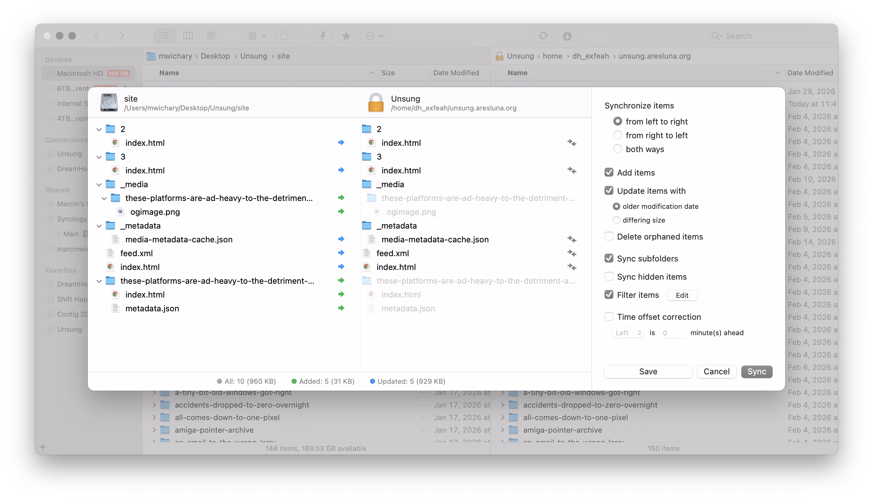
This is a pretty straightforward and dependable function – and I’ve depended on it for years.
I recently updated to version 4 to check it out, particularly since it promised faster syncing. But I was thrown aback by how it randomly deteriorated:
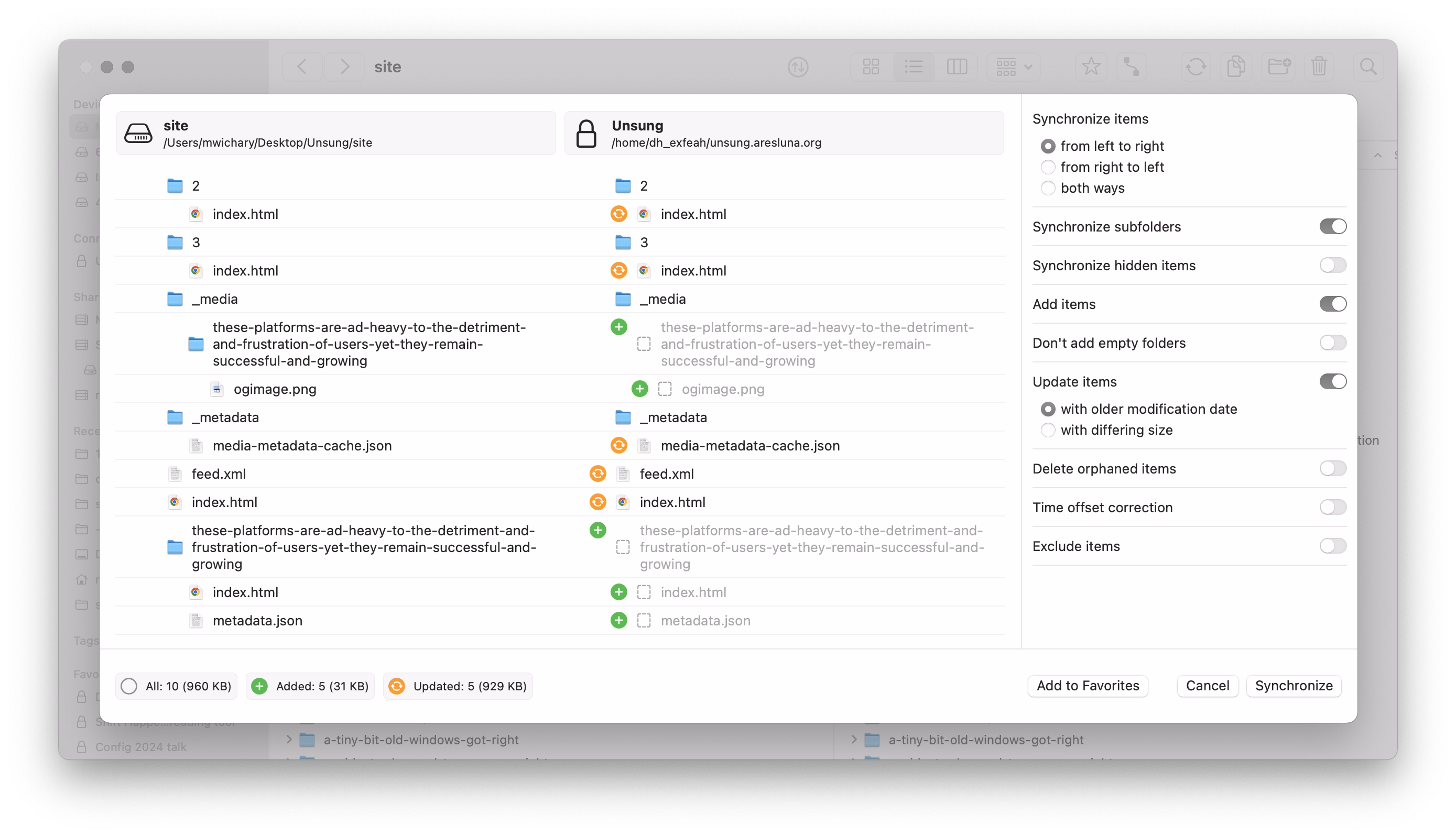
It’s not that there seem to be some UI challenges: the new icons make it harder to understand hierarchy, and one of the switches starts with “Don’t” in contravence of rules of avoiding double negatives.
No, the worst part is this:
This is a new temporary state that meant to help me understand the details of what’s changing.
On the surface, it’s a thoughtful thing. But it’s done in the worst possible way for this kind of a power-user interface: It’s very slow to invoke and slow to cancel. I often activate it by accident – it makes large swaths of UI a minefield where you can no longer rest your cursor safely. It also changes the hierarchy of the output in a way that’s confusing – and it even animates the text wrapping in a distracting way. Then, if you press Esc instinctively to get rid of whatever happens, the window closes altogether.
It’s a “delightful,” luscious transition that is completely out of place. I think this is how many people misunderstand craft – that it’s only about “high polish” without any thought underneath. Here, the effort was spent on executing something that couldn’t be saved this way and needed a more serious rethink. It seems like its creators forgot who’s using the app and for what, and embarked on accidental UI calming.
There are other challenges along the same lines, both downgrades from version 3:
- when the app analyzes the differences, I can no longer press the Sync button and walk away
- even when the button becomes active, I can no longer press Enter to activate it – I have to use the mouse
In version 3, I could invoke Sync, immediately press Enter, and get on my merry way, with syncing continuing in the background. It was exactly what I wanted. Version 4 slows me down by requiring me to pay constant attention to the interface: it matters where I rest my mouse, it matters when I click the button, it matters what input device I use to commit.
It’s okay to think of friction and sometimes transitions are indeed very helpful for UI calming to avoid drastic movements or accidental activations. But here, this isn’t great at all; the creators of Forklift promised me faster syncing and achieved the opposite.