An accident inside an accident
I have never been particularly fond of “shake to undo” on the iPhone. It’s not a pleasant gesture to perform, I feel like typically I don’t have strong enough of a grip on my iPhone to invoke it without fear, and the gesture often undertriggers, requiring an even harder and more cumbersome shake, etc. etc. (One thing I never want to undo is my screen’s pristine surface by having it meet the sidewalk.)
I am aware that many years ago, iOS introduced an alternative: a three-finger swipe. But I feel like Apple flubbed that, also – three fingers are hard to plop onto a small screen, and while regular going back navigation means swiping from left to right, undo is inexplicably a three-finger right-to-left swipe. I mean, okay, it’s explicable – it’s the movement of the cursor before and after the typing is undone. But to my brain that feels less strong than the other association, and undo is not always about typing.
I also see many people not knowing about this alternative and I must not be the only person struggling, since I see more and more apps throw in the towel and put undo and redo as on-screen actions:
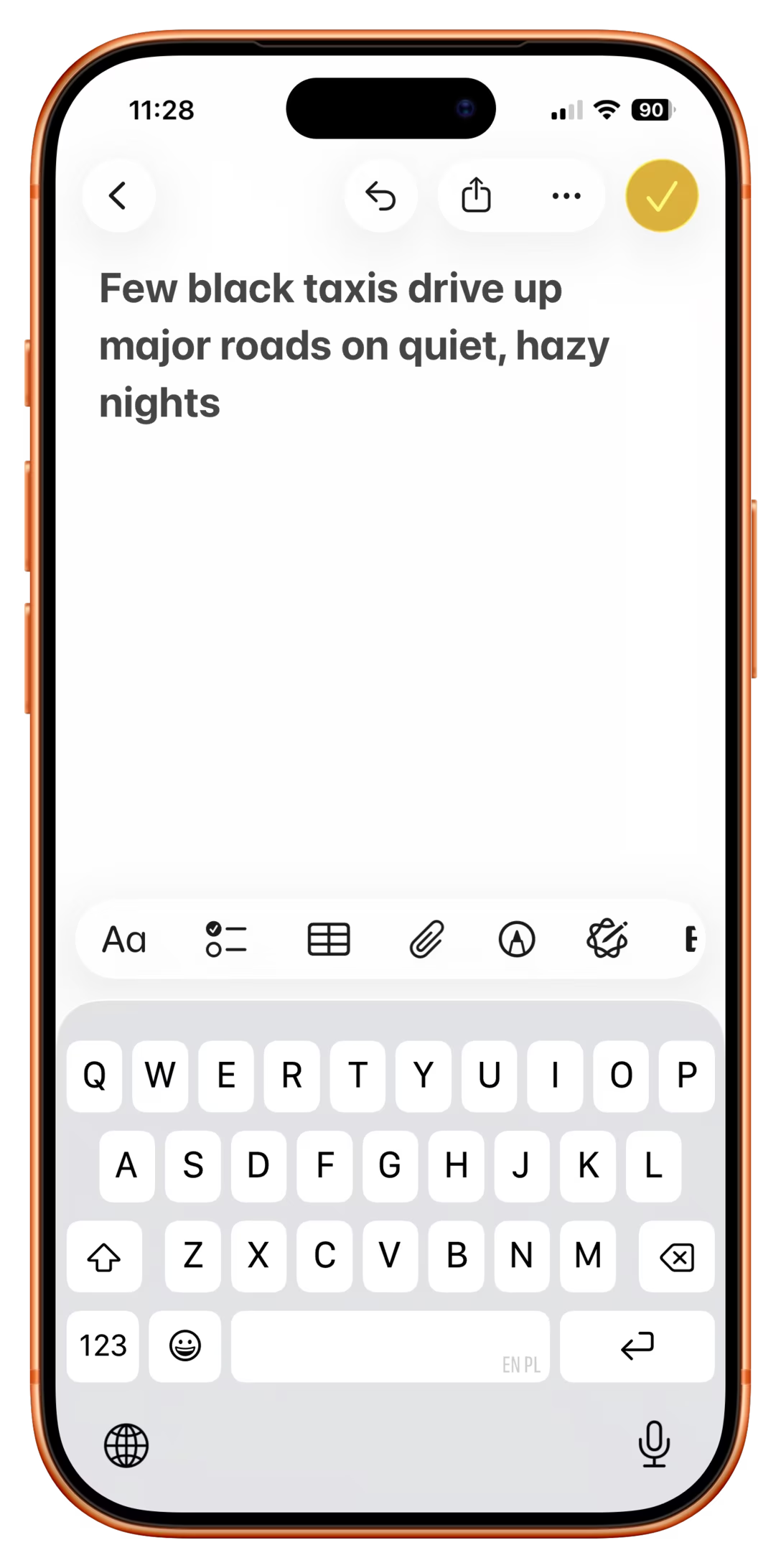
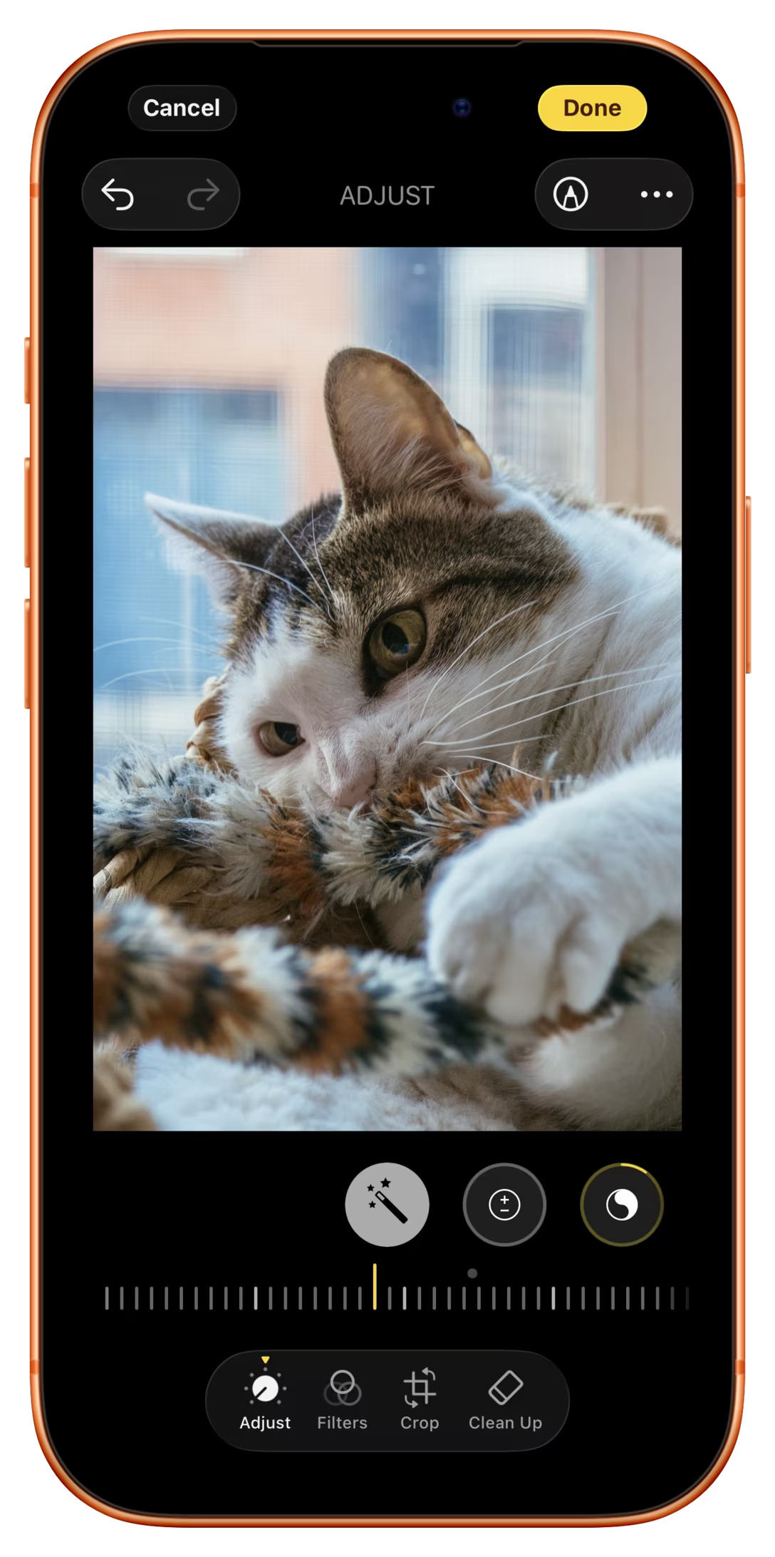
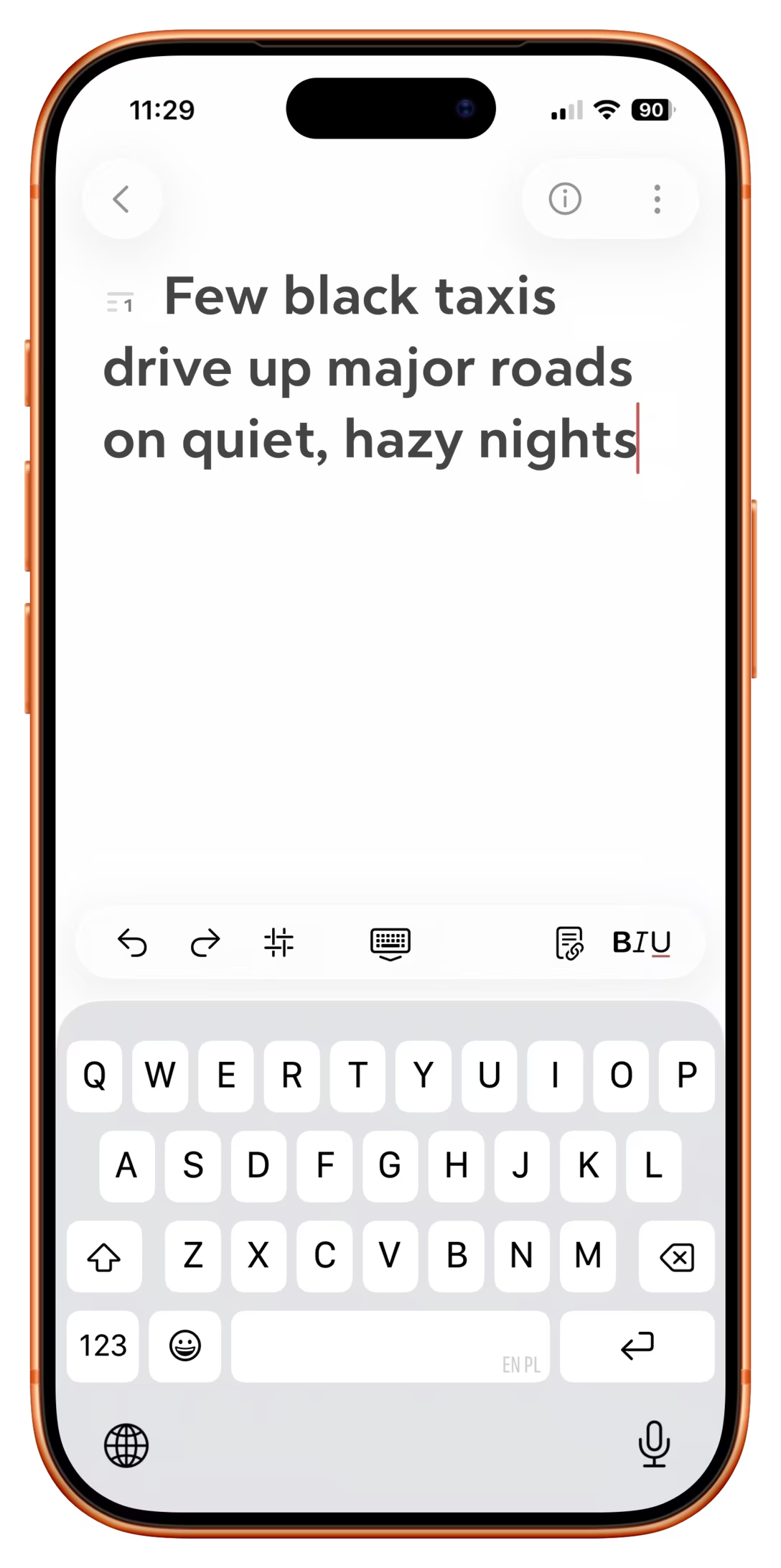
Curiously, I even spotted Gmail on desktop doing that recently:
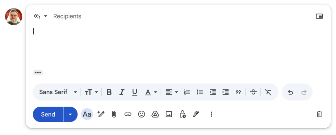
It’s all a welcome improvement under the circumstances, but those are literally all over the place – imagine if on a laptop, each app had a different key shortcut for undo. (We’ve had that, in the 1980s. The 1980s Nostalgia Industrial Complex doesn’t want you to know about stuff like that.)
Anyway, some time ago I promised more onboarding content, and here’s a little thing that happened to me recently. The inciting incident is that I accidentally shook my iPad, and then I saw this:
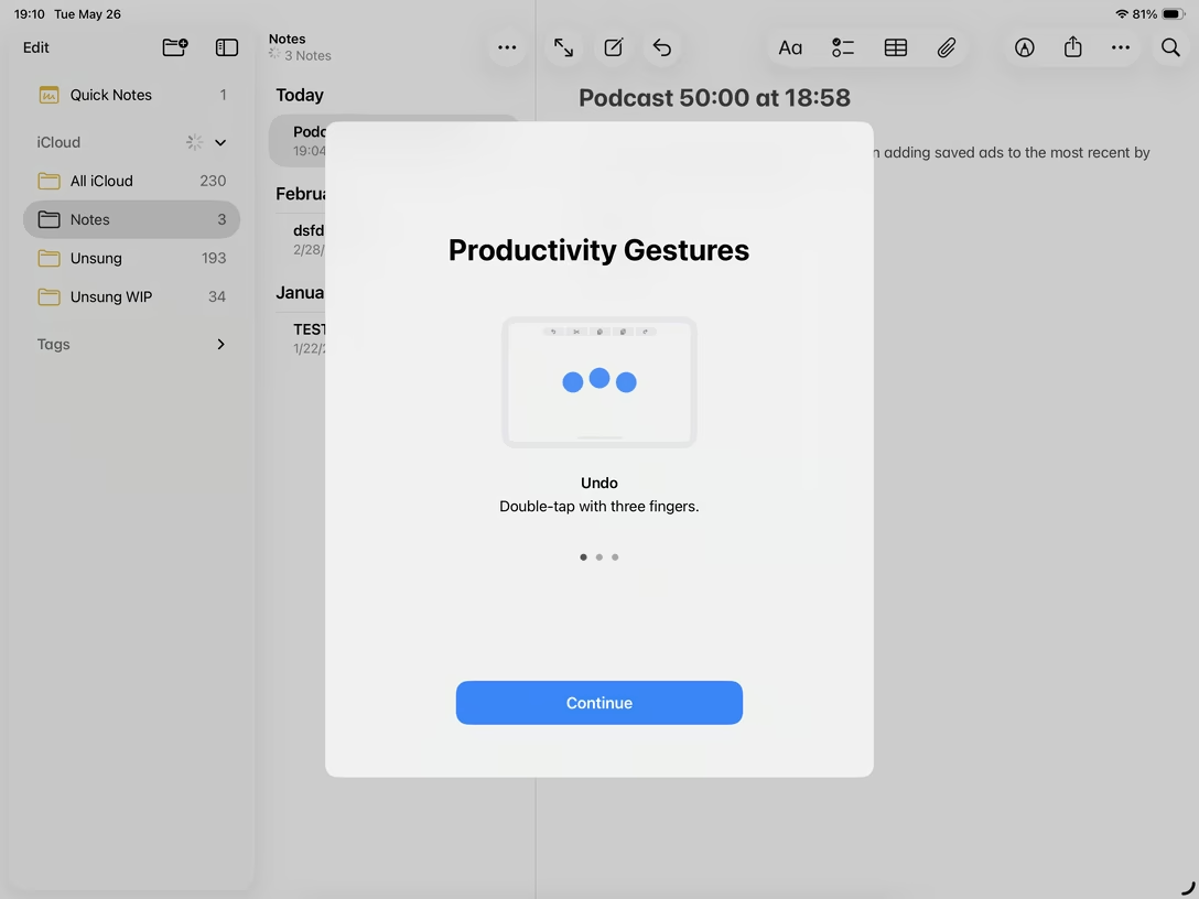
Wait, does it mean there is yet another, third undo shortcut?
I swiped through the carousel to see these:
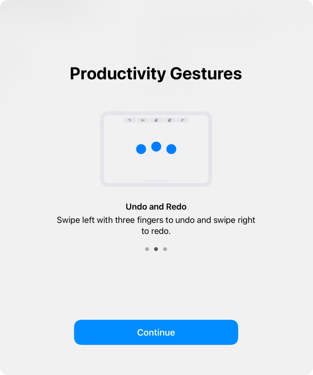
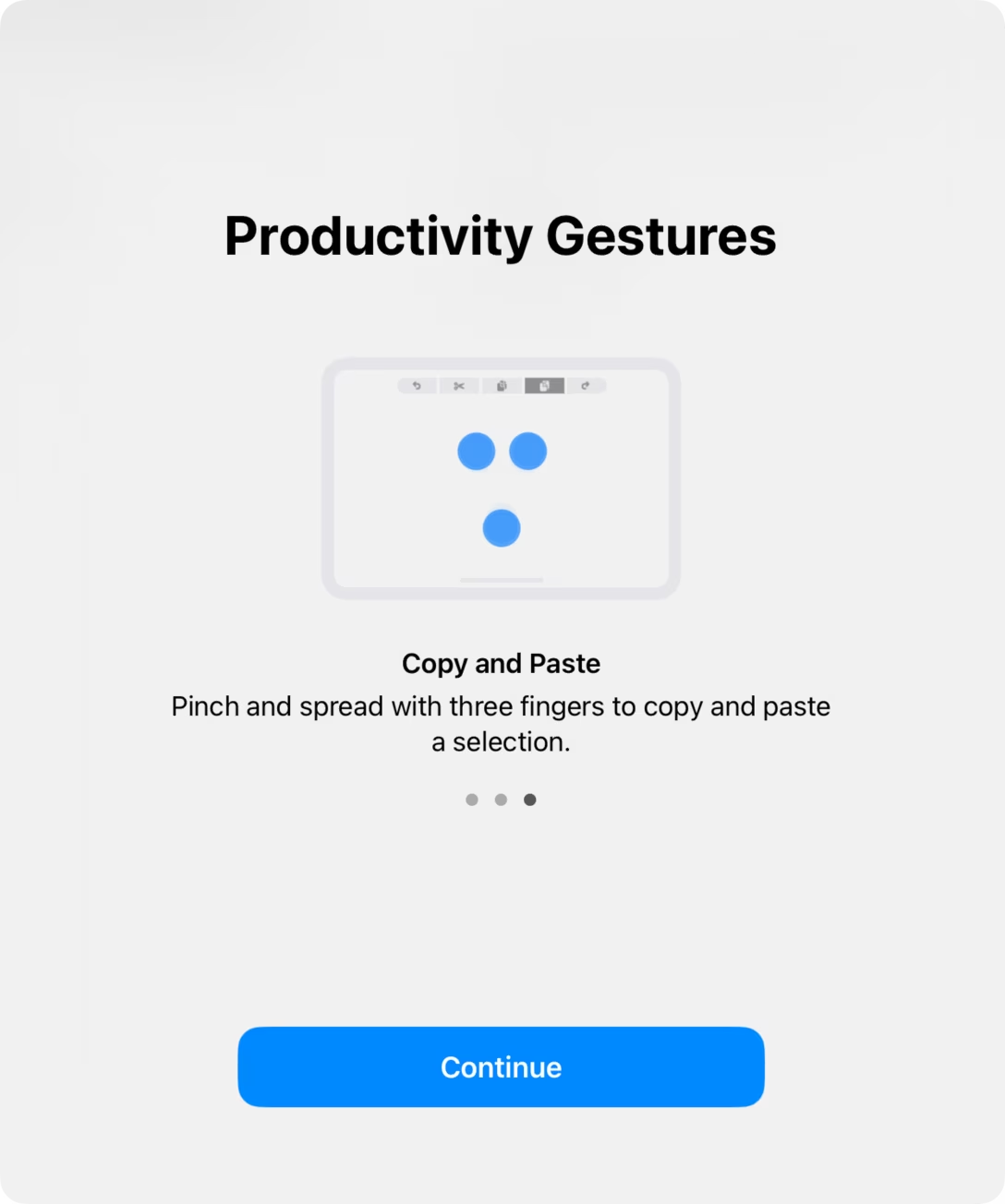
None of these feel particularly pleasant to use – although they are nicer on the iPad than on the iPhone – but I started playing with them, and I discovered a fourth entry point. Just a single three-finger tap shows a new-to-me onscreen editing menu, sort of the equivalent of the Edit menu on the desktop:
This works on the iPhone and the iPad, and since then that’s the one thing I did remember and I find using. So, to summarize:
- shake to undo – unpleasant
- double tap with three fingers to undo – unpleasant
- a three-finger swipe to undo – unpleasant, confusing direction
- single tap with three fingers to show a menu, then tap to undo – less unpleasant, but stuck with me
Yeah, even this still doesn’t feel great. But it’s there in a (no pun intended) pinch.
So, is this a success story for onboarding? I think not quite. It all started with an accidental iPad shake, after all, and the gesture I ended up using I also discovered accidentally. But to be fair, I also did learn something, and I think there are some bones of the right solution in here somewhere. Onboarding and in-product education generally feel so bad that even this rickety encounter can be counted as a small victory.