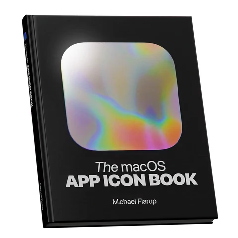
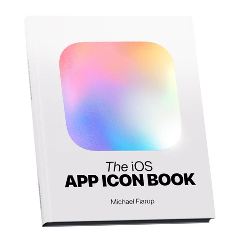
Book review: The iOS App Icon Book/The macOS App Icon Book
★★★★★ (as books)
★★★★☆ (for the purposes of this blog)
I still remember Mac OS X arriving on the scene with icons that felt infinite in every possible way: in size, in color palette, in dimensionality. We got used to them over the last quarter century, but Michael Flarup’s books rekindled that feeling for me; the icons presented here are lavish, larger than life, and basically pixel-less.
I do not generally like coffee-table books. But I really liked these. The iOS App Icon Book came out in 2022, and the macOS App Icon Book followed two years later. They’re “almost-coffee-table” – which is a compliment! – extremely well-made but portable, and with soul, and thoughtful details, and inspiring evidence of being labours of love.
Each one has an almost-absurd amount of icons (I counted almost 1,200 in one book, and consequently didn’t even attempt counting in the other), but it’s not just the quantity that impresses. The icons are laid out carefully on gorgeous color-coordinated spreads. Many appear in variations so you compare their evolution over the years. Each one is big enough and printed so well you can study it in detail, and I have not noticed one technical flaw in their reproduction.
In addition to beautiful collections of beautiful icons, the book also veers a bit into history, and design advice, and adds ~10 interviews with icon designers each. Those are welcome additions that elevate the books from a boring coffee-table existence, but those are also its weakest parts – although “weakest” in a comparative sense. The things missing for me in the book are: more work in progress and rejected efforts, more specific advice and hard-learned lessons rather than general-interest interviews, a bit more about recognition of icons when reproduced small on screens, and some harder/cerebral conversations about iconography and its place in the universe.
On the other hand, I know that of all icons it’s app icons that get to be least concerned with semantics and semiotics, as they’re maybe the closest to just pure art and graphic design. I can understand how talking through it all would be an extremely hard task; all of the fantastic icon designers I know personally would struggle with explaining why their output is better than others. It’s possible the extra “left-brain” stuff I want from these books would also make them less desirable for those who just seek visual or artistic inspiration.
Both books are otherwise basically a love letter to app iconography, and awash in memorable details: delightful covers, colour-coordinated ribbon bookmarks, beautiful ex librissen, and a product index and an artist index.
The price – $84 without shipping (they’re printed in Denmark, so for once Europe gets an advantage) – might be a bit of a showstopper. The books are well-made, but you are definitely paying a premium for a short/bespoke print run. The volumes complement each other well on a shelf, but you’ll do no wrong with getting either one if two is too much for your budget. (There is also a half-price PDF version, if that’s of interest to you, but I cannot vouch for that.)

