CleanShot’s onboarding via settings
I recently installed a screenshotting utility CleanShot, and I was enamored with its settings:
There’s much to like here – thoughtful grouping and layout, good explanations, more details than expected.
There are some nice interaction moments, for example the hints swapping to reflect the current status:
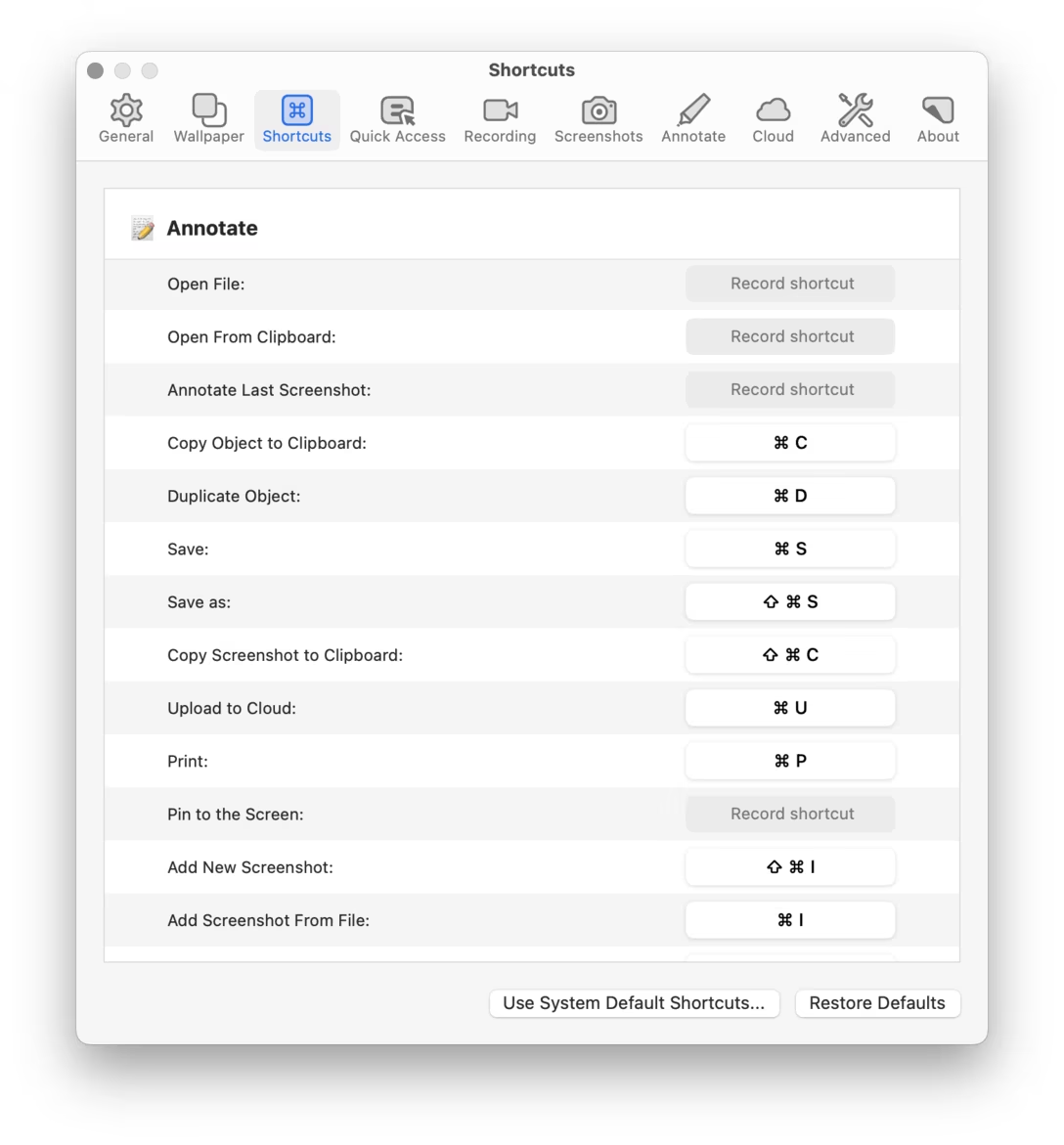
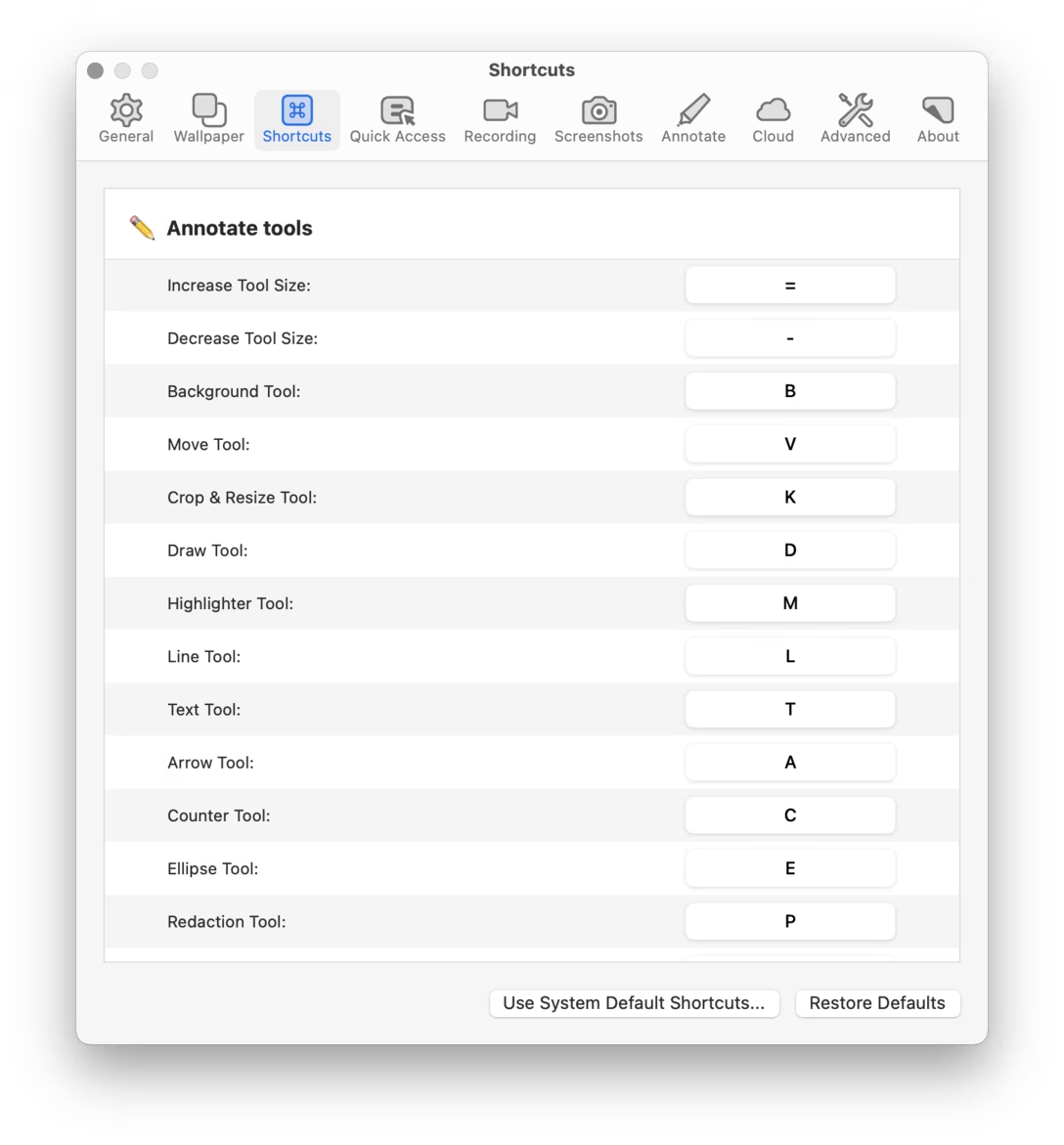
The fact that the tool allows you to override its single-key shortcuts, which are the hardest to change using third-party keyboard customization apps:
Or, when you want to customize the key visualization, Settings shows a nice preview:
There was even this lil molly guard:
But also just the settings themselves gave me a sort of competence contact high. A few clicks in, and I thought “oh, they do know what they’re talking about.” So many things here were for me, to solve specific problems I encountered.
It all gave me confidence this is the right tool for the job. (Also, perhaps a corollary: has there even been a bad tool with well-designed settings?)
Compare with also-new-to-me settings from Affinity, which I was much less impressed with:
It uses the troubled right-aligned style originating in iOS, the capitalization is clumsy, and the navigation muddy (it feels like in-page links on the web, which are always confusing).
Is this a fair comparison? Not at all. I don’t actually want to say that CleanShot is better and Affinity is worse. This is so very much east coast apples and west coast oranges.
I don’t even want to say settings are always worth designing well in the traditional sense; sometimes the only thing between you and 20 unnecessary options in your app is simply having no surface that could host them. A limited (but never unpleasant!) settings UI might be an intentional design decision.
But there was a nice quote in the Shadow of the Colossus book: “I often find myself exploring simply because it’s beautiful.” I too became a tourist in all of CleanShot’s settings because they were put together so well, and I was so curious what’s behind the next corner. Its creators understood that the best way to get to know what the tool is capable of is to take a peek through the settings. I think it’s a good case study at how a proper welcome mat doesn’t always have to be a few onboarding tooltips flying spastically around the screen. Sometimes it won’t look like a welcome mat at all.