Come at the king, you best not miss
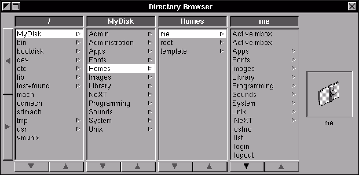
Column view cut its teeth on NeXT computers…
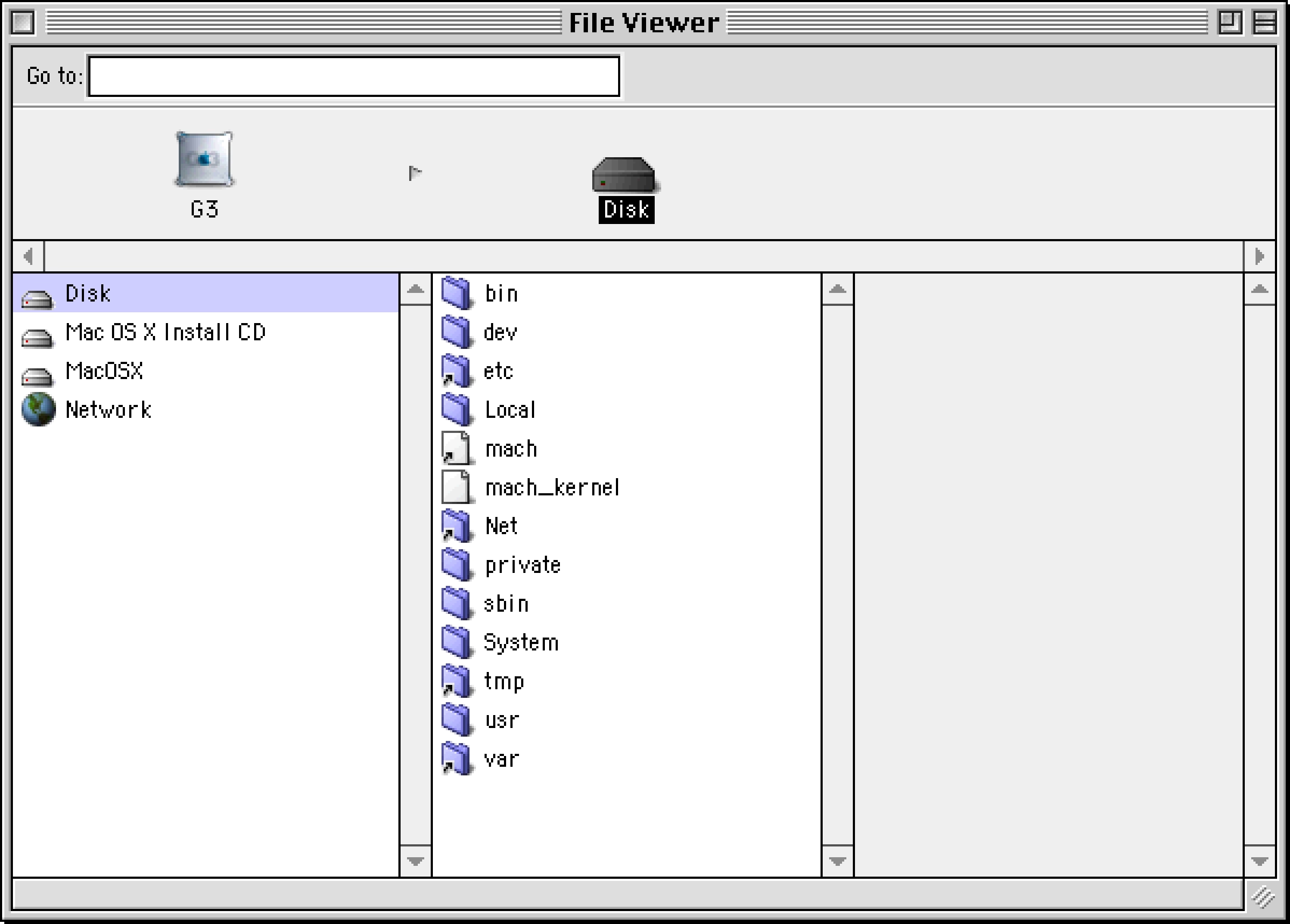
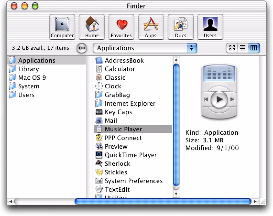
…and blossomed on early versions of Mac OS X…
…but where I thought it really shone was the first iPods:
This was perhaps the most fun you could ever have navigating a hierarchy of things; it made sense what left/right/up/down meant in this universe, to a point you could easily build a mental model of what goes where, even if your viewport was smaller than ever.
It was also a close-to-ideal union of software and hardware, admirable in its simplicity and attention to detail. This is where Apple practiced momentum curves, haptics (via a tiny speaker, doing haptic-like clicks), and handling touch programmatically (only the first iPod had a physically rotating wheel, later replaced by stationary touch-sensitive surfaces) – all necessary to make iPhone’s eventual multi-touch so successful. And, iPhone embraced column views wholesale, for everything from the Music app (obvi), through Notes, to Settings.
Well, sometimes you don’t appreciate something until it’s taken away. Here are settings in the iOS version of Google Maps:
I am not sure why the designers chose to deviate from the standard, replacing a clear Y/X relationship with a more confusing Y/Z-that-looks-very-much-like-Y. They kept the chevrons hinting at the original orientation – and they probably had to, as vertical chevrons have a different connotation, but perhaps this was the warning sign right here not to change things.
I think the principle is, in general: if you’re reinventing something well-established, both of your reasoning and your execution have to be really, really solid. I don’t think this has happened here. (Other Google apps seem to use standard column view model.)