“Each one of these buttons has four distinct purposes.”
A nice blog post by Nathan Manceaux-Panot on Pending Design about the subtle design of the tabs underneath the search results in the programming editor Nova:
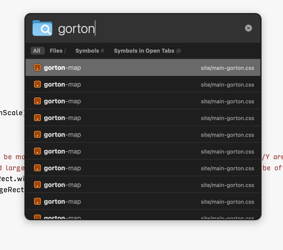
Through buttons right below its text field, the bar also lets you filter results: only show files, only show symbols, or only show symbols in current tabs. Here’s the thing, though: each one of these buttons has four distinct purposes. They’re not just for clicking.
The tabs are clickable as they normally are, but they’re also a treasure map (to tell you something is possible), a cheat sheet (to remind you how to do it again), and an onramp for faster keyboard navigation.
I’d add two more things to the celebration:
- I myself often forget onboarding is not just about the first run, but also about reinforcement. Here, this UI does a lot of reinforcing over time, helping you build the habit. Pressing the key highlights the tab. Clicking on the tab adds a key as if you pressed it, and so does using an advanced shortcut (e.g. ⌃⌘O instead of ⇧⌘O). Even slash as a symbol comes from path names, so you might naturally associate it with files.
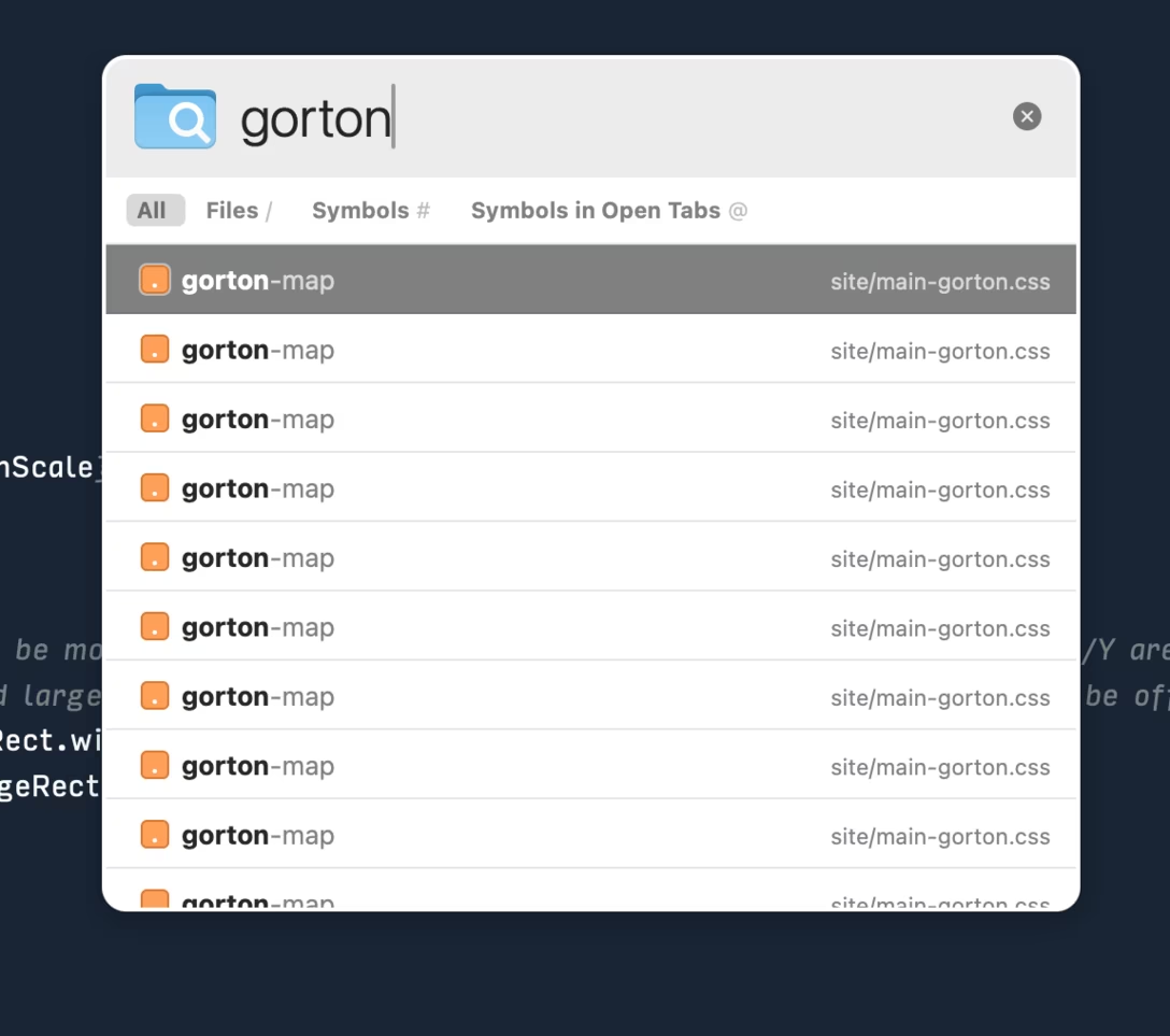
- The search pop-up always has a nice contrasty appearance: dark when the background is light, or vice versa. Many modern interfaces go for white background for every UI element and surface. This seems like solely an aesthetic choice, but has more consequences when it comes to visibility of things, and even hierarchy. I am personally always excited when I see a duochrome app these days, because it feels like the team knows what they’re doing and isn’t just chasing visual trends. (Below is an example from Bear.)