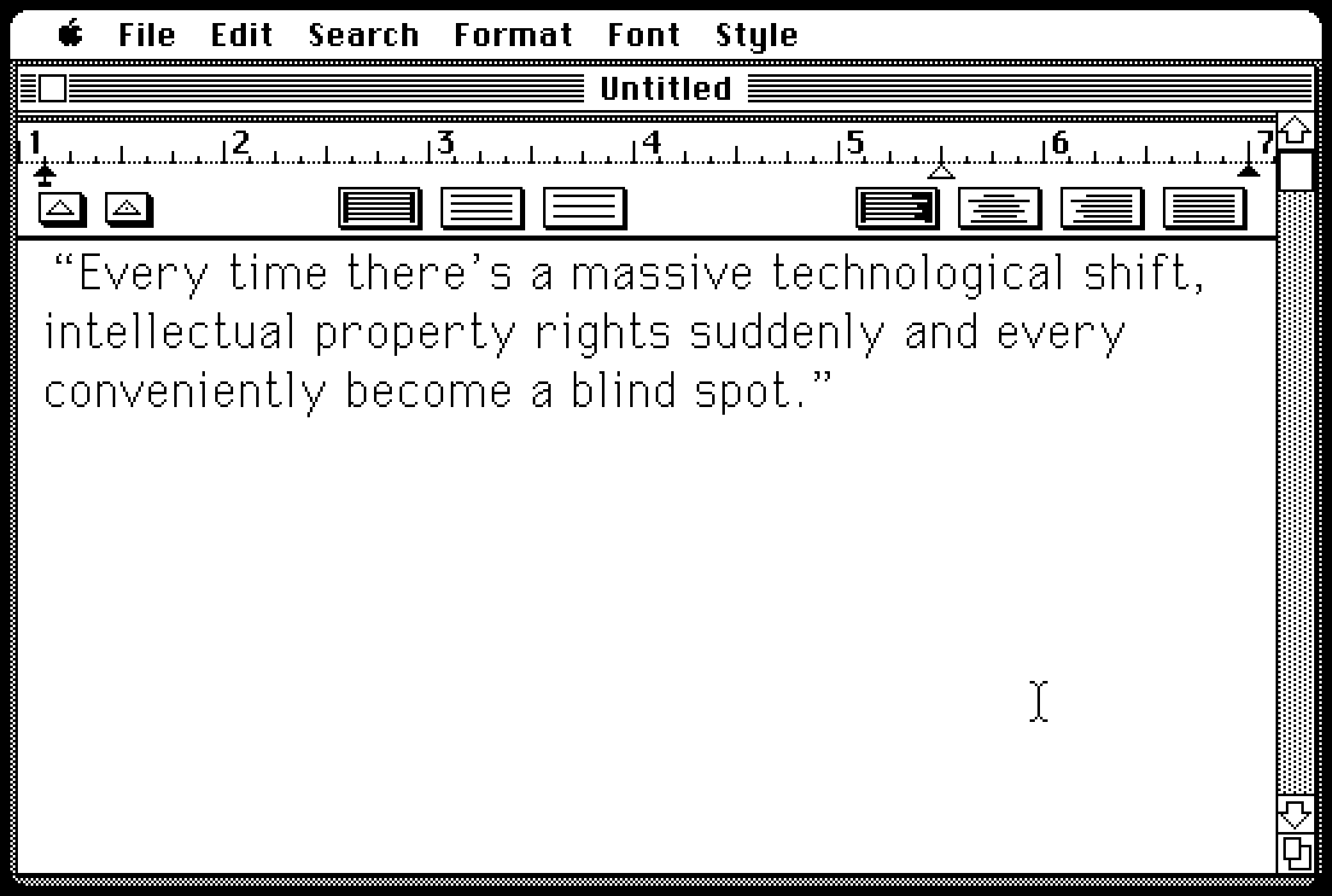
“Every time there’s a massive technological shift, intellectual property rights suddenly and very conveniently become a blind spot.”
From May last year, a 21-minute video by Linus Boman about font piracy, specifically during the era of personal computing and early internet:
The nuances of what separates font piracy from non-pirated revivals or general inspiration are too much even for me, but I liked how the video moved on from the obvious and cheap “haha, you wouldn’t pirate a font” story to cover a few of the more complex issues with panache.
My small contribution to the discourse is that I just scanned an interesting booklet from 1979 called Typeface Analogue, which catalogs various names different phototypesetting manufacturers used for their “replica” fonts – a sort of a translation table between once-relevant parallel type ecosystems.
Some are pretty uninspired: CS for Century Schoolbook, OP for Optima, Eurostyle for Eurostile, and so on. Others are more interesting: a version of Palatino called Patina, American Classic becoming Colonial, or Futura renamed to Twentieth Century. Absolute fav? Helvetica becoming Megaron.
The display fonts you see on this blog are my vector conversion and slight improvement (kerning pairs!) over a bitmap PC/GEOS font called University, which itself was inspired by the original Macintosh’s Geneva. Inspired or downright stolen? You decide: