Fonts have bugs, too
You might not encounter them often in polished fonts unless you’re knee-deep into typography, but: fonts have bugs, too.
Paul van der Laan on Mastodon:
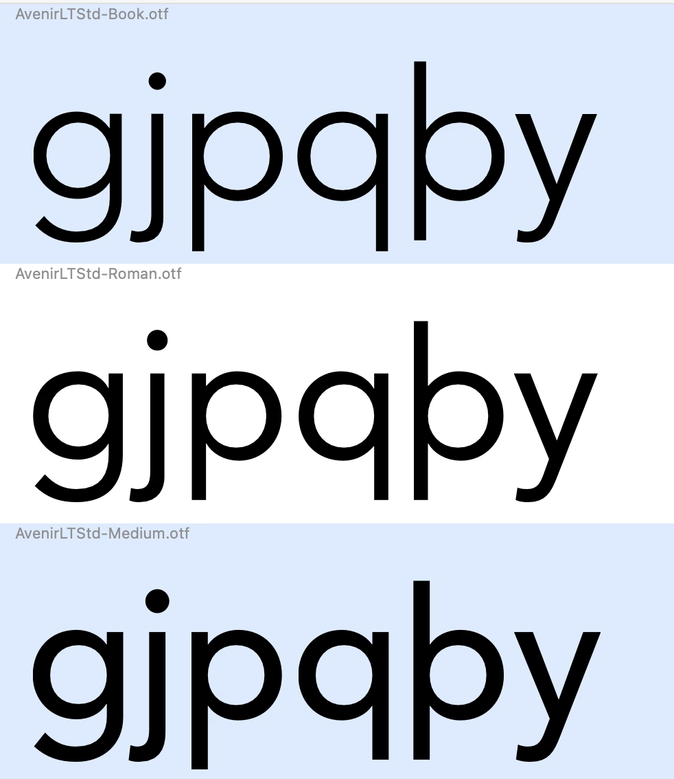
Did anyone ever notice that Avenir LT has some serious errors in the descender lengths of p and q in certain weights?
Florian Hardwig adds:
It’s one of the things that got revised in Avenir Next. But it’s bonkers that it hasn’t been fixed in the “legacy” Avenir that’s still being sold – and bundled with Mac OS – after all these years.
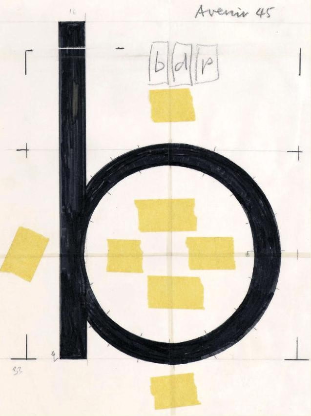
Downthread there’s an original Avenir drawing that for some reason I found very evocative: