From dawn (or dusk) till dusk (or dawn)
This iPhone UI for dark/light theme is doing something clever:
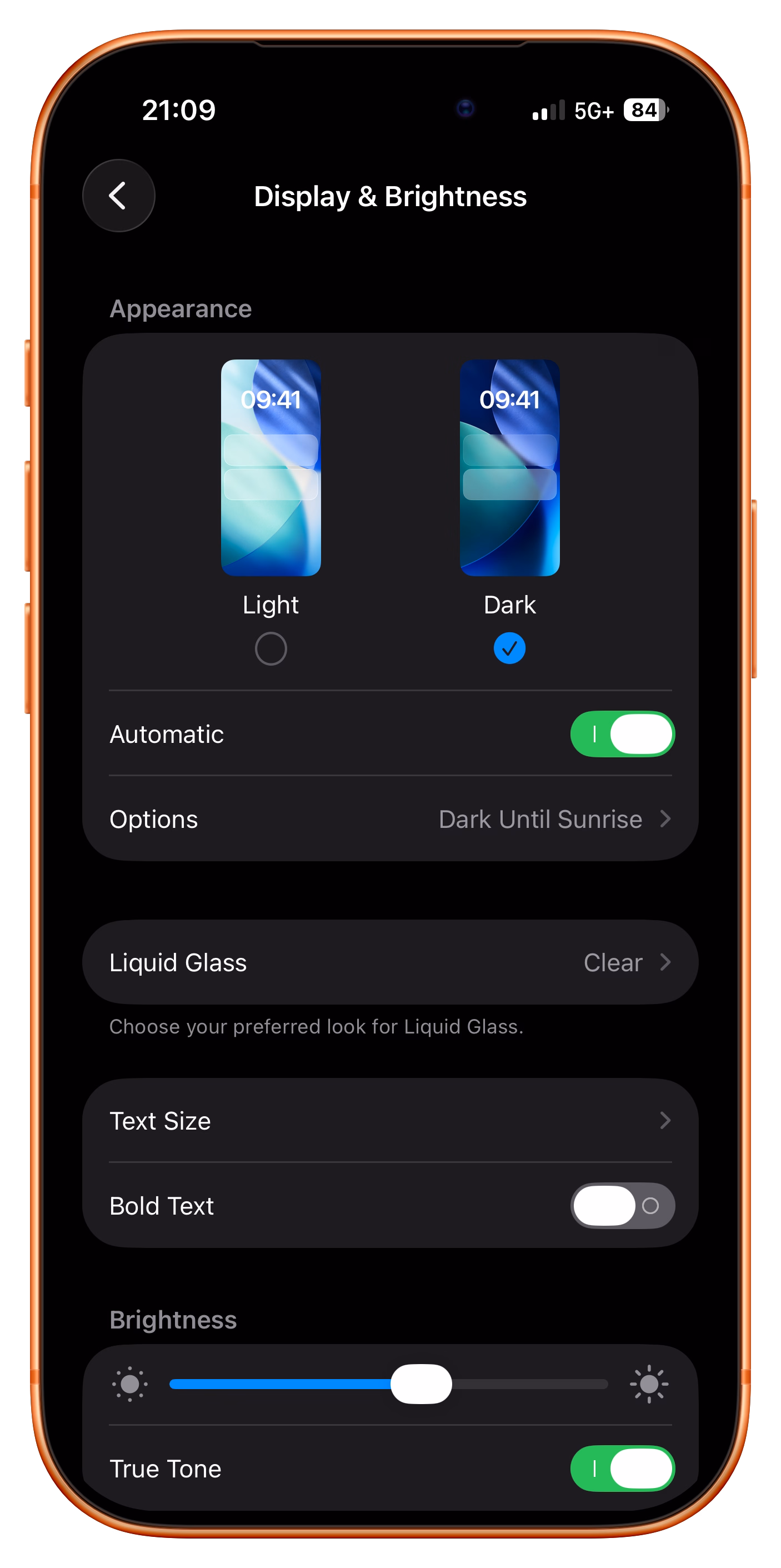
Ostensibly, there are two modes here:
- automatic, for when you want the theme to match the time of day
- manual, for when you want to keep one of the themes forever
But check out what happens when I am in automatic mode, but toggle the theme by hand anyway:
More rigid or less thoughtful interfaces would either disable manual changes when you’re in automatic mode, or understand a manual theme switch to mean “I want to turn off automatic.”
But here, iOS is quietly putting me in a temporary hybrid mode: a manual theme override until the theme catches up with what automatic mode would do, at which point it snaps back (I’m resisting very hard calling this rubber banding) to automatic mode.
What I think is clever is that this isn’t presented as a third mode – which could be more confusing than helpful – but the design simply reuses the existing Options field to set the expectations.
One has to be careful designing in shades of gray; once you enter the space you really have to commit to it and see it through. My go-to analogy is symmetry vs. asymmetry. Symmetry in visual design is usually easier and safer. If you venture into asymmetry you have to make an effort to make it work. The highs of asymmetry will be higher than anything symmetry can provide, but getting to those highs can be arduous and sometimes might even be impossible.
I thought this particular example was really nicely done and the team found a great balance. (I think Apple’s previous shade of gray – “Disconnecting Nearby Wi-Fi Until Tomorrow” – ended up slightly less successful.)