“I am skeptical it achieves what Apple intends.”
Nick Heer’s analysis of Apple’s Pages interface over time is a nice counterpart to the recent post about Sinofsky doing the same for the early years of Microsoft Office. Here is the key comparison, 2011–2025:
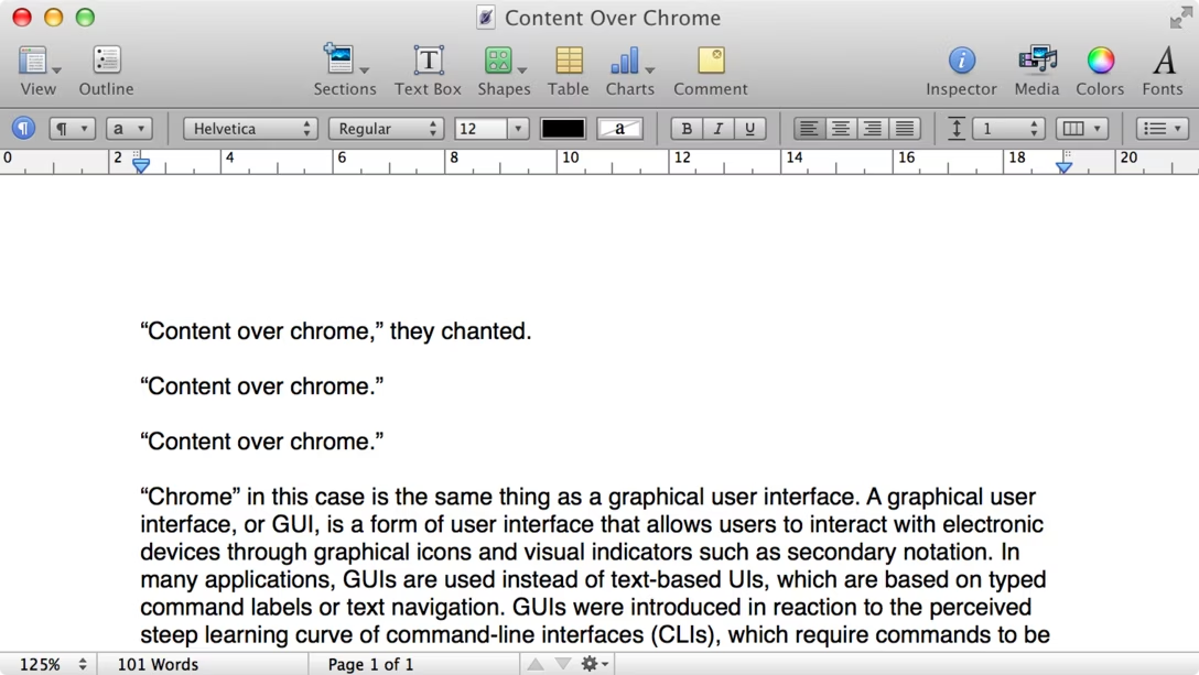
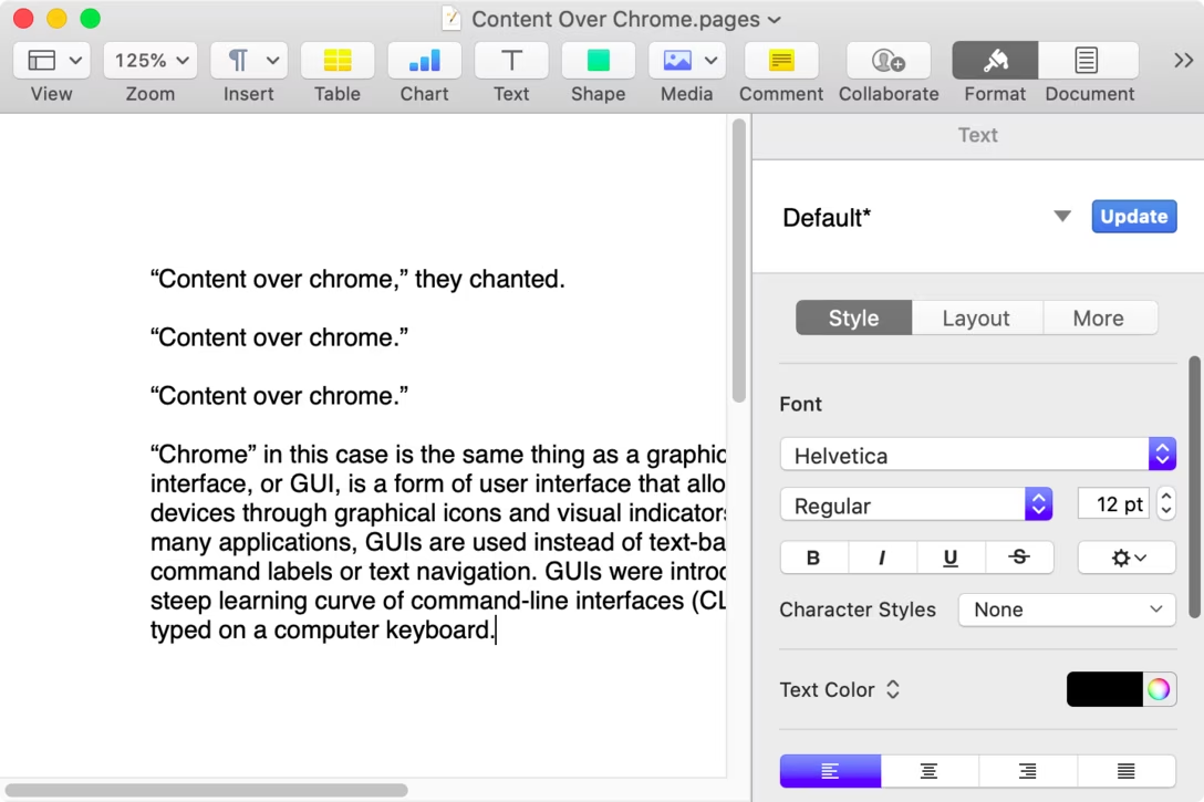

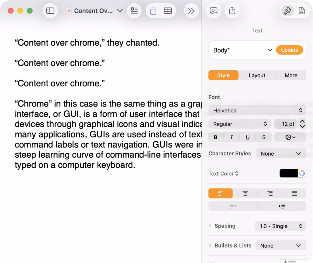
I’ll let you read the whole excellent analysis and Heer poking at the notion of “content over chrome” which feels dogmatically attractive, but needs deeper thinking which usually doesn’t follow.
The interesting thing to me about that last screenshot above is that the team didn’t want a toolbar separated from content – and yet, they walked themselves into recreating a de facto toolbar anyway, just uglier and with more problems. (Just like designers who use all-white for complex surfaces, and arrive at visual hierarchy challenges that now require more work.)
We’re a few hours away from WWDC. I don’t imagine we will see any direct response to the criticism of Liquid Glass as Apple doesn’t work that way, but it will be interesting to spot any indirect signs of reactions or course corrections.