“I was inspired by the Comic Sans typeface”
I hate most font reveals; they’re written in a pretentious, corporate-meets-Design-with-capital-D way that’s devoid of any value or meaning or feeling, with the requisite highly polished motion graphics that feel pretty like empty sugar calories. They did feel like written by AI before that became a meme.
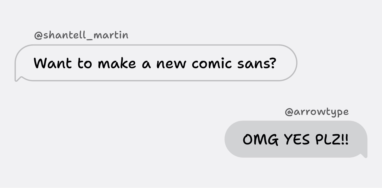
This feels like the opposite: an actual personal font announcement of Shantell Sans that made me feel things. From Shantell Martin:
When I was 20 or 21, I found out that I was dyslexic. When I started my art degree at Central Saint Martins in London, I was in an environment where it felt like the majority of people were dyslexic. I was instantly part of a cool group of creative people. However, I was disappointed about the amount of teachers who had never spotted my reading challenges. Instead of supporting me to learn to read and write, they punished me.
What I liked about this post is that it hands the mic off to other involved people: Stephen Nixon who “produced” the typeface, and Anya Danilova who took care of the Cyrillic side. It’s a simple technique, but I feel much more effective than doing the “oral history” a.k.a. “journalistic” approach of different people having various quotes interspersed. It can work, but only if you do it really well. Almost no one does it really well.
There’s just so much to love here. The motion graphics are actually useful, informative, and allow you to learn things! Even the “in use” photographs are delightful and don’t feel arbitrary.
Just well done all around.
(Also, I hate Comic Sans, so having something new in the same vein will be genuinely useful.)