“If you just ignore those pesky impossible details, the demo looks deceptively simple.”
This DOS demo called Wake Up! is astonishingly small – only 16 bytes:
The demo doesn’t just make QUOD feel gargantuan. Output this one solitary emoji, “Woman Technologist with Light Skin Tone” – 👩🏻💻 – and you spent all your 16 bytes, too. (Proof!)
The creator’s write-up is a bit hard to follow, but there are some interesting aspects to it: “stealing” the beauty from math itself, the reliance on the environment being set up properly (to avoid wasting precious bytes on initialization), and the tight connection between the hardware, the visuals, and the sound.
Oh yeah, in case you haven’t noticed, this has sound! Two out of 16 bytes are devoted to its production, using an existing BIOS function that slots nicely into the existing graphics routine.
This is another recent demo that caught my attention: NINE, from about a year ago:
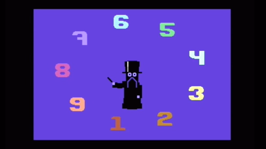
The platform here is a computer of a similar vintage as the early DOS machines, Commodore 64. C64, like many other home microcomputers, supported special graphical entities called “sprites,” which were used for gaming since the rest of the graphics couldn’t move very fast. (Today, your mouse pointer is conceptually similar to a sprite, being imbued with special powers unavailable to anything else.)
C64 could output up to 8 such sprites. The demo inexplicably has… nine.
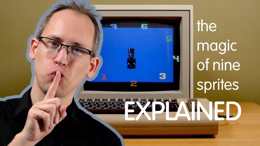
The NINE demo didn’t focus on absolute minimalism, but instead employed a barrage of ghostly (and ghastly!) trickery to achieve something that was thought impossible. This time around, the explainer from the author – a 22-minute YouTube video – is filled with great storytelling, and absolutely worth a watch:
I think both of these showcase two things that I appreciate and that translate to great UX design as well.
The first demo shows tight integration between design and the capabilities of software and hardware. Let’s pick the sound routine that needed just 2 bytes. If there wasn’t a way to output sound within this extremely tight budget, the author likely wouldn’t fight to their death to get sound… they would instead focus on what else was possible within two bytes. This is getting as close to full understanding of the medium you’re working in as possible.
The second demo highlights how sometimes you can use absolutely horrid sleights of hand to achieve something beautiful – and how you can perhaps find beauty in those sleights of hand, too. It reminds me of the quote attributed to Teller (of Penn & Teller):
Sometimes magic is just someone spending more time on something than anyone else might reasonably expect.
Penn & Teller talk a lot about how there are only two keys to their success: going further than others would think, and not worrying about employing inelegant tricks in service of something that would appear to be of utmost elegance.
Today’s computing limitations are different than the ones from the 1980s. But a lot of this attitude can still be helpful, even four decades in, and even if your work seems as far away from the demoscene as you can imagine.