“It’s not so simple to celebrate a phrase.”
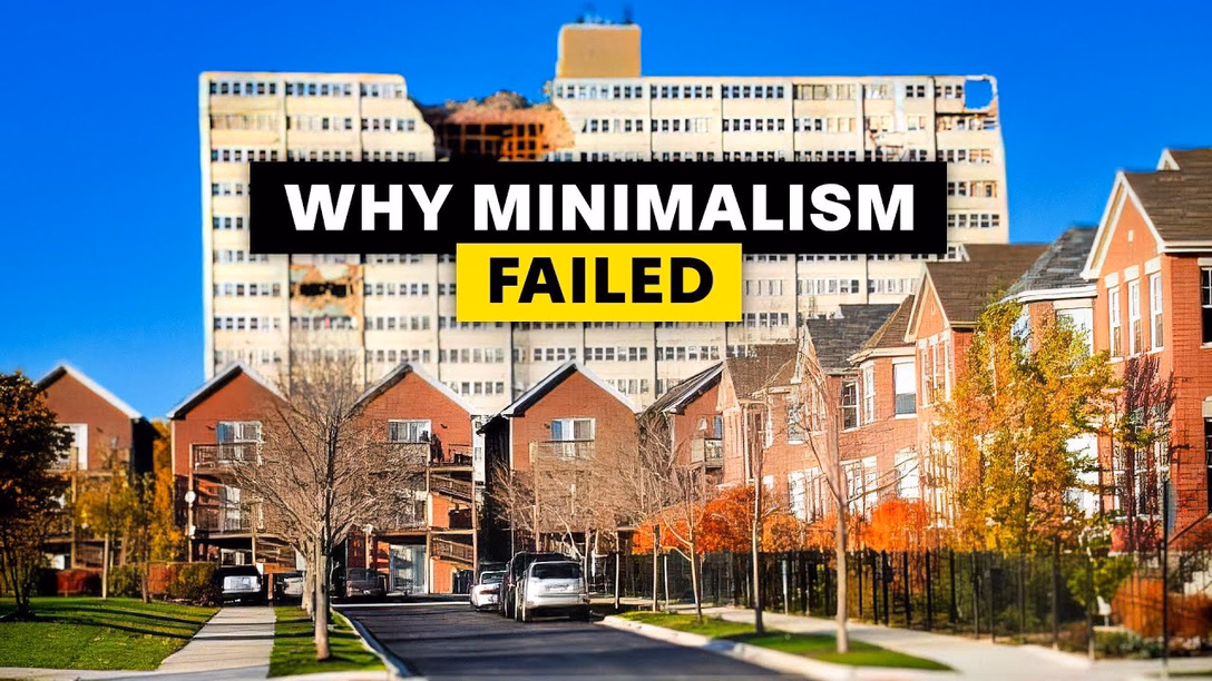
This was a fun 15-minute architectural video from Stewart Hicks (absolutely worth a follow otherwise) that mapped precisely into the same kind of tension and internal debate I sometimes feel when talking about minimalism in UX design: Minimalism is good! Until it’s not!
One interesting lesson here is that the famous “less is more” was actually – surprise! – perverted from the original poem, where it meant “less technical perfection means more emotional impact.”
I wasn’t fully sure why Hicks decided to incorporate a commentary to his own story this way – maybe he was afraid that the sarcasm of “steel wanting to share its joy” and “lessness” and “simplificity” wouldn’t land well? Or perhaps it was just the introduction that didn’t quite work for me, as it confused the entire joke.
But it was fun to watch it twice anyway. Those stories are never easy. I am not ready to draw too many parallels between architecture and UX design, even if Hicks lightly does so at the end. There’s no gentrification and displacement when Liquid Glass takes over Aqua, although I think a lot of people would love to see a Apple’s recent design decisions meeting the business end of a wrecking ball.
My favourite recent saying to replace “less is more” is this, by Paul Valéry (another poet!):
Everything simple is false. Everything complex is unusable.
You can see it as unsolvable, cynical, maybe even nihilistic. I do too, on a dark day. But more often, I see it as a great challenge. “Less is more” has this simplistic seductiveness that feels naïve. “More” is not an option, but often in my work on complex systems “less” is neither, and a lot of UX design is finding the perfect shade of gray.