Lisa’s copy (and cut, and paste)
I love looking at origins of obvious things, because of two things:
- They help me get unstuck. If you go far enough, you will find out that even the most ossified conventions that are older than you haven’t always been this way.
- They put me in the mood of “what of the things that feel normal today that deserve to feel dated, obsolete, or awkward?”
I’ve been emulating the Apple Lisa recently, and I was struck by how many of its UI strings were slightly or wholly different than what we’re used to.
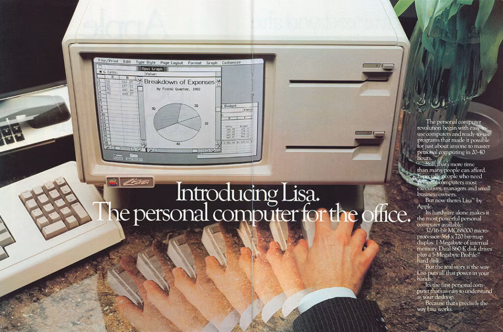
It makes sense. Lisa came out in 1983 as Mac’s predecessor and really the first GUI that is directly linked to what we’re using today. Even though it borrowed things from work done at Xerox, tons of conventions were not established yet.
So, I thought it would be fun to actually take a closer look.
For context, Lisa was as slow as it was expensive, and generally considered a failure. It was basically abandoned by 1985. Not much third-party software has ever been written, but Lisa shipped with 7 impressive office apps with fantastic names: LisaWrite, LisaCalc, LisaDraw, LisaGraph, LisaList, LisaProject, and LisaTerminal.
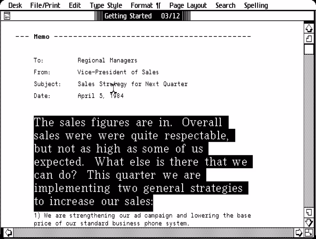
The screenshots below come from an emulator and from manuals (this links to the 1984 version, but each manual also includes a link to the original 1983 edition). The emulator is pretty harrowing; please upvote the idea of Lisa in Infinite Mac if you would want to see it!
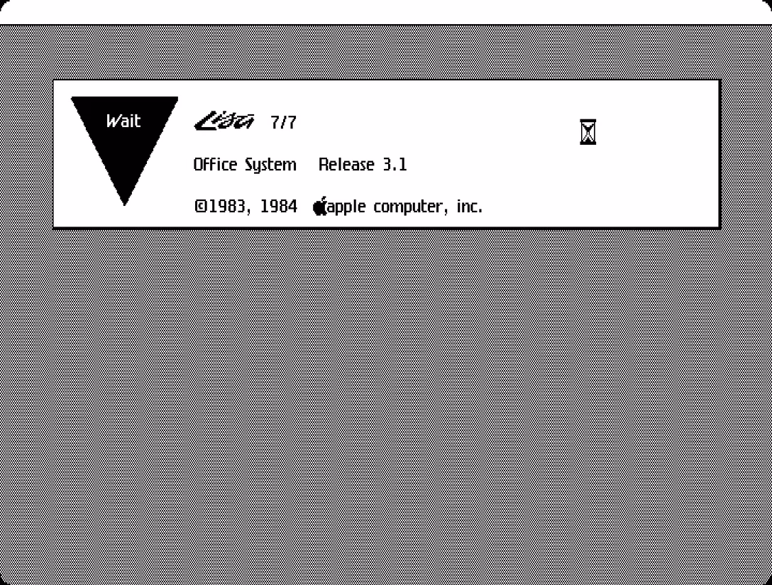
As Lisa powers up, we see the appearance of the “wait” dialog box. We’ll encounter more symbols like this triangle, inspired by traditional flowcharts.
Let’s start with menus, as these really were the treasure map to the whole system.
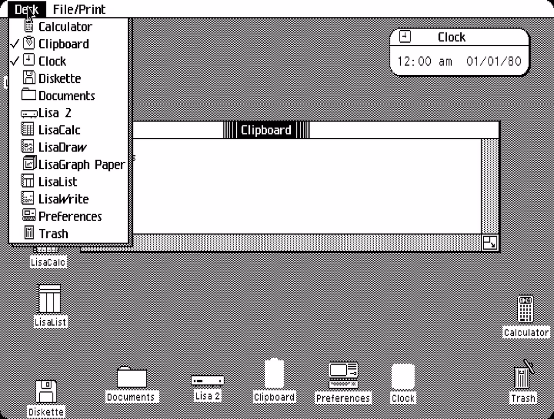
The Desk menu is basically the equivalent of the dock today.
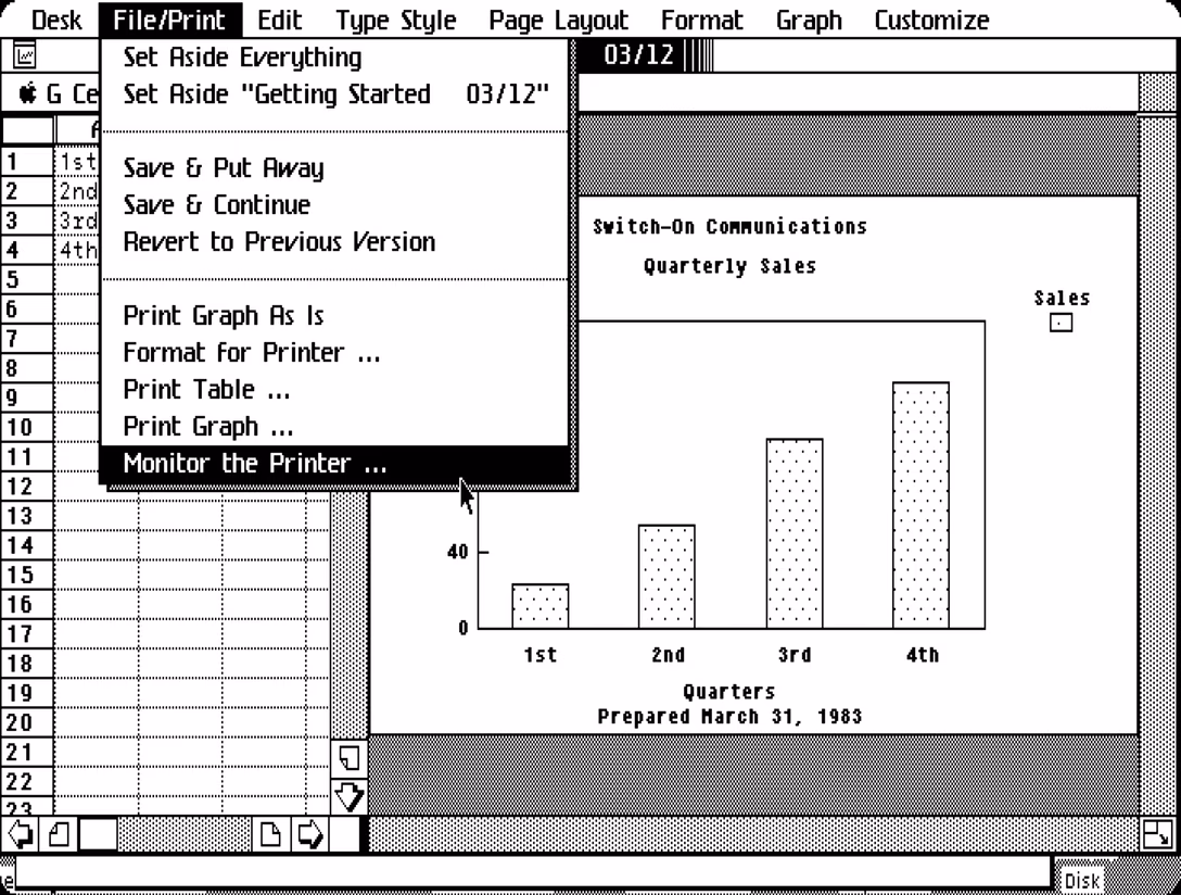
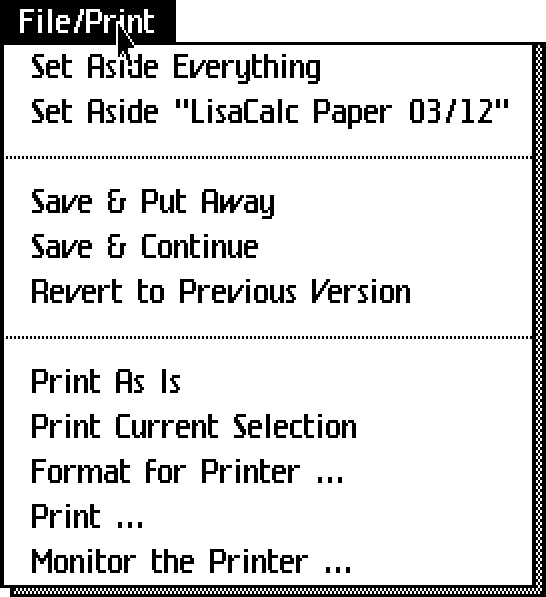
The File menu has Print appended to it, indicating how important printing was still then; a truly “paperless office” won’t really be possible for two more decades (and seemingly still hasn’t fully arrived).
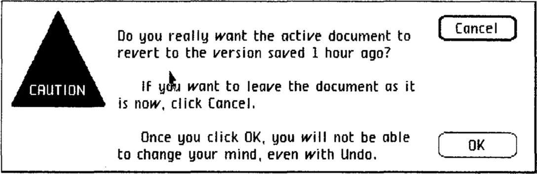
There is no Window menu yet, so the menu also contains some of that burgeoning functionality. Set Aside is what we would call Minimize today. Save & Continue is basically a contemporary Save, and Save & Put Away a hypothetical Save & Close. Revert to Previous Version is the same as today’s Revert. By the way, in the Revert dialog I appreciated the nice gesture of telling the user how much time passed since the last save, and a warning about undo (we’ll get back to this):
Print Current Selection would today be just Print Selection. Print As Is is basically Print… but skipping the setup dialog with number of copies, etc. It was added later in Lisa’s life, and today, we’d probably call it Print Again?
If you’re noticing a pattern already, it is more wordiness compared to what we see these days. It makes sense. Our growing familiarity with these concepts is what will allow these strings to become tighter over time.
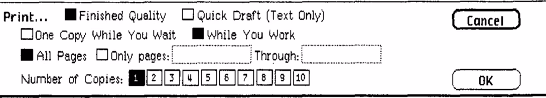
This is that Print… dialog, by the way, with beautiful “while you wait” and “while you work” verbiage (although usually I do not condone strings getting so close to each other). The manual explains: “You can have the Lisa use most of its attention to print your document while you wait. A document will print more quickly if you choose While You Wait, but you won’t be able to use the Lisa for any other tasks.”
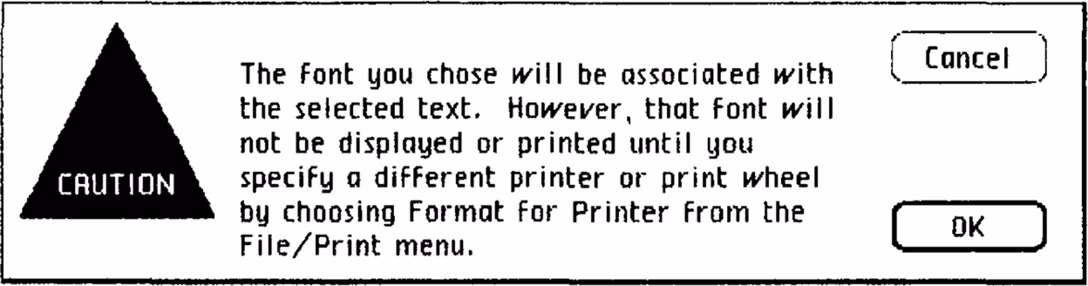
The other strings feel less typical. Format For Printer… is Page Setup, but with a lot of quirks. Printers were not usually yet WYSIWYG, able to mirror stuff exactly on the screen. They often came with their own fonts, so some matching was necessary:
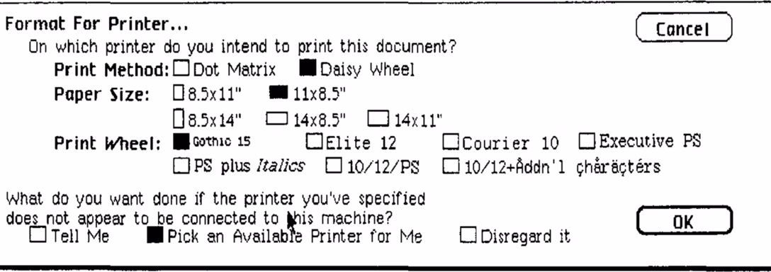
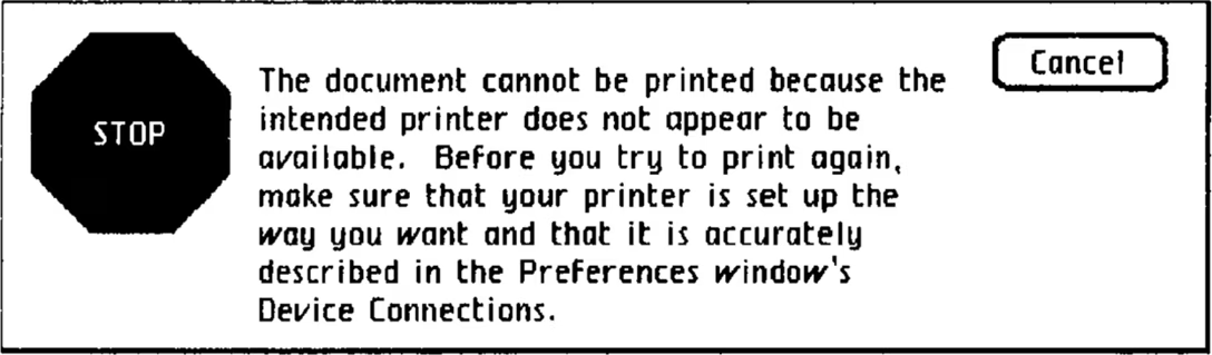
The manual had an entire section called “When Settings Don’t Match a Printer,” and there were I imagine god knows how many error cases that had to be covered, including:
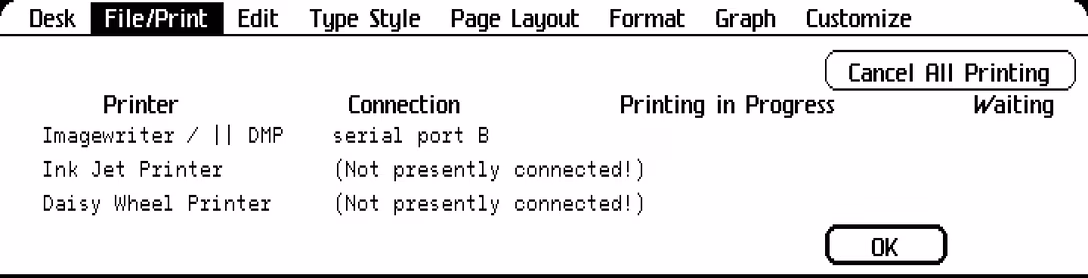
And Monitor The Printer… is today’s Print Center: a way to see the real-time printing status. Note a lot of writing here elaborates further on the “while you wait/while you work” dichotomy:
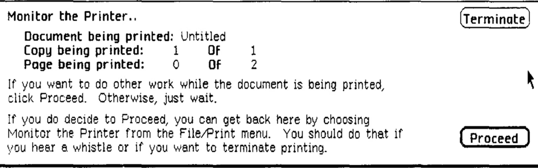
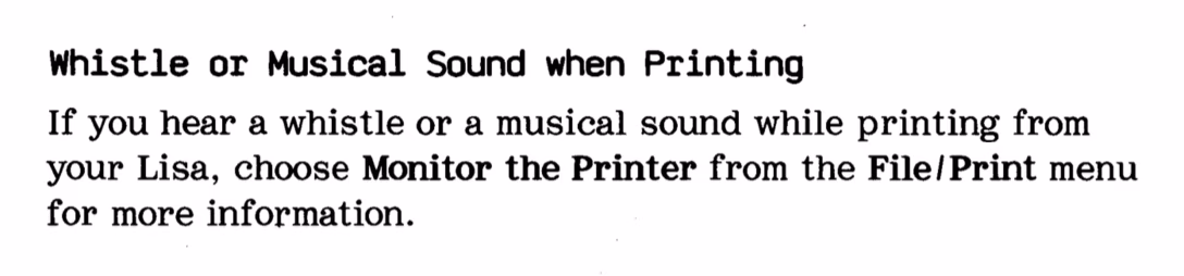
Monitor The Printer was important, by the way, since the manual warned you your printer might occasionally become haunted:
But, let’s go back to the File/Print menu. I actually found a version of this menu that comes from a 1982 pre-release Lisa, never launched to the public. Let me show them side by side:
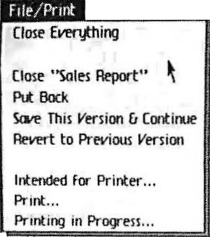
It’s fun to see designers figuring it all out. You will notice the lack of dividers and ellipses actually touching the work-in-progress strings. 1983’s Set Aside is 1982’s very modern Close. Save & Put Away is Put Back. And, at the bottom, it seems the team didn’t yet figure out that the menu options need to consistently use verbs for commands, and adjectives or nouns for toggles – so we see Intended for Printer… (rather than Format For Printer…) and Printing in Progress… (rather than Monitor The Printer…).
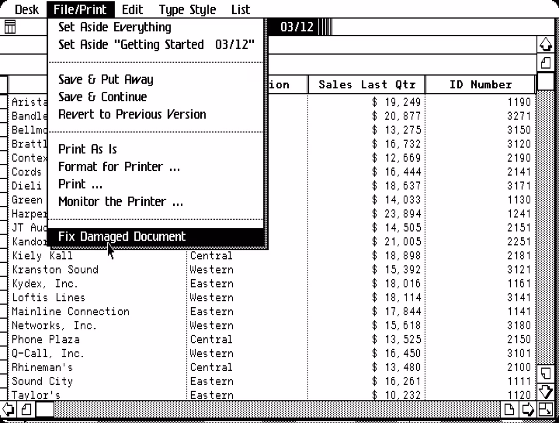
Lastly, in a released version of LisaList, this menu would come bearing a harrowing Fix Damaged Document command. Not only it doesn’t even have an ellipsis, but the manual also says “there is always the chance that the recovery process will make things worse instead of better.” Vaya con dios, I suppose.
Let’s move on to the Edit menu.
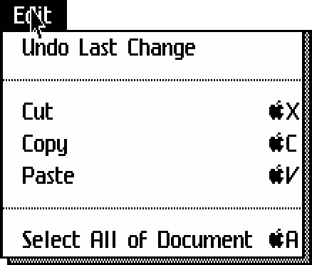
Today’s Select All is a verbose Select All Of Document, and since this is the first public appearance of undo, that feature is also more descriptive, appearing as Undo Last Change. But otherwise the menu feels surprisingly modern, shortcuts and all.
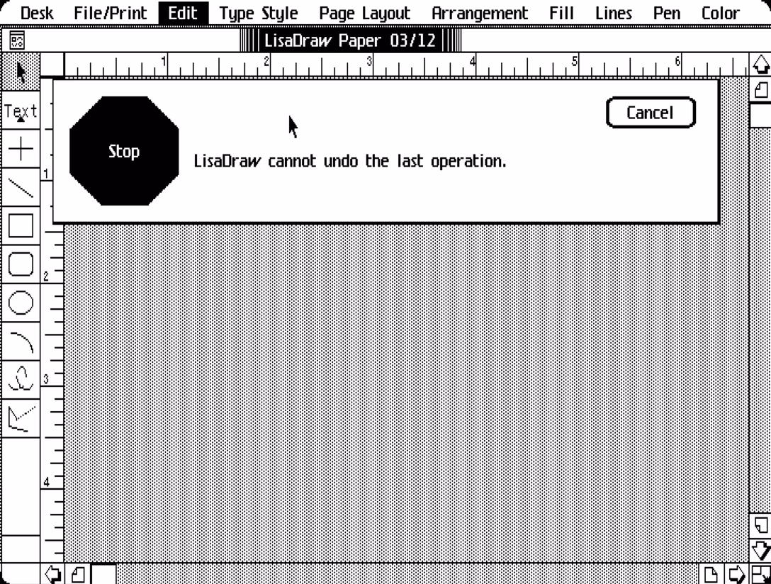
Unsurprisingly, the first undo wasn’t as developed. We saw earlier in this post “Once you click OK, you will not be able to change your mind, even with Undo,” which today would probably say “This is not undoable.” You could also see a frightening error message arriving without any further clarification, like above.
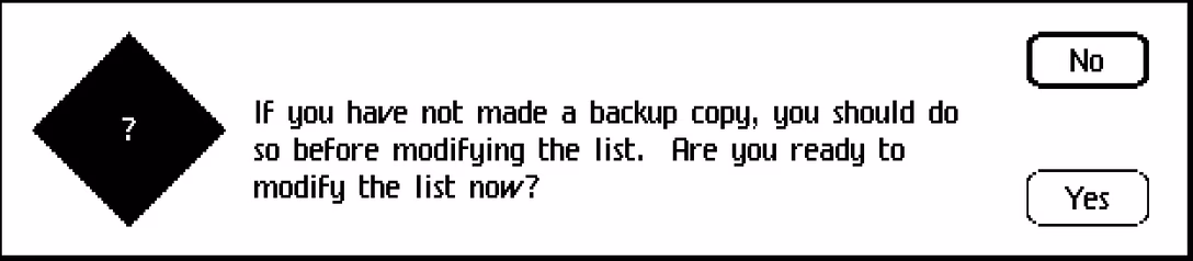
Sometimes, the app would warn you undo doesn’t have your back. We’ve seen this before, and here’s another example.
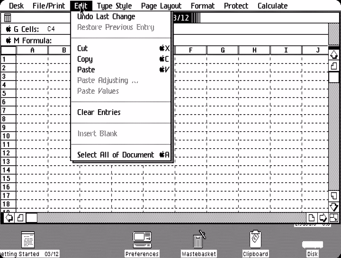
Since undo only had one step, LisaCalc and LisaList also had Restore Previous Entry for when you changed your mind after editing a cell in the spreadsheet. You had to employ this strategically, as you did the already-mentioned Revert to Previous Version.
“You can even undo Undo!” bragged the manual, and I imagine there must have been interfaces where undo came without a matching redo. But the eventual solution, of course, was bidirectional undo/redo with many steps. This basically only needed more memory, still very expensive in 1983.
Above we also see Clear Entries that would just be called Clear today.
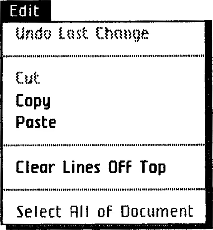
Elsewhere in Edit menu, Clear Lines Off Top would appear in LisaTerminal only, and was a charming (and I would argue better) way of saying Clear Scrollback.
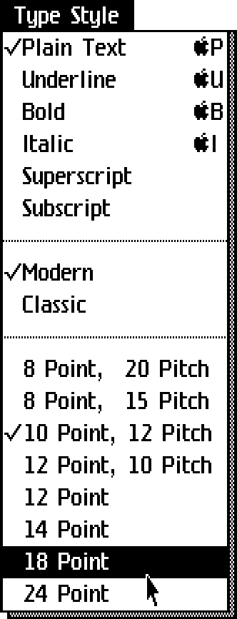
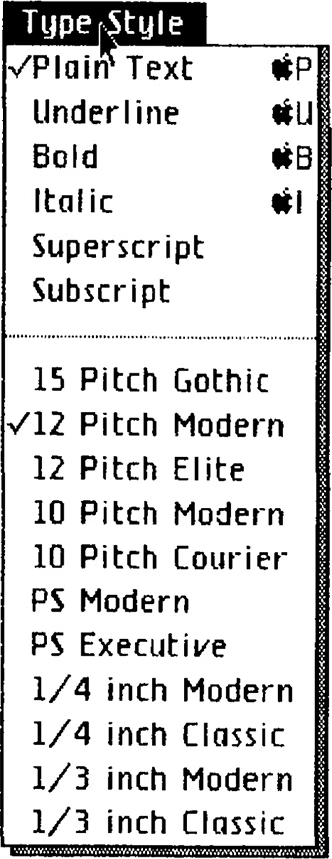
The next menu, Type Style, would be called Font today. “Type” is typewriter nomenclature – Lisa was meant to be a typewriter replacement. The point/pitch convention for font sizes and letter spacing also comes from typewriters, and in an older version of that menu even font names arrive from that universe (PS = Proportionally Spaced!):
Otherwise, notable is the deterministic Plain Text reset with a P shortcut that would in time lose to printing. I miss this sometimes, this “reset” idea, as I think it would nicely compliment Paste And Match Style.
(By the way, Lisa was the last computer to use Apple logo as a modifier key.)
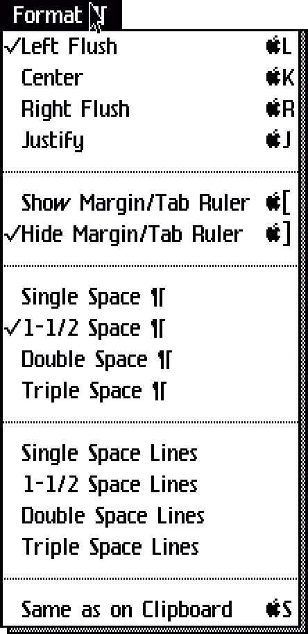
While Type Style is for selection, Format ¶ is all about paragraphs – HTML people know this distinction as “inline vs. block.” (The pilcrow symbol means “paragraph,” although I did not expect it to be common use even then.) The flyout menus with their convoluted mechanics weren’t invented yet, but in some sense there was no need for them as the options were very limited.
It is interesting to see Margin/Tab Ruler as two options with deterministic shortcuts ([ and ]). But the most unbelievable shortcut must be Same As On Clipboard. It reformats the current selection to match what you have in the clipboard – an early salvo in an endless battle that later brought us Paste Special, Paste And Match Style, Paste And Retain Style, Copy/Paste Properties, Paint Format and so on, and so on. And it was given S, rather than spending it on Save (& Continue).
Otherwise Left Flush and Right Flush would be called aligning today, and the ¶ pilcrow symbol would be replaced by a simple Paragraph Spacing.
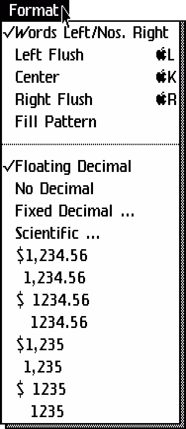
In LisaCalc, Format is missing the ¶ because, well, there are no paragraphs in spreadsheets! I love Words Left/Nos. Right, and empathize with trying to align the digits. But it wasn’t even close, was it.
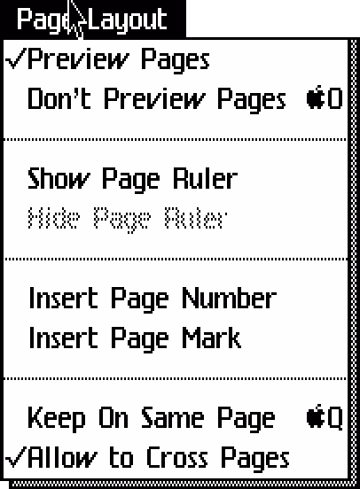
Page Layout shows that we’ve had UI boolean problems from day one. Show Page Ruler and Hide Page Ruler do it deterministically, with one always disabled, and without checkmarks. Preview Pages and Don’t Preview Pages do the checkmark, but introduce a dreaded double negative. (These last options, by the way, is the “pages/pageless format” showing page margins and dividers, that bother us so much about Google Docs.) Today, these would all be in the View menu that doesn’t exist yet.
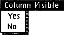
And speaking of boolean challenges, here are some top-level menus from LisaList with even more conventions:
But, back to the Page Layout Menu. Insert Page Mark would be Insert Page Break today. I really love Allow To Cross Pages as the opposite of Keep On Same Page, and the incredible O and Q shortcuts.
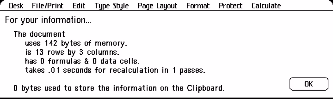
In LisaCalc, this particular menu comes with a beautifully named For Your Information (sentence capped, for some reason)…
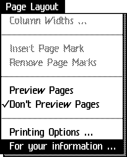
…throwing up a sheet-like window showing basic stats. Today, that window would have a more boring name and probably land in the File menu:
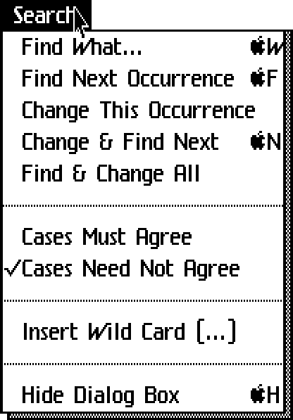
The Search menu is fascinating – why wasn’t it called Find like its items are? I am particularly enjoying W keyed off of Find What (today: Find), while F is taken by Find Next Occurrence (today: Find Again). There is some mnemonic sense to it all, but I like today’s proximity of ⌘F/G better.
What we know as Replace is Change here, and I am particularly loving Cases Must Agree and Cases Need Not Agree (today usually called “case sensitivity.”)
Hide Dialog Box is a string with surprising to me amount of UI jargon. The H shortcut was added later in Lisa’s life, presumably at users’ behest. It’s strange today to see a shortcut like this to hide one specific floating dialog box.
Similarly, Insert Wild Card with a confusing ellipsis allows you to insert a symbol in your find dialog that stands for “match anything here” – top-level menu options reaching inside specific dialog boxes were not uncommon in early years of GUIs, but I think fell out of favor over time as the idea can be conceptually confusing.
The menu below is from LisaWrite, and I like how comparing it with other apps makes us see the team trying to settle on a convention. In LisaList there are no ellipsis, but question marks!
And in LisaCalc, there are… both:
You can notice that it wasn’t clear where one would put Find-related commands and their today’s presence in Edit menu doesn’t really make a lot of sense, either. We just got used to it. (Also note the “occurence” typo.)
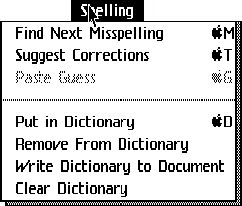
Spelling menu has a bunch of fun options and conventions, and an extremely generous use of keyboard shortcuts:
- Find Next Misspelling (you don’t often see that word!)
- Suggest Corrections + Paste Guess (this is just replacing the word with the suggestion – interesting use of the clipboard metaphor)
- Put In Dictionary (today: Learn Spelling)
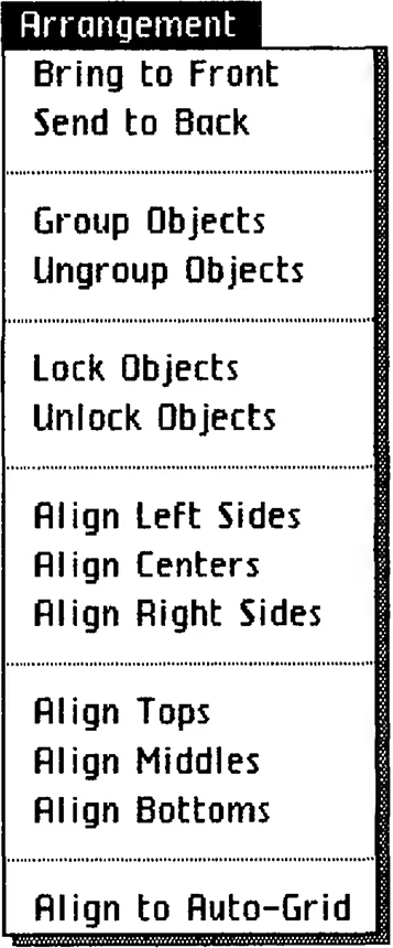
LisaDraw sports the Arrangement menu, which will look very familiar to anyone using Illustrator, Sketch, Figma, and so on. This is where Bring To Front and Send To Back started! With a tiny bit of editing (Arrangement is now Arrange, and some of the Objects nouns would be omitted), this would feel pretty modern.
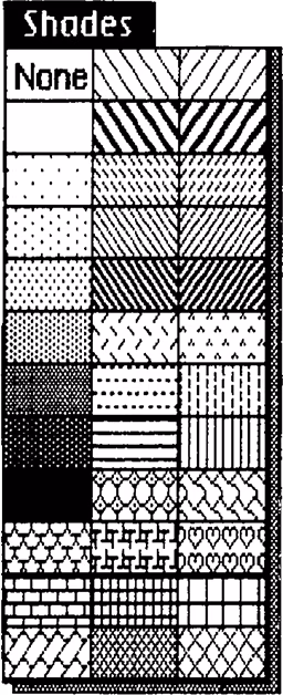
I love these visual menus, and I think we lost that kind of stuff along the way:
Okay, let’s move on from menus. The system also relied a lot of dialogs. Let’s look at some of them:
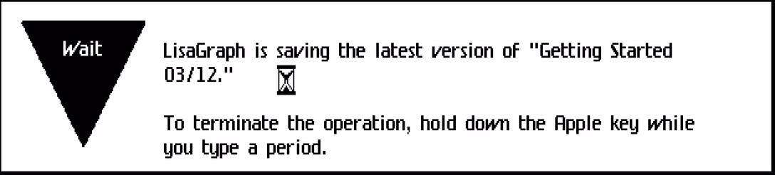
This wordy dialog would become a small loading state today. The verbose “To terminate the operation, hold down the Apple key while you type a period” probably felt necessary because other than Shift on a typewriter, people were not familiar with modifier keys. Lisa doesn’t have the Esc key, and Mac still respects the ⌘. convention in many places in 2026.
(By the way, why would you want to stop saving? Presumably because it could take quite a while.)
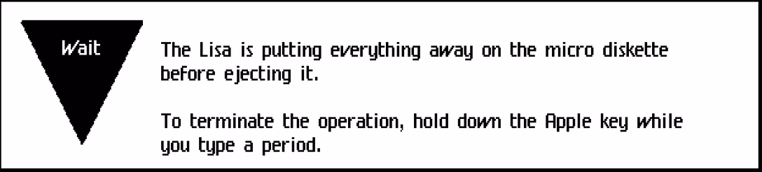
In this similar dialog, you can see a reference to a “micro diskette.” Even though Lisa’s “Twiggy” disks seem gargantuan today, they were smaller compared to the original, 8″ floppy disk. (In a similar way, Lisa and other machines of the era were called “microcomputers.”)
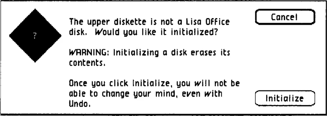
Lisa had some proprioception: In this dialog, the disk put in the first drive is called an “upper diskette.” (Also note: more undo education.)
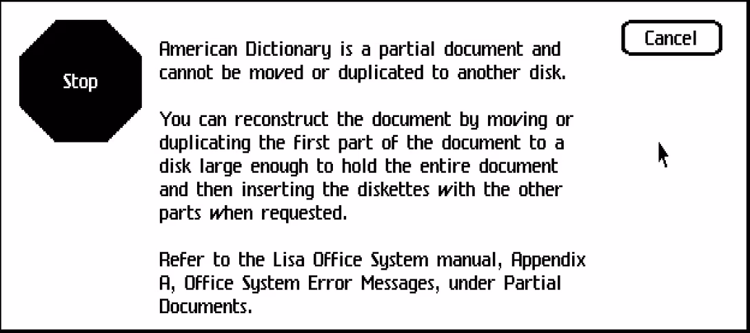
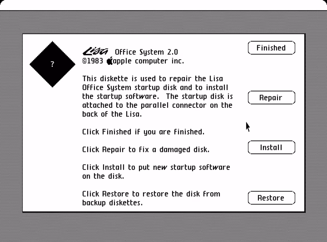
Disks were not large, so sometimes you had to deal with this kind of horror. It’s interesting how the dialog plain sends you to the manual – an early equivalent to eventual Learn More links.
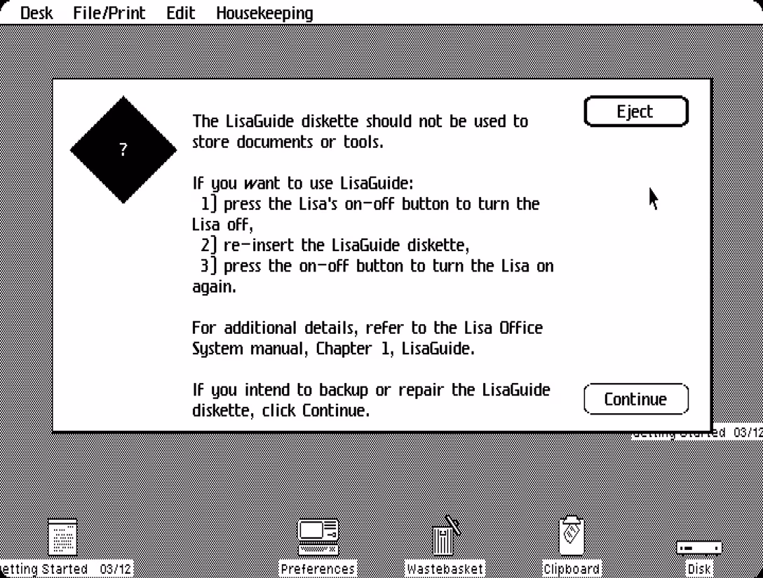
This is another example of a rather verbose set of instructions. On one hand, this is better than “Error 456” and nothing else. On the other hand, it feels like a lot of stuff to memorize.
Also of note, the beautiful Housekeeping menu. I actually forgot about the Finder (or, in Lisa’s parlance, Desktop), so here’s a screenshot of it also:
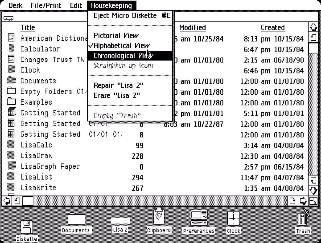
Housekeeping was basically the junk drawer – on the Mac a year later, this will be named Special. It also has some stuff that today would be in the View menu. (This later version of Lisa calls Trash the same as the Mac. Earlier on, you would see it named a Wastebasket instead.)
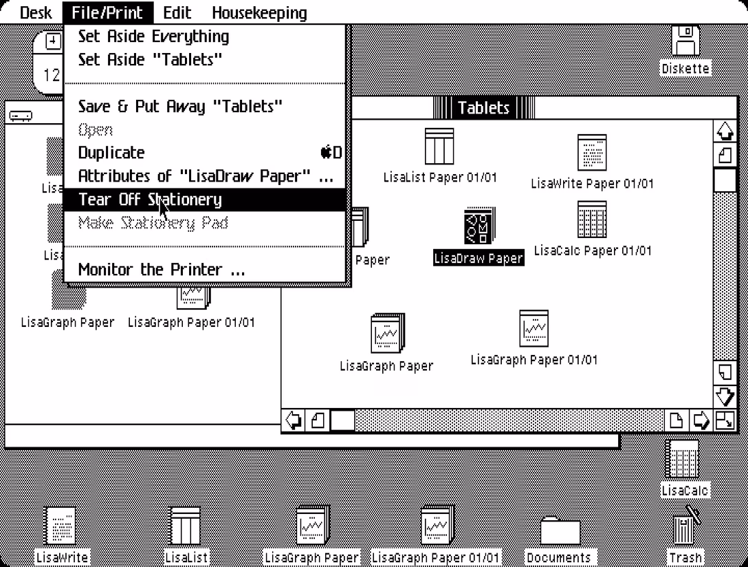
Of note elsewhere in Desktop is the use of the term Stationery, roughly meaning “template,” but with extra sprinkling of desktop-metaphor skeuomorphism. Also, Attributes Of is an early version of Get Info.
Another verbose dialog (compare with Abort/Retry/Ignore from around the same time). This is before we invented hint text that we’d just put under the buttons themselves.
In case you haven’t noticed by now, Lisa’s strings all have two spaces after a full stop!
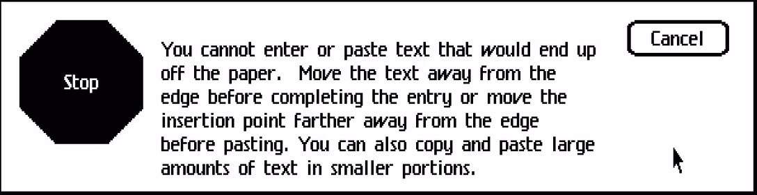
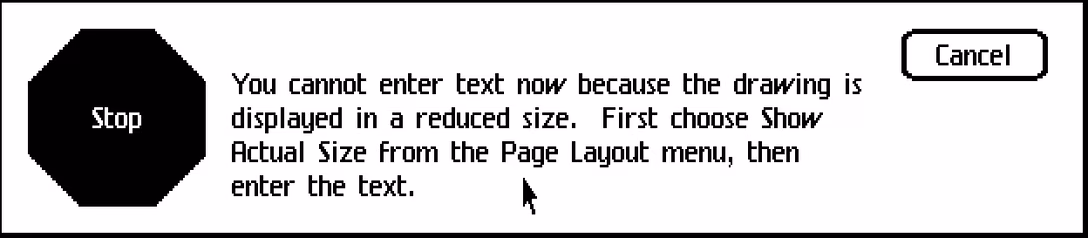
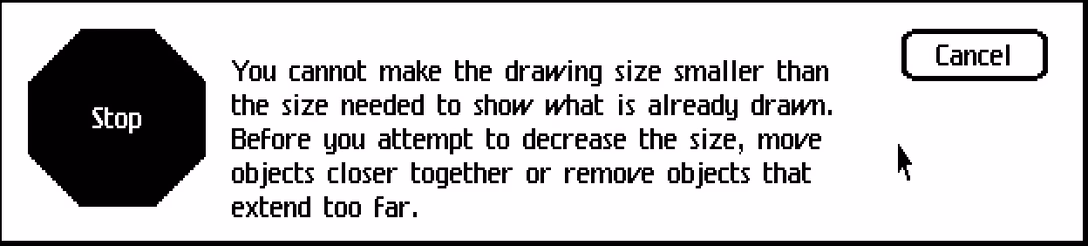
There was lot of “you cannot” dialogs, walking you through some recovery steps.
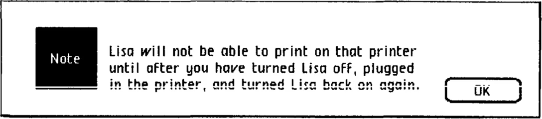
Plug and play didn’t yet exist (this would all happen in the 1990s), so that had to be explained also.
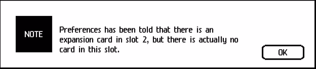
I also love the anthropomorphic phrasing “Preferences has been told,” which I don’t believe you see anywhere today.
And I think we can round up this post with a few small delightful language details like this one.
As a huge fan of the slightly pretentious “presently” over “currently,” I smiled seeing this next to the printing status.
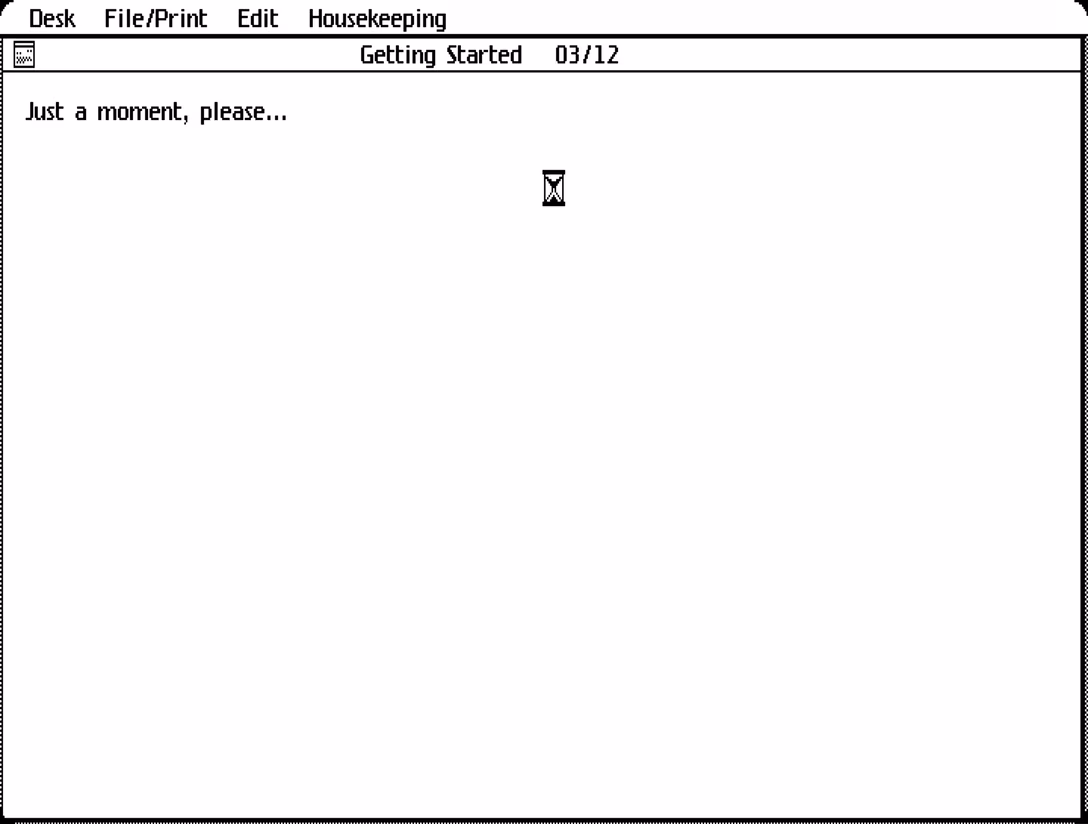
“Just a moment, please…” feels so old-fashioned, somehow.
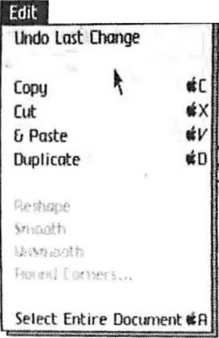
And I want to end on a pre-release version of the Edit menu we’ve already seen. You can spot here Select Entire Document (instead of eventual Select All Of Document), but of course the best thing is the Copy, Cut, & Paste with an ampersand! I find it so, so charming.
I hope you enjoyed this tour. It was interesting to me to see how many of these became the standard back there and then, how many were tweaked a little bit, and which ones had to be redone more thoroughly.
Now, excuse me as I have to go deal with my whistling printer.