Living in the Upside Down
As you progress in your UI design career, you learn that there are quite a few unsolvable challenges:
- do you write My Items or Your Items in UI?
- do you put hand cursors over buttons?
- for a boolean item (especially in the menu), do you talk about the present state or the future state?
- do you try to solve for change blindness or change aversion?
I was reminded of one of those today: how do you sort items in a bottom-aligned menu?
One school of thought is to keep it in the same order as you would a regular top-aligned menu:
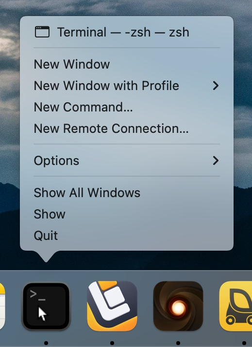
On the positive side, this allows to build consistent understanding of how menus are structured: the most important thing is at the top, Quit is always at the bottom. But the downsides are obvious, too – now the most important item is furthest away from where you cursor started, and you have to awkwardly cross all the other items on the way to it.
iOS’s springboard went, literally, the other way:
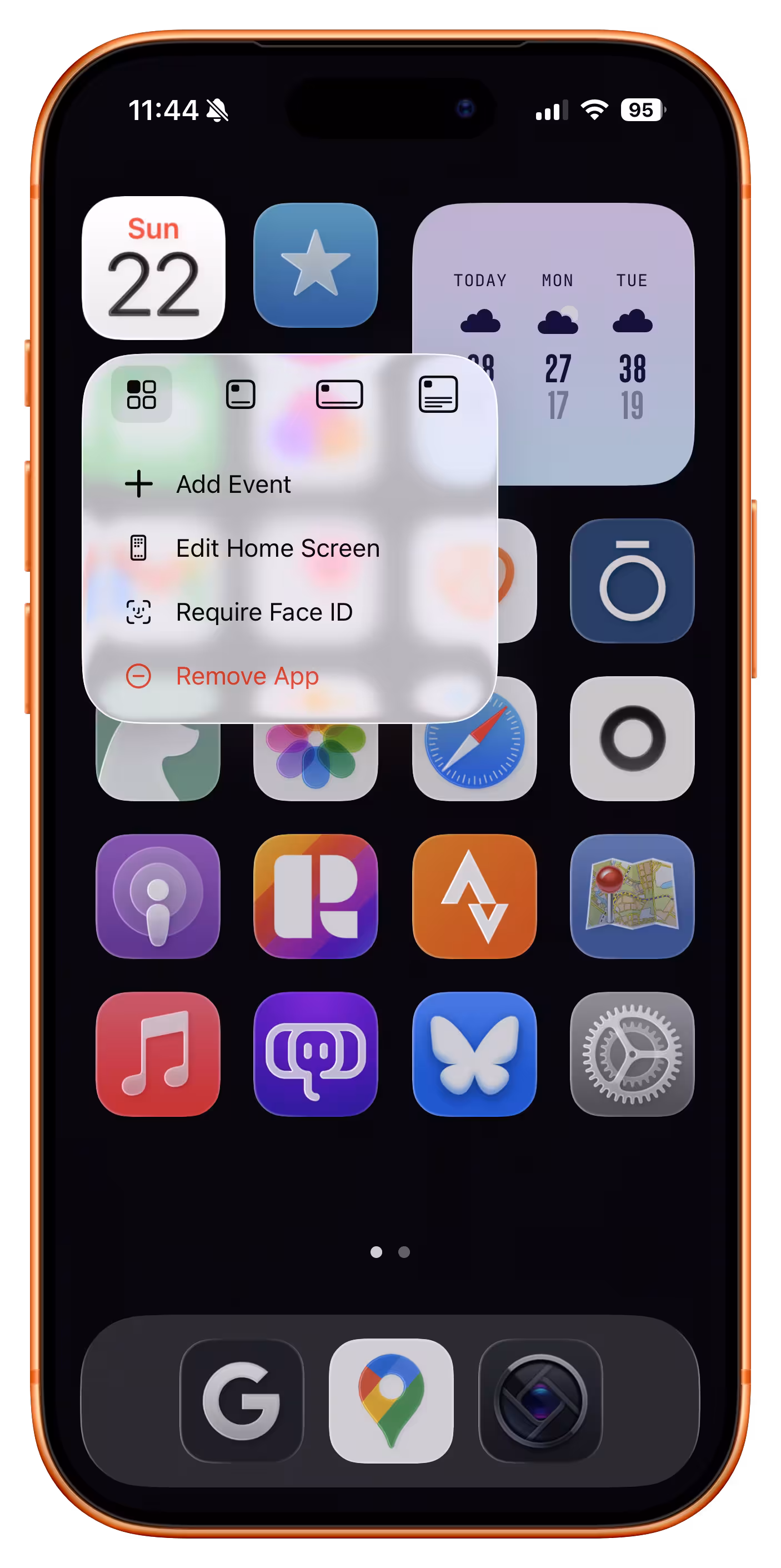
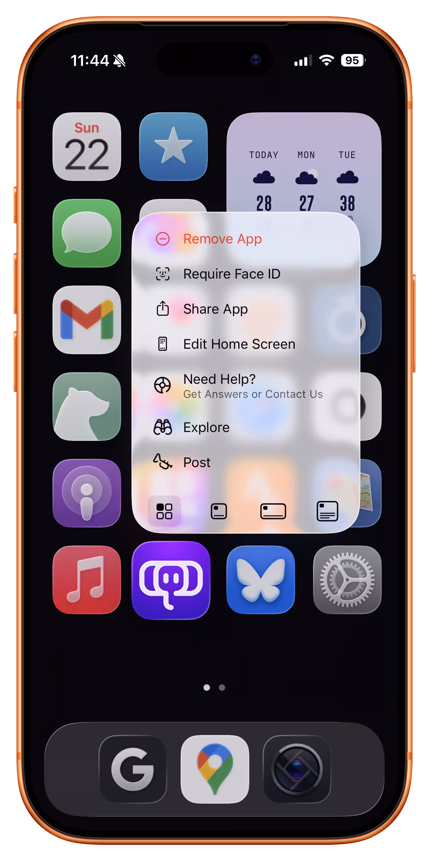
Here, the bottom aligned menu reverses its item order. This tripped me up today. The dock in macOS was actually more defensible upside down because there, every menu was always going the same way. Here, the inconsistency starts rearing its ugly head.
Of course, the best way to not face an impossible choice is to avoid it altogether. Not sure how one could accomplish it here, though. Placing the menus consistently below would make some of them scrollable, or basically invisible for bottommost icons. You could also slide the entire screen up to make room for the menu, but that would probably feel disorienting.
So, I can’t say this is a wrong solution. The inconsistency might only bother people who use this often, and maybe no one uses this often? Or, perhaps, it was really important to allow to resize widgets and make that item as easy to tap as possible? But still, I think I would have done it the other way – align as needed, but items always in the same order.