Mailbag: Photoshop’s focus post
The post about some of Photoshop’s new dialogs traveled through some of internet’s pipes and alleyways. Michael Tsai has a nice roundup of reactions; let me pick a few things that caught my attention.
1.
Nick Heer at Pixel Envy made a discovery that Photoshop’s new windows are… websites:
Maybe it really is possible to build a web app that feels platform native. But I have never used one — not once — and for this mess to be increasingly used in the industry-standard professional suite of creative tools is maddening.
I think it is possible – especially in the realm of classic form fields – but you really have to care and step up and test and replicate a some stuff that the operating system controls give you for free. (As an example, if the web platform/Electron don’t give you access to the “keyboard navigation” OS accessibility setting, you’ll need to build a bridge from the OS to pass it through. This is how Figma’s Electron app got haptics, for example.)
It is true that we don’t see that level of effort often. But there are also bad native interfaces, and there might be more; Roger Wong recently made an interesting observation that stuck with me. Emphasis mine:
The mechanism differs but the outcome is the same: the platform stops being a place a designer can rely on. […] [Text user interfaces] are back because the platforms quit, and the curriculum can’t fix that.
I think I agree with this; I’ve felt there haven’t been a lot of improvements in native desktop interfaces recently.
In the mid-1990s, Apple was losing to Windows 95/98, and after years of falling by the wayside, the team eventually got their priorities in order, and rebooted classic Mac OS into a (I believe generally successful) Aqua. And in later years, Apple as a whole has often been good about creating extra distance from the peloton even if there was no immediate danger of being overtaken.
But not here. Windows lost its way, and perhaps even the memories of the darkness of the 1990s and the revival of the 2000s are now forgotten. Even if Liquid Glass was executed extremely well, macOS would still feel bereft of true evolution and care. I know there have been some slight improvements to window tiling and more recently Spotlight, but little of this betrays urgency or suggests a vision.
Finder feels like it’s been abandoned for over a decade. AirDrop UI is worse in use than many of the file sharing interfaces that came before it. This common UI is stuck in the state of the art of display colour science that is out of the previous century:
Just on the topic that is fresh on my mind: Why does Shortcuts feel like a toy in all the moments it shouldn’t, but few of the moments it should? Why does the keyboard customization situation feels so messy? Or, why are both macOS and iPadOS still stuck in the ancient way of thinking that menu bars contain all the app’s commands, when the modern approach is: it’s command bars that do, with menus containing only a subset? An innovative modern operating system would offer a universal API for command bars that any app that wants one could use – instead, apps invent their own with varying levels of success and UI quality, and automation tools cannot do much since nothing’s compatible. (This in particular is an example of an area where web apps started leading the way.)
These are just some examples that come to mind. It’s true I have admired and been inspired by some work done on Apple TV and the Vision Pro, but we also have to acknowledge that designing for net-new platforms is in many ways easier than for legacy ones.
2.
Back to Photoshop. In the Hacker News thread, at least one person from Adobe dropped in to comment, and one paragraph caught my attention:
These changes were part of the Beta program. As far as I am aware the response there was not on the same level as this blog post.
It’s not my intention to pick on this Adobe employee, and I am not aware of the specific of their beta program (although I have used Photoshop in beta for a few years). But from my experience, this is why beta testing fails in this regard:
- People in beta programs might be more lenient and excited to experiment.
- For obviously broken small UI things, people will be more inclined to think “oh, they will surely take care of that in the polish phase.”
- In general, reports of smaller UI things are less likely than bigger functional bugs like “this is not working” or “this is really slow now.” You really have to encourage and reward and incentivize people to do that, and usually identify the right people first, too.
- Please excuse my directness, but Photoshop’s user interface has felt low-quality for at least a decade now. There are a lot more examples. It’s hard to expect people in the beta to flag small UI stuff – including literal broken windows – when the evidence all around them is that the company doesn’t care.
- Just because we all encounter interfaces doesn’t mean everyone knows how to identify the things and say the words and connect the dots, especially when it comes to generally undefinable and unmeasurable craft. Good UI is deep expertise. Just like you cannot research or data science your way out of fundamentally bad product decision-making process, you also cannot add craft through relying on your users to tell you. You need to foster this on the inside.
3.
Oh, and when I say “broken windows,” I’m not just being cute. Here’s an example of Photoshop’s “explore” halo that occasionally appears on top of another app just because I have Photoshop open underneath. And, there is nothing I can do in Photoshop to get rid of it:
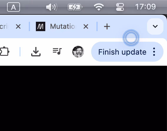
I think there is something fundamentally very broken with Photoshop’s (custom?) window management, seeing how PS windows jump in front of other applications, or how PS breaks other apps’s mouse pointers. But that’s a story for a different post.