Making repetitive things less tedious
One of my favourite recently-noticed little patterns is this one thoughtful accelerant in iOS Photos.
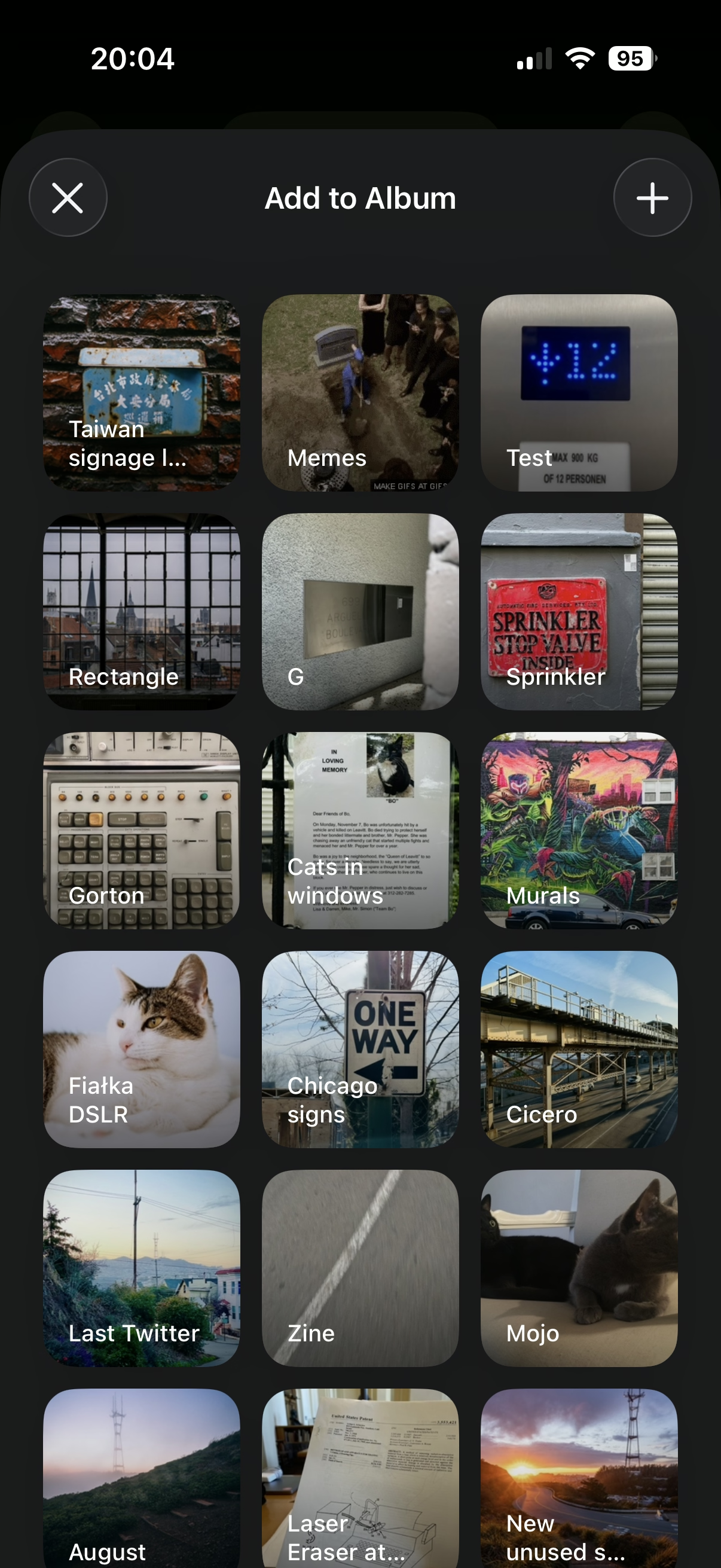
If you want to add a photo to an album, you normally have to choose from a list of albums:
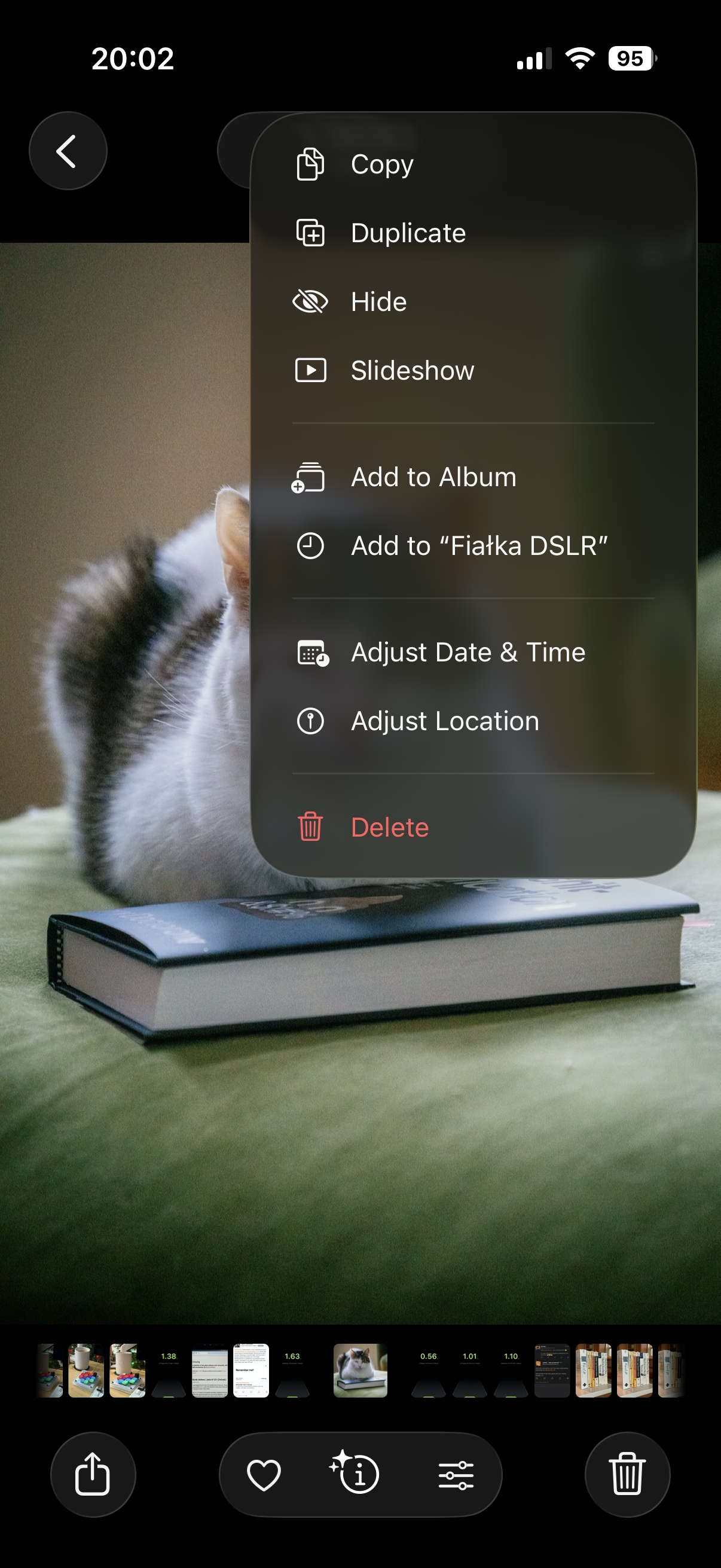
However, once you do that one time, a new menu option appears. It’s effectively “Add again quickly to the album you just chose” (Fiałka is the name of my cat):
That skips the album selection altogether. It’s always only just one album you used more recently, so it’s relatively simple… but so helpful. You often, after all, want to add more stuff to the same album, and it saves you choosing the same album over and over again.
This is great because it flattens the option space to zero options, which mirrors how we all think when we’re focused. It’s tunnel vision exactly when you want it.
I have always been a fan of both “repeat”-type actions and smart “recent”s, and consider them a truly underappreciated secret weapon. Those little savings really add up over time – in saved time, in less tedium, and in avoided mistakes. (Imagine not only having to choose the same album for 30th time in a row, but also… making a mistake doing that and tapping on a wrong one! Then the frustration very quickly compounds, as you have to recover from something that felt completely avoidable.)
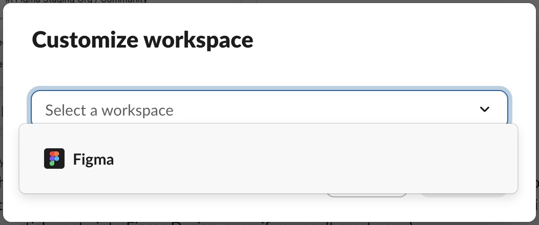
I always respect designers of interfaces that invest in functions like these. There is also an anti-corollary to this, which is: if there’s only one option, consider not even asking. Slack seems to excel (derogatory) here:
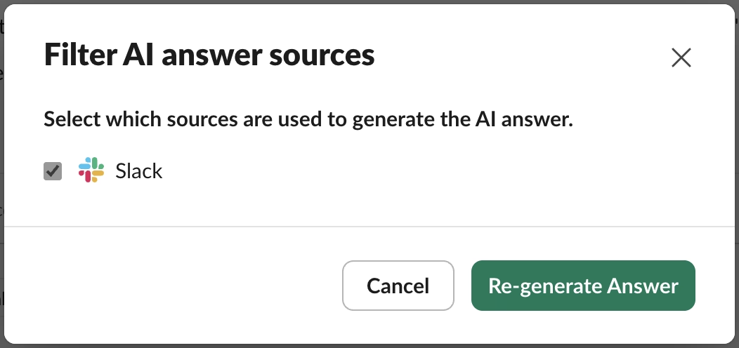
The second one is somewhat defensible since it’s a settings dialog you enter at your own will, although the active “Re-generate answer” when I haven’t done anything (and nothing can be done) feels overbuilt.
But the first of these always appears on a way to other settings (like adding emoji), and it’s even worse than the Remember me? examples because it repeatedly stops you for absolutely no reason at all.