One big step forward, three small steps back
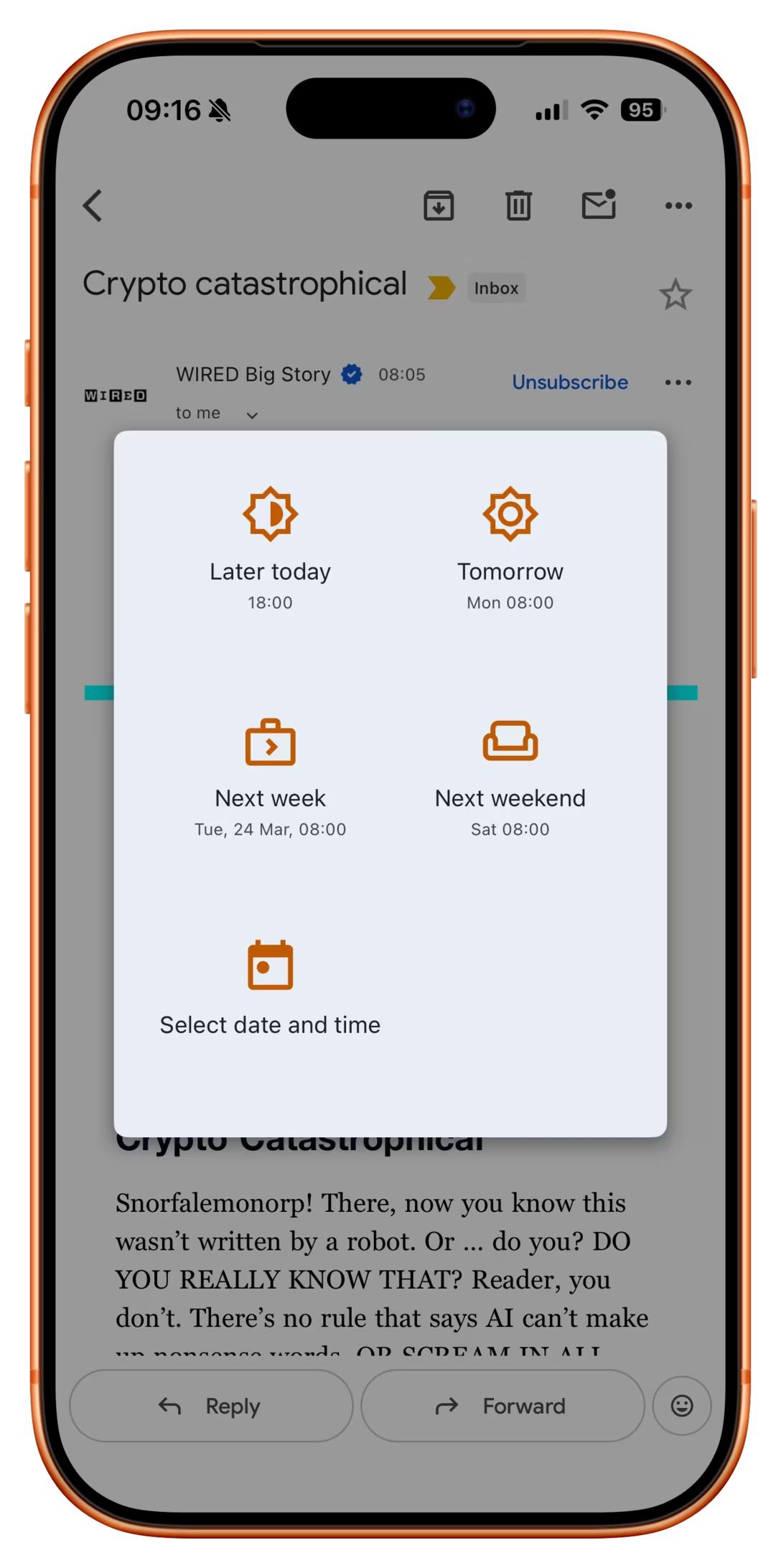
This is a typical iOS Gmail dialog that allows you to snooze an email so it resurfaces later:
If you invoke that function on an email that’s an order receipt, a new option appears:
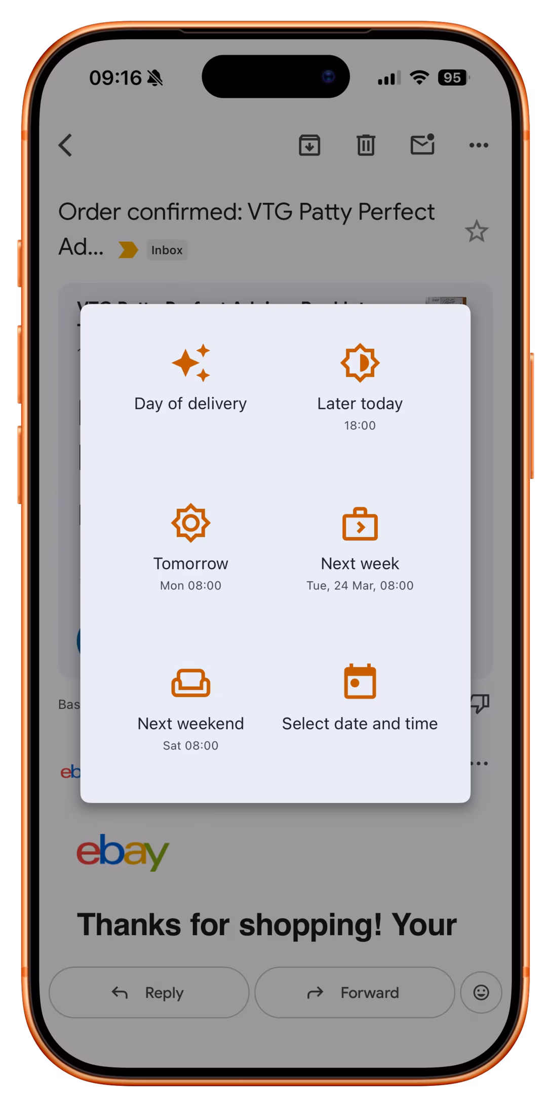
It’s great to see this clever and thoughtful button which is likely the best option here. But:
- It reshuffles everything else, preventing motor memory from building. At this point, you can no longer rely on “bottom left” to always be “custom date,” and so on with other buttons. (One idea would be to put it at the back but draw attention to it visually, or at least make it span the entire row.)
- It doesn’t show you the inferred date, even though there already is a precedent for doing that – especially important here as the feature seems to be powered by AI, which can get things wrong.
- The icon heavily promotes the AI association, which is not that useful. It would probably be better to show a truck or some other visual signifier of “delivery.”