Peaked in 2015
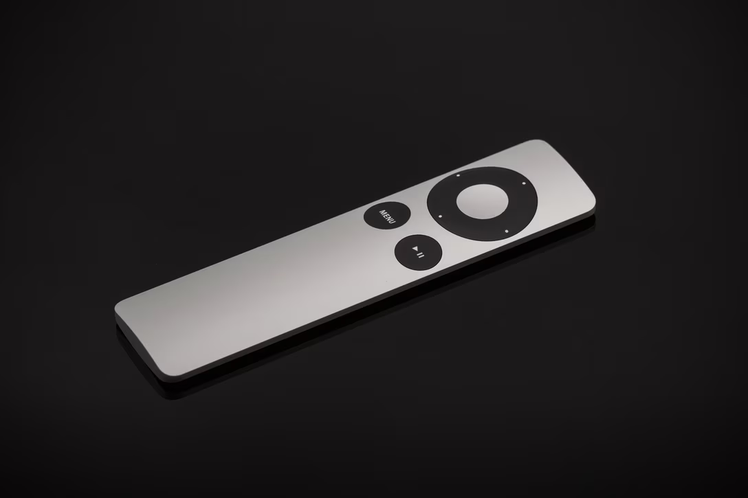
I have a confession to make. I prefer Apple TV’s 2015 remote:
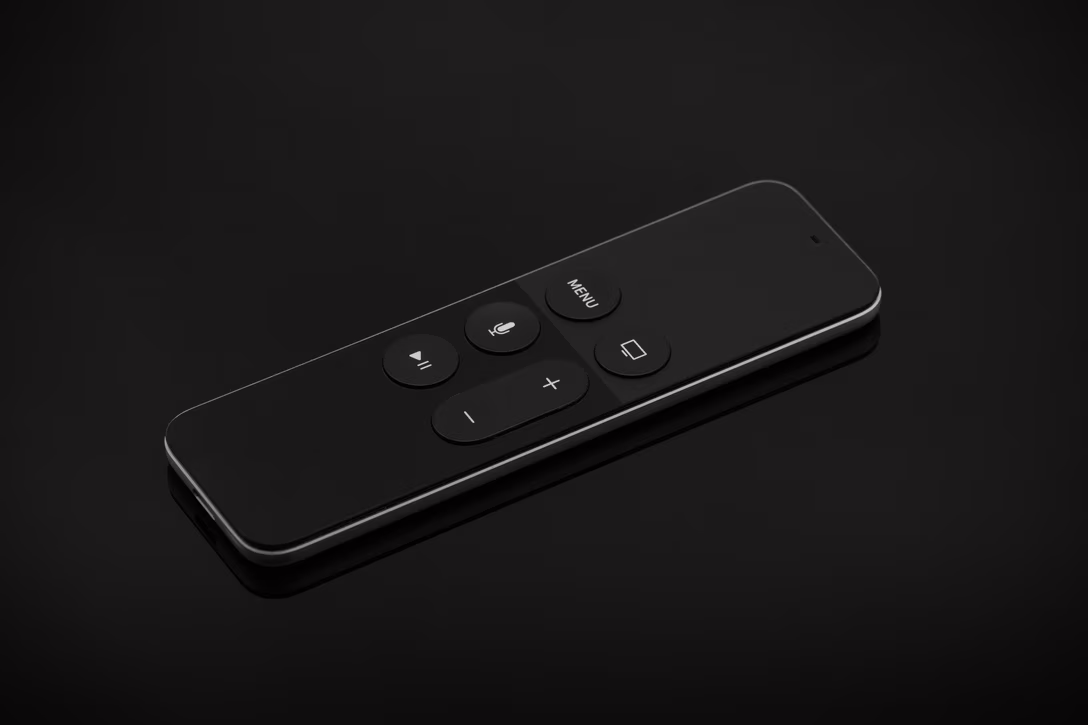
The remote was universally ridiculed for its “which way is up?” problem – too much vertical symmetry which didn’t give your hand enough cues to know whether you’re picking it up the right way or the wrong way.
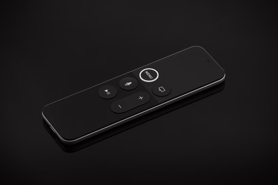
Apple tried a half-measure first; in 2017 they broke the symmetry by making the MENU button slightly distinct in visual and tactile ways. Hindsight is 4K, but I don’t think it had a chance of working – the tactile cues were too subtle, and the visual ones do not matter when you’re not looking:
So Apple overshot – the subsequent 2021 edition was a full-measure-and-then-a-half:
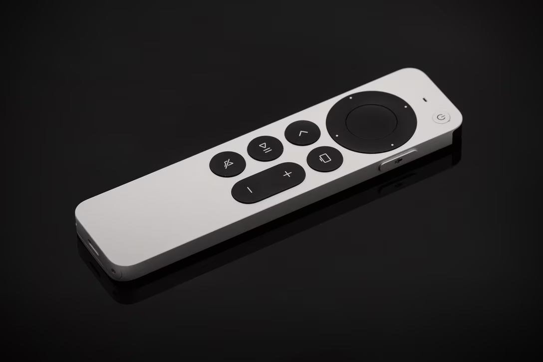
The remote shrank the touch surface but otherwise drastically increased the volume, and added four arrows, two new buttons, and a strange iPod-inspired clock wheel interaction on top. And to me it started feeling a bit complicated, inching toward the very TV remotes that earlier designs ridiculed. (It also wasn’t as pleasant to touch, as the buttons feel a bit rougher.)
But the reason I like the 2015 remote is primarily because it introduced one of my favourite gestures in recent history: tap to see progress.
It’s hard to describe how wonderfully light this interaction feels every time I use it. You just tap anywhere on the remote’s top half, you see where you are in the video via a subtle UI, and then wait a few second for it to disappear. After this, doing the same in every other player – YouTube, Netflix, HBO Max, anything on a Mac or even the iPhone – feels clunky and heavy. In many of them, you can’t even see were you are without stopping the video!
It gets better. Tap for the second time, and the elapsed time gets replaced by current time, and the remaining time by what the clock will say whenever you’re done watching. I thought this is delightful and clever, sneaking in clock functionality without showing it all the time.
There is also this really nice gestural separation. When you watch the video, taps and swipes are safe. Anything that is “destructive” – that is, causes the video to stop, or rewind, or fast forward, is on the “click” layer: press stronger on the center to pause, or on either side to move forward or back.
What I’m describing feels mechanically similar to other input devices, but the devil is in the details. On smartphones, everything is a tap, so you don’t really get anything lighter. On a Mac, tap as a gesture could only be available for people who opt in to press to click on their trackpad (like I do) – but the fact that tap is the default for clicking, means that can never realistically happen.
The Apple TV tap feels conceptually like Mac’s hover instead, but so much more pleasant and elegant and simple. (I want to prototype tap on a Mac as a lightweight “explainer,” showing tooltips there instead of on hover.)
To be fair, the tap gesture still exists in the still-current 2021 Apple TV remote, too – but the tap area is much smaller.
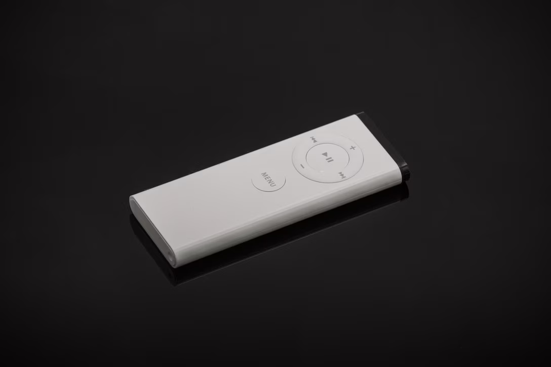
And just in case you were curious, these are the first two editions: the 2005 remote – shipped with the iMac, predating Apple TV – and the 2010 remote. (I’m referring to model years, because Apple’s own names are so confusing.)
I don’t have access to Apple’s user feedback, but I guess that Apple’s 2021 design was likely the very right thing to do. But looking at four-and-a-half of these models side by side, I am still in the 2015’s minimalistic, unusual, innovative corner.