Sets of overlapping circles
This is a design joke that always makes me laugh:

This was made by… someone, a while back, I believe in response to the Twitter logo redesign of 2012, which showed the new logomark as composed of exclusively circles:
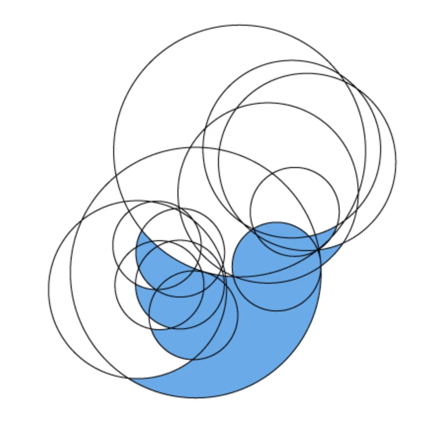
Now, to be clear: that Twitter logo redesign was gorgeous, and I do not particularly care if it was designed out of circles or whatever else. I don’t even think its announcement was presented in a overly pretentious way – it was nowhere near the 2008 bloviating Pepsi redesign or the rank amateurism of Yahoo’s new 2013 logo.
It’s just… design can be so pretentious and up its own golden-ratioed ass, and I can’t help but love anything piercing that bubble. (In my perfect, naïve world, Doug Bowman – the designer behind the logo – also finds the joke hilarious!)
Also, I feel like design is just not… funny, all that often. Quick, think of any product design joke.
See what I mean?
I can’t, either. My favourite graphic design joke is “if it’s big and ugly, it’s not big enough.” (You know, it’s funny because it’s sad.)