Software proprioception
There are fun things you can do in software when it is aware of the dimensions and features of its hardware.
iPhone does a cute Siri animation that emanates precisely from the side button:
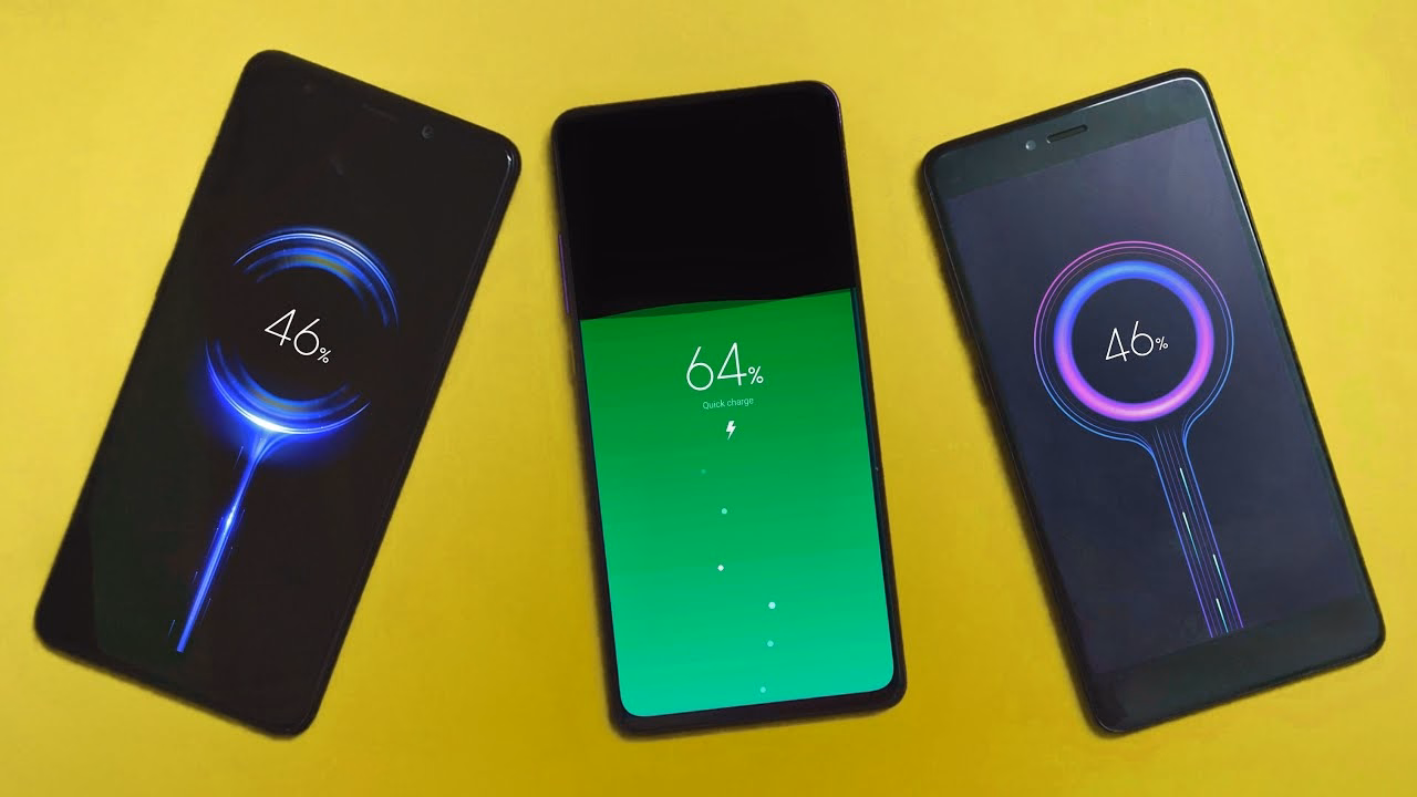
A bunch of Android phones visualize the charge flowing to the phone from the USB port…
…and even the whole concept of iPhone’s Dynamic Island is software cleverly camouflaging missing pixels as a background of a carefully designed, ever morphing pill.
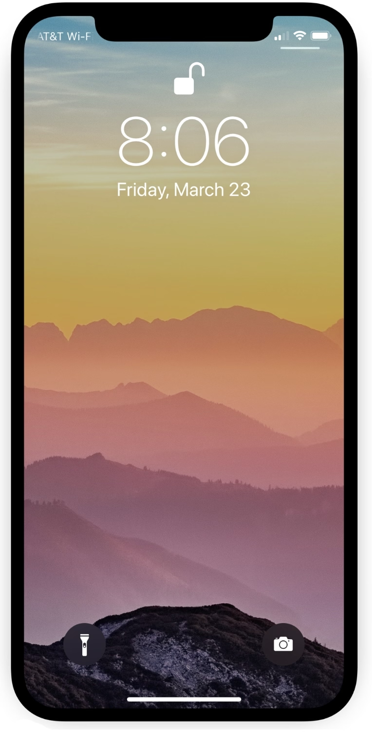
But this idea has value beyond fun visuals. iPhone telling you where exactly to tap twice for confirming payment helps you do that without fumbling with your phone to locate the side button:
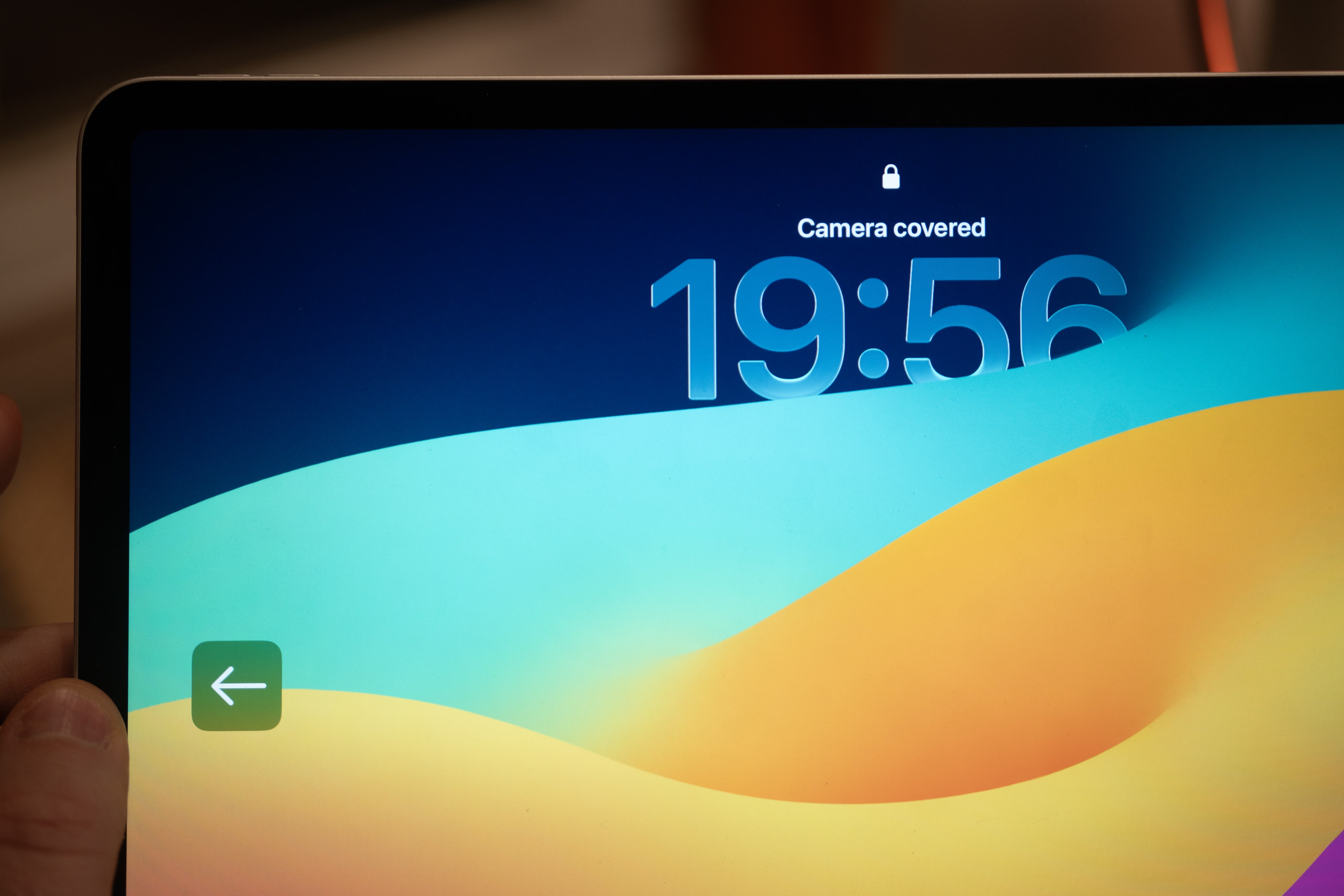
Same with the iPad pointing to the otherwise invisible camera when it cannot see you:
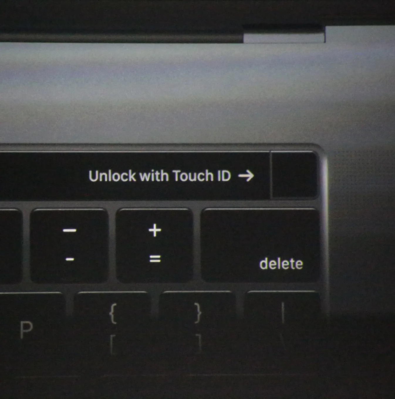
Even the maligned Touch Bar also did something similar for its fingerprint reader:
The rule here would be, perhaps, a version of “show, don’t tell.” We could call it “point to, don’t describe.” (Describing what to do means cognitive effort to read the words and understand them. An arrow pointing to something should be easier to process.)
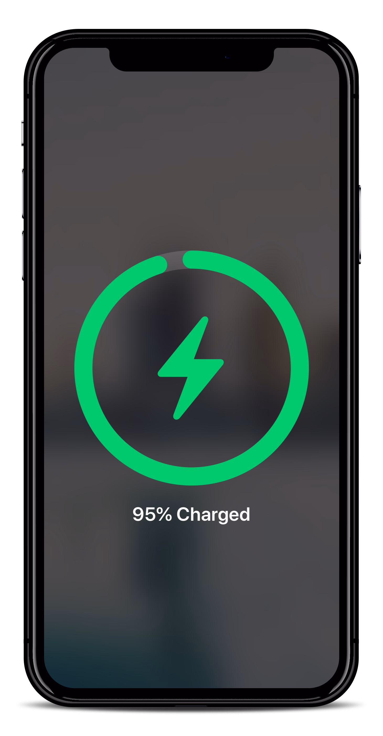
You could even argue the cute MagSafe animation is not entirely superfluous, as over time it helps you internalize the position of the otherwise invisible magnets on the other side of your phone:
In a similar way, as it moved away from the home button, iPhone X introduced light bars at two edges of the screen – one very aware of the notch – as swiping affordances:
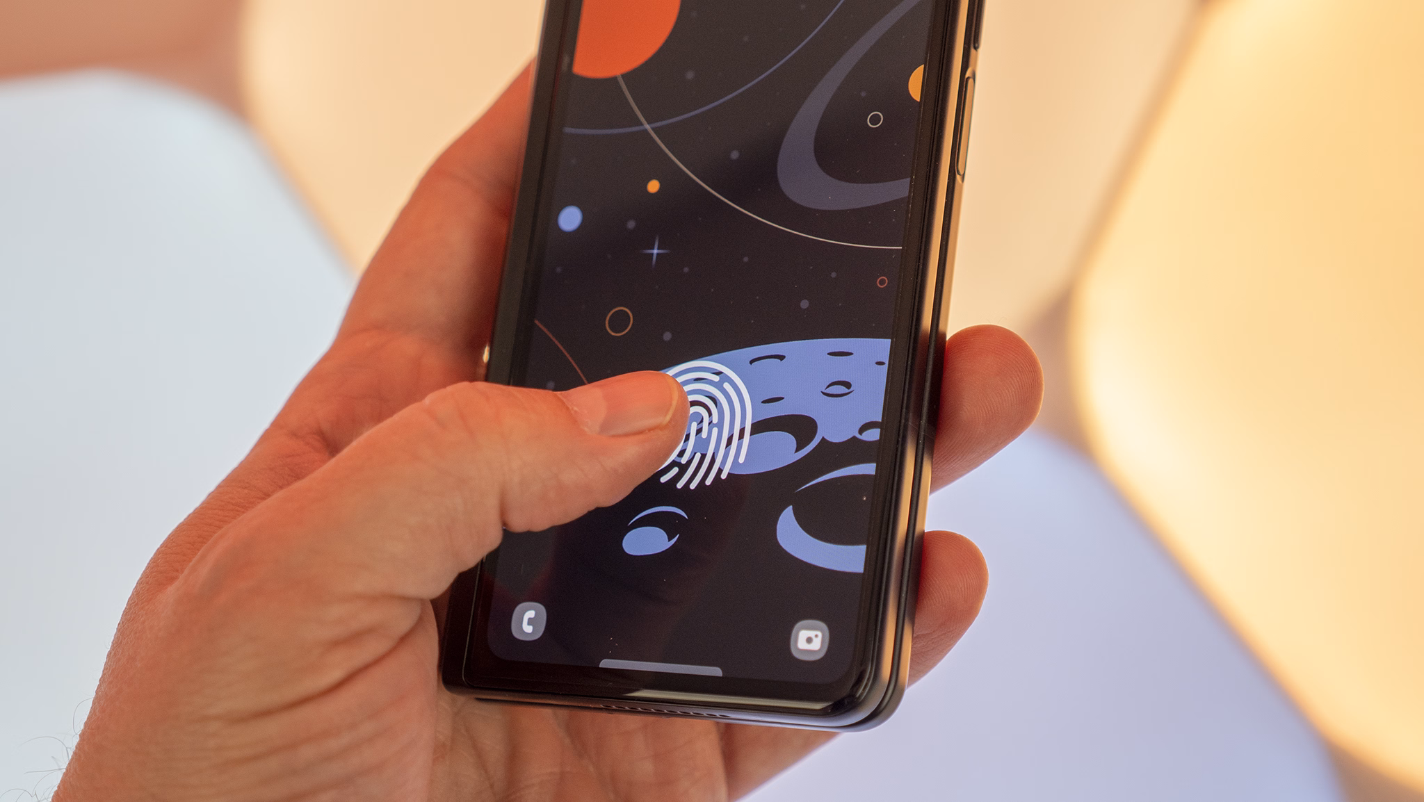
And under-the-screen fingerprint readers basically need a software/hardware collab to function:
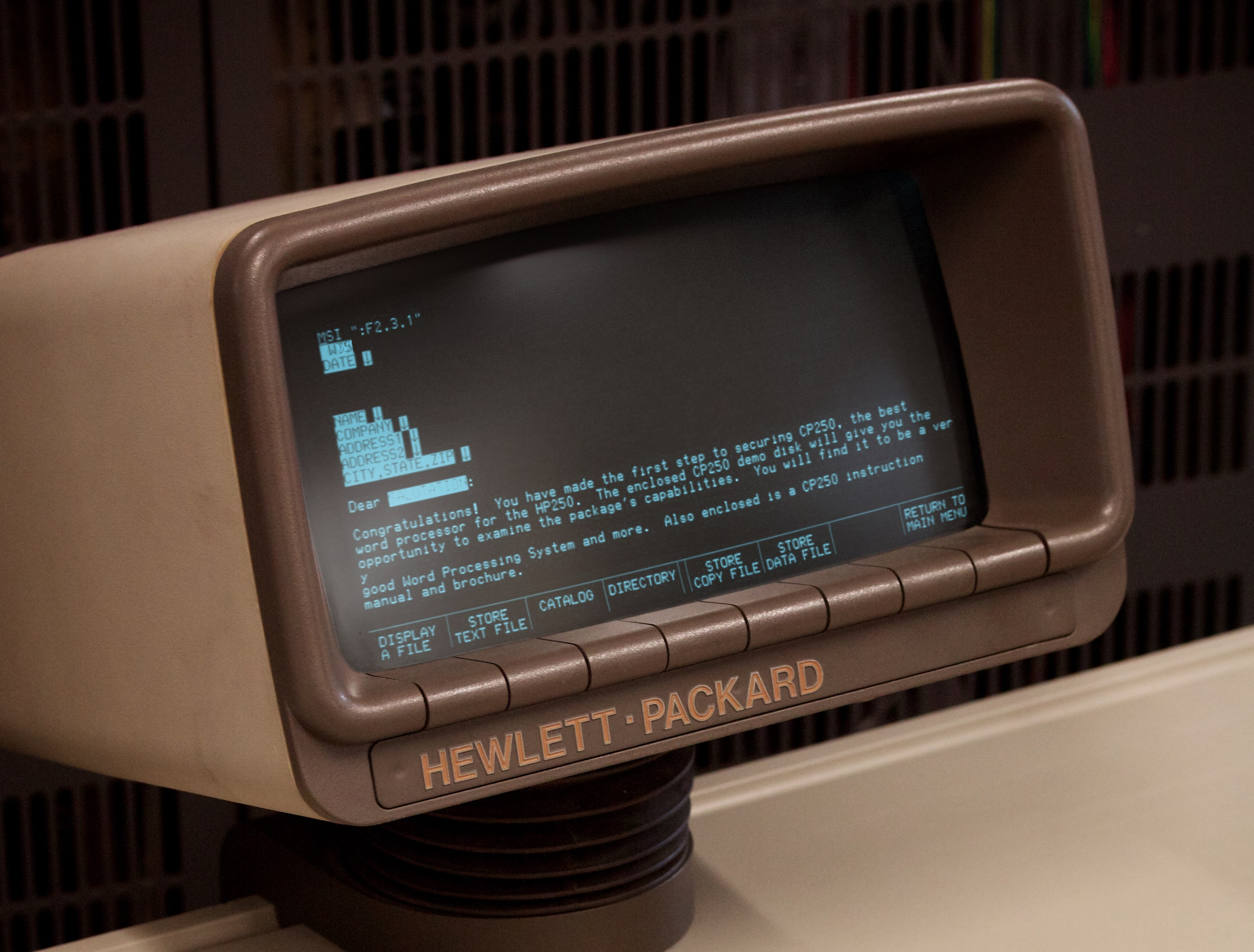
One of my favourite versions of this kind of integration is from much earlier, where various computers helped you map the “soft” function keys to their actual functions, which varied per app…
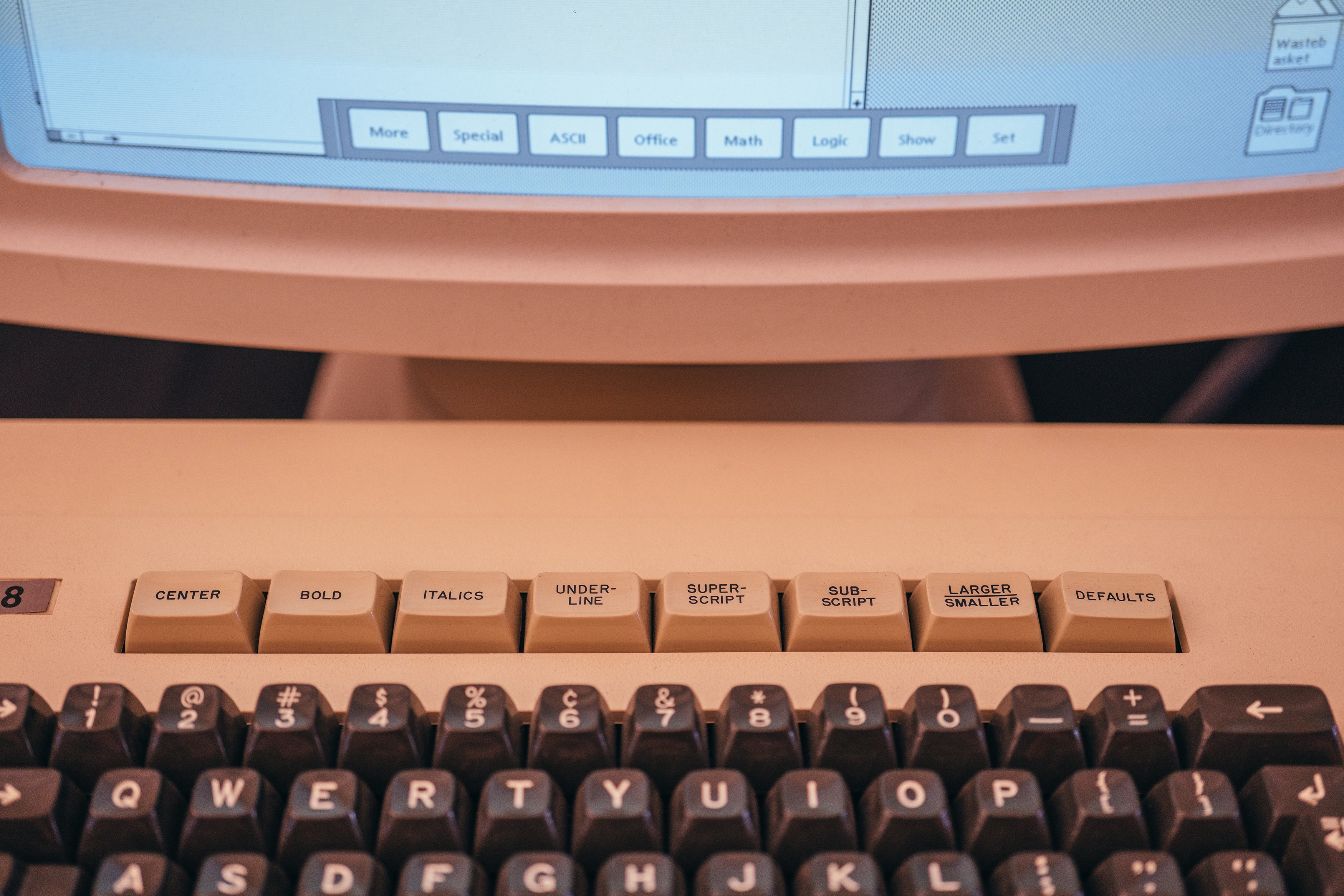
…and the famous Model M keyboard moving its keys to the top row helped PC software do stuff like this more easily:
(And now I’m going to ruin this magical moment by telling you the cheap ATM machine that you hate does the same thing.)
The last example I can think of (but please send me your nominations!) is the much more sophisticated and subtle way Apple’s device simulator incorporates awareness of the screen’s physical size and awareness of the dimensions of the simulated device. Here’s me using the iPhone Simulator on my 27″ Apple display. If I choose the Physical Size zoom option, it matches the dimensions of my phone precisely. The way I know this is not an accident is that it remains perfectly sized if I change the density of the whole UI in the settings.
Why am I thinking about it all this week?
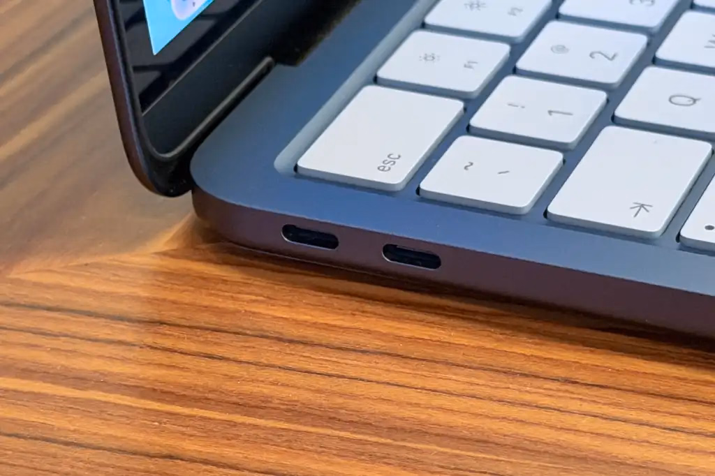
The new MacBook Neo was released with two USB-C ports. Only one of the ports is USB 3, suitable for connecting a display, an SSD, and so on. The other port’s speeds are lower, appropriate only for low-throughput devices like keyboards and mice.
To Apple’s credit, macOS helps you understand the limitations – since the ports look the same and the USB-C cables are a hot mess, I think it is correct and welcome to try to remedy this in software. It looks like this, appearing in the upper right corner like all the other notifications:
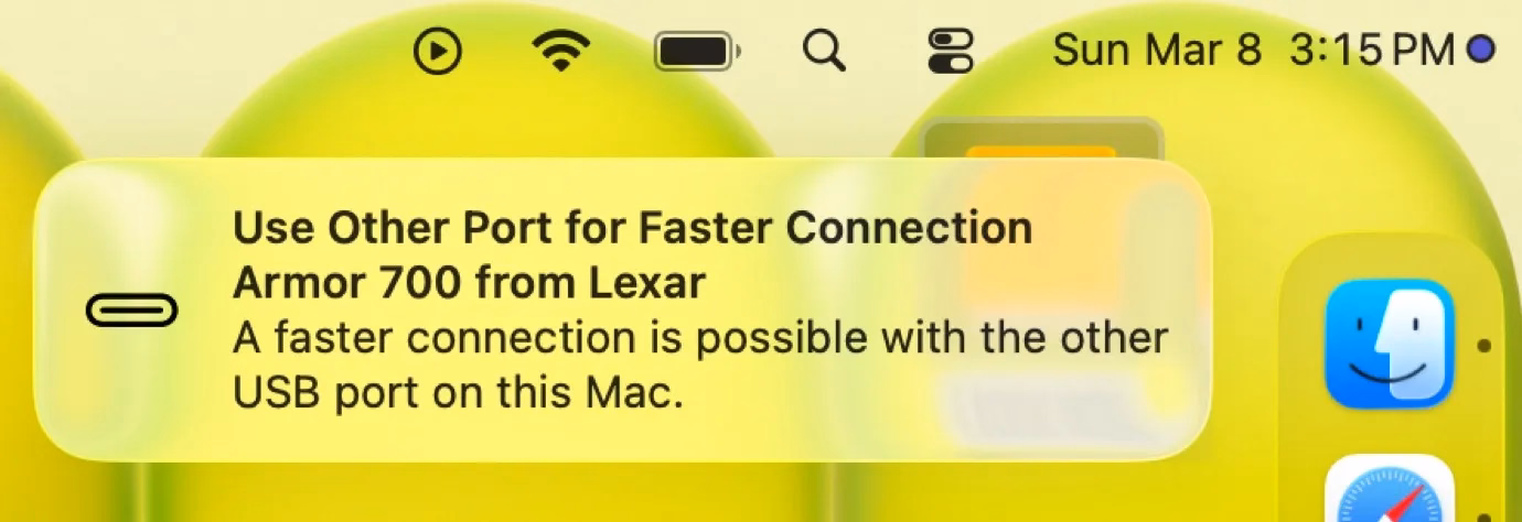
I think this is nice! But it’s also just words. It feels a bit cheap. macOS knows exactly where the ports are, and could have thrown a little warning in the lower left corner of the screen, complete with an onscreen animation of swapping the plug to the other port – similar to what “double clicking to pay” does, so you wouldn’t have to look to the side to locate the socket first.
“Point to, don’t describe” – this feels like a perfect opportunity for it.