Tactical dark modes
Before dark mode became mainstream in the late 2010s, there were two main customers of dark UI themes: programming and photo/video production. But, to the best of my knowledge, they arrived at that preference from two very different angles.
Programmers’ fondness for dark mode was a result of decades of bad display technologies. The early CRTs were so awful, the burn-in risks so real, and the pixels so fuzzy and headache-inducing, that you wanted to see as little screen light up as possible – hence, defaulting to black background for everything computers did.
These challenges were there all the way through the 1980s, really, teaching generations of coders that computers meant light letters on dark backgrounds. Games moved away from being “in space” or “at night” as quickly as they could, text editing and spreadsheets went for paper-like livery soon after that, but programming never meaningfully existed on paper, and so the skeuomorphic pull wasn’t really there.
(Have you ever heard of a term “reverse video”? What’s kind of confusing about it is that its meaning was reversed around that time.)
AV professionals took a different route. They already had CRT calibration, gray walls, and monitor hoods so that light from outside wouldn’t contaminate content colors – and when computer UI started appearing on those CRTs, it was likewise best to keep it as dark and as neutral as possible.

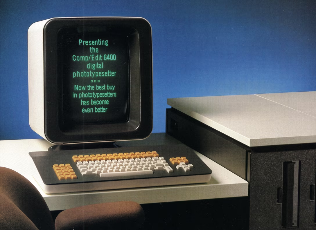
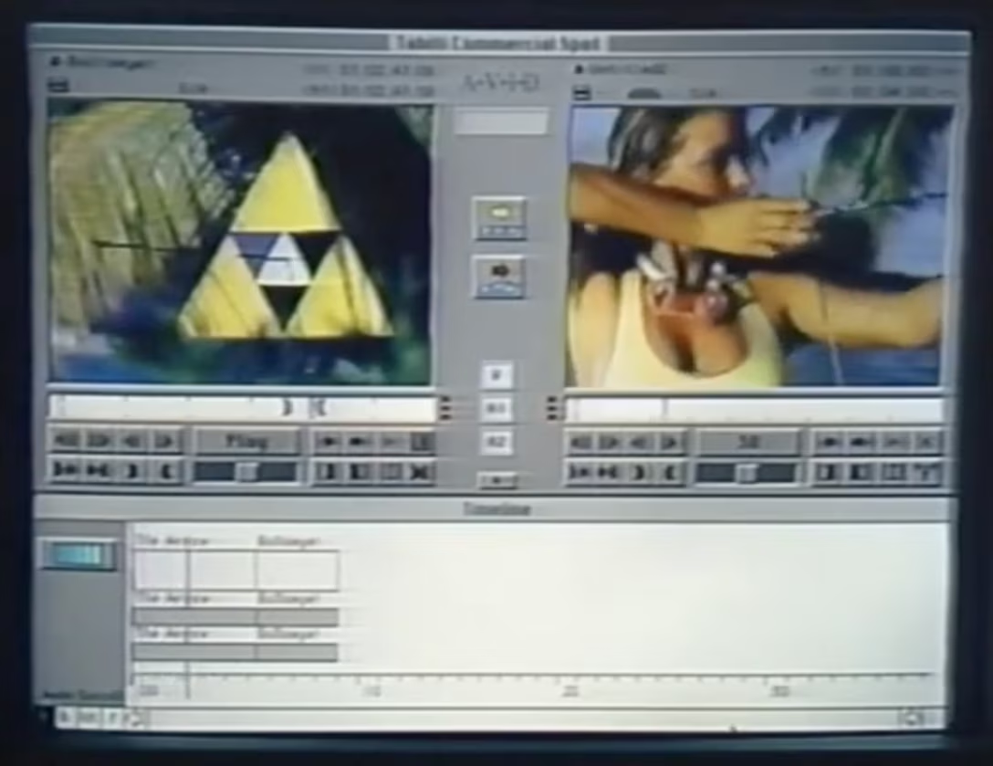
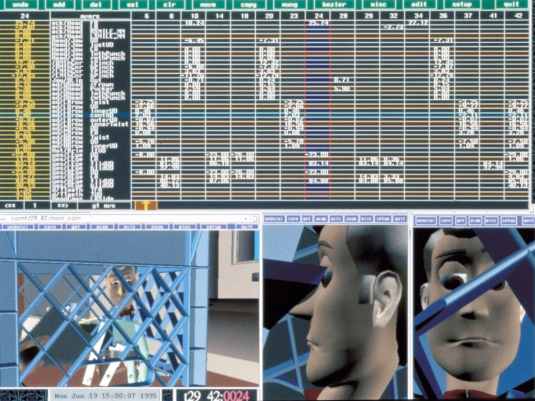
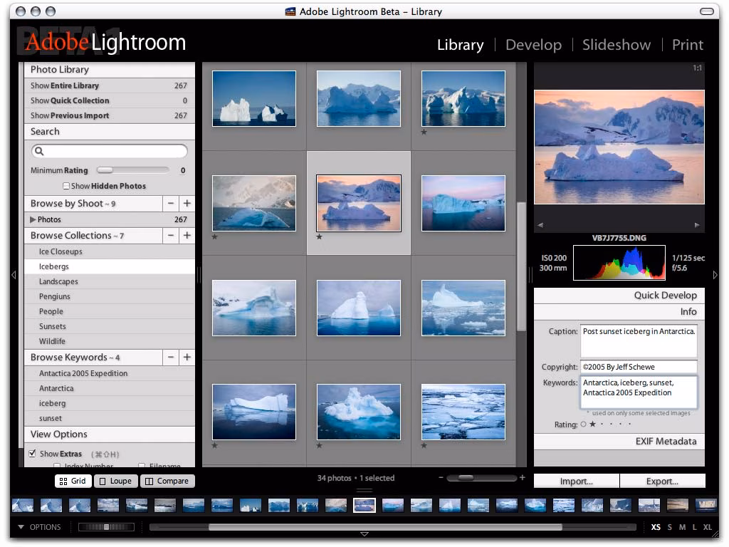
Below are pictures of Avid Composer in 1990, Pixar’s RenderMan in 1995, and the first versions of Lightroom in 2006 where you can see the interface trying to at least gesture toward a dark theme:
Today, things are more flexible. Many people prefer one theme over the other for any of many legitimate reasons, most leave dark theming synced to daylight, and display technology can handle all themes so well that it jumped ahead of our brains, which still have some interesting asymmetries in processing light shapes next to dark ones.
As users celebrated dark mode appearing in popular apps and services in the 2010s, some had to catch up the other way: Apple TV added light mode (for some reason) in 2017, and Affinity apps celebrated new light UI option just earlier this year.
Most programming text editors still default to dark, but allow you to switch; as a software category they were probably the first to fully embrace color theming.
But what led me to writing this post was a delightful discovery today of this setting:
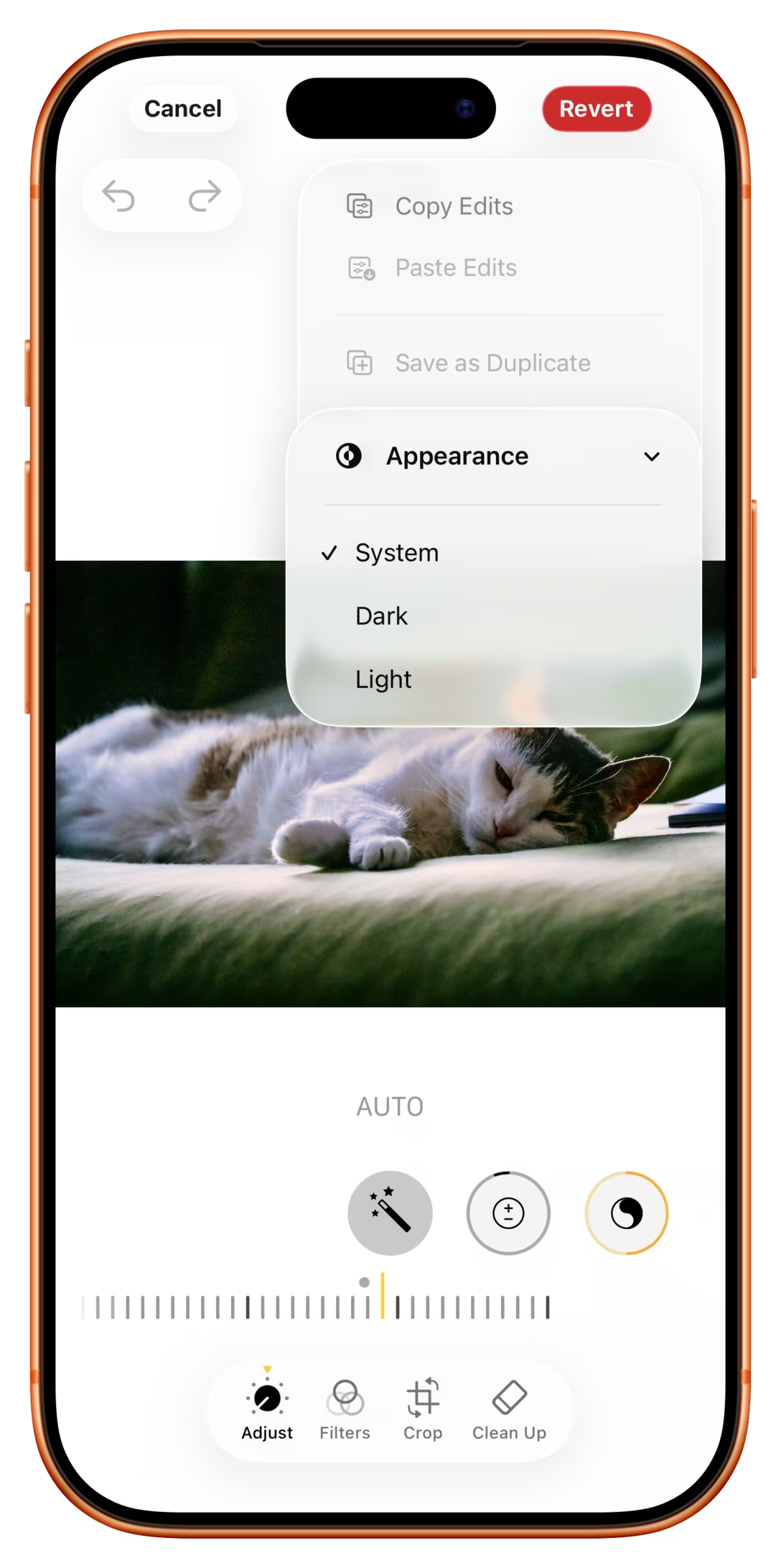
Why, of all apps, would iOS Photos allow you to switch to dark mode, and only while editing to boot?
I think this might be because of the above tradition of pro AV apps, where we learned it’s good for visuals to be surrounded by black; a little nod to its earlier professional roots – similar, perhaps, to the story of the Clear button in calculators.
But I had two more thoughts. First, for all the reasons above, to me at least dark mode still has connotations of “professionalism” and toggling the option makes me feel I’m a bad-ass pro whenever I’m editing a photo. I wonder if others also feel that way, too.
Second, dark mode looks different. Dark UI only when editing means it’s easier to spot whether I’m editing or just browsing, and be ever so slightly better oriented.
(In general, apps today are much more similar-looking, and I’m surprised neither iOS nor Android doesn’t allow you to switch the theme per app, just so it’s easier to know where you are as you move around quickly.)