A few years ago, I suggested adding a new interaction to Figma. If your text cursor was on a misspelled word (anywhere inside, or the edges), you could press Tab to quickly accept the suggested correction, without even seeing it:
Independently, Google Docs approached it from a slightly different angle, but landing on a similar interaction – in their version there’s a small visual callout, although you can still press Tab (and then Enter) to accept the suggestion:
I know the Tab key has a lot of jobs – from indenting bullet points to jumping through GUI elements – but in this context this new addition doesn’t seem to be in conflict.
(Should I write a long photoessay about the Tab key, similar to the ones I wrote for Return/Enter and Fn keys?)
Since we added it, I’ve really loved how it feels. From various typeaheads and autocompletes elsewhere, Tab has a strong “forward movement” energy so it makes conceptual sense, and it’s just really fun to go around and quickly fix your writing this way.
I think a lot about how to make keyboard interactions feel superpower-y: a good keyboard shortcut on a large key, a tight interaction, a blink-of-an-eye velocity – something that’s eminently designed to lodge itself in your motor memory as quickly as possible, as it builds on top of prior motor memory. I’m biased, of course, but I like the “no scope” Figma version more, and it has that feeling to me.
…but where I thought it really shone was the first iPods:
This was perhaps the most fun you could ever have navigating a hierarchy of things; it made sense what left/right/up/down meant in this universe, to a point you could easily build a mental model of what goes where, even if your viewport was smaller than ever.
It was also a close-to-ideal union of software and hardware, admirable in its simplicity and attention to detail. This is where Apple practiced momentum curves, haptics (via a tiny speaker, doing haptic-like clicks), and handling touch programmatically (only the first iPod had a physically rotating wheel, later replaced by stationary touch-sensitive surfaces) – all necessary to make iPhone’s eventual multi-touch so successful. And, iPhone embraced column views wholesale, for everything from the Music app (obvi), through Notes, to Settings.
Well, sometimes you don’t appreciate something until it’s taken away. Here are settings in the iOS version of Google Maps:
I am not sure why the designers chose to deviate from the standard, replacing a clear Y/X relationship with a more confusing Y/Z-that-looks-very-much-like-Y. They kept the chevrons hinting at the original orientation – and they probably had to, as vertical chevrons have a different connotation, but perhaps this was the warning sign right here not to change things.
I think the principle is, in general: if you’re reinventing something well-established, both of your reasoning and your execution have to be really, really solid. I don’t think this has happened here. (Other Google apps seem to use standard column view model.)
Connecting to public wi-fi networks with their captive portals is always a bit of a wonky proposition, and nothing makes public wi-fi wonkier than using it on a plane.
I believe that the resurgence of https made things harder – if the captive portal doesn’t kick in, no secure traffic can happen – and over time I just started remembering that “captive.apple.com” is a reliable HTTP-only destination to visit.
But I noticed this week that United’s onboard wi-fi network is called “Unitedwifi.com” as a reminder where to go once you are connected, to avoid that problem. I thought this was a nice touch.
Software engineering has long had a concept of “premature optimization” – overbuilding things too early in anticipation of future that might or might not come.
I feel design has a version of that, too. Here’s viewer menu hierarchy in Google Drive:
One should always feel very uneasy about a menu with just one item, like Insert here. Even within the View menu, one could imagine streamlining all the commands to be in one main menu, rather than two tiny submenus (coupled with pretty excessive width that makes for an interaction that feels like walking a tightrope).
These are the menus for a PNG image. It’s entirely possible other file types offer more options and this menu structure earns its keep then, paying off in consistency over a long run – but I tried a few file formats, and the menus all looked similarly sparse.
As a counterpoint, here’s an example I just spotted in the context/right-click menu in Apple’s Notes:
When you have one device, the three options get appended to the ground floor of the menu. But if you have more than one, they all get ejected into a submenu.
I like this soft consistency of introducing hierarchy only when it’s needed – or in reverse, flattening/streamlining it as necessary.
I have mixed feelings about this one particular use, however. This menu is already very long (and seemingly abandoned – look at table and checklist and link options), so in this case perhaps a consistent submenu would be overall better. Also, the “Insert from iPhone and iPad” label is long and makes the entire menu slightly wider.
But as a pattern, it’s worth considering. (Just for completeness’s sake, you could also half-streamline by adding a submenu for the iPhone and another one for the iPad. But in this particular case, it’d also likely be a bad idea.)
…and I wanted to share a response by Nikita Prokopov, because he had a great point about those Dropbox Paper placeholders that I didn’t consider:
For me it’s […] confusing placement. Like if somebody writes “Have a nice day” on a door instead of “Push” or “Pull”. I don’t mind seeing “Have a nice day” message somewhere neutral, in a place not occupied by any other function, but not where I expect very specific help.
I was reminded of Prokopov’s comment when I saw this at the airport yesterday:
I remember, eons ago, how impressed I was when one of the Chrome designers was telling me how all of these error pages were specifically designed to feel like liminal spaces and notlike destinations. These were, in a way, placeholder content.
But “Press space to play” feels like a strange thing to put in here. (Previously, the message said “No internet” or “There is no Internet connection.”) I understand that this is Chrome’s popular mascot, but this is still an error page whose purpose is to tell me what’s wrong, rather than serve as an entry point to a minigame.
Also, just a few days ago, I just stumbled upon this fun example of a placeholder collapse – where a temporary text becomes permanent:
If you are curious, this is what it looks like if you don’t forget to set the message. And funnily enough, given where we started, it says “Have a nice day”:
I feel like social media and recently the slate of AI-powered “tell me what’s here” features continue to show us the power and longevity of screenshots. After all, nothing beats a more or less approachable shortcut and a file format that works literally everywhere.
But screenshots have issues, and I liked how Bear (a note-taking app) brilliantly integrated OCR inside images into its flows. This just worked for regular ⌘F finding without me having to do anything:
The recognized text also appears when you search through notes, and so on. It’s just a great peace of mind that you’re not going to miss on text just because you happened to screenshot it.
Apple operating systems have had detection of text inside images for a while – I know on iOS in particular it sometimes gets in a way of normal gestures – so I thought it was just that, but curiously this doesn’t work as nicely in Apple’s own Notes.
To be fair, I am traveling and haven’t looked for solid evidence or citation that this works for people, but I personally like this approach: in lieu of a separate language selector button, each option here itself is both a language selector and a commit button.
The labels themselves are not the name of the language, but a call to action; I imagine recognizing the one label that means something to you should be easy if the other nine look like gibberish.
And, a thoughtful moment by one exhibit: Not only showing you where you are in the sequence of three videos, but even within the currently-playing video.
This is a typical iOS Gmail dialog that allows you to snooze an email so it resurfaces later:
If you invoke that function on an email that’s an order receipt, a new option appears:
It’s great to see this clever and thoughtful button which is likely the best option here. But:
It reshuffles everything else, preventing motor memory from building. At this point, you can no longer rely on “bottom left” to always be “custom date,” and so on with other buttons. (One idea would be to put it at the back but draw attention to it visually, or at least make it span the entire row.)
It doesn’t show you the inferred date, even though there already is a precedent for doing that – especially important here as the feature seems to be powered by AI, which can get things wrong.
The icon heavily promotes the AI association, which is not that useful. It would probably be better to show a truck or some other visual signifier of “delivery.”
The search for the strangest Adobe setting continues in Lightroom, where the first option in the Interface section is… end marks:
Presently, only one option is there…
…but at least back in 2012 there were many more:
What does it do? It adds an old-time’y glyph at the end of either left or right panel.
The internet is rife with people perplexed by this option and I cannot deny – I’m one of them. (The title of this post is a reaction of one of the users.) It feels like such a peculiar way to add delight.
You are not limited to the pre-existing (one) flourish, as you can upload your own. Some people add a logo of their production studio, but John Beardsworth found a more creative use:
Alternatively, with a tiny bit of imagination you can exploit an often-forgotten detail of Lightroom’s interface – the “panel end marks”. These decorations at the bottom of Lightroom’s panels have often been derided as a waste of programming time, but in fact they can be made to serve more than their somewhat-trivial purpose. And as you can see in the examples on this page, they can serve as a reminder of star ratings, colour labels and even keyboard shortcuts for flags.
This is a fascinating hack, and an example of William Gibson’s famous “the street finds its own uses for things.” It made me curious why didn’t onscreen interfaces ever evolve to allow you to annotate them easily? You see stuff like this a lot in real life…
…but the Lightroom end mark hack is the only thing that comes to my mind where an onscreen UI got this kind of a treatment – and the feature wasn’t even intended for that use.
I think about some aspects of interface design as sugar.
This is how you adjust the photo in Photos app in the previous version of iOS:
And this is the same view in the current version:
The difference is in the delayed/animated falling of the notches.
I don’t think it’s great. It’s “delightful” in a rudimentary and naïve sense, but like sugar, you cannot just add it to your daily diet without consequences. This extra animation serves no functional purpose, and the sugar high wears off quickly. What remains is constant distraction and overstimulation, the feeling of inherent slowness, and maybe even a bit of confusion.
It pairs nicely with the previous post about avoiding complexity and rewarding simplicity. I often see this kind of stuff as related to designer’s experience. Earlier on in your career, you are proud you’ve thought about this extra detail, you’ve figured out how to make this animation work and how to fine-tune the curves, and you’ve learned how to implement it or convince an engineer to get excited about it.
Later in your experience, you are proud you resisted it.
MKBHD’s Waveform podcast (audio or video) sometimes has a fun “Did they even test this?” section. This week, for the first 12 minutes, the team was ranting about various volume controls – a meandering conversation that I also found just very enjoyable.
But then some research revealed that about 20 years ago, Chrysler decided to try to find the perfect volume interval, one that would result in meaningful difference in sound level without going too far. After much experimentation, they decided that 38 discrete volume settings provided the perfect amount of adjustability—not too fine, not too coarse. So the decree went out across the company that all stereos should go to 38.
However, no citation is given, and I couldn’t find any more information about it.
The one thing the group missed in their discussion is “why even show a number”? I think it helps people in remembering their preference, especially if they share a car with someone else. Remembering that “my volume number is 17” can be helpful, even if it feels a bit clunky.
When volume controls were physical, I believe if they didn’t have a number, they at least had a certain amount of notches so you could remember the nearest notch you liked:
Keynote is an app that could use something like that. At this very moment, I am trying to unify the volume of various clips across slides for an upcoming presentation, and having to use environmental cues like “between Edit Movie below and the rewind button above”:
I have been at times frustrated by cute placeholder text in places, most notably Dropbox Paper, which still puts them in a just-created doc…
…and in new to-do items:
This bothered me for two reasons.
First was a potential tone mismatch. What if you are writing a layoffs announcement, a project cancellation doc, or something personal and heartfelt? At Medium back in the day, at some point we added a fun celebratory dialog after publishing that said something like “Now, shout it out from the rooftops!” We took it down very quickly as people made us realize Medium is used to write many kinds of things we didn’t anticipate, and in those situations the cutesy message really failed to read the room.
But the other half of my frustration with Paper was that it felt like the app was making itself too comfortable in my space, in effect shouting all over my inner voice and distracting me. I felt like any app giving you a creative canvas should back off of that canvas unless it’s explicitly invited to participate.
The researchers asked participants to fill in an online survey with questions about hot-button social and political issues. Some were prompted with an AI autocomplete answer that was deliberately biased toward one side of the issue. For example, participants who were asked whether they agreed that the death penalty should be legal might receive an AI suggestion that disagreed.
Across all the different topics in the survey, participants who saw the AI autocomplete prompts reported attitudes that were more in line with the AI’s position—including people who didn’t use the AI’s suggested text at all. Overall, the study participants who saw the biased AI text shifted their positions toward those espoused by the AI.
Interestingly, the people in the study didn’t tend to think the AI autocomplete suggestions were biased or to notice that they had changed their own thinking on an issue in the course of the study.
…and elaborates on how adding warnings didn’t really help:
The Warning and Debrief messages failed to significantly reduce the attitude shift, which is concerning because they were also inspired by those used in real AI applications. AI tools such as ChatGPT show brief and general statements about AI’s propensity to hallucinate false information (e.g., “ChatGPT is AI and can make mistakes. Check important info.”), similar to the messages used in our interventions.
I know on this blog I often focus on the mechanics of interactions, but the job of every designer is to think of more than that. I keep coming back to both pull-to-refresh and infinite scroll mechanics. Both can be put to good use and feel “delightful,” but both started being abused so much that it led to their respective creators disowningthem.
There are fun things you can do in software when it is aware of the dimensions and features of its hardware.
iPhone does a cute Siri animation that emanates precisely from the side button:
A bunch of Android phones visualize the charge flowing to the phone from the USB port…
…and even the whole concept of iPhone’s Dynamic Island is software cleverly camouflaging missing pixels as a background of a carefully designed, ever morphing pill.
But this idea has value beyond fun visuals. iPhone telling you where exactly to tap twice for confirming payment helps you do that without fumbling with your phone to locate the side button:
Same with the iPad pointing to the otherwise invisible camera when it cannot see you:
Even the maligned Touch Bar also did something similar for its fingerprint reader:
The rule here would be, perhaps, a version of “show, don’t tell.” We could call it “point to, don’t describe.” (Describing what to do means cognitive effort to read the words and understand them. An arrow pointing to something should be easier to process.)
You could even argue the cute MagSafe animation is not entirely superfluous, as over time it helps you internalize the position of the otherwise invisible magnets on the other side of your phone:
In a similar way, as it moved away from the home button, iPhone X introduced light bars at two edges of the screen – one very aware of the notch – as swiping affordances:
And under-the-screen fingerprint readers basically need asoftware/hardware collab to function:
One of my favourite versions of this kind of integration is from much earlier, where various computers helped you map the “soft” function keys to their actual functions, which varied per app…
…and the famous Model M keyboard moving its keys to the top row helped PC software do stuff like this more easily:
(And now I’m going to ruin this magical moment by telling you the cheap ATM machine that you hate does the same thing.)
The last example I can think of (but please send me your nominations!) is the much more sophisticated and subtle way Apple’s device simulator incorporates awareness of the screen’s physical size and awareness of the dimensions of the simulated device. Here’s me using the iPhone Simulator on my 27″ Apple display. If I choose the Physical Size zoom option, it matches the dimensions of my phone precisely. The way I know this is not an accident is that it remains perfectly sized if I change the density of the whole UI in the settings.
Why am I thinking about it all this week?
The new MacBook Neo was released with two USB-C ports. Only one of the ports is USB 3, suitable for connecting a display, an SSD, and so on. The other port’s speeds are lower, appropriate only for low-throughput devices like keyboards and mice.
To Apple’s credit, macOS helps you understand the limitations – since the ports look the same and the USB-C cables are a hot mess, I think it is correct and welcome to try to remedy this in software. It looks like this, appearing in the upper right corner like all the other notifications:
I think this is nice! But it’s also just words. It feels a bit cheap. macOS knows exactly where the ports are, and could have thrown a little warning in the lower left corner of the screen, complete with an onscreen animation of swapping the plug to the other port – similar to what “double clicking to pay” does, so you wouldn’t have to look to the side to locate the socket first.
“Point to, don’t describe” – this feels like a perfect opportunity for it.
This iPhone UI for dark/light theme is doing something clever:
Ostensibly, there are two modes here:
automatic, for when you want the theme to match the time of day
manual, for when you want to keep one of the themes forever
But check out what happens when I am in automatic mode, but toggle the theme by hand anyway:
More rigid or less thoughtful interfaces would either disable manual changes when you’re in automatic mode, or understand a manual theme switch to mean “I want to turn off automatic.”
But here, iOS is quietly putting me in a temporary hybrid mode: a manual theme override until the theme catches up with what automatic mode would do, at which point it snaps back (I’m resisting very hard calling this rubber banding) to automatic mode.
What I think is clever is that this isn’t presented as a third mode – which could be more confusing than helpful – but the design simply reuses the existing Options field to set the expectations.
One has to be careful designing in shades of gray; once you enter the space you really have to commit to it and see it through. My go-to analogy is symmetry vs. asymmetry. Symmetry in visual design is usually easier and safer. If you venture into asymmetry you have to make an effort to make it work. The highs of asymmetry will be higher than anything symmetry can provide, but getting to those highs can be arduous and sometimes might even be impossible.
I thought this particular example was really nicely done and the team found a great balance. (I think Apple’s previous shade of gray – “Disconnecting Nearby Wi-Fi Until Tomorrow” – ended up slightly less successful.)
I just stumbled upon a nice little power-user innovation in Chrome’s Web Inspector.
In Safari, and previously in Chrome, when editing CSS properties, you’d get a usual editing typeahead for the property name, and then the same on the other side for the property value.
In newer versions of Chrome, the typeahead menu works as before on the right side. However, the menu on the left side also includes the right side.
I think this is really clever in this context – not just to speed you up, but also to aid understanding. Just like the inert mouse up and down in the previous post could serve as a safe “peek” into the values, this new interaction can quickly allow you to explore the CSS space if you are curious, or if you only lightly remember part of the name, or even just one of the values.
This blog is authored in Apple Notes, and some time ago Notes added quick linking via typing >>, and that has a similar effect: The interactions are so nimble and precise that it is very easy to link to something, but a nice side effect is that it also feels very welcoming just to type a few letters to remind yourself of a title of an article, and then cancel out.
The downside of the Chrome change is, well, more stuff matching, but I think the audience for this UI is going to be okay with that.
I know we’re probably collectively a bit tired talking about macOS Tahoe, but I just noticed something that I think is a good example of how small details can ladder up to bigger things.
This is macOS Sequoia (the pre-Tahoe release) and a typical pop-up button:
One clever thing macOS has been doing since basically the dawn of GUIs is that upon clicking on a button like this, the currently selected row will be in the same place as before you clicked. (As opposed to, for example, the entire menu appearing below like it would from a top menu bar.)
This has interesting and often underappreciated consequences. It allows you to orient yourself quicker since you don’t have to find the selected option again. And, it saves you movement overall: the next or previous option will always be at the absolutely shortest possible distance. (Of course, the approach also has some challenges,for example if the button is positioned close to the top or bottom of the screen.)
There’s another clever thing that happens throughout macOS: All the menus work using a classic click-to-open and click-to-select sequence, but they are also usable via the slightly more advanced, but faster mousedown-drag-mouseup gesture.
These building blocks work together and mean that selecting the next option can be as simple as a little flick of a mouse.
Now, check out macOS Tahoe (current release):
You will notice that iCloud Drive, upon clicking, is now misaligned both horizontally and vertically.
On the surface, this feels just like a visual blemish – slighly embarrassing, but without much consequence. But check out what happens if you hold your mouse button at a certain position, and then release it without moving:
The stability of macOS’s interface and the thoughtful set of aforementioned rules allowed for an emergent fast behaviour: mouse down and up meant you could “peek” into a menu safely, or you could change your mind right after seeing what’s inside. In a bigger sense, it created a certain trust between you and the operating system: it’s worth learning those gestures, as they will be rewarded.
In Tahoe, some of that learned behaviour – by the way, I see it in all of these buttons, not just this one – will now work against you. Now, you can accidentally change an option without intending to do so.
Is it a big deal? No, not really. This likely – hopefully! – simply fell through the cracks in a rush to get Liquid Glass out the door, rather than no one being there to care, or no one understanding that all these gestures add up in aggregate, creating a GUI that feels fast, trustworthy, and catering to your motor memory in a way that elevates your experiences with the interface in the long run.
But I’d feel better if it wasn’t almost half a year since the release, and if we hadn’t already seen other things exactly like it.
One of the most mysterious keys on the PC keyboard has always been Scroll Lock, joining Caps Lock and Num Lock to create the instantly recognizable LED triumvirate:
Scroll Lock was reportedly specifically added for spreadsheets, and it solved a very specific problem: before mice and trackpads, and before fast graphic cards, moving through a spreadsheet was a nightmare. Just like Caps Lock flipped the meaning of letter keys, and Num Lock that of the numeric keypad keys, Scroll Lock attempted to fix scrolling by changing the nature of the arrow keys.
This is normal arrow key usage in Lotus 1-2-3, doing what you’d expect, if likely a bit slower:
And this is Lotus 1-2-3 with Scroll Lock enabled. Here, the arrows do not move the cursor, but move the spreadsheet:
In time, scrollbars helped with the problem, then mice with wheels solved it in one direction, and then trackpads in both. (Although even though my 2025 Windows laptop doesn’t have a Scroll Lock key, its onscreen keyboard does, and the key still works in Excel.)
But, I grew to believe that UI problems never fully die, and often come back dressed up in new clothes.
This is the TV app on my Apple TV, doing movement as you’d expect:
But Netflix a while back picked a different approach – scrolling almost as if Scroll Lock was on:
More recently, I saw that approach spread to HBO Max and YouTube apps as well:
Is this good? To me personally, the Scroll Lock-esque approach feels strange and claustrophobic. I see the (hypothetical) value of keeping the selection in one place, but the downsides are more pronounced: things feel lopsided, going back in this universe is flying blind, and the system creates strange situations at the edges, where Scroll Lock struggled as well.
And yet, given I just dated myself by reminiscing Lotus 1-2-3, I’m curious how it feels to others.
Mac allows you to assign keyboard shorcuts to menu items, but the interface is clunky – you have to select the app even if you just came from it, and then type in the menu item name by hand without any assistance:
Other tools, like Keyboard Maestro, do something similar. You either have to type it again, or you can point to it, but in a replica of the menu of the app shown in a very different style and orientation:
But this week I learned of another app, KeyCue, that approaches this differently. You simply point to the menu item and hold the desired key for a while:
Okay, this is not a universal endorsement. The feature works clunkily, and KeyCue as a whole is way too comfortable adding itself to login items without asking.
But as far as singular interactions go, this is great and eye-opening. It made me realize that the previous things I’ve shown – System Settings, Keyboard Maestro – are really not GUIs, and they don’t practice direct manipulation. They’re still partially command line interfaces dressed up in GUI clothing.
We kind of lightly made fun of Jony Ive going angelic on “staying true to the material” and things being “beautifully, unapologetically plastic.” And there is, of course, value in command line and those kinds of approaches. But this part of KeyCue at least is unapologetically a graphical user interface, and it is nice to still be surprised in this space.
I keep thinking about this very good 11-minute Not Just Bikes video about traffic calming. In it, a simple argument is made: the posted speed limit of any given street or road doesn’t really matter. What matters is how the street feels. Generously wide and separated lanes, sparse traffic lights, and the road being straight past the horizon will make you unconsciously speed up. Reducing the posted speed limit or adding flashing YOUR SPEED signs won’t help:
The truth is that many drivers will not slow down because of signs or speed limits. They’ll slow down either because they don’t feel safe, or because they’re afraid of damaging their car.
The only answer is redesigning the street for the desired speed limit – narrowing the lanes or joining them, creating choke points and speed bumps, adding posts and planting trees close to the road, and even adding visual cues like “dragon’s teeth.”
One of the great thing about driving in the Netherlands is that it’s rarely necessary to look at the speed limit. The road design takes care of that for you.
There is an app I use a lot called Forklift, a suped up Finder, with one of its functions being syncing files to a remote server.
In its version 3, the syncing window looked like this:
This is a pretty straightforward and dependable function – and I’ve depended on it for years.
I recently updated to version 4 to check it out, particularly since it promised faster syncing. But I was thrown aback by how it randomly deteriorated:
It’s not that there seem to be some UI challenges: the new icons make it harder to understand hierarchy, and one of the switches starts with “Don’t” in contravence of rules of avoiding double negatives.
No, the worst part is this:
This is a new temporary state that meant to help me understand the details of what’s changing.
On the surface, it’s a thoughtful thing. But it’s done in the worst possible way for this kind of a power-user interface: It’s very slow to invoke and slow to cancel. I often activate it by accident – it makes large swaths of UI a minefield where you can no longer rest your cursor safely. It also changes the hierarchy of the output in a way that’s confusing – and it even animates the text wrapping in a distracting way. Then, if you press Esc instinctively to get rid of whatever happens, the window closes altogether.
It’s a “delightful,” luscious transition that is completely out of place. I think this is how many people misunderstand craft – that it’s only about “high polish” without any thought underneath. Here, the effort was spent on executing something that couldn’t be saved this way and needed a more serious rethink. It seems like its creators forgot who’s using the app and for what, and embarked on accidental UI calming.
There are other challenges along the same lines, both downgrades from version 3:
when the app analyzes the differences, I can no longer press the Sync button and walk away
even when the button becomes active, I can no longer press Enter to activate it – I have to use the mouse
In version 3, I could invoke Sync, immediately press Enter, and get on my merry way, with syncing continuing in the background. It was exactly what I wanted. Version 4 slows me down by requiring me to pay constant attention to the interface: it matters where I rest my mouse, it matters when I click the button, it matters what input device I use to commit.
It’s okay to think of friction and sometimes transitions are indeed very helpful for UI calming to avoid drastic movements or accidental activations. But here, this isn’t great at all; the creators of Forklift promised me faster syncing and achieved the opposite.
As you progress in your UI design career, you learn that there are quite a few unsolvable challenges:
do you write My Items or Your Items in UI?
do you put hand cursors over buttons?
for a boolean item (especially in the menu), do you talk about the present state or the future state?
do you try to solve for change blindness or change aversion?
I was reminded of one of those today: how do you sort items in a bottom-aligned menu?
One school of thought is to keep it in the same order as you would a regular top-aligned menu:
On the positive side, this allows to build consistent understanding of how menus are structured: the most important thing is at the top, Quit is always at the bottom. But the downsides are obvious, too – now the most important item is furthest away from where you cursor started, and you have to awkwardly cross all the other items on the way to it.
iOS’s springboard went, literally, the other way:
Here, the bottom aligned menu reverses its item order. This tripped me up today. The dock in macOS was actually more defensible upside down because there, every menu was always going the same way. Here, the inconsistency starts rearing its ugly head.
Of course, the best way to not face an impossible choice is to avoid it altogether. Not sure how one could accomplish it here, though. Placing the menus consistently below would make some of them scrollable, or basically invisible for bottommost icons. You could also slide the entire screen up to make room for the menu, but that would probably feel disorienting.
So, I can’t say this is a wrong solution. The inconsistency might only bother people who use this often, and maybe no one uses this often? Or, perhaps, it was really important to allow to resize widgets and make that item as easy to tap as possible? But still, I think I would have done it the other way – align as needed, but items always in the same order.
I have been enthralled with this tiny feature in Google Sheets called “Show edit history,” which premiered in 2019:
Mind you, it’s not unconditional love. The execution feels a bit clunky, showing the edit values in a pop-up rather than in situ, with formatting that feels too heavy, and an awkward “No more edit history” state rather than just disabling the button.
But! Just its very presence here is delightful. Version history is often this huge, comprehensive, perhaps disorienting mode you enter that by design deals with the entire file. It always feels like a longer trip:
But edit history reimagines the feature from the perspective of the cell. You can just peek inside, quickly and effortlessly. Right click menu, a few arrows, I learned what I needed, and I barely even moved my hand. It’s a perfect example of the rule “to make something feel faster, make it smaller.” It’s like picking your newspaper at your doorstep in your pajamas rather than having to dress up to go to the newspaper store.
(…he said, dating himself and perhaps also thinking of The Sopranos for some reason.)
This kind of reimagining of something that already exists (see: undo send in Gmail) can be really hard, and I don’t even imagine Google Sheets was the first with this idea – but for me seeing this remix was eye-opening, and it inspires me to this day.
For a few months now, when re-running search queries in Bluesky’s iOS app, I ended up occasionally arriving on the wrong search, and it happened enough that I started suspecting something’s afoot. (Ahand?)
So I opened the app on my Mac via iPhone Mirroring, and started clicking testing carefully. This is what I saw:
Turns out there was something wrong there – the touch targets are so vertically lopsided you’ll often end up tapping the item below by accident.
This is a nice way iOS Safari behaves the moment you tap one of the font size buttons – it immediately ejects all the other chrome:
After Liquid Glass specifically, we seem to be going through an interesting re-evaluation of whether “the content is the king; it should feel expansive and UI should get out of the way at all costs,” so seductive as a principle, is ultimately the right approach. Liquid Glass-sporting operating systems have so many contrast and blending and distraction issues that I wonder if they alone are radicalizing people, making them appreciate traditional rigid toolbars with solid backgrounds and fortified borders.
But here? Here letting contents shine and putting the UI atop feels like the absolutely right thing to do, since you are redesigning your reading experience.
Contrast this with Books:
It’s not even that the crossfaded transitions feel awkward. It’s mostly that the interface takes up so much room that the content preview slice becomes almost claustrophobic. And it’s even weirder when you tap the Customize button, and whatever was visible gets inexplicably replaced by a pop-up with… largely the same content anyway.
How will the entire page feel? For that you have to use your imagination – or keep tapping back and forth.
Old-school computing has a term “molly guard”: it’s the little plastic safety cover you have to move out of the way before you press some button of significance.
Anecdotally, this is named after Molly, an engineer’s daughter who was invited to a datacenter and promptly pressed a big red button, as one would.
Then she did it again later the same day.
You might recognize molly guards from any aerial combat movie you ever watched:
And some vestigial forms of molly guards exist everywhere in civilian hardware, too: from recessed buttons, through plastic ridges around keys, to something like a SIM card ejection hole.
Of course, molly guards happen in software, too: from the cheapest “are you sure?” dialogs (which sometimes move buttons around or disable keyboard activation to slow you down), through extra modifier keys (in Ctrl+Alt+Del, the Ctrl and Alt keys are the guards), to more elaborate interactions that introduce friction in places where it’s needed:
But it’s also worth thinking of reverse molly guards: buttons that will press themselves if you don’t do anything after a while.
I see them sometimes, and always consider them very thoughtful. This is the first example that comes to my mind:
Here’s what became a standard mobile pattern:
These feel important to remember, particularly if your computer is about to embark on a long process to do something complex – like an OS update or a long render.
There is no worse feeling than waking up, walking up to the machine that was supposed to work through the night, and seeing it did absolutely nothing, stupidly waiting for hours for a response to a question that didn’t even matter.
It’s good to think about designing and signposting those flows so people know when they can walk away with confidence, and I sometimes think a reverse molly guard could serve an important purpose: in a well-designed flow, once you see it, you know things will now proceed to completion.
But it also made me think. I still strongly associate macOS shake with “wrong password,” meaning “you’re doing something wrong” – something the system has been teaching us ever since the late 1980s NeXT computer, whose windowing manager it inherited. Am I careful about the motion vocabulary and the semantics of shake, or am I simply overthinking it? Sometimes it is hard to tell.
(By the way, is it okay for me to link to random work by strangers, or is it weird? Don’t be afraid to let me know. One thing I want to practice on this blog is various ways to be a critic, in the sort of Roger Ebert sense.)
This menu in Chrome feels like a surface running away from its creators:
I think cerebrally I understand the subtle difference between Show and Always Show, but is that difference worth it? Because at some point the repetitiveness and heaviness of that top section is casting a huge shadow over the rest of the menu.
I have an internal rule for adding a new menu item that happens to result in the longest string yet: think about the volume – the literal amount of pixels – you’re adding to the whole surface. Big menus are scarier, wide menus separate items from their shortcuts, submenus become harder to jump into, and so on. The economy of words can benefit in more ways than just the obvious ones.
But what made me a little nervous were the two grayed out options. What does it mean for something starting with Always Show to be grayed out here? What does it mean for something to be grayed out and enabled? My guess is that someone wired these without thinking too much about all the states, but it results in a stressful tension. Software should be making it very clear about what is under my control, and what is not.
Lastly, and this is almost funny: Full Screen is either F or ⌃⌘F, in all standard Mac apps. This alone is already confusing, as is Apple’s entire horrible Globe/Fn strategy (this is a story for another time), and I verified they both work independently in Chrome. How did they get conflated into one shortcut from hell is probably a really interesting bug somewhere – but also a sign no one is seemingly paying attention.
1.
Column view as a concept and when done well deserves to be in the UI hall of fame. It flew and still can fly high in the Finder, and it was the unsung hero of both the iPod and the iPhone. It’s really fun to fire up NeXTSTEP 0.8 in Infinite Mac and see its first incarnation.
2.
Apple decided not to ship the auto-sizing columns a few years ago, hiding it under a “defaults write” incantation as a sort of a beta, but then seemingly just launched it this year without any changes. There are some charitable explanations – perhaps the beta was hard crashing Finder and the released one no longer does? – but in the current zeitgeist I’m feeling that it’s something more like this: the people with taste who were stopping it from getting launched in the bad state were either sidelined or are no longer there.
3.
And it is a bad state. It’s a first draft made public. Like anyone who deals with layouts learns over time, things like this one need careful min and max widths to have certain good pleasing and stable visual rhythm. They might even need a scale or a grid on top. And the fact that the width accommodates only visible objects doesn’t seem to make sense.The top hand doesn’t know what the bottom hand is doing, and it feels the feature is incompatible with itself.
This feels like an old Unix windowing feature, a sketch of an idea for GUI nerds who get excited about just the cool concept alone, ignoring the execution. Although, to be fair – this is opt-in and buried as the last checkbox inside a pretty obscure window. This might still be GUI nerd territory.
4.
So Apple really did think we’re going to love Liquid Glass, huh?
83% of participants associated the floppy disk icon with saving. […] Another 13% described this object literally with responses such as “disk,” “disc,” or “this is an SD card for storing information.” These responses were not coded as “save,” but still suggest familiarity with the image.
What a fascinating journey! The icon didn’t change at all, but its perception went from being a literal representation of a familiar object, to a skeuomorph once floppies were replaced by hard drives, to then a symbolic representation of physical media in general (a lot of people think it’s an SD card – or perhaps even that floppy disks and SD cards are one and the same), to increasingly just an abstract symbol that represents saving as a concept, registering similarly to the circular arrows for syncing, and an arrow pointing south for downloading.
NN/Group is itself kind of a floppy disk, trying to walk a fine line between their legacy and reinventing themselves. They’re dismissed by many as old-school, academic, boring enterprise software aficionados, relics of a different era. I see some of that and often disagree with them, but I also sometimes appreciate their rigor, reliance on user studies, and outright dismissal of fashion in UI design. I want to revisit their site in more detail and see how I feel about it today, 30 years after Jakob Nielsen’s books rocked my world.
Many designers and engineers have Apple products with their flawless and praise-worthy trackpads. By default on macOS, trackpad means only “shy” (iPhone-like) scrollbars are shown. Shy scrollbars become half-visible when two-finger scrolling, and only fully visible when hovering over them.
To anyone working on front-end, I encourage you to toggle this setting to “Always,” and convince half of your team to do the same. Your macOS will now pretend you have a mouse connected, and show more traditional scrollbars, all the time.
Why? Because you might already be accidentally generating spurious scrollbars without realizing. Here’s something I just spotted in Coda today:
This scrollbar serves no purpose, so it will become visual noise for a lot of your users. But when you yourself use “shy” scrollbars, you might not even realize.
Of course, the scrollbar is just a symptom of a bigger problem – an accidentally scrolling surface that will be janky to everyone regardless of their scrollbar visibility status.
Always-visible scrollbars make it easier to spot these, not to mention also being helpful in spotting:
scrollbars mismatched in theme (e.g. light scrollbars on dark-theme surfaces) or accidentally left unstyled
scrollbars not fully nestled into their correct edge, accidentally being offset from the top or the right
using a wrong CSS setting for overflow (or not knowing about the -x and -y variants), and consequently showing both scrollbars when one will suffice
the loading state or skeletons not anticipating a scrollbar appearing later
that most frustrating occasional math/measurement issue where the appearance of vertical scrollbar reduces the horizontal space, and as a result also makes a horizontal scrollbar appear (see also: scrollbar-gutter)
After James Moylan’s death in December, we were reminded again of the Moylan Arrow, the little arrow telling you which side of your car has the little fuel door:
I started wondering: what would be the conceptual equivalent of this in software? My best guess would be iOS offering to fill the one-time code from a recent SMS:
This is what it has in common with the Moylan Arrow:
everyone benefits from it
it happens all the time
it solves an actual little (but not too little) frustration
it’s there at the right place at the right time
it is relatively low-tech (it’s not an overdesigned or an overengineered solution)
once you know it’s there, you will love it forever
Curtosis on Mastodon unearthed the original 2019 Twitter thread from one the creator of the iOS feature, Ricky Mondello (link to XCancel), which I‘m reproducing here:
The idea for Security Code AutoFill came out of a small group of software engineers working on what we thought was a much more ambitious project. It wasn’t a PM, it wasn’t just one person, and it wasn’t what we set out to do initially.
It started as a small side idea we had while designing something very different. We jotted it down, tabled it for weeks, and then picked it up after the “more ambitious” project wasn’t panning out. It was hard, but I’m so glad we changed focus.
Even with a gem of an idea, it was still just an idea. Ideas are obviously super important — they’re necessary, but not sufficient. Here, the end result came from the idea, teamwork, and execution.
Years later, I’m still so proud of the team for making this feature happen. The team combined expertise from several areas to ship magic that worked on day 1, while asking nothing of app and website developers, without giving anyone your text messages. This still inspires me!
To every one of the folks who made this happen, I’m still in awe. Y’all are the best. <3
Addendum: FAQs
- “SMS is bad.”
↪ I know.
- “MITM.”
↪ I know.
- “FIDO is better.”
↪ It’s complicated, but acknowledged; I totally get it.
- “Android did it first.”
↪ Nah. Details matter. Privacy matters. And clipboard != AutoFill.
- *negativity*
↪ Not now. :)
I asked others on social and here are some other contenders I liked:
The indicator that alerts you of Caps Lock when typing passwords
One of the most potent themes in Stanisław Lem’s writing was the fallacy of first contact.
Lem argued that we are just not ready for an actual meeting with something truly alien. That the most open-minded of us are close-minded on a cosmic scale. That sci-fi made us think that aliens will look like human with prosthetics when good, and insect-like creatures when evil, but sci-fi needs to be self-constrained for all the same reasons; showing us something actually inhuman will immediately render it utterly incomprehensible.
He wrote about it in Eden, and Solaris, and The Invincible, and Fiasco. The last of these is a book I was once so angry at that I threw it at the wall.
It also happens to be my most favourite book, ever.
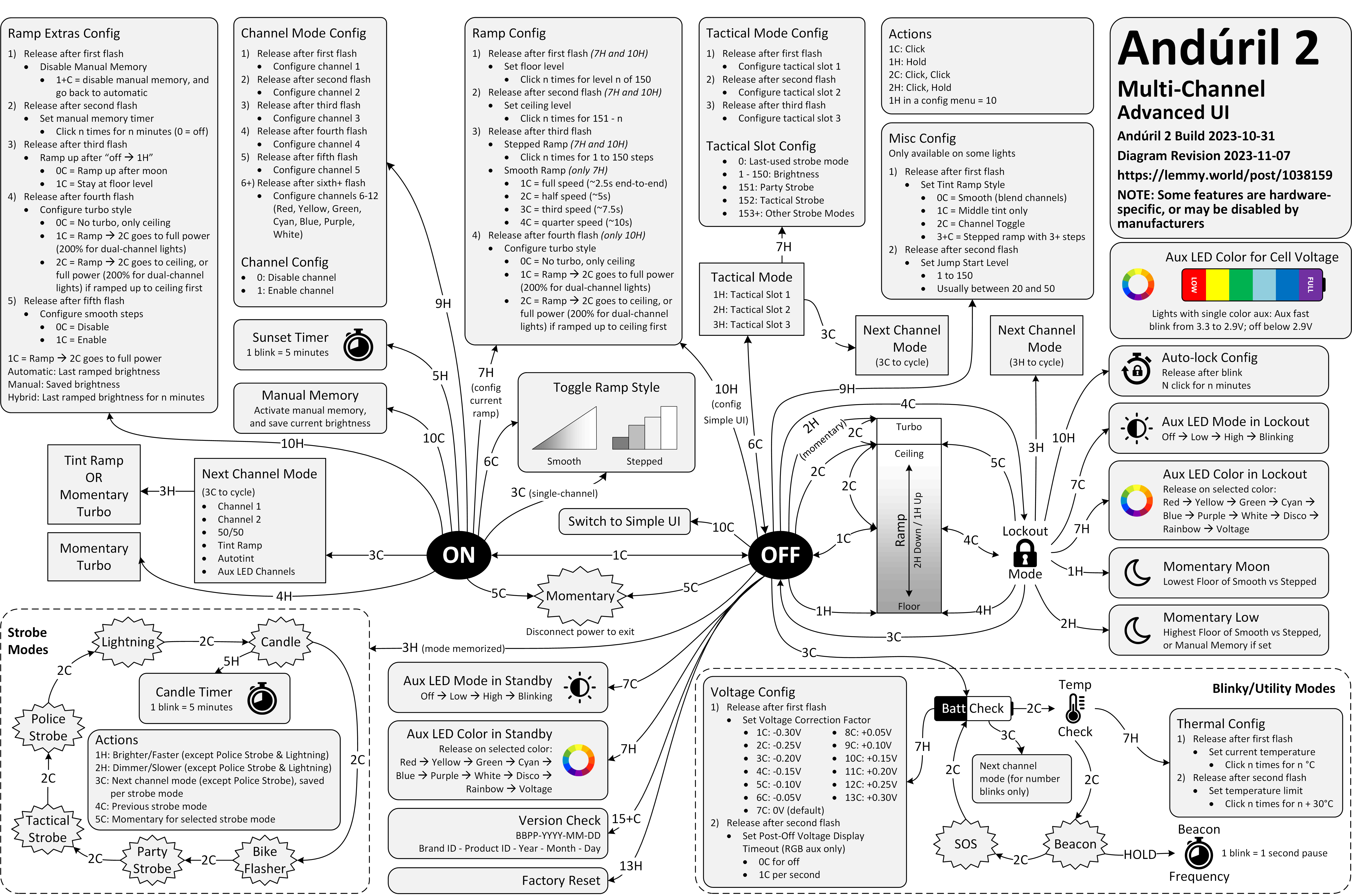
Anyway. This is a diagram for a single-button flashlight called Andúril 2 (larger version):
I saw it for the first time earlier this week. I was speechless. Maybe a little bit in awe. I know I’m supposed to hate this, but this feels so profoundly… alien, that I don’t know if anything I know applies here. I don’t want to judge it by the wrong set of rules. I want to understand the dividing lines between the UI and its explanation. I want to study it more.
Oh, and because I was curious too – this is the flashlight:
I have recently stumbled upon two websites that try to do something interesting and inspiring when it comes to showing scale.
John Wallace’s Tangible Media Connection’s initial appearance might not feel very well-crafted, but jump to any page (for example this one) and it’s astonishing how great the photos of the objects are.
They’re great not just on their own (it’s really hard to photograph metals and plastics!), but also consistent with each other when it comes to angle, style, and – most importantly – scale. I am not sure if I have ever seen on online museum do this before. It’s very well worth checking out.
The other example is Neal Agarwal’s recent Size of Life. The whole website is delightful, with subtle music and sound effects, great handling of keyboard navigation and swiping, and so on. And the way it resizes objects and uses transitions to always keep you oriented is something a lot of other interfaces, even for productivity apps, could learn from.
Of course, now I wonder what the first website would feel like with the user interface of the second.
The state of menus on Google’s search result page: all inconsistent, most ugly, ignoring UI mechanics learned decades ago (for example understanding the importance of diagonal movement or supporting mousedown-drag-mouseup in addition to just clicking), with easily triggered buggy states, bad animations, and even clicks falling through.
I wouldn’t be so angry, but I use – or at least see – these all the time. I wouldn’t be so angry if we hadn’t learned how to make GUI menus well 30 or so years ago.
I don’t want to pin it all on browser makers; if the designers and engineers cared above, there are ways to make great menus in custom JavaScript. But I wonder why the web tech didn’t evolve quicker to provide well-built and stylable and accessible primitives for this kind of stuff. I would love to understand more why that didn’t happen. Even scrollbars and sliders still feel unfinished on the web, and those are much easier than multi-level menus.
Also, Gemini:
Are the mechanics of menus on google search page working well?
In terms of technical execution, the mechanics of Google’s menus are a masterclass in Interaction Design (IxD). They are designed to feel “snappy” even on low-powered devices, using a blend of instant feedback and carefully timed animations.
I stumbled upon this small page about friction by Carl Barenbrug. I found myself vehemently disagreeing with one example listed; I don’t think Undo Send is an example of friction, as to me it actually feels like the exact opposite (“Are you sure you want to send this email?” dialog box would be friction – just like the last example Barenbrug showed).
But this paused me in my tracks:
“Intentional pagination instead of infinite scrolling is progress with awareness.”
It made me realize that the only implementation of infinite scrolling I know is basically pretending the page has already been there the whole time… if it’s done well, and if you move slow enough, and if you don’t pay attention to the scrollbar, it really feels like the page goes on and on forever.
But… it doesn’t have to be that way. You could turn off the smoke or hide some of the mirrors. You could uncouple the gesture from what follows. You could add milestones (in the traditional sense of the word) after every X results. You could make the scrollbar react differently. Instead of frictionless scroll, you could force the user to bounce off of a bottom of the page in a similar vein as pull-to-refresh forces them to bounce off of its top.
I’m curious now. Did anyone ever experiment with infinite scrolling that feels… closer to pagination?
I love how this Byte magazine archive by Hector Dearman tries to do something different. It inspired me, and reminded me of the excitement of what Internet was supposed to be. I think we all wanted the web to feel more like this – fast, with infinite information right at your fingertips, the biggest library you could imagine at the comfort of your home.
I hope seeing everything in single, searchable place offers a unique perspective.
(The details of the zoomable UI are a bit wonky in practice, but one can imagine fixing all that.)
If you choose to remove the app names from the springboard, a small thing Apple could do would be to show the app name in the long-press menu here. Otherwise, I found it feels really easy to forget the name over time! (It would be a small riff on this disambiguation detail.)
I was surprised at this little thing that appeared in my Chrome Canary this morning.
It is rare to see an interface clean up after itself this way. This flew by quickly and wasn’t communicated very well, but I believe this changed my new tab page from this…
…to this:
Now, I said “surprised” and not “delighted” not just because the implementation felt a bit rough. I am also suspicious of the motivations, as Google’s sister iOS app played very fast and loose with this surface, literally moving the search bar from under my thumb in order to create room for features I would never use and could never remove. I suspect this is a preparation for something else that would take the place.
But until that day comes, this was an interesting gesture, and it’s really welcome to see a new tab harking back to the simplicity of Google from days past.
Start spending time in the online photography sphere and you’ll start to notice a small but undeniable undercurrent of lament of its loss to this day. Find an article about Adobe hiking their subscription prices because they added AI for some reason, and amongst the complaining in the comments you’ll invariably find it: “I miss Aperture.”
Kennett goes deep into two specific details: the HUD-like UI that travels to the photo, and the technically impressive loupe. It’s worth checking it out just to reflect on the importance of execution; ostensibly those features exist in Adobe’s Lightroom (Aperture’s main competitor), Photos, etc. But Aperture designed them in particularly memorable and impressive ways.
Back in the early 2010s I used Aperture, too. I was rooting for it. I felt like it was designed, and Lightroom merely existed.
It reminded me of the 1990s when I felt the same about Netscape 4 over Internet Explorer 4. There was something about Netscape’s feel that appealed to me more. The way buttons were designed. The way they responded to clicks. The way pages loaded. All these little nuances. This was perhaps the first time I appreciated one app over another for things I didn’t know how to measure, or perhaps even describe.
Aperture vs. Lightroom feels like a similar story, because for all my appreciation for Aperture, I remember it being slower than Lightroom, and the noise reduction (much more important 10+ years ago) was worse, too. In a small way, it was a relief that Aperture was discontinued, because it saved me from a tricky choice: better designed vs. technically superior.
But: I miss Aperture, also. Maybe it would’ve caught up technically today and it would’ve been the best of both worlds. To this day, I use Lightroom (now Lightroom Classic). If it’s filled with UI quirks, it’s mostly bad ones. If there is beauty in it, I no longer know how to see it. It’s a tool in the most reductive sense of the word. My photos deserve more.
Also something I learned from Kennett:
“Shoebox” apps are apps that contain the content you use with them, as opposed to document-based apps which work with content you manage as a user. It’s an extremely common design nowadays, but less so back then — early pioneers of the shoebox app were iPhoto, iMovie, etc.
I added a table of contents UI to the most elaborate essays on my site, and then wrote about some of the design details and choices I made there. Let me know if this is an interesting case study! I tried to do something new here with tons of mini videos.
At the bottom, I will also be collecting other implementations I see that are interesting alternatives to my approach.
Let’s say you are in Reeder (an RSS reader for iOS), looking at the list of posts, and already from the title you know you don’t care, and you want to mark it as read.
You can tap to see it and then swipe back the moment it shows. This is the slow path.
There is a faster path. Reeder enables you to slide right or left on the item. You get nice haptic feedback, and many apps support this kind of an interaction.
But there is an even faster path.
You can tap to see it and immediately swipe back. Your thumb is already there on the left anyway, and the distance is a lot shorter now.
Like every advanced gesture this takes a bit of practice, but I noticed I started doing it instinctively, without even thinking.
This happening required two small design details: The original slide transition to be interruptible at any moment, and the app to support swatting/draging the incoming item away even if my finger was nowhere near it. Both are clever, and both feel very welcome, because they enabled this emerging (to me) behaviour that made going through the list snappy without me even realizing.
This might be a good modus operandi: Think of the slow interaction. Think of its fast version. Then, think some more.
Nicely done, Reeder team. (Or, if this is a default iOS behaviour, nicely done, Apple!)
One of my favourite recently-noticed little patterns is this one thoughtful accelerant in iOS Photos.
If you want to add a photo to an album, you normally have to choose from a list of albums:
However, once you do that one time, a new menu option appears. It’s effectively “Add again quickly to the album you just chose” (Fiałka is the name of my cat):
That skips the album selection altogether. It’s always only just one album you used more recently, so it’s relatively simple… but so helpful. You often, after all, want to add more stuff to the same album, and it saves you choosing the same album over and over again.
This is great because it flattens the option space to zero options, which mirrors how we all think when we’re focused. It’s tunnel vision exactly when you want it.
I have always been a fan of both “repeat”-type actions and smart “recent”s, and consider them a truly underappreciated secret weapon. Those little savings really add up over time – in saved time, in less tedium, and in avoided mistakes. (Imagine not only having to choose the same album for 30th time in a row, but also… making a mistake doing that and tapping on a wrong one! Then the frustration very quickly compounds, as you have to recover from something that felt completely avoidable.)
I always respect designers of interfaces that invest in functions like these. There is also an anti-corollary to this, which is: if there’s only one option, consider not even asking. Slack seems to excel (derogatory) here:
The second one is somewhat defensible since it’s a settings dialog you enter at your own will, although the active “Re-generate answer” when I haven’t done anything (and nothing can be done) feels overbuilt.
But the first of these always appears on a way to other settings (like adding emoji), and it’s even worse than the Remember me? examples because it repeatedly stops you for absolutely no reason at all.
It was, I’d argue, a small mistake for Apple to stop putting a visual affordance in the lower right corner of windows to show where to click to resize the window. It was a bigger mistake to change the scrollbars on MacOS to look and work like those on iOS — invisible, except while you’re actually scrolling (by default, that is — savvy Mac users keep them always visible). The removal of the resize indicator happened long ago, in Mac OS X 10.7 Lion, released in July 2011.
I can recall at least one place in macOS where you can still see the resize grabbers – it’s in column view in the Finder.
I still think sometimes of old Windows where all the 8 affordances for resizing were clearly visible. I know Windows 3.1 was generally kind of ugly, but I liked how they aligned with the title bar and the buttons:
By the way, don’t love Gruber’s “Dyehoe” thing in the title. Feels Trumpian.
Since upgrading to macOS Tahoe, I’ve noticed that quite often my attempts to resize a window are failing. This never happened to me before in almost 40 years of using computers. So why all of a sudden?
I understand this might be the casualty of the absurdly large border radii in the new macOS.
The little video in the middle made me laugh:
(I do think there is room for gestures triggered “outside” a window, and we’ve seen rotation and some specific flavors of resizing or cropping work this way in drawing and design apps across the last few decades – but one has to be careful. Often, those are secondary and/or for power users.)
This feature can’t pull back an email that’s already gone; it just holds your message for five seconds so you have a chance to hit the panic button. And don’t worry – if you close Gmail or your browser crashes in those few seconds, we’ll still send your message.
There’s so much cleverness hiding in here: recognizing that this particular flavour of l’esprit de l’escalier exists, shifting time from the past to the near future, the repurposing of the undo branding, the fallback if things go wrong.
There was, I imagine, even the challenge of having to forget about the previous version of this feature elsewhere, which were the awful emails with RECALL: in the title, which I think maybe only worked in Outlookk, if at all? (Everyone else suffered like green bubble people do today.) I don’t know. Sometimes the biggest hurdle to a great idea is blocking bad execution you already know from your head. On the other hand, sometimes someone else’s bad execution can be motivating.
I even think that not using ⌘Z for this was a clever idea. ⌘Z without text editing context/focus can be really tricky. Do you remember when Safari had ⌘Z to bring back last closed tab before they came to their senses and used ⌘⇧T like Chrome?
It is sometimes harrowing when you want to click it Undo Send and just miss it – keyboard is more precise here – but not sure ⌘Z would register here. Even Esc would be tricky.
I miss when Gmail was in the “young and open to trying new things” phase.
I have been wondering the other day why aren’t there more mouse pointer museums and here’s one – Amiga Pointer Archive! (Amiga was a 16-bit home computer especially popular in Europe.)
Doesn’t work so well on mobile, but it’s fun on desktop. I recommend zooming the page to 200%.
The first iPhone famously introduced the soft keyboard, which could change its shape depending on the need. Sometimes it would mean becoming a keypad (for numeric entries), and sometimes something subtler, like introducing a “.com” key to the bottom row, or adding a new column of keys and making the keys a bit more narrow for a few languages that need that.
Bear (the note-taking app) does something interesting: after a button press, it replaces the onscreen QWERTY keyboard with a “funpad” or a “function keypad” (like StreamDeck or Figma Creator Micro). This achieves a similar result to a scrolling toolbar above the keyboard (see: Apple Notes), but in a different way. I haven’t seen anything like this before, and I think it’s really clever and it has worked well for me in practice.
(It also cleverly closes itself upon some actions like introducing a divider, but stays put for bolding, indentation, etc.)
In my opinion, Apple took on an impossible task: to add an icon to every menu item. There are just not enough good metaphors to do something like that. ¶ But even if there were, the premise itself is questionable: if everything has an icon, it doesn’t mean users will find what they are looking for faster.
I always liked this kind of an exercise:
There’s a game I like to play to test the quality of the metaphor. Remove the labels and try to guess the meaning. Give it a try:
This is a gallery of elementary problems. None of this should have shipped if someone with power internally had a critical eye for consistency and detail. If Apple deems it necessary to retain the icons, though I am not sure why it would, it should be treating this post as one giant bug report.
One of the frustrating patterns for me is a dialog box that doesn’t offer “skip it next time” option, or even just defaults to remembering.
My go-to examples? Apple’s Remote Desktop which always throws this thing up on connection:
And this in Photoshop upon saving a PNG file, which has been there forever:
I never change these options. These are flow-killers; trees have grown to maturity as I have spent collective hours in those dialogs over the years/decades, even though they serve no purpose for me.
(The worst part might be if you forget this dialog waits, and move on to do other things, and the operation you thought was completed never actually finishes.)
A thoughful moment in Buttondown. Gmail’s truncation has been going on for decades, and I have no idea why they still do this. Even the overflow interface for a truncated email is awful – the rest of it doesn’t appear in situ, but it opens a new window that where you have to start from the top.
An extremely thoughtful moment in DaVinci Resolve. When you drop the first video clip into a new project, it suggests to update the settings of the entire project, on the correct assumption that the first media might set the tone of the whole thing.
“You can’t undo this action” is scary and kind of… untrue? But I’ve stopped reading by then. I press Enter and it saves me a trip to a complex project settings dialog box I always forget the location of.
Edward Tufte has this visual rule that 1+1=3: With a single line on the screen, you have just that single object, but adding a second line does something interesting, it adds a third ‘object’ on the screen, the negative space between the two. All good visual designers deeply understand this effect.
In UX design we have a cognitive equivalent. If you have two buttons, there is a third ‘object’ created: the decision a user must make on which button to tap.


