Technical details
Back-end
Unsung is built on a completely custom back-end that uses local Apple Notes as a source. It is heavily inspired by Montaigne, and as a matter of fact ran on Montaigne for the first month or so.
This part last updated June 9, 2026.
Transparent videos
Unsung uses transparent videos, which can be best seen here if you toggle between dark mode and light mode:
For Chrome, transparent videos are encoded into a .webm file using this incantation:
ffmpeg -c:v libvpx-vp9 -pix_fmt yuva420p -auto-alt-ref 0 -an
For Safari, they are encoded into .mov using this incantation:
ffmpeg -c:v hevc_videotoolbox -allow_sw 1 -q:v 45 -alpha_quality 0.65 -vtag hvc1 -pix_fmt yuva420p -an -vf premultiply=inplace=1
This is how both are wired in HTML (the third video is non-transparent fallback):
<video>

  <source src="_media/test/1-safari.mov" type="video/quicktime;codecs=hvc1">

  <source src="_media/test/1.webm" type="video/webm">

  <source src="_media/test/1.mp4" type="video/mp4">

</video>
I can’t tell with certainty I understood all the nuances of these formats, but one thing that might be useful to know: yuv420p(tv) was good, and yuv420p(pc) was bad. This bit me at some point and might be useful to know.
This part last updated June 9, 2026.
Images with shadows
I post a lot of screenshots with shadows, and that normally causes the images to be spaced out too generously. I wanted to detect these shadows and compensate so that an image with a shadow would be positioned exactly the same as if the shadow wasn’t there.
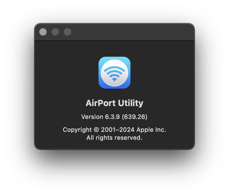
The alpha edges are determined during publishing naïvely by loading the image into canvas and then doing this:
let left = 0

for (let x = 0; x < width; x++) {

  let allTransparent = true

  for (let y = 0; y < height; y++) {

    if (getAlpha(x, y) === 255) { allTransparent = false; break }

  }

  if (!allTransparent) break

  left++

}
It basically assumes that any transparent edge pixels are shadows. Then, the same is done for three remaining all edges, which will result in something like: transparency: { left: 10, right: 10, top: 20, bottom: 40 }
Then, when outputting the image, the principle is that the outlying wrapper will have the same size as the cropped image – e.g. as if the image didn’t have any shadow at all. Then, the image is put inside, allowing to stick to the side. The job is to reposition and resize the image to let it be in its natural
styleText = `

  style="'

    width: ${(width / widthWithoutTransp * 100).toFixed(2)}%;

    height: ${(height / heightWithoutTransp * 100).toFixed(2)}%;

    left: ${(-(100 * transparency.left / width) * (width / widthWithoutTransp)).toFixed(2)}%;

    top: ${(-(100 * transparency.top / height) * (height / heightWithoutTransp)).toFixed(2)}%;

  "`
(The actual system inside Unsung is more complex because of other considerations.)
The same logic is applied to transparent videos, too.
Small note: I also do a simple transparency.bottom /= 2 on the assumption bottom shadows are usually heavier, and we should keep the content below a bit further away.
This part last updated June 9, 2026.
Lists
Short lists are (automatically) spaced differently than long lists.
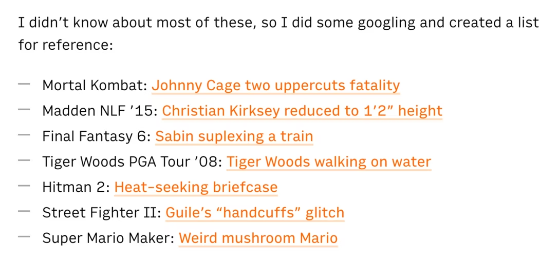
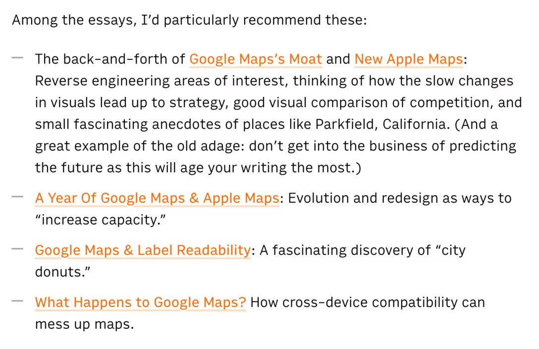
The detection is pretty rudimentary:
const words = text.split(/\s+/).filter(w => w.length > 0)

const longList = words.length >= 40

ulEl.classList.toggle('long-list', longList)
Then it’s as easy as li { margin-top: .2em; margin-bottom: .2em; } and ul.long-list li { margin-top: .6em; margin-bottom: .6em; }
This part last updated June 9, 2026.
Want to learn more?
You can always check #about-unsung tag, and the dashboard.
This part last updated June 9, 2026.