The adjective of the present or the verb of the future
My arch nemesis lives only about 1.5 blocks away from me. It’s a coffee shop door. More specifically, it’s a sign on that door:

This is what happens with embarrassing regularity: I am inside, about to step out, my brain reads PUSH from the other side – and so of course, like an idiot, I push the door instead of pulling it.
Sure, bad design. But don’t worry, I am not going full Don Norman on you. I wanted to show you this other thing, in Pixelmator Pro:
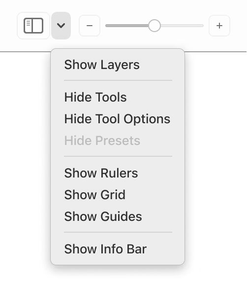
A pretty non-threatening menu, it seems, but sometimes when I see a treatment like this, my brain actually sees this…
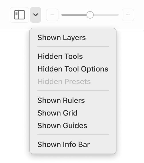
…and it takes just a bit of extra thinking to figure out where I am and where I’m going.
This is one of the recurring boolean problems in UX design. Given a choice, do we show the noun/adjective of the present, or the verb of the future? Because another way would be to show the current state:
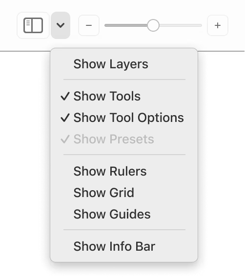
To me, this is unambiguous; the state is easy to understand visually without thinking, and the implied flip action also feels pretty natural. You could go even further:
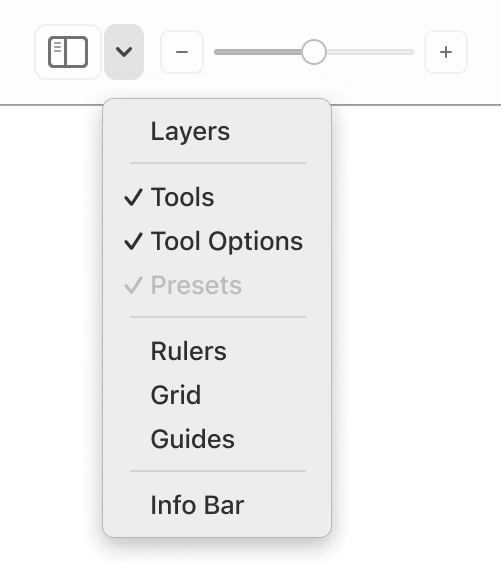
Without knowing much of the context here, this would be my recommendation. Of course, this last configuration not only implies toggling but also implies showing, but that’s probably okay given all the context surrounding it?
Now, like with many things I talk about here, I don’t have the benefit of user testing or research. (In practice, though, they aren’t often available for small things like this, anyway.)
Also, this isn’t a universal recommendation. This is an evergreen UX problem for a reason. If there were other commands around it, the showing/hiding verbs might have to appear. Same if no option had a checkmark by default. (One or two checkmarks establish an implied “show/hide” verb for the whole section, but without any, it might feel like an unusual menu filled with only nouns.)
There are more conventions – “Turn X On,” showing both options, submenus – each one with pros and cons. It’s good to be aware of all, because even if your tool uses one consistently, users might bring a different one as a default way of processing things. But the worst part about the Pixelmator menu is that it’s mixing conventions:
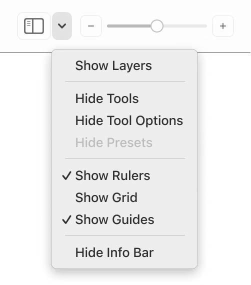
It’s hard for me to understand the rationale here, and it makes processing this menu even harder. Maybe I need to go to a certain neighbourhood coffee shop to get more coffee…