“The floppy disk icon relies on interface familiarity, not object familiarity.”
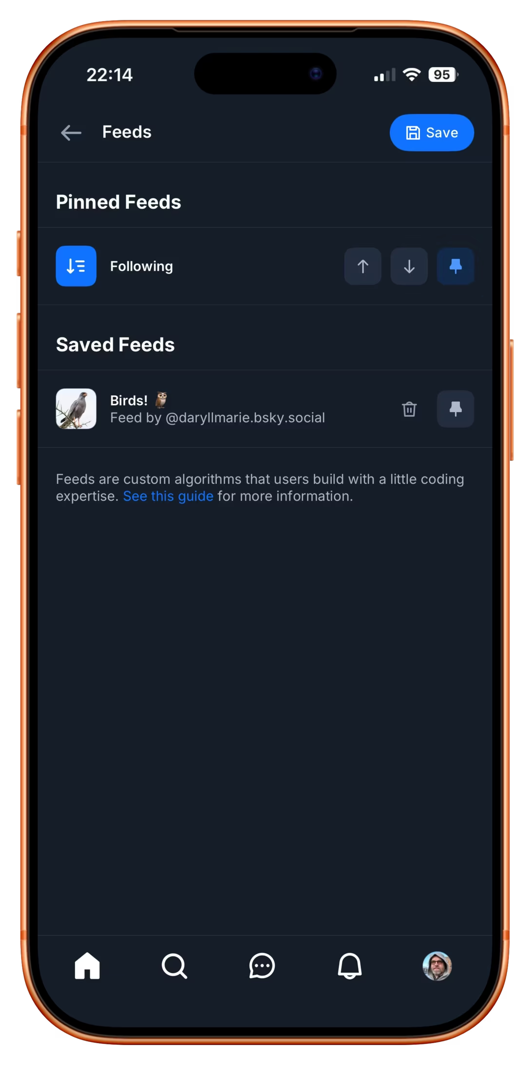
Just a few hours after writing about floppy disks, I stumbled upon a bona fide floppy icon in the Bluesky’s iOS app, anno domini 2026:

I imagine this, in a nerdy view deep inside settings, might be more of a fun nod, but it made me curious – does Word still use a floppy icon?

Yes, it does! Right next to the icon-less AutoSave toggle, deep within a veritable kowloon walled city of interface elements.
And yet, maybe I should chill with the jokes – NN/Group revisited the save icon in July of last year and surprise! People still understand them.
83% of participants associated the floppy disk icon with saving. […] Another 13% described this object literally with responses such as “disk,” “disc,” or “this is an SD card for storing information.” These responses were not coded as “save,” but still suggest familiarity with the image.
What a fascinating journey! The icon didn’t change at all, but its perception went from being a literal representation of a familiar object, to a skeuomorph once floppies were replaced by hard drives, to then a symbolic representation of physical media in general (a lot of people think it’s an SD card – or perhaps even that floppy disks and SD cards are one and the same), to increasingly just an abstract symbol that represents saving as a concept, registering similarly to the circular arrows for syncing, and an arrow pointing south for downloading.
NN/Group is itself kind of a floppy disk, trying to walk a fine line between their legacy and reinventing themselves. They’re dismissed by many as old-school, academic, boring enterprise software aficionados, relics of a different era. I see some of that and often disagree with them, but I also sometimes appreciate their rigor, reliance on user studies, and outright dismissal of fashion in UI design. I want to revisit their site in more detail and see how I feel about it today, 30 years after Jakob Nielsen’s books rocked my world.