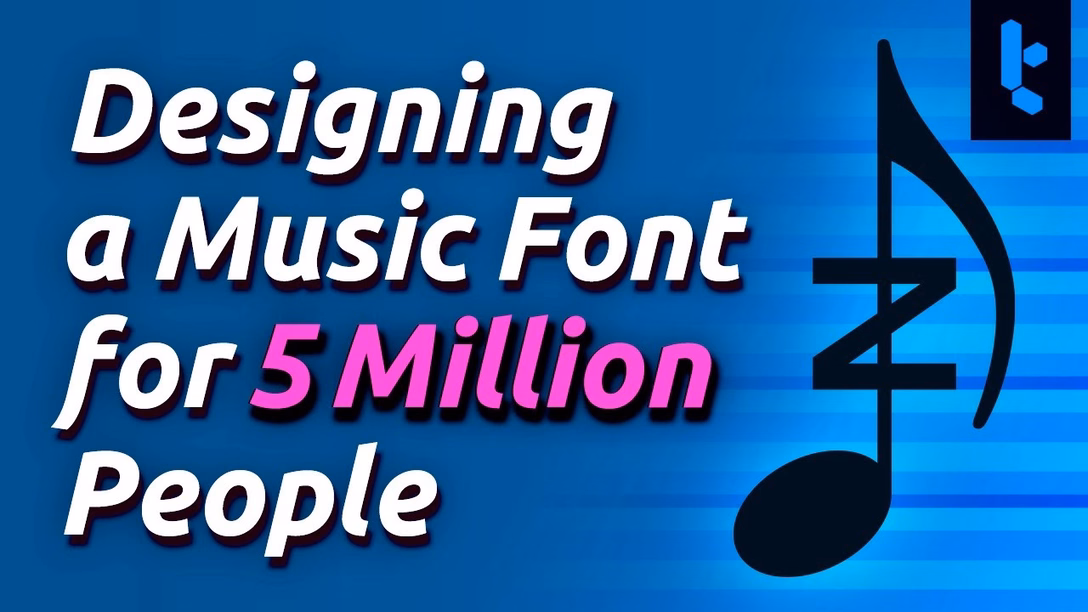
“The Helvetica of music notation”
A 19-minute video from Tantacrul about a parallel universe that’s right next to ours, but most of us don’t get to think about – typography of fonts for music notation:
The video has some nice things going on besides specific details and conventions: there is a glimps of an obsolete app with a fascinatingly obtuse interface, a mention of modern standardization developments, and even a little (sad?) story of perfectionism and legacy.
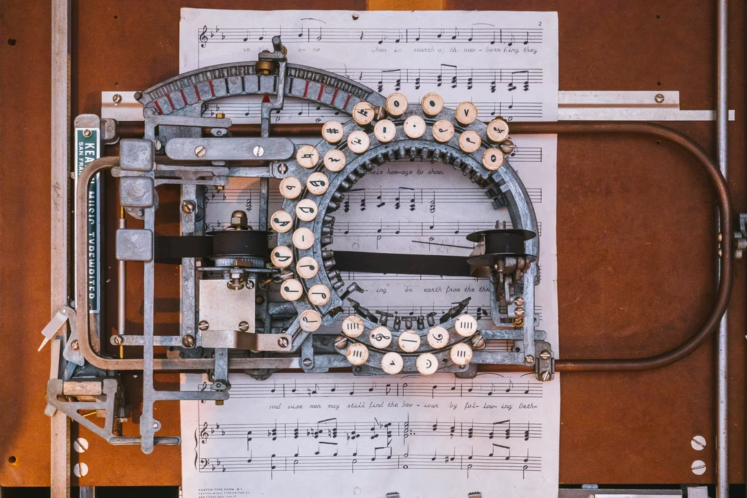
I’m also kind of mesmerized by this shot of what music typesetting used to be:
There is also a short 1936 video showing more of that process. A small contribution from my end – a photo of the Keaton Music Typewriter from a museum in Catalonia: