The modern powers of ten
I have recently stumbled upon two websites that try to do something interesting and inspiring when it comes to showing scale.
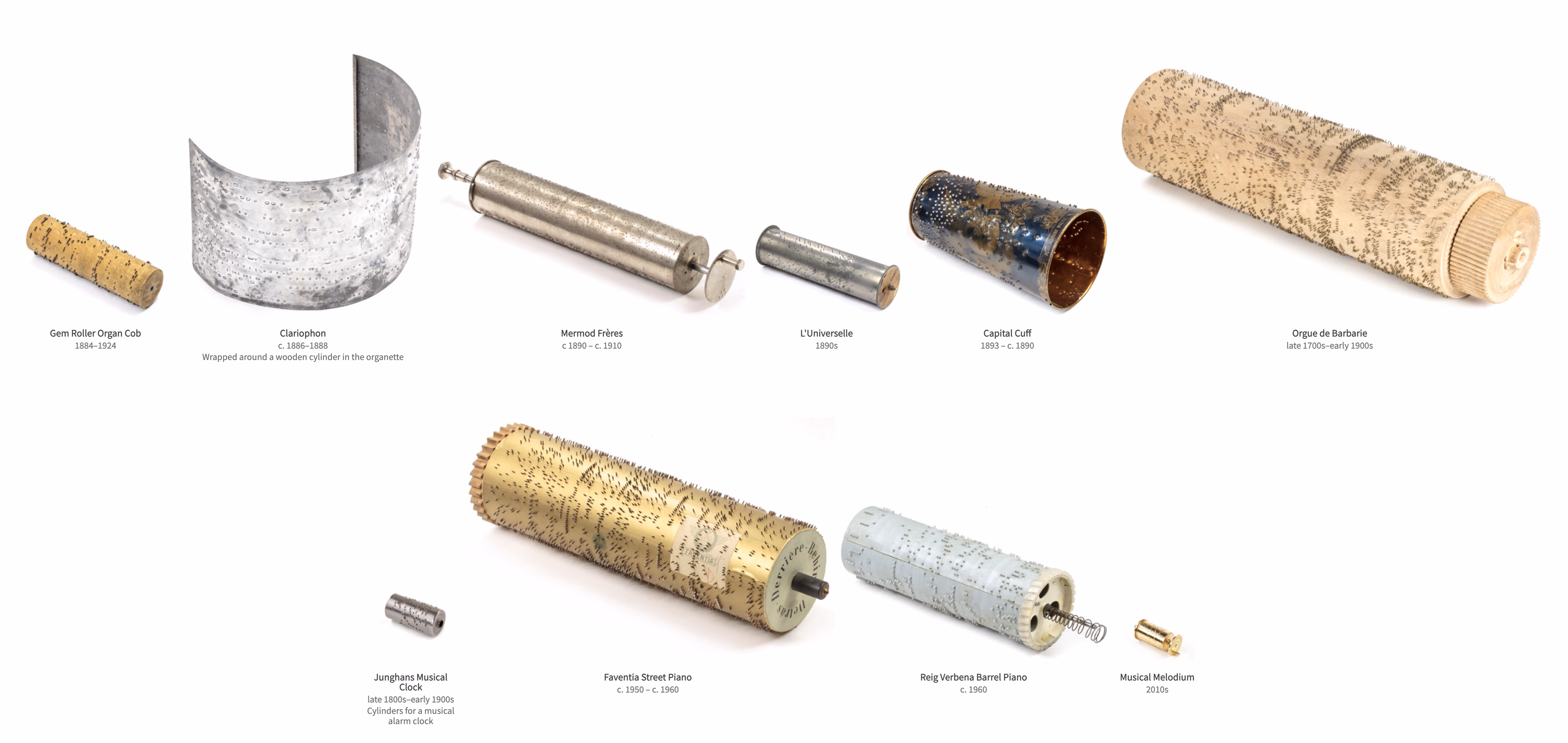
John Wallace’s Tangible Media Connection’s initial appearance might not feel very well-crafted, but jump to any page (for example this one) and it’s astonishing how great the photos of the objects are.
They’re great not just on their own (it’s really hard to photograph metals and plastics!), but also consistent with each other when it comes to angle, style, and – most importantly – scale. I am not sure if I have ever seen on online museum do this before. It’s very well worth checking out.
The other example is Neal Agarwal’s recent Size of Life. The whole website is delightful, with subtle music and sound effects, great handling of keyboard navigation and swiping, and so on. And the way it resizes objects and uses transitions to always keep you oriented is something a lot of other interfaces, even for productivity apps, could learn from.
Of course, now I wonder what the first website would feel like with the user interface of the second.