The trouble with font previews
A reader sent me this screenshot from PowerPoint, with one of the menus looking the best it’s ever looked, and the other one showing to work with what we could charitably call “a UI hangover”:
It’s obviously bad craft and crossing over to the “embarrassing” territory, but I thought it’s an interesting question: what happened?
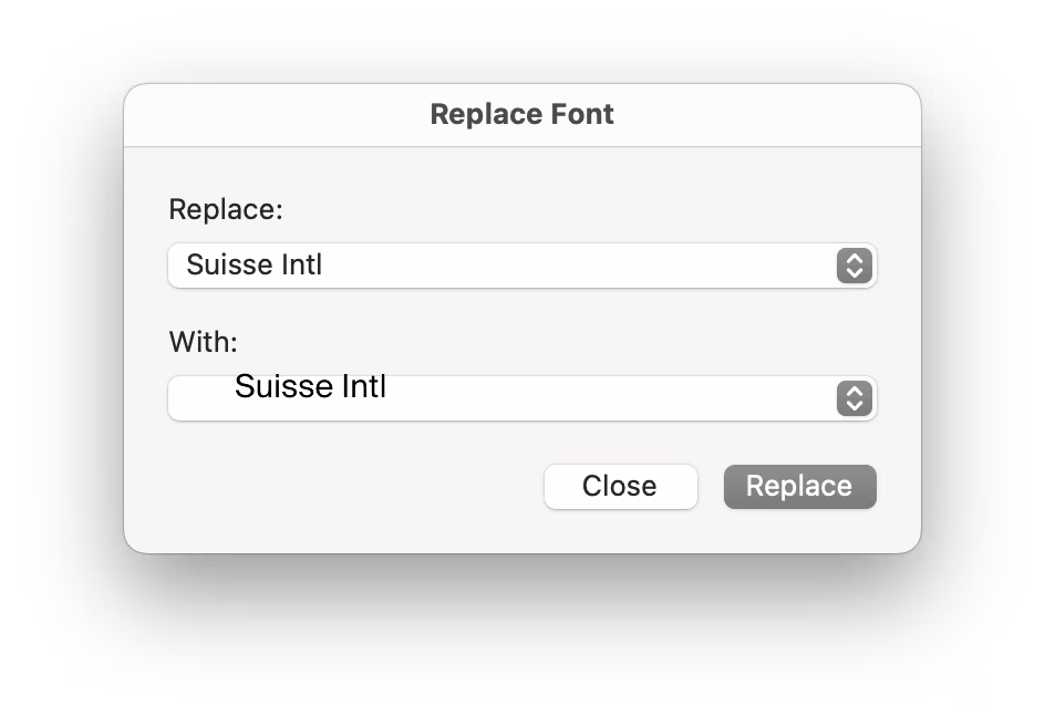
The main piece of the puzzle is that the first menu shows the name of the font in San Francisco, but the second asks to render the font name in itself, serving as a font preview.

Font previews are fascinating because they are the perfect showcase of how tricky fonts can be at scale.
Some time ago, I wrote an essay called Typography is impossible. TL; DR: It’s actually impossible to left align or center text. Ever. Not just because each font does whatever it wants – font size is a number that doesn’t really give you anything to hang a hat on, and the font can place itself in its box however it desires, too – and not just because fonts often lie (via bad metrics) about what they store inside, but also because aligning and centering are really in the eye of the license holder, and have more than one definition.
So, every time you align text to anything, in whatever way, it’s only an approximation. Most of the time that’s good enough. Here it is not.
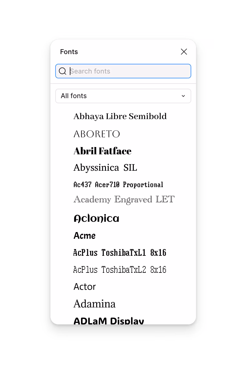
I worked on font previews at Figma, and wanted to show you three screenshots of what we did.
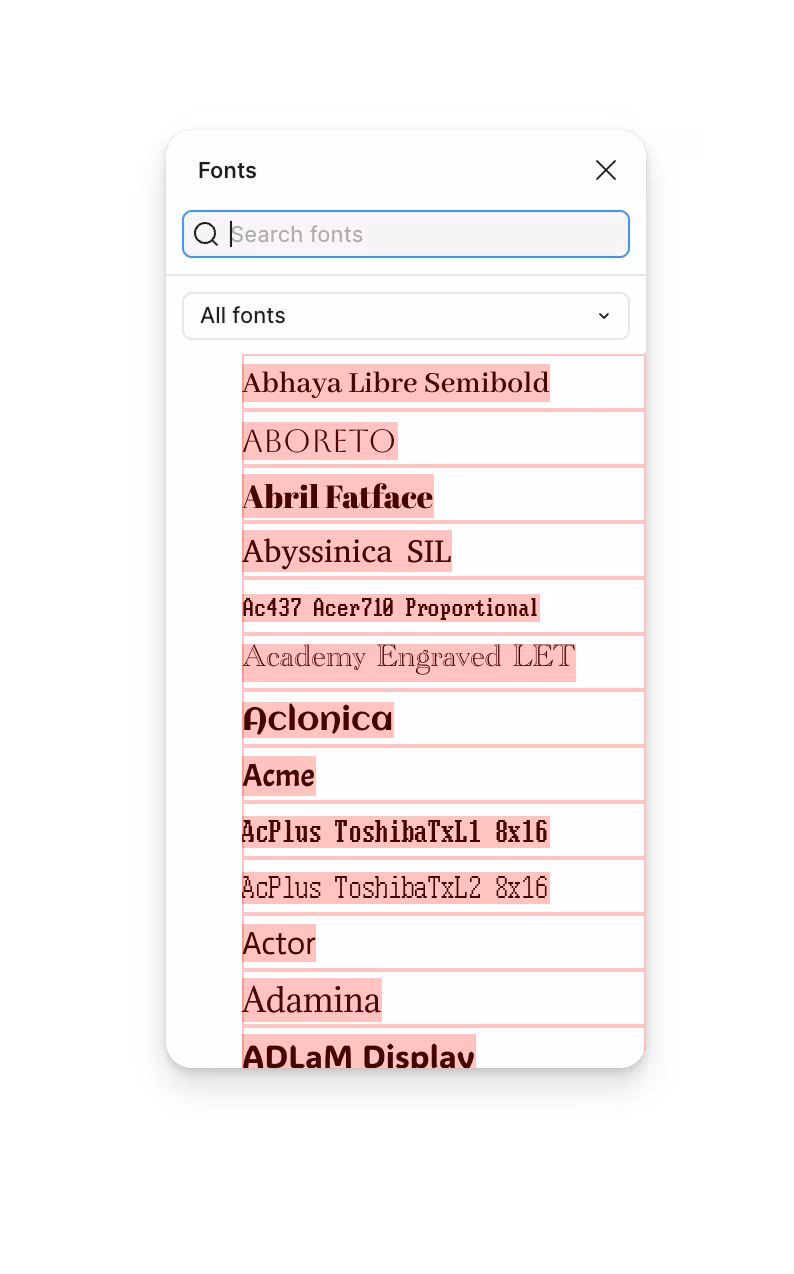
This first one shows the default attempt: we ask the fonts to render themselves in the same size (16px), vertically centered in a box that’s always 28px tall… and they oblige on paper, but it really doesn’t feel like they are:

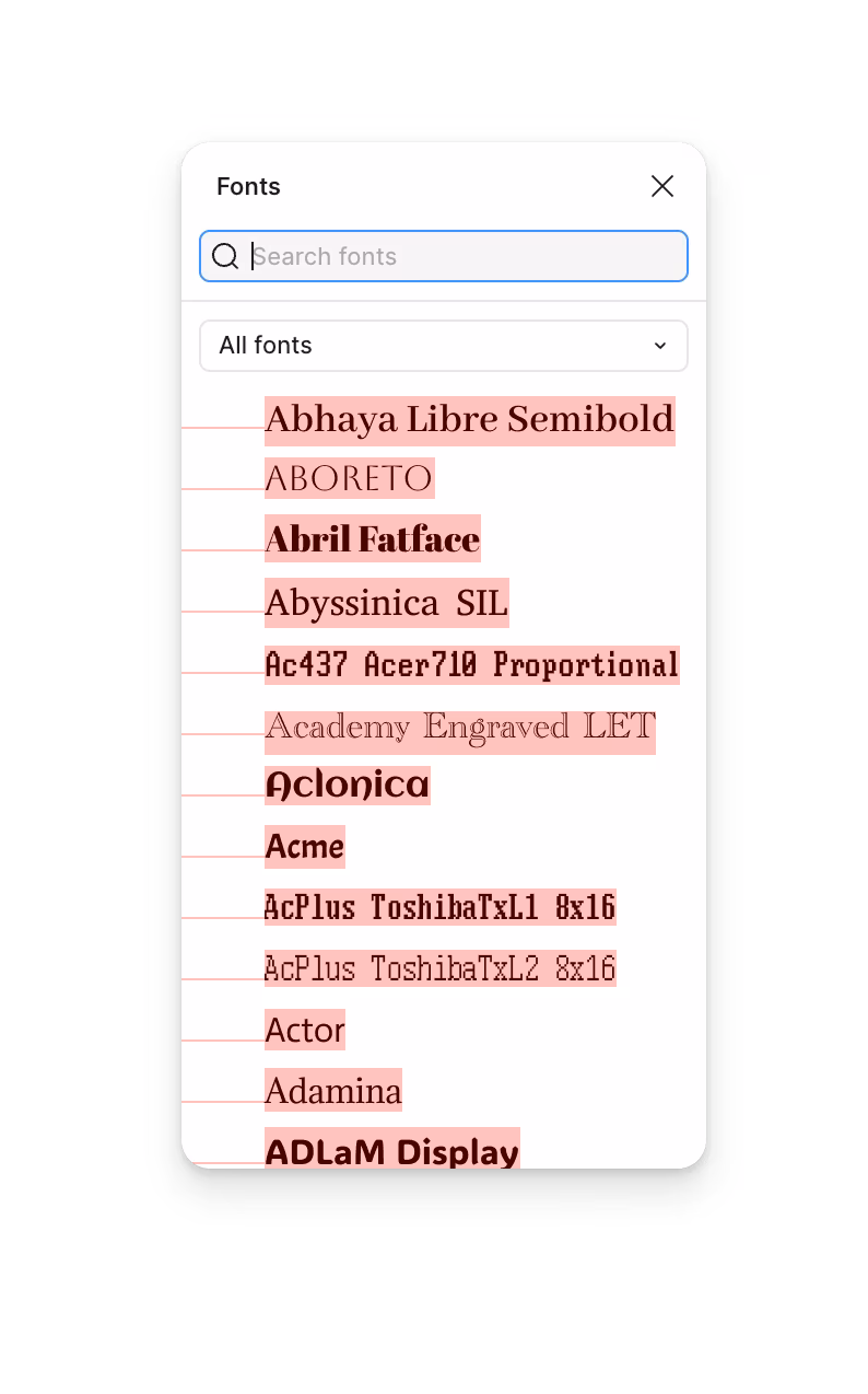
The second take shows what happens if you nudge the fonts up and down so they’re aligned to their baselines. This at least creates vertical rhythm; in effect, we need to make the fonts uneven to make them feel even.


And this is the final result, with extra adjustments:
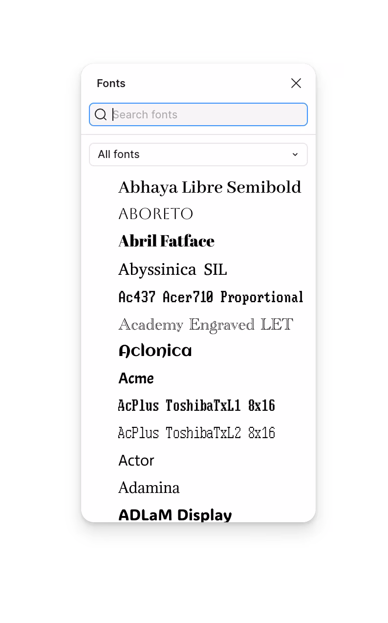
What do we do in the final version? Too many small things to mention, but in essence:
- We literally measure the fonts (programmatically) by rendering them and looking at them, and make adjustments. We blow them up (but not too much) if they’re optically too small, or reduce them (but not too much) if they’re too big.
- We have a multiplier for scripty fonts and monospace fonts, where the traditional measurements are likely to be off.
- We even special-case specific fonts by name. That feels like bad practice, but fonts are so varied and all over the place, that I think it’s perfectly fine to make exceptions for particular individual fonts that are popular or otherwise very important to your users.
These adjustments are all in the same category: getting off math balance to get to optical balance.
Here, you can compare before (the naïve version) with after (the final version):

If it feels subtle, imagine it applied to a much wilder menagerie of very thin, very huge, or very strange fonts. (The go-to example? Open a Mac and try typing in Zapfino.)
I’m not showing this to brag about my work – okay, fine, to some extent I am, we’re all human – and I truly believe this could be so much better, still. There are icon fonts, color fonts, and non-Western fonts so rich in variety and tradition that this category itself is basically a fractal.
Mostly, I wanted to share this lesson: dealing with fonts is hard, and dealing with fonts as a system even more so. Whether it’s the printing press, paper, or Illustrator, it takes people years or even decades to fully learn the craft of setting type, and to believe their eyes instead of only relying on math. But here, what’s needed is manufactured craft: we have to teach the machine to trust its eyes (which it doesn’t have) over math (which it can’t escape).
Now if you’re wondering why font previews look bad in so many apps, I believe it’s because people working on those did not allocate enough time to deal with all that.
But I’ve used the word “embarrassing” as there’s one more thing that the original did poorly, and something the reader identified immediately. The makers of PowerPoint allowed the font to escape its containment:

This is another big lesson: fonts will ignore their bounds at every single opportunity. That infamous CSS IS AWESOME graphic? That’s CSS underestimating text. That naked URL or code snippet pushing the mobile site past the viewport and making it scroll? That’s the creators of the site not building up enough imagination of what fonts can do when they’re not watching. Zalgo text? A joke, but based in reality.
Fonts are so much more feral than you think. Are you ready for it?
Thank you to Giovanni Lanzani for sending in the original PowerPoint screenshots.