“These small, repeated experiences shape us more than we like to admit.”
Many people already linked to Terry Godier’s thoughtful essay about email and RSS and the dangers of skeuomorphism by default:
Email is where the metaphor made its jump from atoms to bits. “Inbox” was borrowed legitimacy. It sounded like that wooden tray, so it inherited its psychology. But the wooden tray had a constraint: physical space. A desk could only hold so much. The digital inbox had no bottom. Still, mostly real obligations. Humans writing to you, expecting responses.
This all resonated me, although only to a point. I long stopped paying attention to those unread counters in Gmail and even though I know they exist, they feel wholly meaningless. And I personally would prefer my RSS reader to work more like email, because worrying that I cannot catch up if I wait too long and old entries get recycled is actually adding stress for me.
But I’m thankful for someone else pushing back on the barrage of red dots and fake urgency, and just thinking about it all is worthwhile. I’m very open to the idea of building something that eschews numbers to begin with, and for trying different operating models. (I deleted Threads from my phone after it was pushing me toward the algorithmic timeline filled with outrage, which was detrimental to my mental health.) I could even imagine choosing different RSS feeds to have different rules – this one “cannot miss,” the other one “casual.”
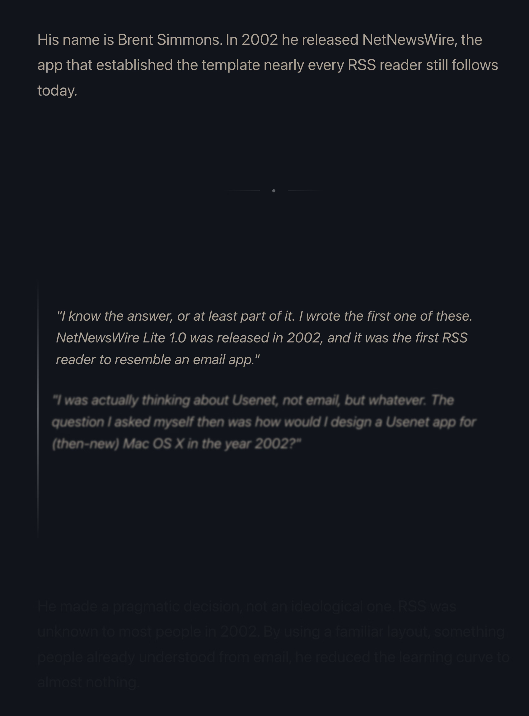
I also want to talk about the essay’s presentation.
The site makes heavy use of scroll effects. Okay, heavy subdued use, but like most of these, this is presentational rather than semantic. In this story at least, it feels a bit more thoughtful and it does feel like it enhances the experience and atmosphere, starting with the ticking number at the very top.
Yet, there are challenges. First, it does seem like there’s a lot of subtle movement going on and at some point that becomes a distraction. Also, I don’t know if it’s a bug or a particular stylistic choice, but things do not reveal themselves until they are almost off the screen. As an example, this is not a screenshot in the middle of animation – this is the page in a resting state, where the bottom is impossible to read:
This property, combined with the fact that all these are always reversible (something that even the recent Death to Scroll Fade page that ridiculed these avoided) makes the essay fiddly and harder to read than it needs to be.
To author’s credit, there is an alternative static version provided and linked to at the very top. But that version is also styled differently, and has more of a “terminal” look.
Thinking out loud and building a set of principles out of these observations, I would personally do it this way:
- a static version should be stylistically indistinguishable from the dynamic version
- ideally, there would be an easily accessible switch between motion/no-motion, similarly to how some sites allow you to switch to dark/light theme regardless of where you are in the story
- if the user specifies “prefer reduced motion” in accessibility settings, a static version should kick in automatically
- make the text effects finish as they scroll in, continuing the momentum on their own – don’t make them stop in the middle
- unless the animation is particularly important or gimmicky (by the way: I love a good gimmick!), going back and forward again should not replay it