“They did the bare minimum and moved on.”
Since the early 2000s, Mac OS X had a few orientations of icons depending on whether they were applications, files, utilities and so on:
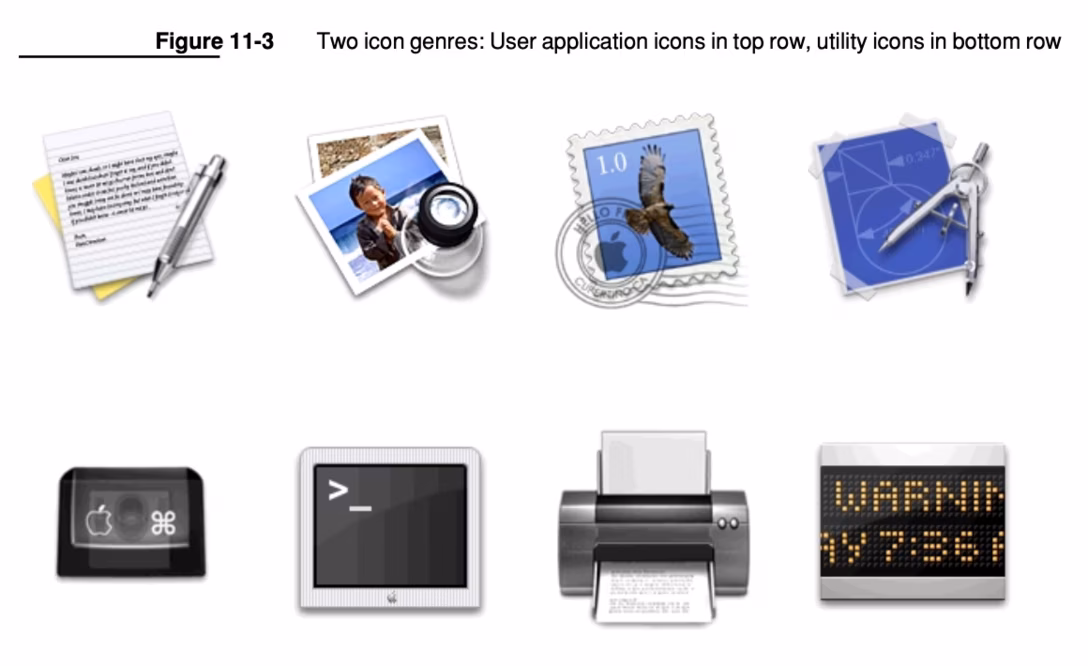
In 2020, macOS Big Sur unified those styles and made them more iOS-like:
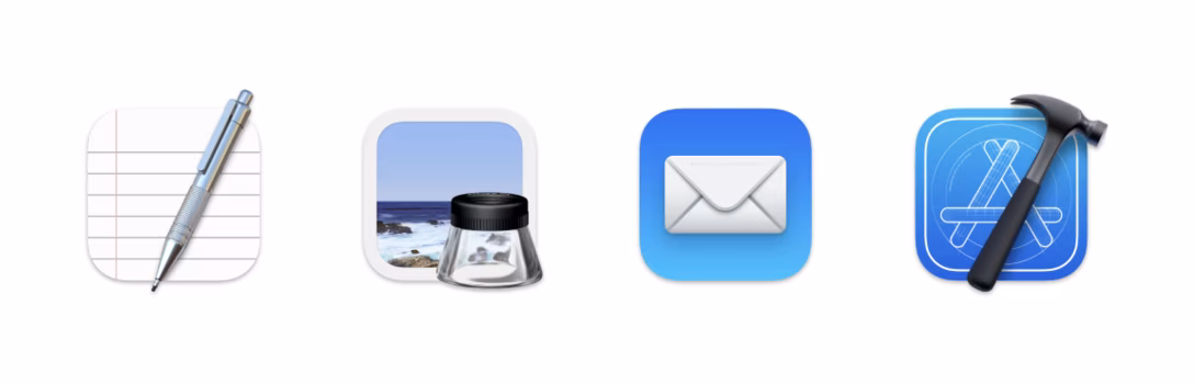
A few years later, Jim Nielsen revisited the icon “Big Sur-ification”, and showed examples of apps that did the transition really well, but also those where the transition felt… lazy, essentially shoving their previous icon into a roundrect.
For those, Nielsen proposes some alternatives that are delightful to see:
The Word/Excel/PowerPoint/Outlook explorations are particularly nicely done.