To streamline or not to streamline
Software engineering has long had a concept of “premature optimization” – overbuilding things too early in anticipation of future that might or might not come.
I feel design has a version of that, too. Here’s viewer menu hierarchy in Google Drive:
One should always feel very uneasy about a menu with just one item, like Insert here. Even within the View menu, one could imagine streamlining all the commands to be in one main menu, rather than two tiny submenus (coupled with pretty excessive width that makes for an interaction that feels like walking a tightrope).
These are the menus for a PNG image. It’s entirely possible other file types offer more options and this menu structure earns its keep then, paying off in consistency over a long run – but I tried a few file formats, and the menus all looked similarly sparse.
As a counterpoint, here’s an example I just spotted in the context/right-click menu in Apple’s Notes:
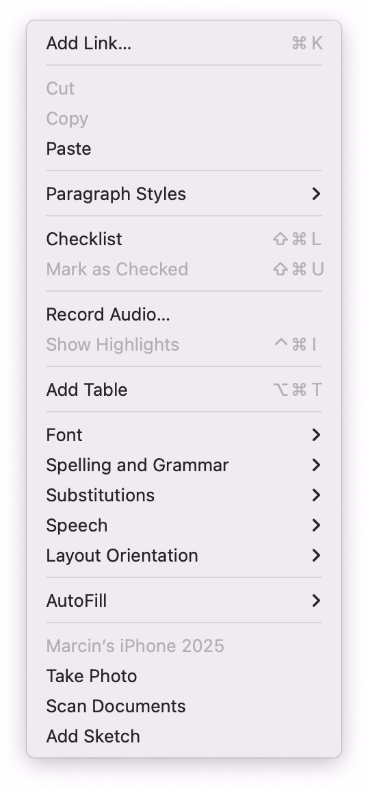
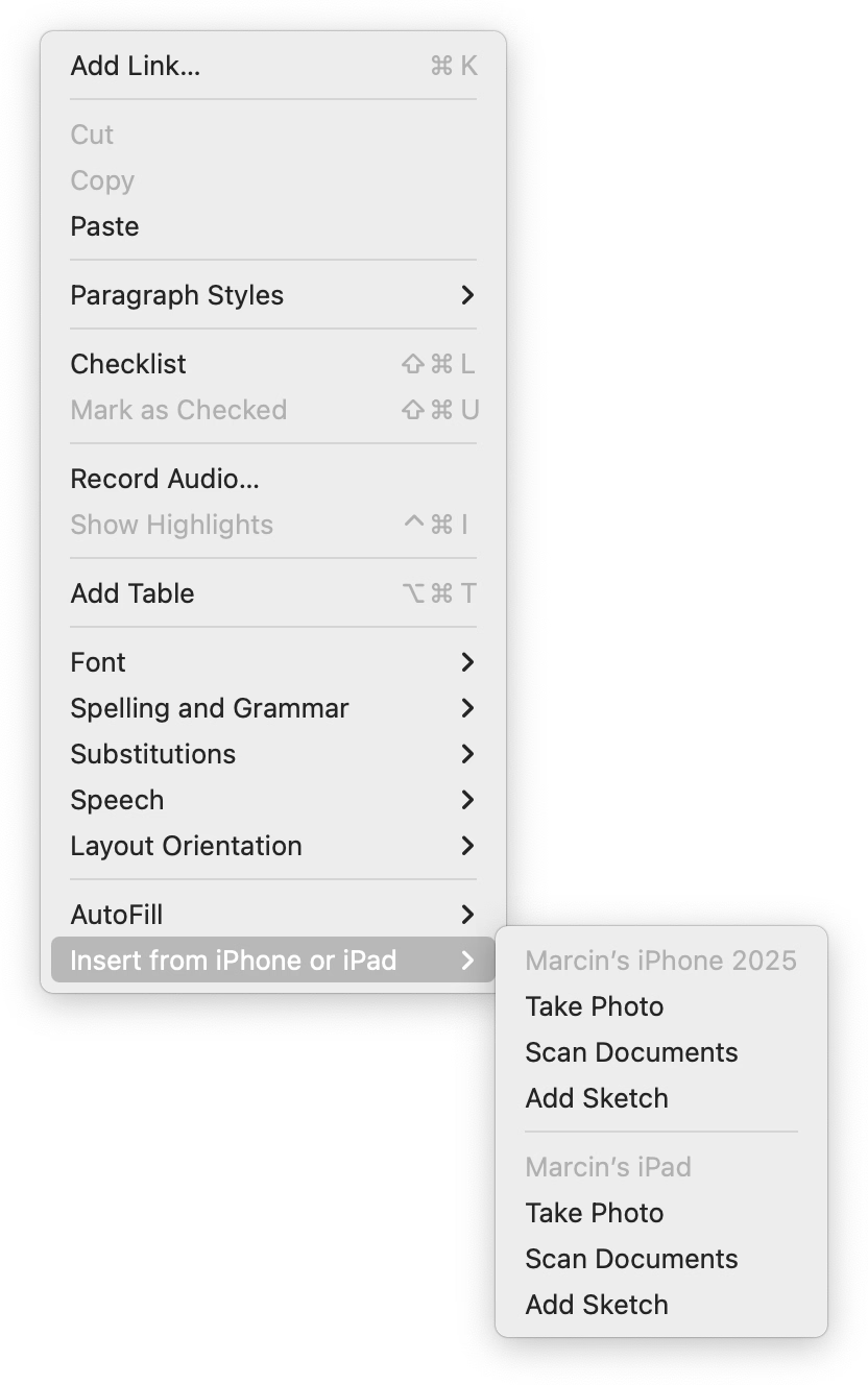
When you have one device, the three options get appended to the ground floor of the menu. But if you have more than one, they all get ejected into a submenu.
I like this soft consistency of introducing hierarchy only when it’s needed – or in reverse, flattening/streamlining it as necessary.
I have mixed feelings about this one particular use, however. This menu is already very long (and seemingly abandoned – look at table and checklist and link options), so in this case perhaps a consistent submenu would be overall better. Also, the “Insert from iPhone and iPad” label is long and makes the entire menu slightly wider.
But as a pattern, it’s worth considering. (Just for completeness’s sake, you could also half-streamline by adding a submenu for the iPhone and another one for the iPad. But in this particular case, it’d also likely be a bad idea.)