“Type is not rubber”
Oh, this is a fantastic adage I haven’t heard before, mentioned here in 1978, arguing against distorted, or “faux” typography:
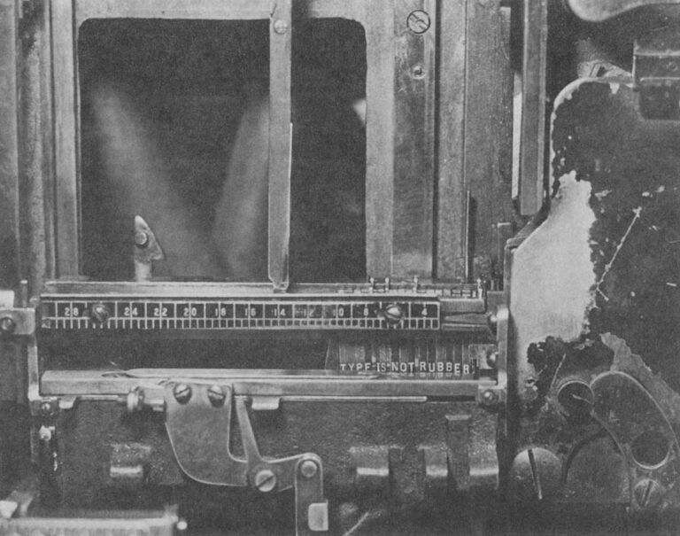
A Linotype assembly elevator with the gate closed. This is the center of an operator’s attention as the mats tumble down and are arranged automatically in lines. The spacer bands adjust themselves to fill out the line but only so many letters can fit in any measure, proving the old trade adage that “type is not rubber.” Modern photocompositors have lenses that can distort the image of the letters to fit where they couldn’t. Today, type is rubber.