Unsung @ 250 Nine design details
(This is one of the meta posts about this very blog. If that’s not interesting to you, skip to the next one!)
I thought I’d share a few of the small design details I am proud of for this small blog!
1.
After years of being annoyed at Slack for mishandling image sizes, it was important for me to show the screenshots (at least the desktop UI) at their 100% precise size, if possible. I think that helps to get a better sense of a scale and feel of things. This was harder than I expected (since I still want images not to grow too wide or too tall), but hopefully works well now.
2.
I wrote some extra code so that if an image has edge transparency or even soft shadows, it will be aligned accounting for all that. I think that feels elegant – especially on a blog that practices asymmetry probably to a fault.
3.
If the images or videos blend too much into the background, they get a lil border to separate them – but only in light or dark mode as needed. This is so that the whole page rhythm holds better together. (Manually assigned so far. Would be curious if one can make this automatic.)
4.
Speaking of dark mode, I almost figured out how to make videos with transparent pixels so that they look good in both dark and light mode. (Chrome only. Still working on it for Safari.)
5
I want autoplay videos (without sound!) so that it’s easier to see interaction design – basically, a modern version of what GIFs used to provide. This has been challenging and required adding some JavaScript, and is still not done! But it’s starting to feel nice.
6.
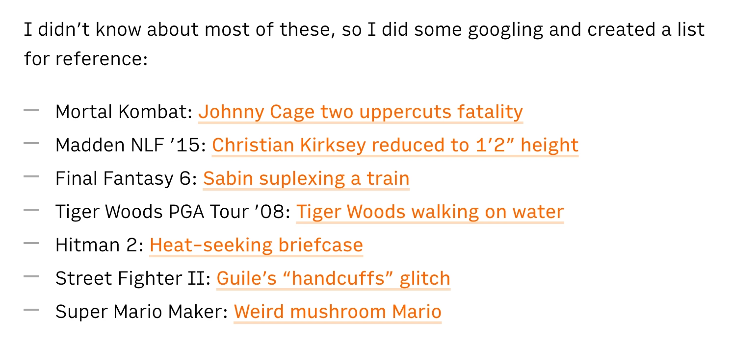
Given all the quotations I do, I added hanging quotes to text. Wildly, they are still not really supported by CSS (Safari is a sole exception), so that required some manual intervention.
7.
Short lists are (automatically) spaced differently than long lists. I’ve always wanted to try that.
8.
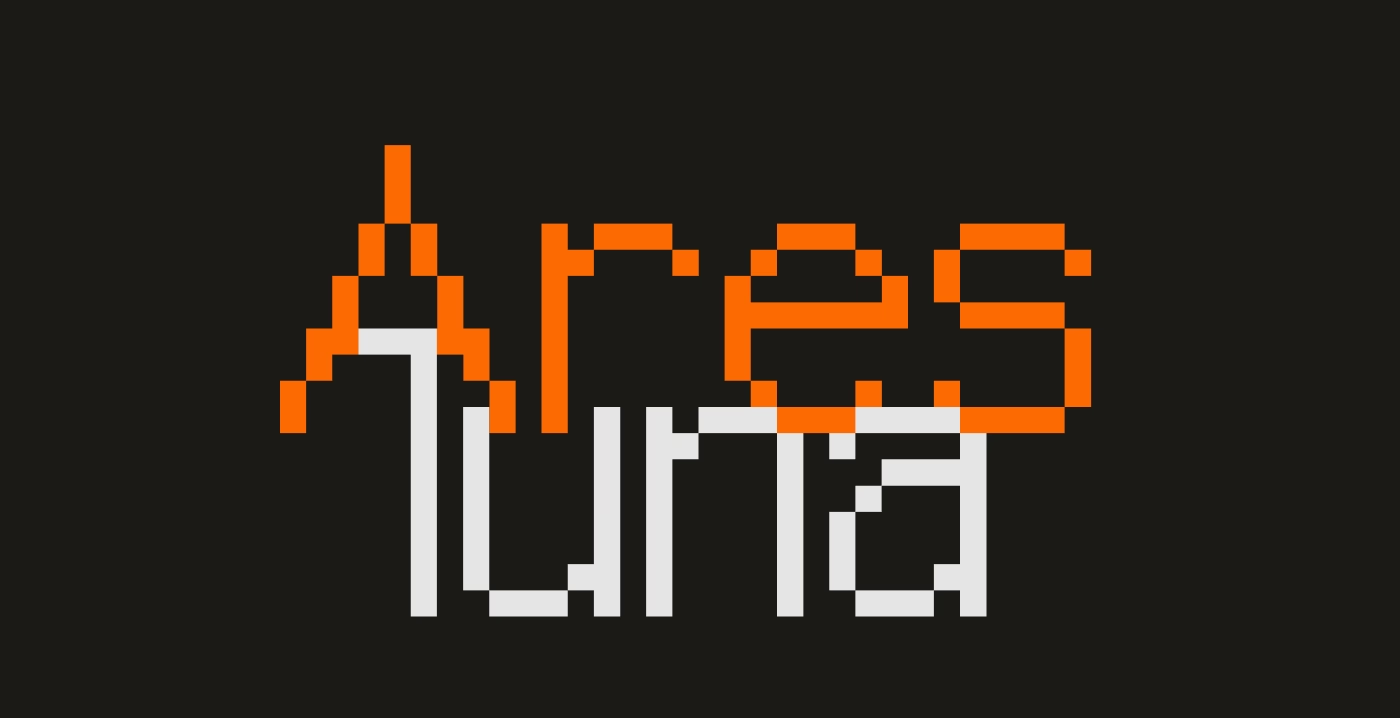
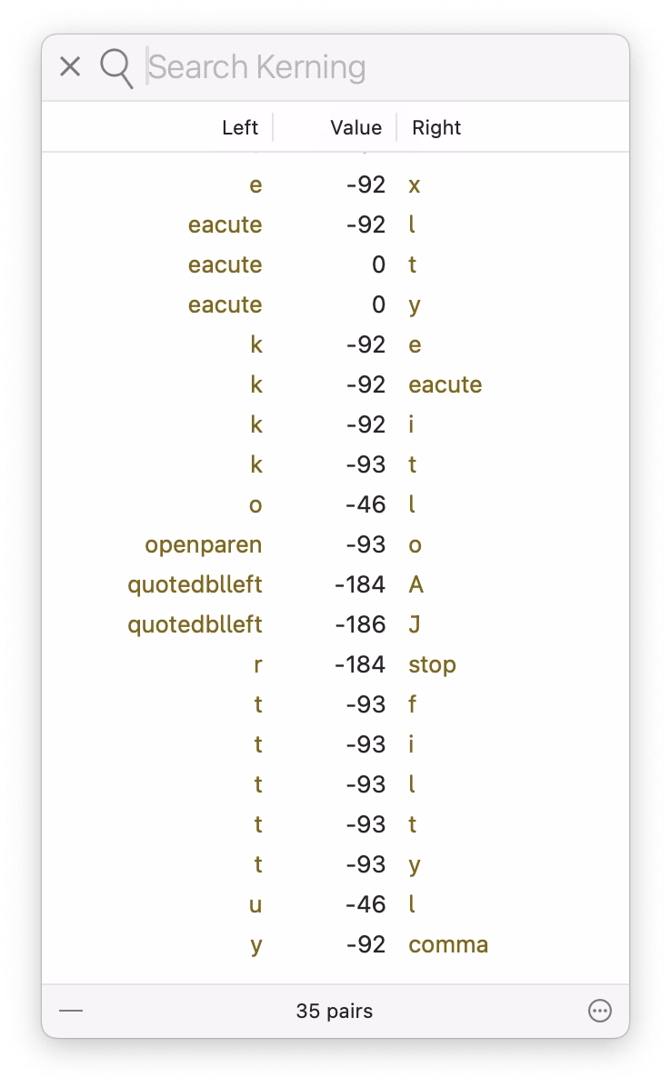
I’m having a blast with the pixel fonts I recreated from PC/GEOS. I keep adjusting the glyphs, adding kerning pairs, etc. It’s fun to keep improving a font as you’re improving its surroundings; I just redrew the @ glyph you can see above!
9.
It’s a bit old-fashioned, but I still like the idea of visited links being styled differently than non-visited links, to help you orient yourself. (Linking feels very important to me.)