“Update announcements are most likely to appear at the least convenient time.”
A quick post from Paul Kafasis at the software company Rogue Amoeba, talking about making update notifications less annoying:
Though [the open source update framework] Sparkle serves us very well, it has one notable downside. Update announcements are most likely to appear at the least convenient time: right after you’ve launched the app.
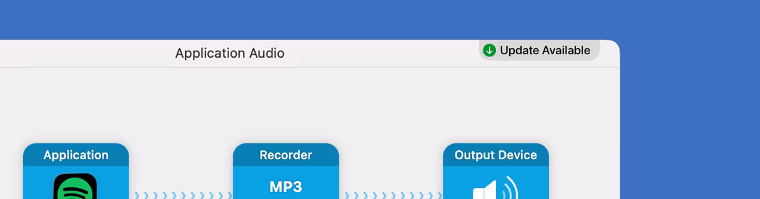
With that in mind, we’re making changes to how update notifications appear throughout our apps. In the future, when the software’s timed automated check detects a newer version, it will no longer pop an obtrusive window like the one seen above.
Instead, a small “Update Available” indicator will be shown in the app’s interface. You can see it right here in Audio Hijack.
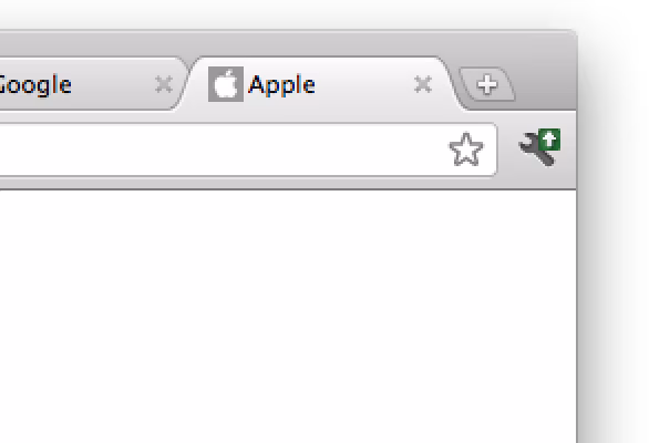
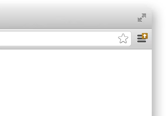
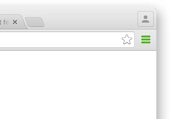
I first remember this approach from Chrome in the early 2010s. (If you know it from an earlier application, please reach out!)
The browser still uses it today, but the visual treatment was different early on; the update icon badge started with green, then yellow, eventually ending up red. While this resembles traffic lights the inspiration was, apparently, rotting fruit – you’d be more likely to want to clean up an old, stinky fruit than a fresh new one.
Here are, I believe, the first three visual treatments in Chrome, 2011-2013:
How effective was that treatment, I don’t know. (It definitely felt more thought through than the trash where the skeuomorphism undermined the function itself.) But it is all interesting to me in the larger context of the tensions underlying updates:
- It’s in a company’s best interest for every user to be on the latest version, since that saves on support headaches.
- A company needs to believe the newest version is the best ever – even if it’s not – similarly as our brains need to believe we are generally right most of the time, just so we can function.
That’s why I always appreciate the improvements that prioritize the user experience over the company’s.