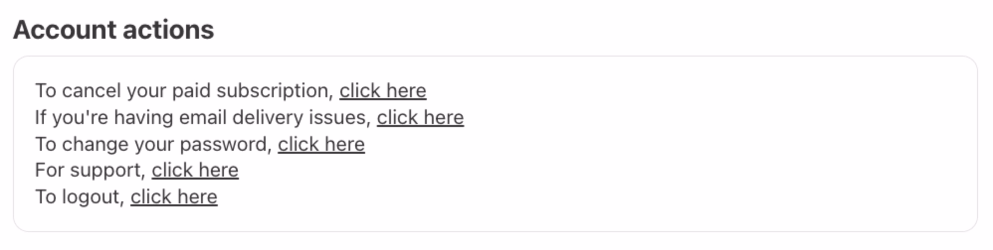
“Use links, don’t talk about them.”
The classic – but still important – rule of web design says to avoid labeling links “click here.”
It’s one of the oldest web design principles. Tim Berners-Lee wrote about it in 1992; if you visit this link right now, it might be the oldest page you will have ever visited.
The gist of it is simple: the mechanics of following a link are not important, and should be replaced by something that can make the link stand on its own. This is important for screen readers, but also for basic scannability: a “click here” label has a lousy scent and requires you to take in the surroundings to understand what it really does. The rule is, in effect, a variant of “show, don’t tell.”
(In modern days, you can also add another transgression: on touch devices one cannot click, but only tap.)
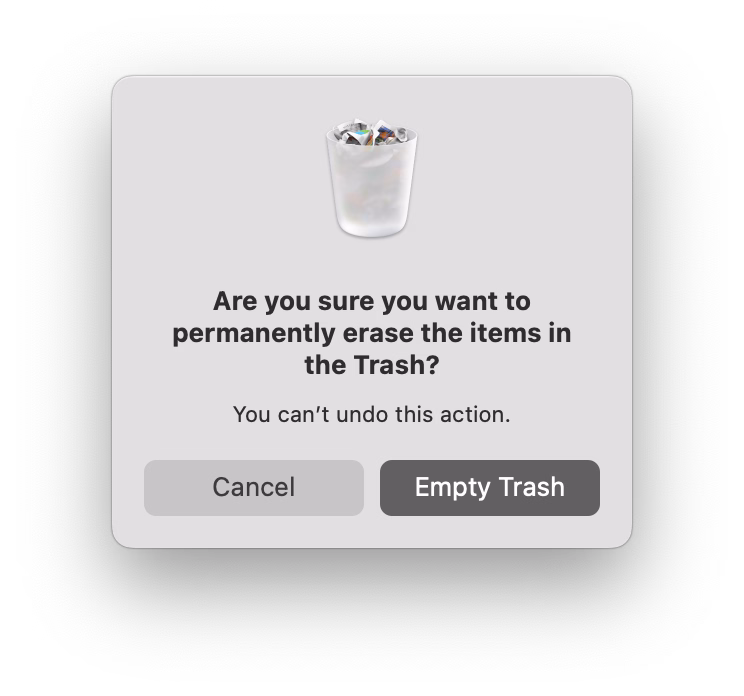
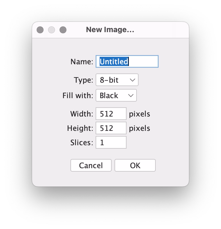
There is a similar rule about button copy design. Button labels, too, should be self-sustainable. Below is a good example (just reading the button lets me understand what I’ll achieve by clicking it), juxtaposed with the bad one (“OK” is so generic you have to read the rest of the window).
Earlier this week, I was passing some train cars on my coffee walk, and saw this bit of UI:
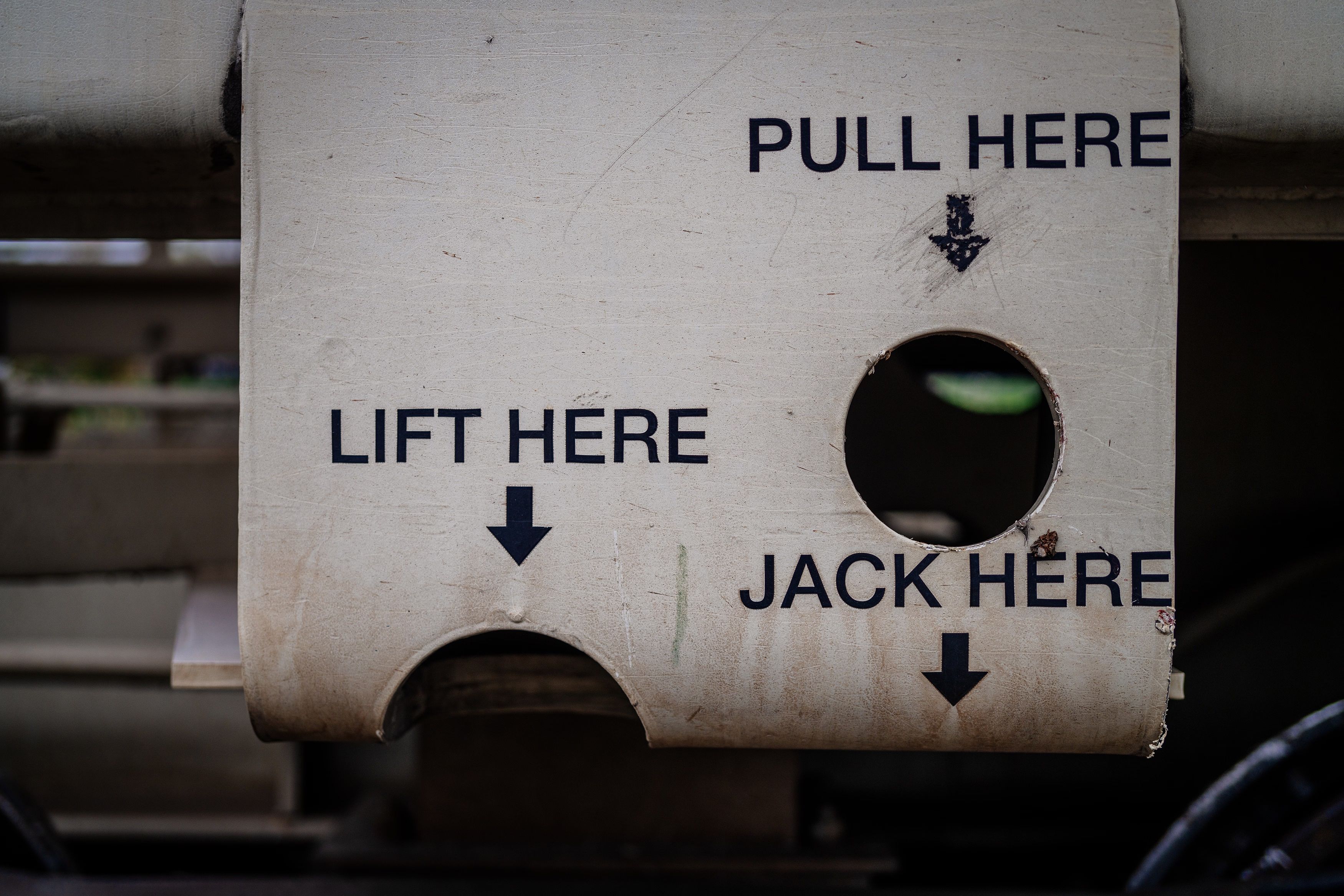

Why are these okay, and “click here” is not? Here’s why, I think: Yes, the ultimate goal is to move a train car, or empty it, or send it on its way. But here, the mechanics matter, too. They’re dangerous. They require preparations. No one says “I’m going to open my laptop and start clicking on links,” but I imagine people say “we have to jack this car” or “we need to lift it.” Even “here” has depth: these are specific tool mounting points. Choosing the wrong “here” will have consequences.
But, going back to the web, avoiding “click here” in strings isn’t always easy. Imagine trying to put a link in the sentence “To change your avatar, visit the profile page.” I’m personally never sure how to linkify it well:
To change your avatar, visit the profile page.
To change your avatar, visit the profile page.
To change your avatar, visit the profile page.
Linking “change your avatar” seems correct since it points to the eventual outcome, but then it leaves the actual destination dangling and unlinked – like putting an accent on a wrong syllable. “Visit the profile page” is better than “click here,” but it’s still not scannable. Linking the entire sentence seems strange and complicated to me, and I also disagree with Tim Berners-Lee, who on the page I liked to above seems to suggest this should be…
To change your avatar, visit the profile page.
…just because this might make a user think there are two separate destinations and actions, and contribute a wrong mental model.
You could, of course, simplify this to “Change your avatar,” but while that would work in a UI string, it wouldn’t within a larger paragraph of text, or a blog post.