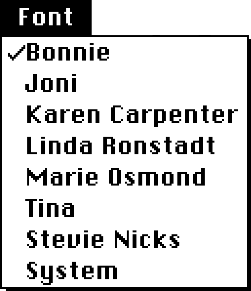
World-class female singers
The story about the original Macintosh’s built-in font set being named after “world-class cities” is well known and documented by Susan Kare on the Folklore site:
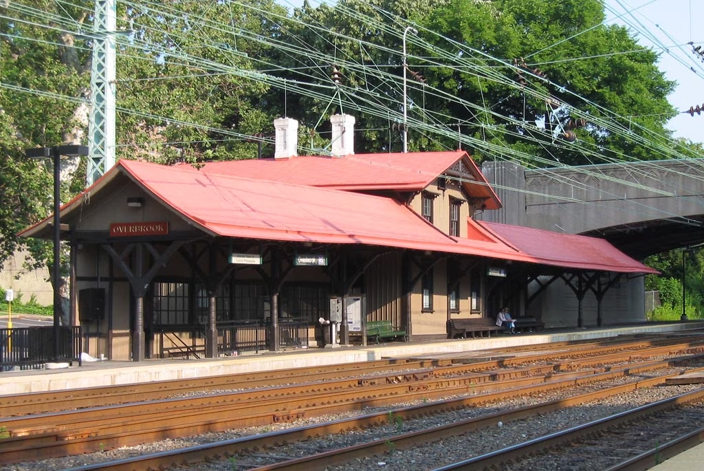
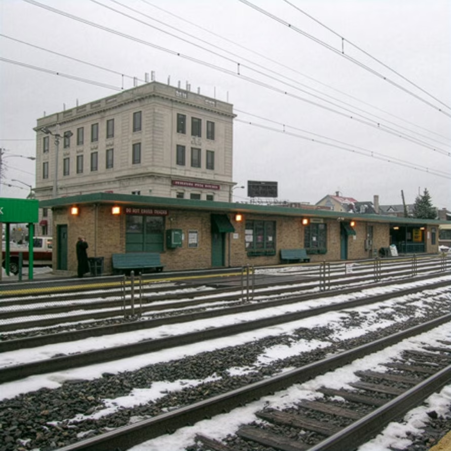
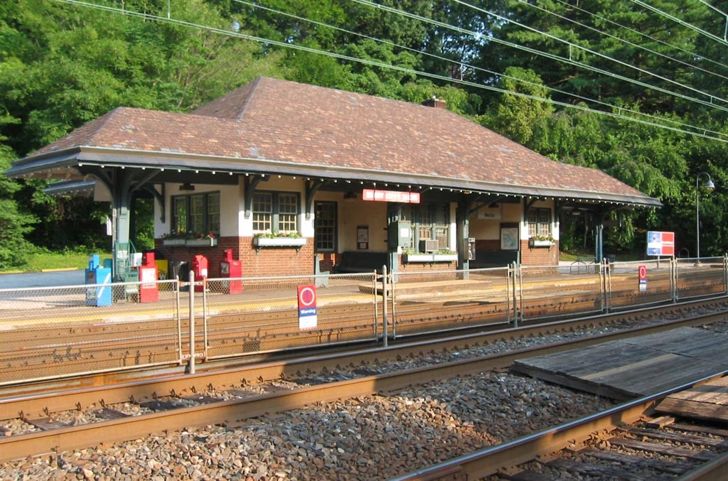
The first Macintosh font was designed to be a bold system font with no jagged diagonals, and was originally called “Elefont”. There were going to be lots of fonts, so we were looking for a set of attractive, related names. Andy Hertzfeld and I had met in high school in suburban Philadelphia, so we started naming the other fonts after stops on the Paoli Local commuter train: Overbrook, Merion, Ardmore, and Rosemont. (Ransom was the only one that broke that convention; it was a font of mismatched letters intended to evoke messages from kidnapers made from cut-out letters).
One day Steve Jobs stopped by the software group, as he often did at the end of the day. He frowned as he looked at the font names on a menu. “What are those names?”, he asked, and we explained about the Paoli Local.
“Well”, he said, “cities are OK, but not little cities that nobody’s ever heard of. They ought to be WORLD CLASS cities!”
So that is how Chicago (Elefont), New York, Geneva, London, San Francisco (Ransom), Toronto, and Venice […] got their names.
If you check out the actual Philly stops and witness all their provinciality, you can understand what Jobs was after:
Go to first Macintosh via Infinite Mac, open Infinite HD and MacWrite within, and you can examine the nine eventual fonts in their pixellated, cosmopolitan glory:
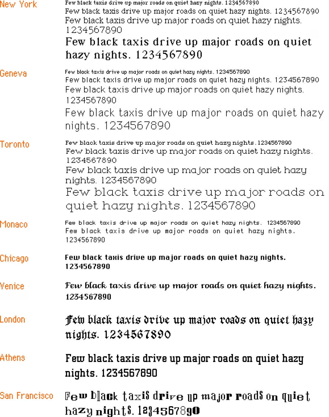
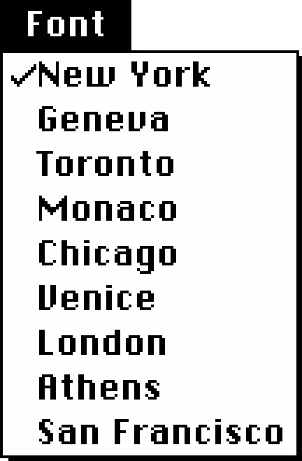
The list goes in this order: New York, Geneva, Toronto, Monaco, Chicago, Venice, London, Athens, San Francisco.
But: How about some hard evidence for the original anecdote? Turns out, the March 1984 issue of Popular Computing used pre-release Mac software and printed a screenshot of the names rejected by Jobs:
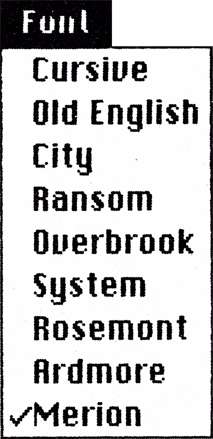
Since on the facing page we see the output in the same order, coming up with the correct mapping is not hard:
- Cursive → Venice
- Old English → London
- City → Athens
- Ransom → San Francisco
- Overbrook → Toronto
- System → Chicago
- Rosemont → New York
- Ardmore → Geneva
- Merion → Monaco
One has to admire the final order of the Mac fonts that went from dependable and utilitarian at the top, to progressively more weird; this earlier list is all over the place.
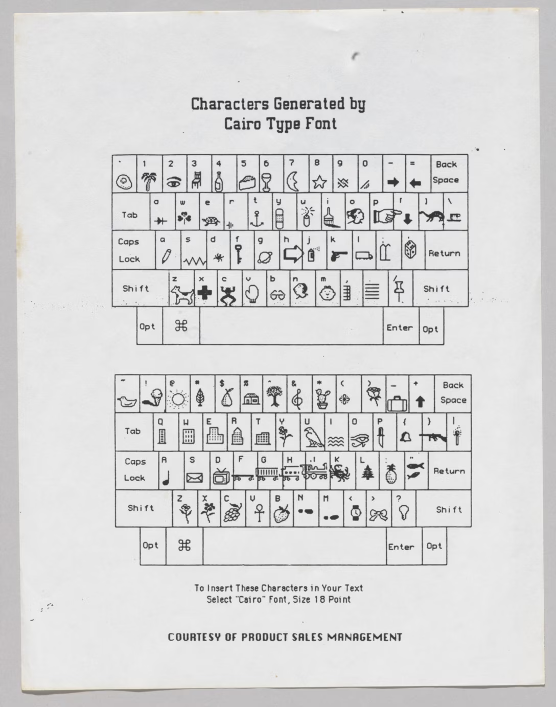
In later releases of Mac OS, three other world-city fonts – Boston, Los Angeles, and Cairo – joined the party, so let’s show them here for completeness’s sake:
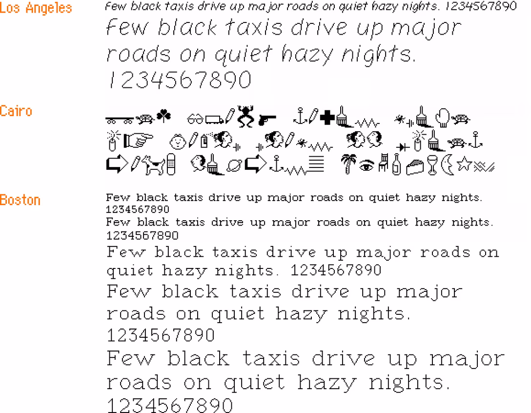
(Cairo is the classic icon font and in a way a predecessor of modern emoji, with inside jokes like Clarus The Dogcow.)
But that’s not the end of the story of the original Mac fonts. Let’s get back to 1983. On yet another page of the magazine, we see this list from MacPaint:
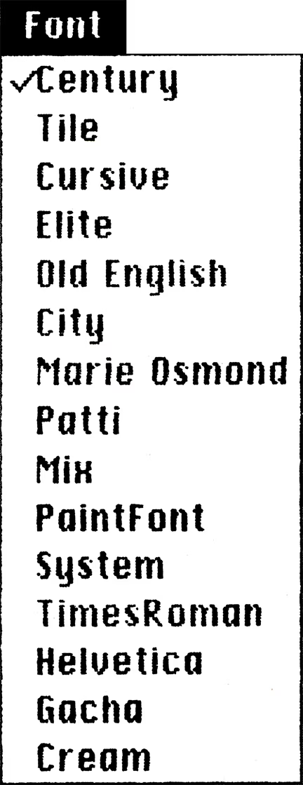
You can tell this screenshot is even older than the previous one, because it is itself set in an earlier version of Chicago, with a single-storey lowercase “a,” and many letterforms being works in progress. (I talked about the history of Chicago in my 2024 talk about pixel fonts.)
And it is old enough that this isn’t just interim names for surviving fonts – it’s actually quite a few old fonts that didn’t make it to the release day.
Unfortunately, this particular version of Macintosh software remains unknown, but one similar pre-release version of the first Mac software leaked, and so we can take a look at some of these fonts, too:
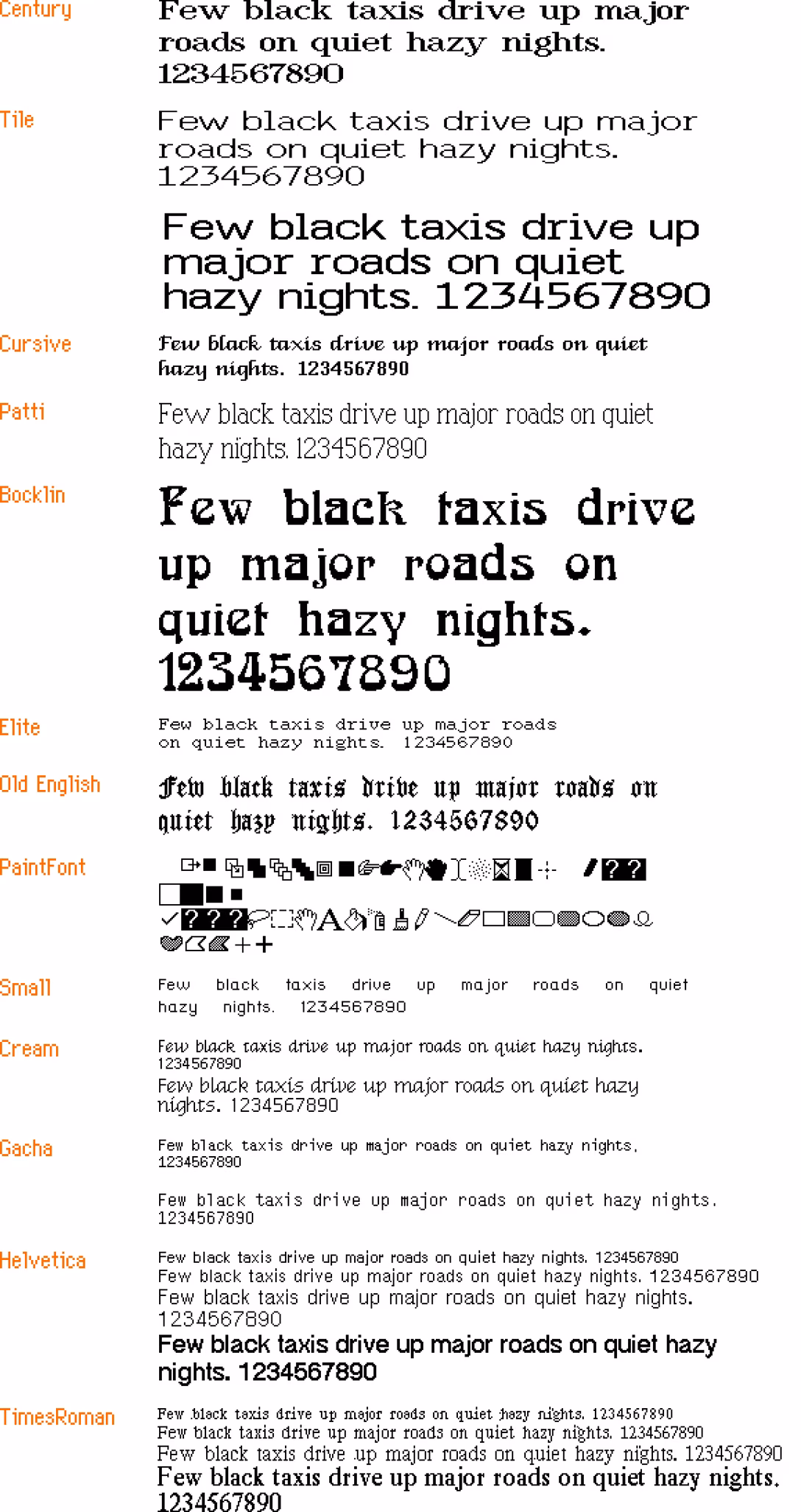
(You can download a lot of these fonts thanks to the hard work of John Duncan. They are still bitmap fonts and might not work in all the places in modern macOS, but they seem to work in TextEdit at least.)
Here’s what I learned from looking at this list:
- You can definitely see how unpolished some of these fonts are in terms of spacing, letterforms, and available sizes – kudos to the team for holding a high quality bar even though there was little precedent for proportional fonts on home computers at that time.
- Even the fonts that shipped – London (née Old English), Venice (née Cursive), and Chicago (née System) – have had their letterforms tweaked and improved.
- Chicago is not named Elefont, but simply System. Had the System name persisted, this Medium snafu from 2015 would have been even more hilarious.
- The name of the monospaced Elite font is likely inspired by one of the two classic sizes of typewriter fonts: pica (larger) and elite (smaller).
- Cream came all the way from Xerox’s Smalltalk and was the original system font for Macintosh-in-progress, before Susan Kare created Elefont/Chicago.
- PaintFont was a symbol/icon font, but distinct from Cairo and emoji in that it seems it was meant to be used only by the app to draw its interface. (Today, SF Symbols serve a similar purpose.)
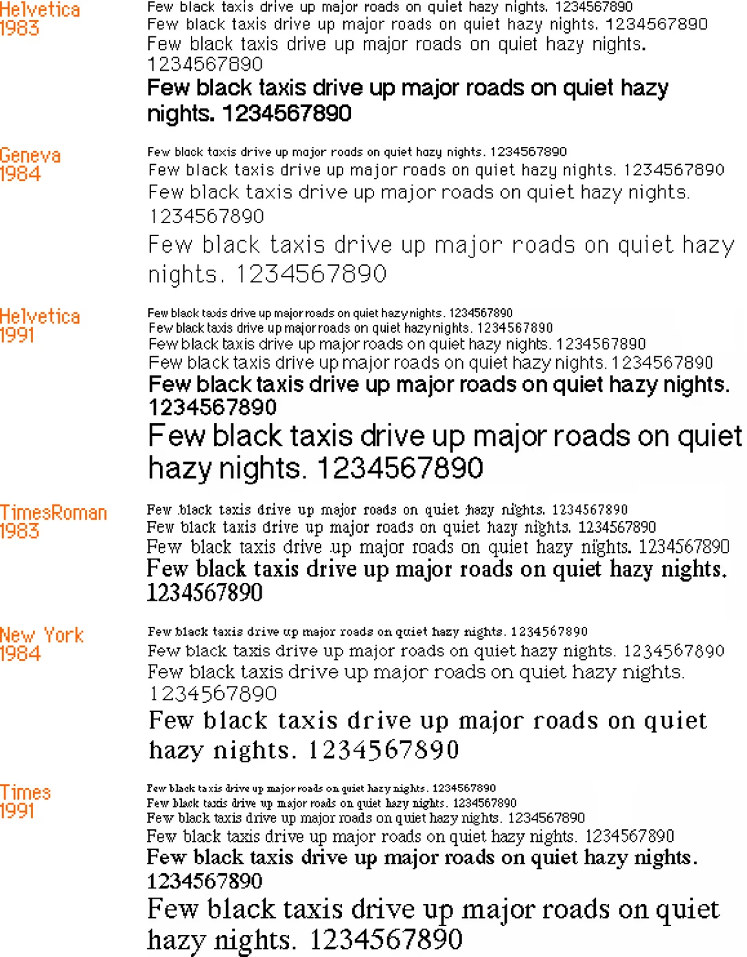
- Apple originally planned to use Times Roman and Helvetica, but this hasn’t happened presumably because of licensing issues. Only years later, the proper Times and Helvetica fonts were introduced. Here’s a comparison:
But the most interesting thing I haven’t noticed before are two fonts called “Marie Osmond” and “Patti.”
I am reaching outside of my well of knowledge here, but from context clues I’ll assume the latter means Patti LaBelle. And so, pulling on that thread, it’s kind of cool to imagine an alternate universe where the original Mac fonts are neither suburban Philly stations, nor well known cities, but something like this: