Xcode’s clever minimap
Minimaps are an interesting UI element because they often feel very exciting – something about things being small, or responsive, or maps just being cool? – but fail to actually be useful.
I find minimaps for coding particularly tricky because, at least in my world, code all looks very much the same from far away. Seeing a thumbnailed/greeked version of it felt just like a more expensive and distracting version of a regular scrollbar, without any benefits.
But Xcode does something interesting. It allows you to use MARK to create a sort of a “header” for the minimap anywhere you want:
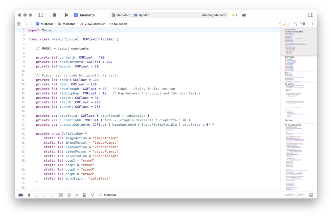
The minimap then shows those headers not greeked, but as human-readable text:
I thought this was clever, allowing you to see the bird’s eye view of the code not just in the most obvious visual sense, but also as a sort of “table of contents,” adding so much more utility.
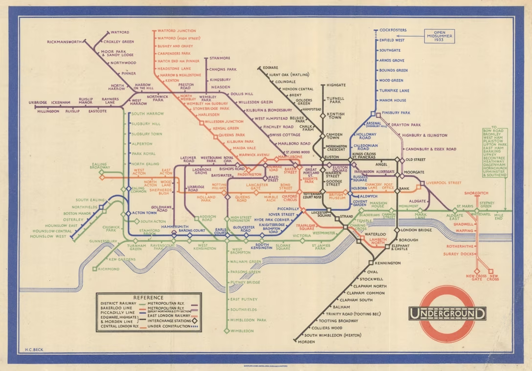
This, of course, is technically no longer a “zoomed out view” but then again, it’s not that there is some sort of rule that it has to be. As a matter of fact, quite the opposite; it all reminded me of the famous London subway map by Harry Beck, which also broke the expectations in a similar way.
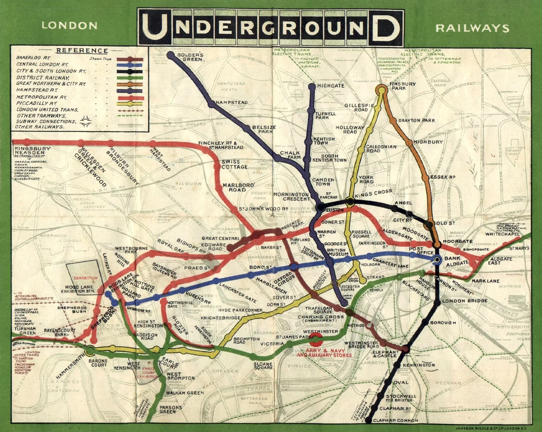
The original, geographically accurate map of London’s tube looked like this:
Beck decided to take liberties with the geography and reimagine the map as a diagram to help the travellers, and ever since he’s done so in 1933, many transit maps followed suit: