Behind the horizon
Just a few days ago, I shared an example of what to me felt like a crammed interface. Here’s a look into an adjacent problem, into how apps deal with making room for your stuff.
Let’s say I have two pages on my home screen in iOS:
(The third “app library” page is kind of an overflow page – automatically generated, and always following whatever pages I create.)
Whenever I enter the customization mode (e.g. “jiggle mode”), iOS thoughtfully adds a third, empty page:
This is a nice gesture that creates extra breathing room ahead of the user, and avoids having to have an explicit, and perhaps flow-breaking “add page” action.
And it feels useful not just if you literally want to add a new page, but also if you want to test or experiment. It’s a nice playground – otherwise you might be tempted to add a new widget on an existing page, and perhaps mess up the existing layout by accident.
If you fill out this page with something, another empty page will be quietly added. And, if you leave any auto-added empty pages intact, they will be removed when you exit the edit mode.
(Just for completeness’s sake, there is also this view when you tap on the page selector, where you can reorder the entire pages – but you will see that “add new page” doesn’t exist here, either.)
It’s interesting to watch apps take different approaches to this kind of problem.
Here’s Excel, which allows you to scroll forever without stopping like yo’u are the Big Bang itself. You can witness the scrollbars getting smaller and smaller and there’s something freeing about it, but I can imagine it feeling unnerving – like driving in a car without brakes:
Google Sheets takes the opposite approach – you start with 26 columns and 1000 rows. Too much? You need to add more by hand. Too little? You’ll have to delete them.
That is honest, but can also feel worse, needing to constantly manage the canvas like you had to keep divvying up available memory for apps on old computers.
Freeform, Apple’s design app on macOS, offers a hybrid approach. There is just always some fixed amount of room around your objects, but not enough to trigger your latent agoraphobia.
Create new objects? More room will be created around them. Remove stuff? The canvas will contract around the survivors. The canvas is truly infinite only when you grab and move an item:
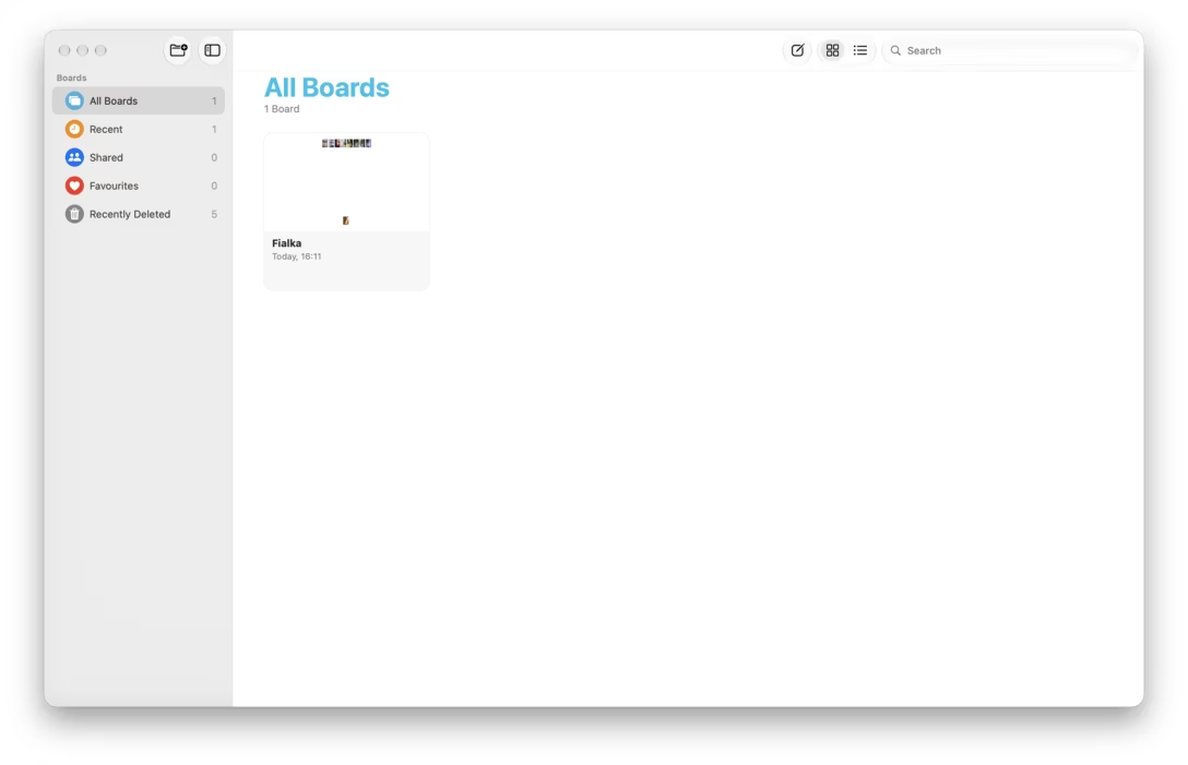
This auto-expanding and auto-trimming behaviour seems similar to the iOS home screen at the beginning of this post, and Freeform’s thumbnails are clever about it, too, skipping all the automatic padding:
I can’t tell you which approach is the best, because I believe it’s all situational. While I don’t like what Google Sheets is doing, I don’t like it chiefly in execution – the interface for adding new rows is clumsy, there are no easy keyboard shortcuts or onscreen affordances to insert rows or columns, and there is no “trim” command to remove all the unnecessary padding. But, with a better UI? It might have felt the best of the bunch, as control can feel better magic, but only if that control isn’t a burden.
It’s all good to think about, this interesting area of giving your user enough space to feel comfortable.