Book review: The Designer’s Guide to the Buttons + Pick, Click, Flick!
★★★★☆ The Designer’s Guide to the Buttons (Andrew Marcus, 2026)
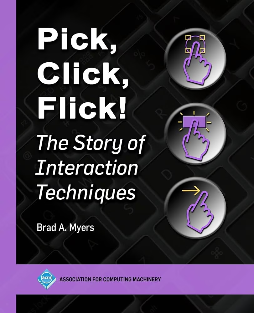
★★☆☆☆ Pick, Click, Flick! (Brad A. Myers, 2024)
Inside you, there are two wolves. At least I hope there are.
One wolf is the aesthete. It’s important for interfaces to look and feel a certain way. Design is mechanics, alignment, typographical choices, rounded corner debates, even fashion.
The other wolf is all about functionality. Design is a task getting done as quickly as possible, and other things don’t matter. Design is efficiency, flow, and accuracy. Fitts’s is the law of the land; GOMS its afterlife.
One wolf loves Not Boring Software and bets on who’ll win Apple Awards, the other wolf adores Craigslist and occasionally clicks through McMaster-Carr without buying anything, the same way others lust over pricey houses on Zillow.
The job, of course, is to feed both. Design is not just how it looks. Design is not just how it works. Design is both, and especially – and often – the tension between the two.
Recently, I stumbled upon two new books which try to cover a similar space – guiding you through the building blocks of a modern user experience – but each one does so from a different perspective. I thought I’d talk about both at the same time.
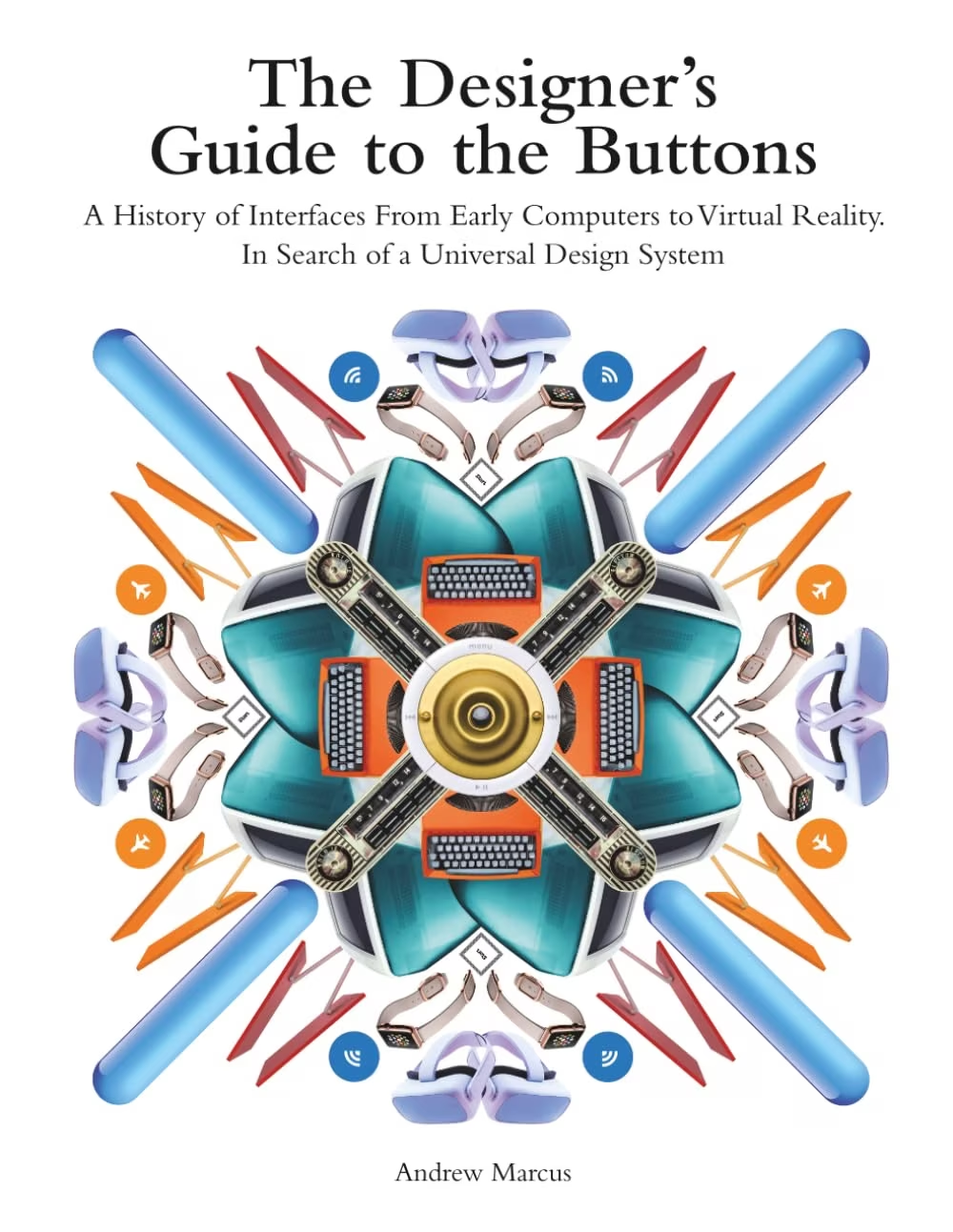
The Designer’s Guide To The Buttons is the first wolf.
The book’s interesting construct is walking through creating a design system – in Figma – and slowly exploring all the interface elements: buttons, checkboxes, lists, text fields, and so on. Each stop serves as an opportunity to dig deeper into the nuances of an element, as well as its history. I can see this being an effective hook for some people, as it starts with something pragmatic, but then goes deeper than just generic advice you see elsewhere.
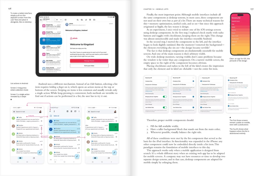
What helps is the book’s excellent imagery. Design is a visual medium, and there are thousands of screenshots here of various apps and interfaces, chosen carefully and reproduced in high fidelity; these must have taken a long time to collect, and you can learn a lot just from looking at them.
It’s also a relatively breezy read, written pleasantly and conversationally. There are some opinions I disagree with, but I consider this a positive thing – in my mind, a design opinion you don’t like from someone you respect can propel you further than a more milquetoast, agreeable presentation. (It’s fun to see yourself nodding with and/or shouting at a book!)
The book has an occasional factual mistake, sometimes confusing Xerox Star for Lisa, or Lisa for the Mac – and it also perhaps spends too much time in Apple’s corner (but so does this blog…). It also avoids a few thornier issues, like the debate on checkboxes vs. switches. But overall, it generally feels trustworthy and contemporary, dipping into history just to inform, but not revelling in it. It covers desktop, mobile, and VR/AR interfaces.
The lack of index can be tricky, although an exhaustive table of contents helps. The book also occasionally throws in a QR code to more online resources. I have a sense that reading it will sharpen one’s appreciation for visual and interaction details of various things that many don’t think about.
Pick, Click, Flick!, at 812 pages to the other book’s 250 is more exhaustive, and could even be seen as a continuation of the above book, spending many pages on flavours of undo, dialog boxes, graphical tools selection mechanisms, and many other design nooks and crannies.
Unfortunately, the breeziness is gone – the book often feels like a heavy dump of various information collected elsewhere, copy/pasted from sources without care for ease of reading, or any sort of narrative. (I am not accusing the author of plagiarism; my complaint is about internal inconsistency.)
The first book does a good job crossing over to the other wolf’s world. The book is not shallow as much as it is focused – knowing what it’s about and not outstaying its welcome. Pick, Click, Flick! feels more sprawling and overwhelming. The author is more of a collector, and not a particularly discerning one. Bad interfaces are presented next to good ones without much differentiation, aesthetic reasons are seldomly mentioned, and the author does not fully build his credibility as a UX designer.
The second book will disappoint you if you’re here for opinions. It is rather meant as a reference – with pervasive links to papers, and a thorough index. But even as a reference, it can fall flat: the author mostly travels in academic circles, which means a certain lopsidedness and a lot of obscure, ugly, non-commercial interfaces. As an example, the section about keyboard shortcuts only takes a page and doesn’t go near some stuff found even on this very blog.
It is, overall, much less pragmatic and more a meandering survey of some academic history on the subject – it’s a hit or miss whether you will find something interesting in here. (I was puzzled, by the way, to see neither book cover loading states, which are interesting from both a pragmatic standpoint, and a historical perspective – and incredibly important in UX design today.)
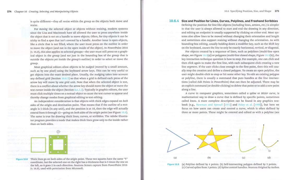
Unfortunately, the visuals in Pick, Click, Flick! are of “academic” quality as well: perfunctory, blurry, shown at arbitrary sizes. It really feels like reading a much more fleshed-out Wikipedia, which I mean both in the derogatory and laudatory senses. (The second wolf inside me enjoys reading Wikipedia all the time. But a designer cannot survive on that alone.)
Lastly, adding to the perception of the book as a kitchen sink, are the interviews with people like Bill Atkinson and Loren Brichter tacked at the end of an already heavy volume, perplexing as they don’t seem to offer anything useful. (Although at least they put some names behind known interfaces.)
I learned things from both books, but only fully read and could recommend The Designer’s Guide to the Buttons. I would consider the other one only with the caveats I mentioned above – it could be useful as a reference, if you’re particularly historically or academically minded, but it will still be an incomplete one. It might be good to get it as an e-book, as the physical volume is heavy and unpleasant.
The Designer’s Guide to the Buttons is available for $29 digitally, $20 in paperback, and $43 in hardcover (that’s the version I bought). Pick, Click, Flick! can be had for $48 digitally, $70 in softcover (I bought this version), and $90 in hardcover. True to their nature, the first book offers a good preview PDF that will tell you exactly what to expect, while the second book’s preview PDF contains only the table of contents, index, and bibliography.