Crammed and dangerous
This is what happens when I search through photos on my iPhone:
I’ll repeat and emphasize the last frame below, because it’s a resting state that doesn’t offer much rest. I am happy with the train results and I just want to look at them in peace – but now there’s a pop-up in the way. What would you do to get rid of it?
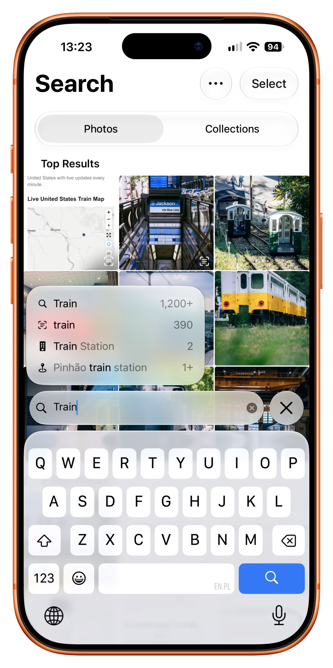
Trying to swipe it away doesn’t work:
Tapping on the available largest surface – the photos – makes the photo you tap on take over the entire screen, which doesn’t help:
Tapping on the input field replaces it with another restless pop-up:
Tapping on X clears the search, so that’s not good:
Tapping on the other X just leaves the search altogether:
Tapping on the keyboard continues typing and adds to “train,” in effect going elsewhere, too:
Noticing that one of the entries in the pop-up is “train” and tapping on it works – sort of – but it replaces the input field with a token, and slightly adjusts search results, which are both worrisome in their own way:
Okay, there are three answers. None of them feels great.
One is to drag the photo chute down and then up:
While I sometimes can enjoy the kind of interface action that is effectively “unplug it and plug it back again,” here it doesn’t feel natural, and the space to perform is limited, too.
And speaking of limited space… the other solution is to tap on one of the few small areas that are actually truly inactive – the Search header, or the Top Results:
Lastly, I believe the most appropriate answer is pressing the blue loupe key (effectively the equivalent of Enter):
Why doesn’t this path feel intuitive? Because the results already appear as I type. The rest of the flow itself suggests Enter isn’t necessary – and it’s not as natural for me to think of Enter as solely a “keyboard hider.”
Despite both human factors and computers starting as military projects, I don’t love military metaphors – yet, this feels like a good example of a minefield interface.
This is because arriving at this kind of a claustrophobic screen feels dangerous; any misstep can derail the whole experience, sending you to another place you have to exit as well.
I wish I could tell you what’s my yardstick to separate a regular UI where some tap targets just do expected things, and one where there so many they all become mines. All of these above, in isolation, make sense, but they’re adding to what feels like a pretty unpleasant, anxiety-inducing interface.
I think this example highlights the value of intentionally leaving some areas of the interface that feel “safe”…
…although you could also say that in this case, that would be treating symptoms. I think the real problem is that in response to my search, the UI did two different things – one was the photos, the other the suggestion pop-up – and overlapped the results of those things. The pop-up feels strangely “growth hack-y” to me, as if the UI was optimized for constant forward momentum, nuding me to tap on new searches over and over until the batteries run out. It made me feel there was something wrong with my search for “train,” when it was a perfectly valid, innocuous search.
This is a wider pattern I don’t love and/or understand. Here is an example of the same thing used in Notes on a Mac as well – and it’s even worse, because the suggestions are bad, and because the pop-up always covers the most important result:
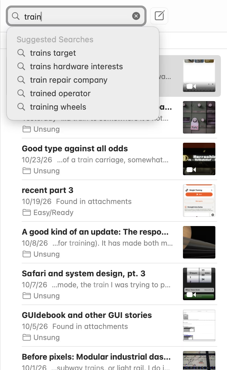
At least here, I am at still equipped with my treasured Esc key, which works reliably in a lot of situations like this – a jetpack to jump over the minefield – but that’s a small consolation prize.
(Enter works here too, but see above. Also, the pop-up reappears aggressively even on arrow key presses!)
An interface that feels like a minefield isn’t great. An interface where you have to over and over again keep escaping something to return to a resting state isn’t great, either.