Day for night
Actors are overwhelmingly diurnal, overtime is expensive, and film emulsion struggles with limited light, so since the dawn of time Hollywood has been using a technique called “day for night” – shooting during daylight, and then darkening and blue-tinting in post to pretend it was night time all along:
It’s a method filled with nuance, as this 11-minute video describes really well. This TV Tropes page lists a lot of examples from movies you might recognize, and another video by Rob Ellis has a lot of practical advice.
Now that you know it, you might spot it in movies that use it poorly: the ones that darken everything too much, the ones where too bright of a sky gives it away, or the ones where the shadows appear lunatic in the wrong sense of the word.
In UX design, you can day-for-night your dark mode as well – long before proper dark mode was a gleam in someone’s bloodshot eye, operating systems allowed you to invert their screens – but the limitations of that approach are apparent very quickly:


Sure, black becomes white, white becomes black, and grays swap places. But in real life, shadows do not get brighter at night, and photos do not behave that way, either.
The “proper” answer is not to do anything automatically and to go all out with a perfectly hand-crafted dark mode that’s an equal partner to light mode: a distinct set of semantic colors, a new strategy for shadows and layering, and a second set of visual assets like icons and images.
Here’s a comparison of naïve inverting and a proper dark mode:


A lot of apps do that for colors and shadows, some even providing multiple dark mode flavors…
…but visual assets is where things get tricky. Yeah, vector graphics can use the same swappable color variables as CSS text and elements, although in practice it is quite a bit of work and from my experience SVG doesn’t make it very easy, either (here’s an example from my essay):
But when it comes to bitmaps, they are usually left alone. Overtime is still overtime, and producing each bitmap twice is a lot of effort.
Since swappable variables don’t exist in this context, the only automatic approach method left is inverting, but a) inverting an already- dark image can make things lighter, and b) inverting things like photos makes them look creepy and mixes up all the colors:
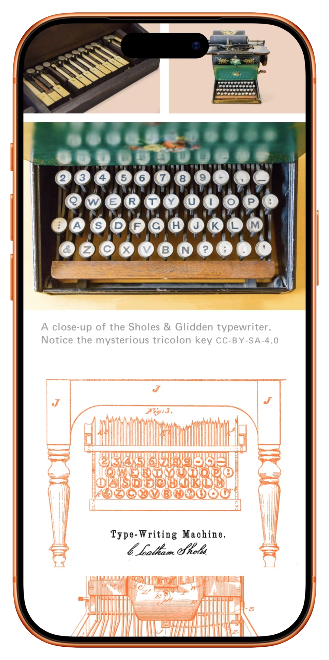
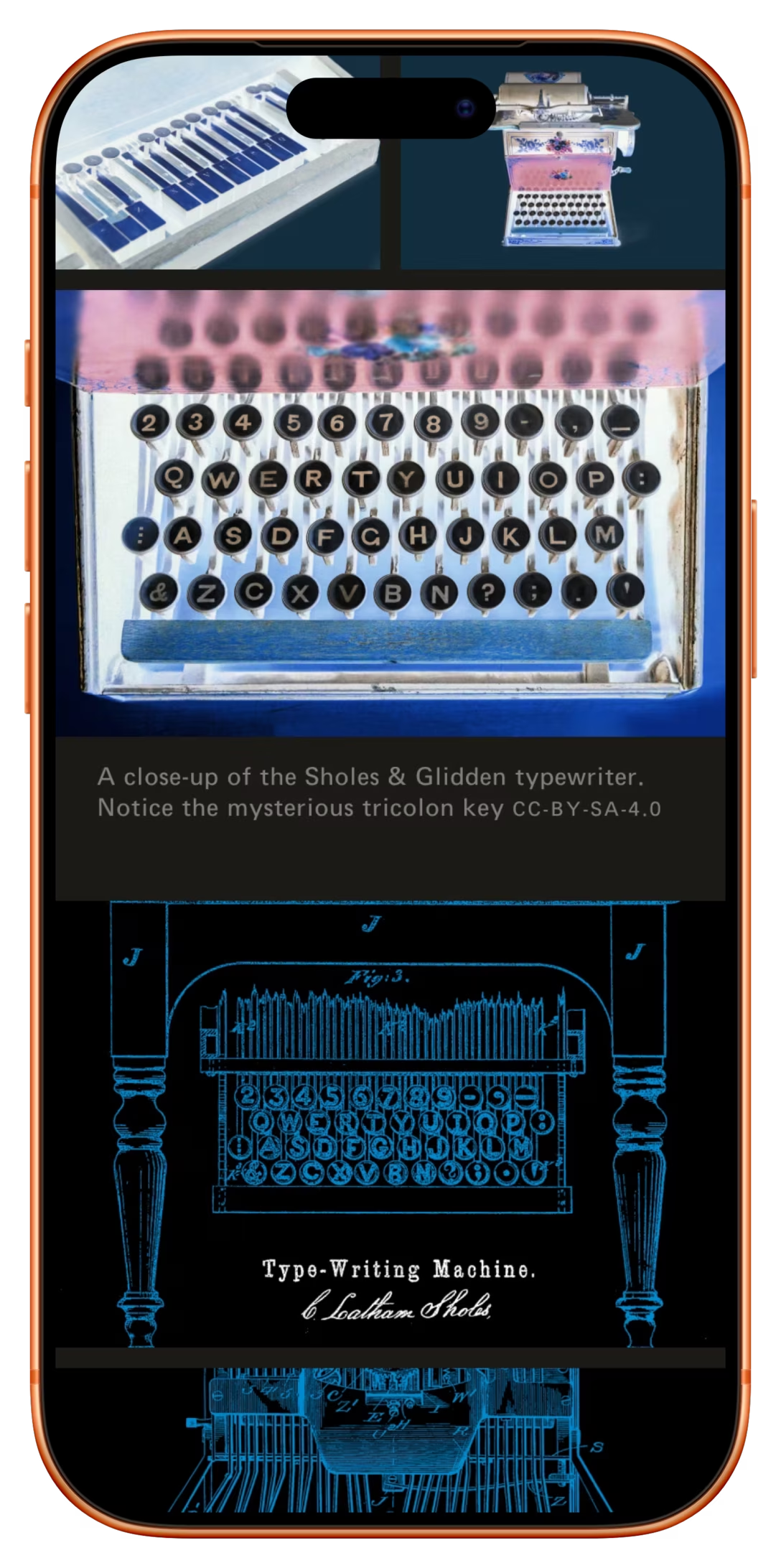
What explains the last part? This has to do with the fact that inversion happens in the RGB color space. R becomes 1–R, and the same for G and B.
Everyone who’s into gradients knows of a similar challenge that results in the gray dead zone effect. This is fixable if you convince a gradient to traverse through a different space instead, or coax it through the RGB space on a more… bespoke path (this is e.g. what Figma gradient plugins do).
Could we invert in HSL or OKLAB color space, then? Yes, we could. They both look similar – this is HSL:
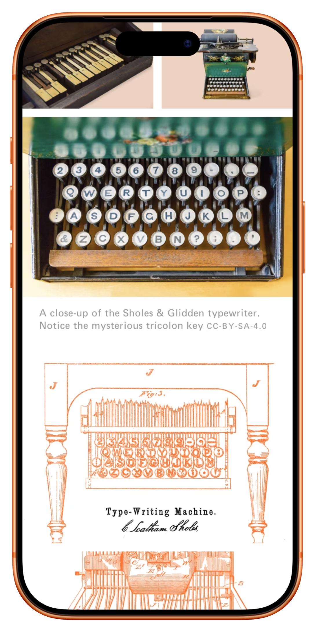
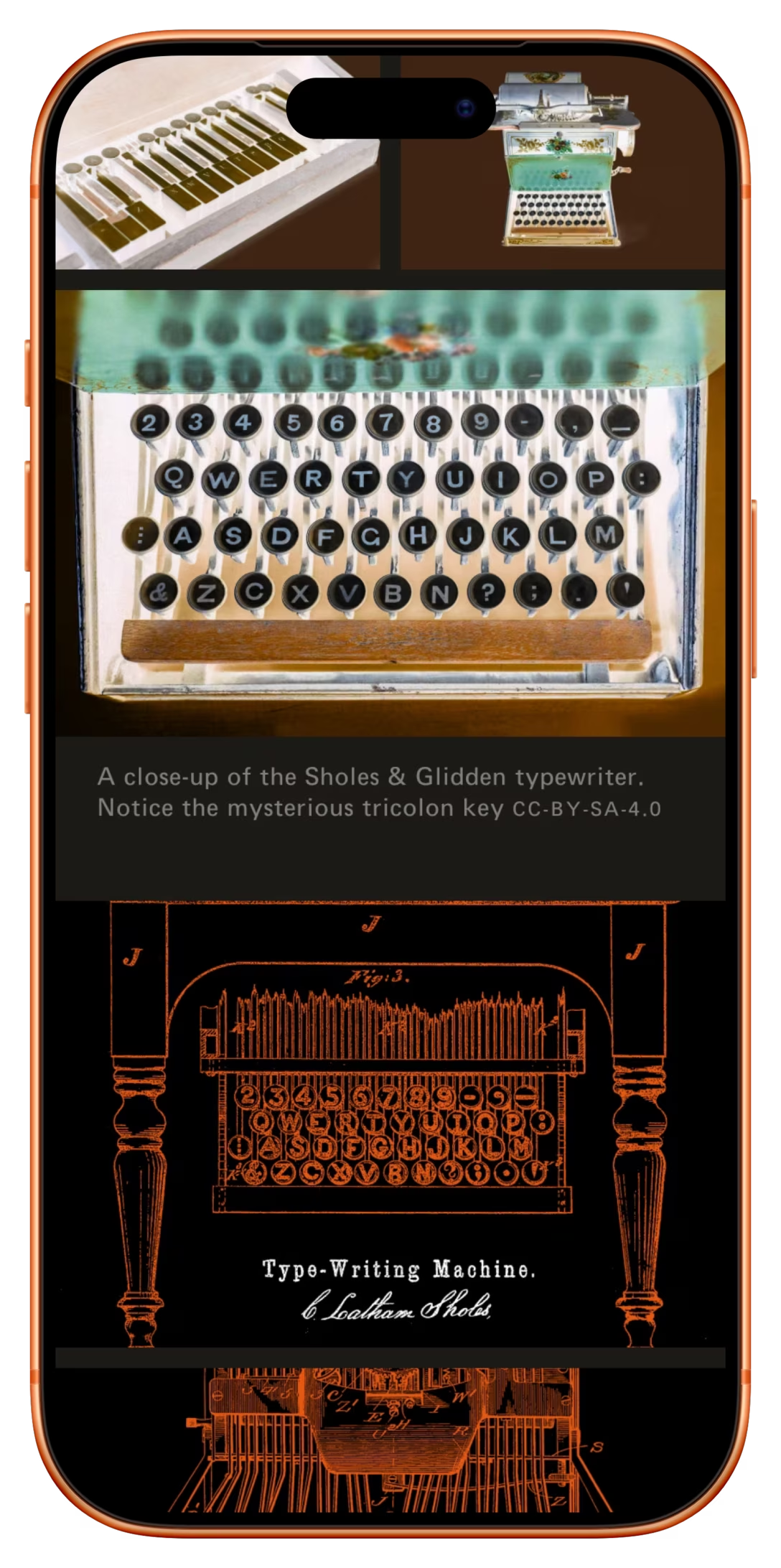
You can see how the photos get inverted now, but the colors remain the same! Still a curiosity, perhaps, but the bottom of the above screen shows this technique feels really interesting for diagrams, screenshots, and things of similar nature. Here’s another bitmap that looks pretty great inverted this way:
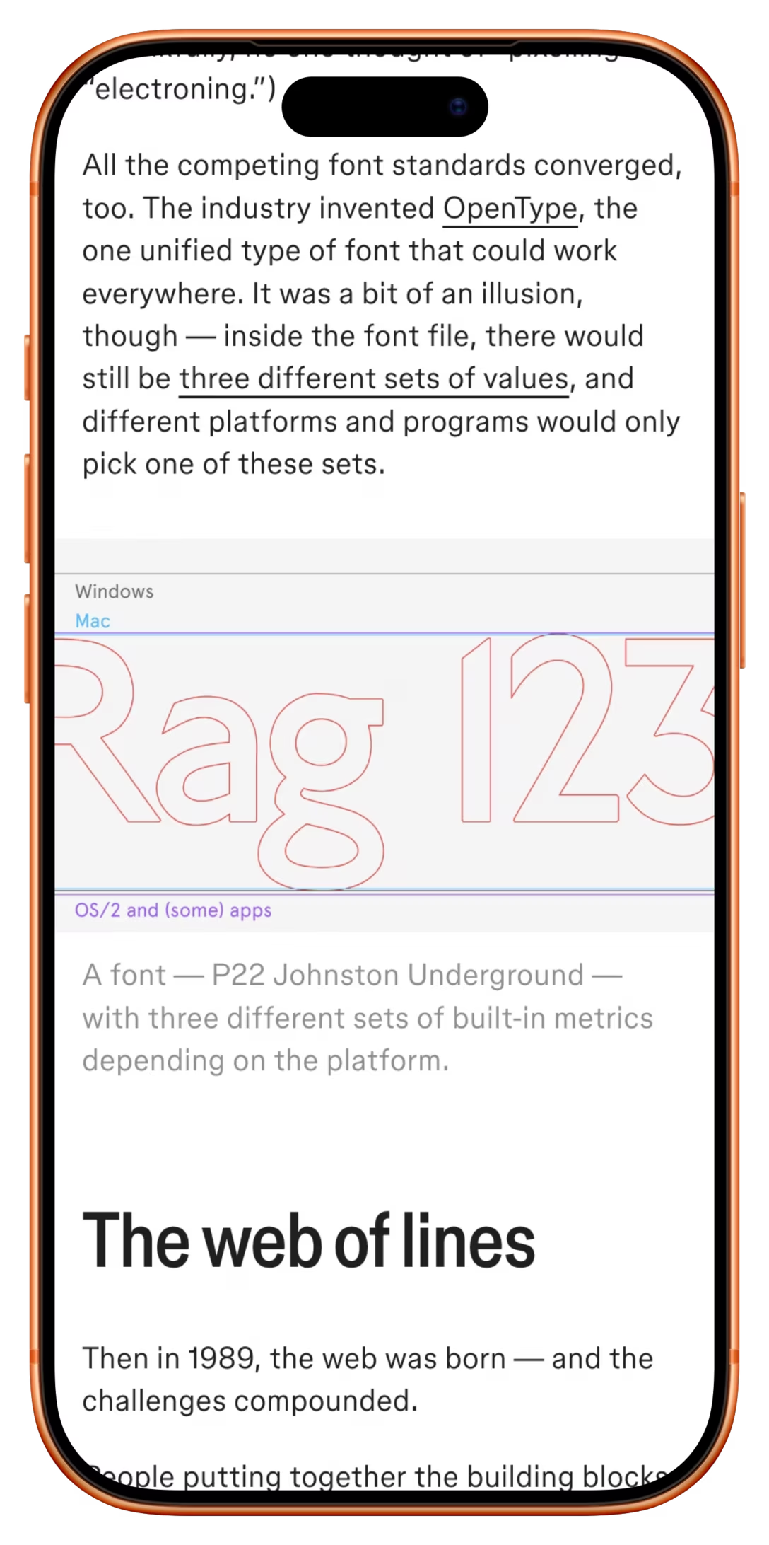
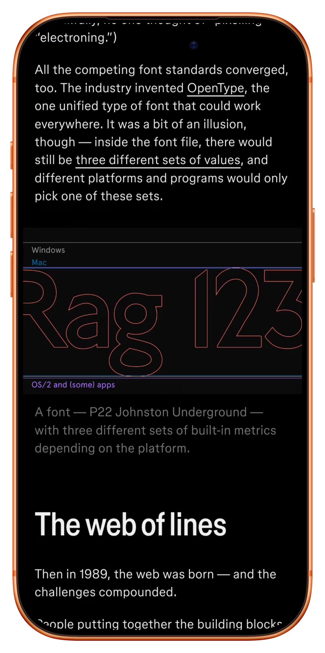
Unfortunately, while there are techniques and plugins to do gradients in non-RGB color spaces, I am not seeing a lot of options for inversion customization anywhere. Neither the graphics apps I use, nor CSS offer anything here.
But there’s a trick: do a regular invert and then rotate the hue halfway through. Through the magic of math, this is the same as inverting just L in the HSL space, which means the colors are preserved. This is actually achievable in graphic programs…
…and, more importantly, available in CSS as a filter: instead of invert(1), use hue-rotate(180deg) invert(1).
So, if you have dark-on-light diagrams, bitmapped text, illustrations, or other similar things – or even vector graphics you cannot throw dark mode variables at – this day-for-night trick that can get you places very cheaply. (And for other bright bitmaps, just reduce the brightness by 25%.)
It’s the same as with Hollywood trickery: remember to add a bit more nuance in the right place, and you get something that feels bespoke for the price of only light – please excuse the pun – manufacture.