Don’t show again (Taylor’s version)
An interesting take from a screen annotation app ScreenBrush – instead of a standard “don’t show again” checkbox modifying a button, it shows two buttons as a fork in a road:
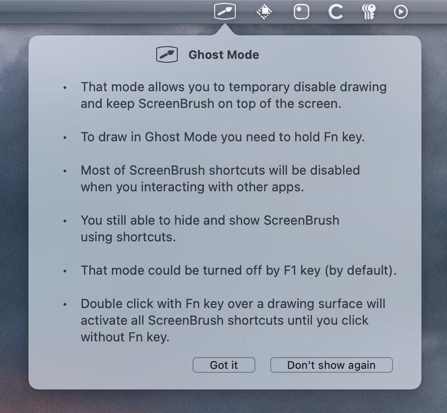
I am not sure I have ever seen it laid out like this before, and I am not sure if it’s good, as it does force a user to make a choice where a choice might not be necessary. In case you are curious, Esc (or click away) is the equivalent to “Got it,” and Enter does nothing at all, which makes the interface somewhat incongruous – the “Don’t show again” button is positioned as a primary command, but takes more effort to invoke.
But what is interesting to me in particular was seeing it next to all of these “Maybe later” buttons that litter user interfaces these days. People seem to generally despise those, and it is refreshing to see a modern UI with a button string that doesn’t hesitate.