Fontificator
I thought about this the other day, and I thought it’d be fun to share this internal tool I made over a decade ago to aid with exploring options for Medium’s typographical redesign.
It’s called Fontificator. You can play with Fontificator here (desktop browsers only), or watch the likely confusing video below:
The motivation for building Fontificator came from two observations:
- font previews on type foundry sites were generally too limited to get a real sense of how a certain typeface feels, and it was best to see a font in situ,
- often an extremely tiny nuance – like adding some letter spacing, or messing with line height – was what separated something that was promising from something that seemed very far from working.
With Fontificator, I was aiming at this Doug Engelbart-esque notion of one hand on the keyboard + one hand on the mouse, and the UI where it was only necessary to point to an element, and the keys under your other hand would start working immediately – no clicking needed:
- F and G to change the font,
- – and + for font size,
- ← and → for letter spacing,
- ↑ and ↓ for line height,
- < and > for opacity (for all the above you can hold Shift for bigger moves),
- and, there are a few more shortcuts you can see at the top.
This way, we could move really, really fast. To accommodate that, Fontificator always tried to keep the current item under the cursor by counter-adjusting scroll position as needed.
On top of it all, a few more shortcuts:
- ⇥ and ⇧⇥ move very quickly between different types of stories so you can preview that,
- Space compares to the original/current version,
- 1–9 allow you to switch to different “slots” so you can have various presets ready to compare,
- Esc hides the toolbar for maximum immersion,
- ⇧R resets.
You can also edit any text if you are so inclined, and also drag in any font file from your computer onto a paragraph – then that font becomes part of the F/G stack. (Bernino Sans and Freight Text were the starting fonts before the redesign.) On the left, you can also see a naïve mobile preview – there was also more sophisticated on-smartphone preview, but I removed it from this restored version.
Fontificator was literally made for an audience of 2–3 designers (and perhaps 1–2 stakeholders in read-only mode), and it was surprising to me how quickly one could master this strange tool, have fun with it, and feel the entire typography on the page becoming much more malleable. We also put up a more “traditional” list of contenders on the wall…
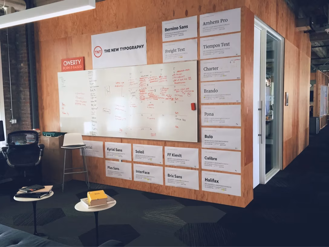
…but it was in Fontificator where we learned the most.
I love internal UIs because they allow you to go very wild and very tactical. If you have one you’d be willing to share (maybe it, too, is on the other side of the statute of limitations?), or one you already wrote about or spotted someone else doing so, please let me know!