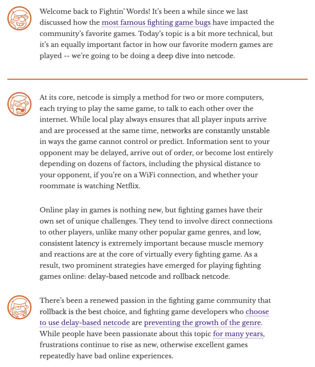
Interesting web design moments
Here are a few nice and interesting design decisions I spotted on various websites in the last months.
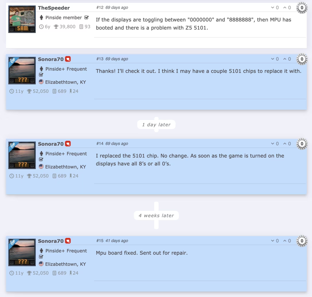
The pinball repair forum Pinside shows specifically how much time has passed between posts. This is great for orientation and especially when catching up or revisiting – history always gets flattened, and this gives the original story a much more truthful cadence:
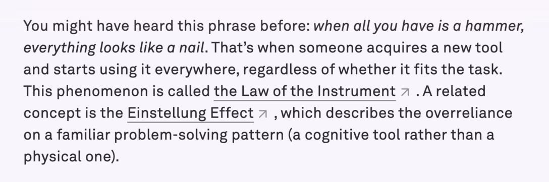
In a post from Reimar Servas I mentioned yesterday, you can see generous linking through the writing…
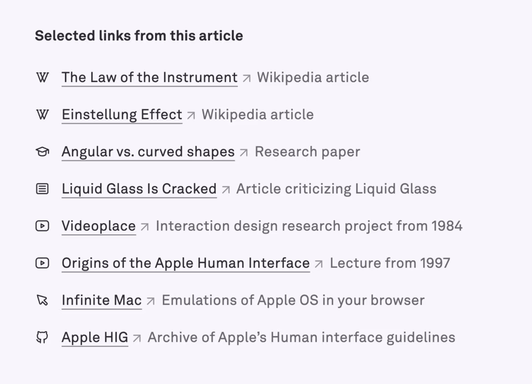
…but also a nice “link summary” at the bottom. I like this because I think this accommodates both people who branch out in the moment, and people who might prefer to read in full, and then explore. Also, it’s just easier to click all of the links if they’re laid out like this:
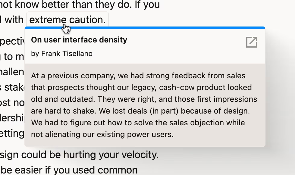
In the same space, Frank Tisellano provides these interesting callouts. They feel perhaps a little too eager, but I feel the eagerness is intentional: they build on how browsers show the URL on hover in the corner as a hint:
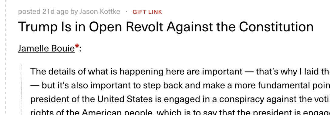
I liked kottke.org’s annotation when something is a gift link (here to the New York Times):
This website by Andrew Murphy has a swear toggle:
And lastly, it was fun to see an interview (by Infil) presented this way:
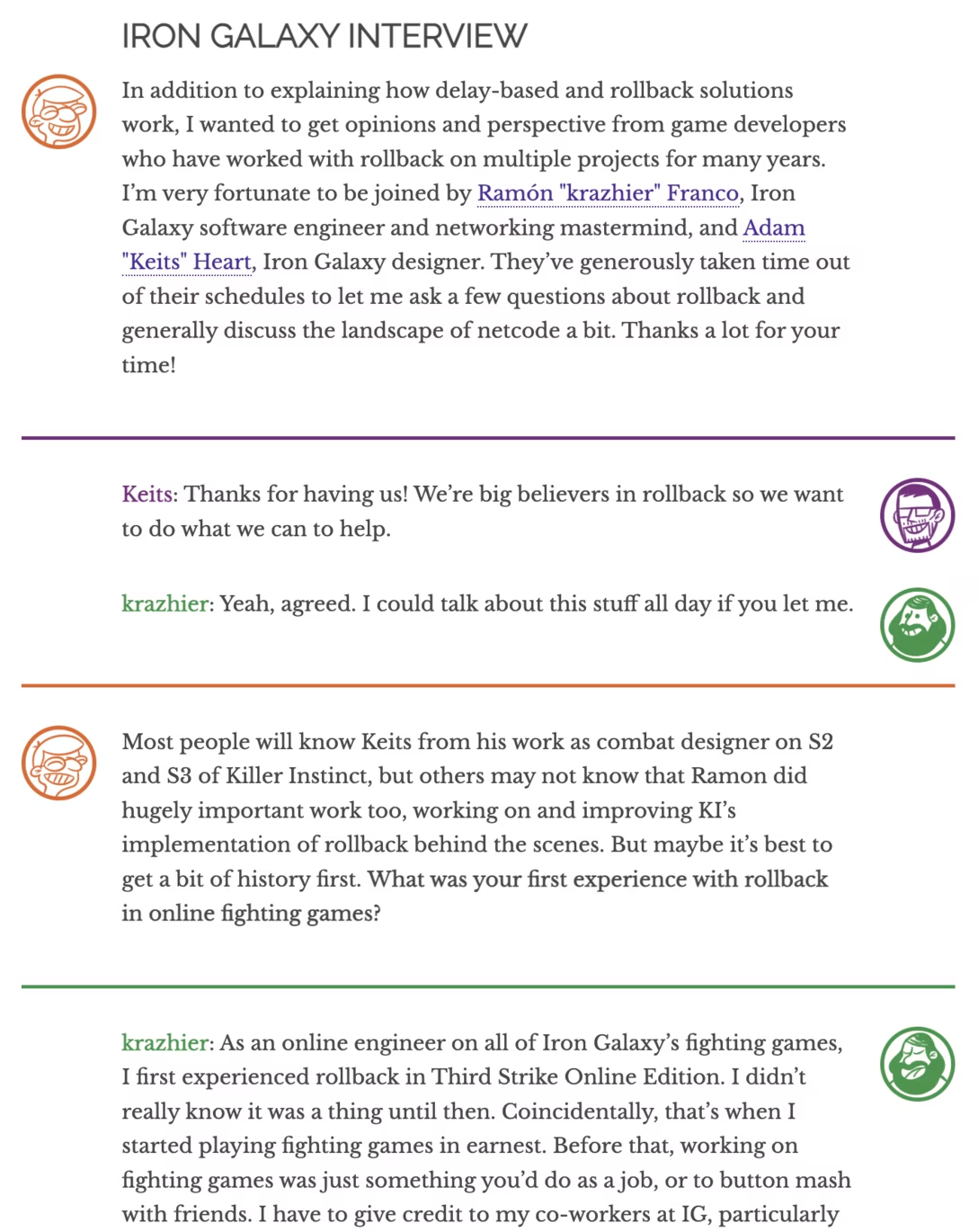
And it’s not just the interview – solo posts employ the same treatment to convey emotions: