Internet Archive’s alphabet
I love the Internet Archive, but I don’t love its interface.
It’s just… not great all around, homely and confusing. It has some endearing qualities, harking back to the web of the 1990s without endless commerce and incessant growth hacking – Wikipedia feels the same – but it’s unpleasant in many ways, and won’t inspire you the way good interfaces will. (Even the thing I once praised it for falls apart in details.)
So this below, once more, is going to be caveated.
I have been uploading things to Internet Archive for almost a decade now, and my collection of various font and typewriter and interface documents just reached a round 1,000 items, which made me proud and happy.
While browsing it myself yesterday, I noticed a new-to-me alphabet bar that pops up when you sort by title:
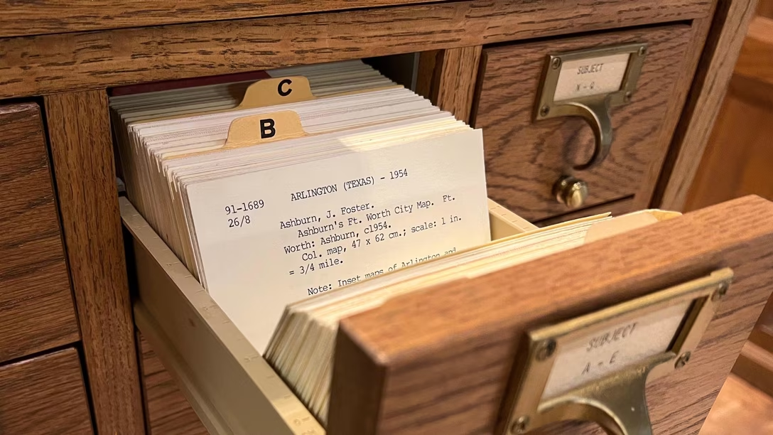
I am guessing it’s inspired by tabs in library catalogs?
The interface is ugly. There are big non-clickable gaps between letters. The tooltips were a mistake. But outside of that, I found it fun and delightful to explore a collection this way, and I’m not sure I have ever seen this kind of an “old-fashioned” approach before.